
The PH 'symbol' ('logo'?)
Author
Discussion

CoolHands

Original Poster:

23,383 posts

224 months

Wednesday 6th March 2013
quotequote all
Admittedly I don't know too much about PH. But I would just like to say, I don't like the symbol / logo? I'm not a great one for stickers, although it's something I vaguely consider from time to time. However, there is no way I'd put a PH sticker on my vehicle, it's just diabolical.

so, any plans to modify it, like ever? or is it sacrosanct?

I just think it is really awful eg
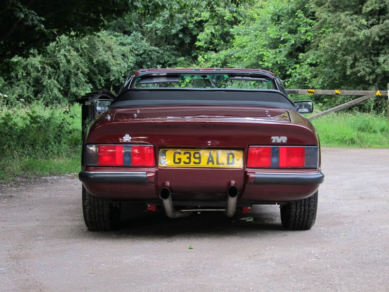


it's just not cool, you know what I mean?

Big Al.

69,336 posts

287 months

Wednesday 6th March 2013
quotequote all
Whilst you may not like it I'm sure there are other who do, if it's not to your liking then I would suggest you removed it.

deeen

6,400 posts

274 months

Wednesday 6th March 2013
quotequote all
Pistonheads wasn't started to be "cool"! My only gripe is I can't find an enameled metal version suitable for my badge bar.

CoolHands

Original Poster:

23,383 posts

224 months

Wednesday 6th March 2013
quotequote all
yeah but things change & evolve, people. No offense need be taken. Just something to think about

Pints

18,451 posts

223 months

Wednesday 6th March 2013
quotequote all
I think it looks great. Clever design, simple yet easily recognisable.

Big Al.

69,336 posts

287 months

Wednesday 6th March 2013
quotequote all
CoolHands said:
yeah but things change & evolve, people. No offense need be taken. Just something to think about
No offence taken but what is there to think about? confused

It was designed for a competition run by Ted a good few years back and IIRC it was the winner.

BliarOut

72,863 posts

268 months

Wednesday 6th March 2013
quotequote all
CoolHands said:
yeah but things change & evolve, people. No offense need be taken. Just something to think about
So what would look 'cool' on a Nissan Note?

miniman

30,017 posts

291 months

Wednesday 6th March 2013
quotequote all
BliarOut said:
CoolHands said:
yeah but things change & evolve, people. No offense need be taken. Just something to think about
So what would look 'cool' on a Nissan Note?

CoolHands

Original Poster:

23,383 posts

224 months

Wednesday 6th March 2013
quotequote all
haha

BliarOut

72,863 posts

268 months

Wednesday 6th March 2013
quotequote all
Too bloomin right, the PH logo is sacrosanct biggrin

The Game

2,324 posts

210 months

Wednesday 6th March 2013
quotequote all
deeen said:
Pistonheads wasn't started to be "cool"! My only gripe is I can't find an enameled metal version suitable for my badge bar.
tongue out


Synchromesh

2,428 posts

195 months

Wednesday 6th March 2013
quotequote all
I think the design is quite clever in being composed of pistons and a head making it graphically legible. It also imitates a skull and crossbones, which references us individuals of like-mindedness sailing the seas that are our roads alone while being united in a distinct fraternity. The only thing I'd change would be the mouth and eyes on the face, just making them more like a traditional smiley.

The Beaver King

6,095 posts

224 months

Thursday 7th March 2013
quotequote all
Synchromesh said:
I think the design is quite clever in being composed of pistons and a head making it graphically legible. It also imitates a skull and crossbones, which references us individuals of like-mindedness sailing the seas that are our roads alone while being united in a distinct fraternity. The only thing I'd change would be the mouth and eyes on the face, just making them more like a traditional smiley.
I like the style of the 'smiley', it accurately portrays the look on my face everytime I jump into the TVR ---> biggrin

Darren156

566 posts

221 months

Thursday 7th March 2013
quotequote all
What is the name of the site? And what is the piture of?

YesItsARover

2,726 posts

194 months

Thursday 7th March 2013
quotequote all
deeen said:
My only gripe is I can't find an enameled metal version suitable for my badge bar.
Yes please!

Stuart

11,639 posts

280 months

Thursday 7th March 2013
quotequote all
We'd be mad to ever change it. You might not like it, but we think it's just about perfect. Simple design, reflects the mindset beautifully, works in any number of colour combinations. Best of all it was done by a PHer, so it came from the members and not from us.

We're keeping it. Sorry about that OP...

madbadger

11,752 posts

273 months

Thursday 7th March 2013
quotequote all
Good decision. woohoo

Mr Roper

14,232 posts

223 months

Thursday 7th March 2013
quotequote all
Stuart,

Put a word in for the PH zippo please.

thumbup

markmullen

15,877 posts

263 months

Thursday 7th March 2013
quotequote all
Synchromesh said:
I think the design is quite clever in being composed of pistons and a head making it graphically legible. It also imitates a skull and crossbones, which references us individuals of like-mindedness sailing the seas that are our roads alone while being united in a distinct fraternity.
You work for an art agency AICMFP

MattDell

3,302 posts

184 months

Thursday 7th March 2013
quotequote all
markmullen said:
Synchromesh said:
I think the design is quite clever in being composed of pistons and a head making it graphically legible. It also imitates a skull and crossbones, which references us individuals of like-mindedness sailing the seas that are our roads alone while being united in a distinct fraternity.
You work for an art agency AICMFP
She's a witch!