Christopher Ward Pepsi GMT - new release
Discussion


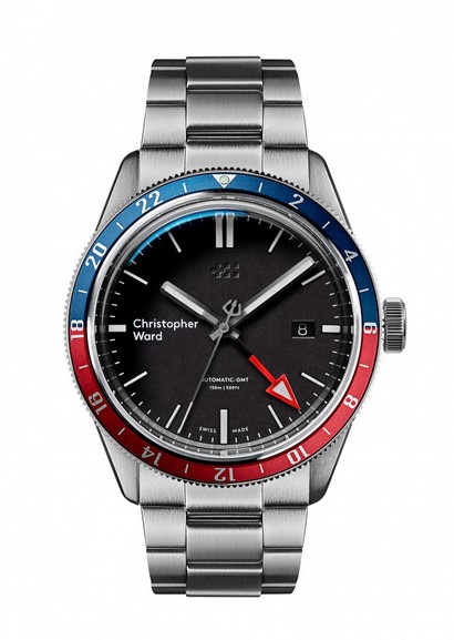
Close but no cigar.
Bezel ring too thin.
Couldn't live with the "Christopher Ward" text at 9pm.
Suspicious of Sellita Movement.
GMT hand jumping rather than Hour Hand jumping as per all budget mechanical GMTs.
Unidirectional Bezel on GMT is cheapskate.
Cringeful Bond References in description - Bond never wore a GMT (although Pussy Galore did).
Preferred the C60 GMT.
Seight_Returns said:
Close but no cigar.
Bezel ring too thin.
Couldn't live with the "Christopher Ward" text at 9pm.
Suspicious of Sellita Movement.
GMT hand jumping rather than Hour Hand jumping as per all budget mechanical GMTs.
Unidirectional Bezel on GMT is cheapskate.
Cringeful Bond References in description - Bond never wore a GMT (although Pussy Galore did).
Preferred the C60 GMT.
the problem with christoper ward is the logo, it just looks bloody awful on all their watches.Bezel ring too thin.
Couldn't live with the "Christopher Ward" text at 9pm.
Suspicious of Sellita Movement.
GMT hand jumping rather than Hour Hand jumping as per all budget mechanical GMTs.
Unidirectional Bezel on GMT is cheapskate.
Cringeful Bond References in description - Bond never wore a GMT (although Pussy Galore did).
Preferred the C60 GMT.
I don't like it at all. I also HATE their lettering. the +:: logo is enough.
Also despite all that its a maybe at £460 but £960 is laughable.
Steinhart can churn out something at under €500 I cannot see where the value is here at all.
Agreed Bezel is too thin and uni-directional is rubbish too.
Also despite all that its a maybe at £460 but £960 is laughable.
Steinhart can churn out something at under €500 I cannot see where the value is here at all.
Agreed Bezel is too thin and uni-directional is rubbish too.
Seight_Returns said:
Close but no cigar.
Bezel ring too thin.
Couldn't live with the "Christopher Ward" text at 9pm.
Suspicious of Sellita Movement.
GMT hand jumping rather than Hour Hand jumping as per all budget mechanical GMTs.
Unidirectional Bezel on GMT is cheapskate.
Cringeful Bond References in description - Bond never wore a GMT (although Pussy Galore did).
Preferred the C60 GMT.
Happy with the bezelBezel ring too thin.
Couldn't live with the "Christopher Ward" text at 9pm.
Suspicious of Sellita Movement.
GMT hand jumping rather than Hour Hand jumping as per all budget mechanical GMTs.
Unidirectional Bezel on GMT is cheapskate.
Cringeful Bond References in description - Bond never wore a GMT (although Pussy Galore did).
Preferred the C60 GMT.
Ditto on the logo, the new one is awful, looks like an after thought.
I could live with the Sellita movement.
The GMT jumping hand doesn't bother me
The protruding glass doesn't bother me either
Any reason why Uni-directional bezel is cheap?
A unidirectional bezel is a safety feature associated with diving watches. If the bezel is inadvertently moved it can only move anticlockwise so as to avoid the potentially dangerous situation where you've been underwater for longer than your watch tells you that you have been.
For a GMT you want to be able to move the bezel in both directions so you don't have to turn the dial almost all the way round anti-clockwise to adjust for a small + time zone change.
Most makers of budget GMTs don't go to the expense of making a bi-directional bezel and just re-use the unidirectional bezels from their dive watches. The better ones have bi-directional bezels - they also generally have 48 clicks rather than the usual 120 for dive watches since you don't need to adjust the bezel in anything less than 30min increments.
Edited by Seight_Returns on Wednesday 20th March 16:21
Seight_Returns said:
For a GMT you want to be able to move the bezel in both directions so you don't have to turn the dial almost all the way round anti-clockwise to adjust for a small + time zone change.
Most makers of budget GMTs don't go to the expense of making a bi-directional bezel and just re-use the unidirectional bezels from their dive watches. The better ones have bi-directional bezels - they also generally have 48 clicks rather than the usual 120 for dive watches since you don't need to adjust the bezel in anything less than 30min increments.
Cool. Thanks for that. I’ve not had. GMT before. Most makers of budget GMTs don't go to the expense of making a bi-directional bezel and just re-use the unidirectional bezels from their dive watches. The better ones have bi-directional bezels - they also generally have 48 clicks rather than the usual 120 for dive watches since you don't need to adjust the bezel in anything less than 30min increments.
Edited by Seight_Returns on Wednesday 20th March 16:21
But still both the logos are awful! God know why they changed it!
Bubba Zanetti said:
When people say they don't like the logo do they mean the logo at 12 o'clock or the wordmark at 9 o'clock?
Dislike the “Christoper Ward” text at 9 with a passion. Loads of people say similar about other watches on the CW forum. I like the c65 diver but the 9 o clock logo really unbalances it as there’s no date on it. As well as looking crap
CAPP0 said:
Miguel Alvarez said:
Well at least it's not a straight rip off design.
I feel I should have added that to my post above. I've been very critical of their plagiarism in the past. I agree this breaks that mould. But I stand by thinking it doesn't look very nice. 
Gassing Station | Watches | Top of Page | What's New | My Stuff