More on desaturation
Discussion


I was thinking about reflections and desaturation (somebody did a nice one here a few weeks ago)
Had the idea of doing this (you'll have to follow the link I'm afraid - it's java script) Rather pleased with the result:
>>>> http://www.stevecarter.com/catreflect.htm
...now in a reflective mode (or should that be mood)! Some work, some don't (this is one that works I think)
[pic]http://www.stevecarter.com/reflectedcolour1.jpg[/pic]
Steve

Ta guys
The java was doing the rounds years ago, I most definately 'shanked' it.
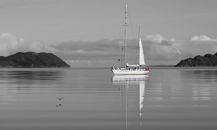
Boat - could well be right on the busy front - I'm just experimenting with the reflection and the source being spot colour - which may have a bit of a future as an idea. I have shed loads of shots of reflections on this HD!
edited to add... just playing with the spot colour being BW - not sure on that yet... interesting but just a bit wrong
>> Edited by GetCarter on Saturday 1st October 18:13
The java was doing the rounds years ago, I most definately 'shanked' it.
Boat - could well be right on the busy front - I'm just experimenting with the reflection and the source being spot colour - which may have a bit of a future as an idea. I have shed loads of shots of reflections on this HD!
edited to add... just playing with the spot colour being BW - not sure on that yet... interesting but just a bit wrong
>> Edited by GetCarter on Saturday 1st October 18:13
Think the boat works and I like the effect with the Caterham, but I find the "reflection" of the car a bit too powerful. Just wondering what it would look like if the colour in the reflection was reduced/darkened down or otherwise softened a bit - not a lot but just subtle enough so that it adds to the image as a whole ?
te51cle said:
Think the boat works and I like the effect with the Caterham, but I find the "reflection" of the car a bit too powerful. Just wondering what it would look like if the colour in the reflection was reduced/darkened down or otherwise softened a bit - not a lot but just subtle enough so that it adds to the image as a whole ?
The Caterham pic is a bit of a web prank to be honest - just a bit of fun. I could play with the variables to make it look a bit better, but hey, its always going to look like a trick!
... and besides, whenever I play with too many variables, the computer crashes.

No problem with that. My comments stem from taking a photo of canoeists on a perfectly still piece of canal, I had a perfectly sharp and clear mirror image of them in the water that I thought was great but no-one liked the photo because they thought that the reflection had been done in PS due to the clarity ! 
Looking at that photo again a couple of years later I was forced to admit that just a little less sharpness and brightness would have been a good idea. Hey ho...
Looking at that photo again a couple of years later I was forced to admit that just a little less sharpness and brightness would have been a good idea. Hey ho...
Good point Tes5icles. I often reduce colour from sunsets from the Highlands 'cos nobody believes that the colours are for real (doh!)
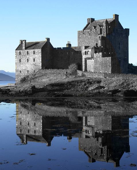
More experimentaion with reflections - this one too subtle methinks:
Maybe I should just go to the pub!
>> Edited by GetCarter on Saturday 1st October 18:38
More experimentaion with reflections - this one too subtle methinks:
Maybe I should just go to the pub!
>> Edited by GetCarter on Saturday 1st October 18:38
I like them all, very striking. Just very minor comments:
1) Fishing boat - not sure about position in frame; it's neither central not sufficiently off-centre.
2) Castle - maybe try the spot colour the other way round, ie colour castle on b/w b/g.
3) Brilliant, thanks to the seabird. A great mixture of spot colour and composition. I'd just like a tad more sky and a tad less foreground.
(NB there are 3 tads in a grumby )
)
>> Edited by simpo two on Saturday 1st October 19:28
1) Fishing boat - not sure about position in frame; it's neither central not sufficiently off-centre.
2) Castle - maybe try the spot colour the other way round, ie colour castle on b/w b/g.
3) Brilliant, thanks to the seabird. A great mixture of spot colour and composition. I'd just like a tad more sky and a tad less foreground.
(NB there are 3 tads in a grumby
) >> Edited by simpo two on Saturday 1st October 19:28


Gassing Station | Photography & Video | Top of Page | What's New | My Stuff