
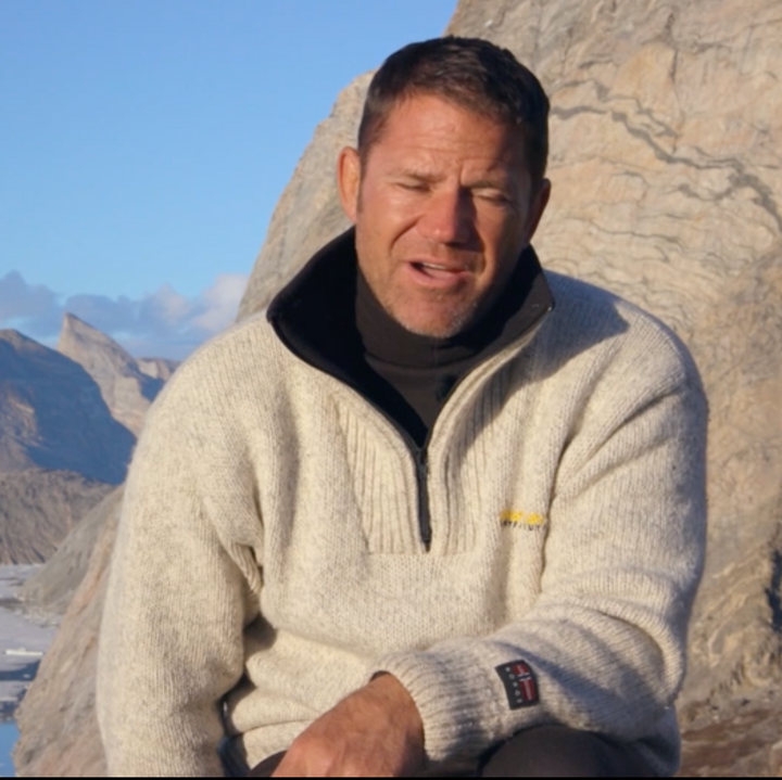
Does anyone know what this logo is, please?
Discussion


The logo featured on the heather grey sweatshirt belongs to Spoon Sports, a famous Japanese automotive tuning company that specializes in Honda vehicles.
If you are trying to find this specific piece of merchandise, let me know if you would like help locating:
- Logo Design Details
- Text Elements: The word "SPOON" is printed in its signature yellow, sans-serif block font. Directly below it, the word "SPORTS" is written in black.
- The Icon: The yellow circular graphic depicts an abstracted silhouette of a crane, a nod to the company's traditional Japanese heritage and its association with precision and aerodynamic form.
If you are trying to find this specific piece of merchandise, let me know if you would like help locating:
- The exact type of garment (e.g., crewneck sweatshirt or hoodie)
- Trusted automotive apparel retailers that ship to your region
Digger said:
The logo featured on the heather grey sweatshirt belongs to Spoon Sports, a famous Japanese automotive tuning company that specializes in Honda vehicles.
As a Honda Fanboi I can tell you that is not a Spoon logo. The Spoon logo is either the word 'Spoon" in large with the word "Sport" below in small letters, or the 'red crown crane/ red car on a track" symbol.- Logo Design Details
- Text Elements: The word "SPOON" is printed in its signature yellow, sans-serif block font. Directly below it, the word "SPORTS" is written in black.
- The Icon: The yellow circular graphic depicts an abstracted silhouette of a crane, a nod to the company's traditional Japanese heritage and its association with precision and aerodynamic form...
The company is named after the Spoon Curve at Suzuka , Honda's test track.
Edited by Super Sonic on Sunday 21st June 22:41
Edited by Super Sonic on Sunday 21st June 22:42
Thanks all.
It is a top I’ve seen the to presenter, Steve Backshall, wearing.
This was the clearest pic I could get of the logo. Had I been been able to make out the wording I think I could have found the company but, as mentioned, this was the clearest pic I could snap and enlarge.
Somehow I don’t see if as a sports car type of guy.
Anyway, I appreciate everyone’s efforts and suggestions.
It is a top I’ve seen the to presenter, Steve Backshall, wearing.
This was the clearest pic I could get of the logo. Had I been been able to make out the wording I think I could have found the company but, as mentioned, this was the clearest pic I could snap and enlarge.
Somehow I don’t see if as a sports car type of guy.
Anyway, I appreciate everyone’s efforts and suggestions.
This is from Series 1 Episode 7 of Expedition with Steve Backshall. The logo is more visible earlier in the episode but it is still not legible. The photo below shows it has what looks like a Norwegian flag with the word Norge underneath. It could be from a clothing company called Norwool or Bratens.
It is Skandinavisk Høyfjellsutstyr.
https://www.shutrondheim.no/
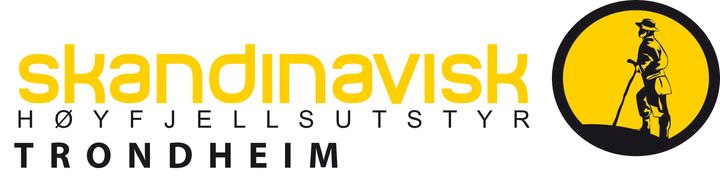
https://www.shutrondheim.no/
Edited by InitialDave on Monday 22 June 00:00

Gassing Station | The Lounge | Top of Page | What's New | My Stuff