How boring does Callum Design's XJ220 look?
Jaguar's fabled supercar no more needs updating than an English Electric Lightning does...
Callum Design, the consultancy founded and led by Ian Callum, has been doing many fine and interesting things since it set up shop in 2019. The R-Reforged Vanquish and Evoluto Automobili 355 we liked very much. But other projects, like the off-road-y Callum Skye, we could take or leave. Its latest wheeze, a design study based on what the Jaguar XJ220 might look like were it pushed through a ‘modern lens’, very much falls into the second category.
Of course, Callum (specifically, the man) has well earned the right to tinker with any Jaguar he likes, and there’s always a what-if appeal to seeing what the designer of the XK and XF and F-Type has come up with - especially in the wake of the controversial Type 01. But the XJ220, for all the criticism levelled at it, is too wholly of its time for it to easily succumb to a ‘contemporary interpretation’ of Keith Helfet’s original effort, which famously caused a storm at the 1988 British Motor Show in concept form.
Moreover, the XJ220 has a famous backstory that speaks to its appearance - it seeming less like the product of a sanitised, mood-walled studio, and more like something cobbled together in a backroom over a weekend. Yes, it was partly an homage to previous Jaguars, but mostly (originally) it was supposed to go Group B racing and reinforce the idea that this was still a car company to be reckoned with. Clearly then, it was not a success on every front - its failure to bring to market the 6.2-litre V12 intended for it contributed to its commercial shortcomings - but the look is considered iconic for a good reason: it looks like nothing else.
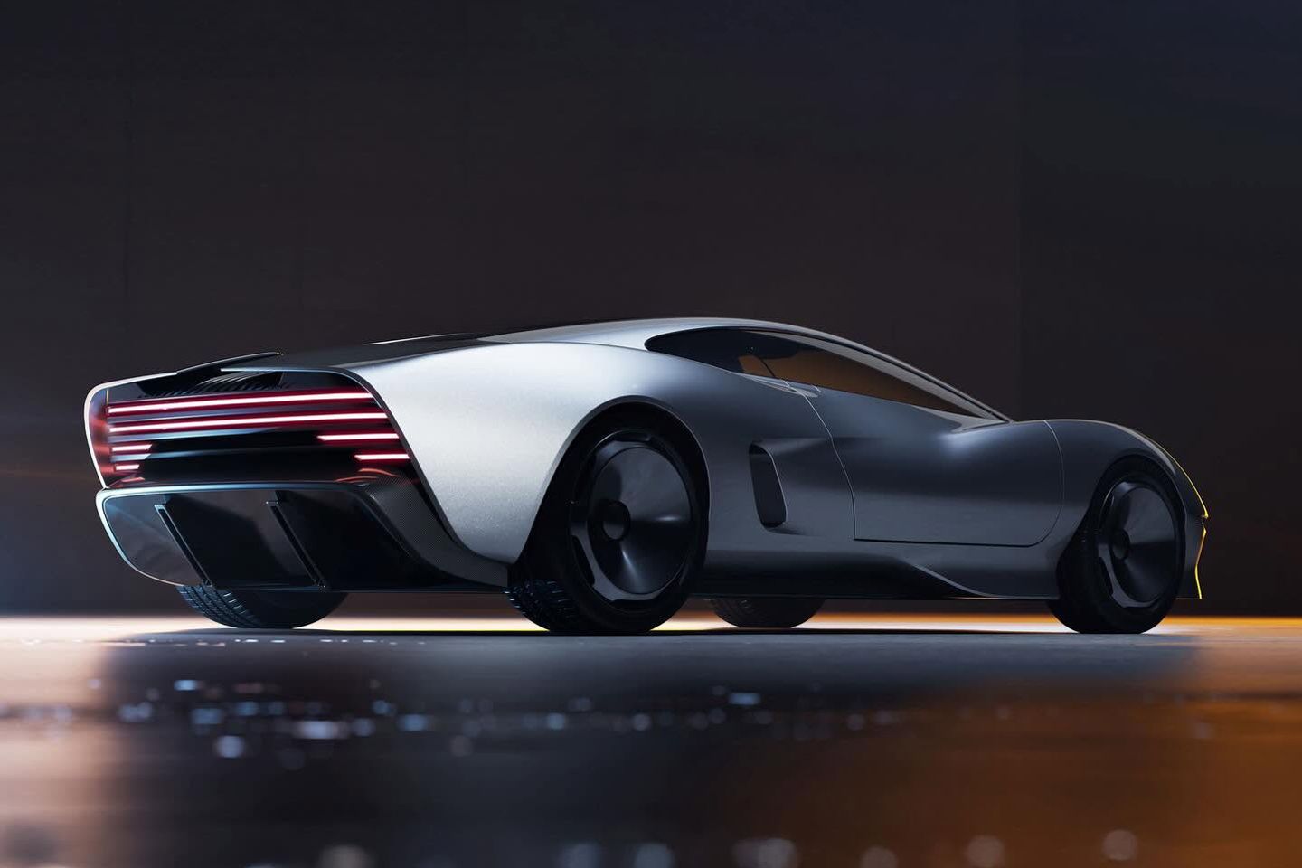
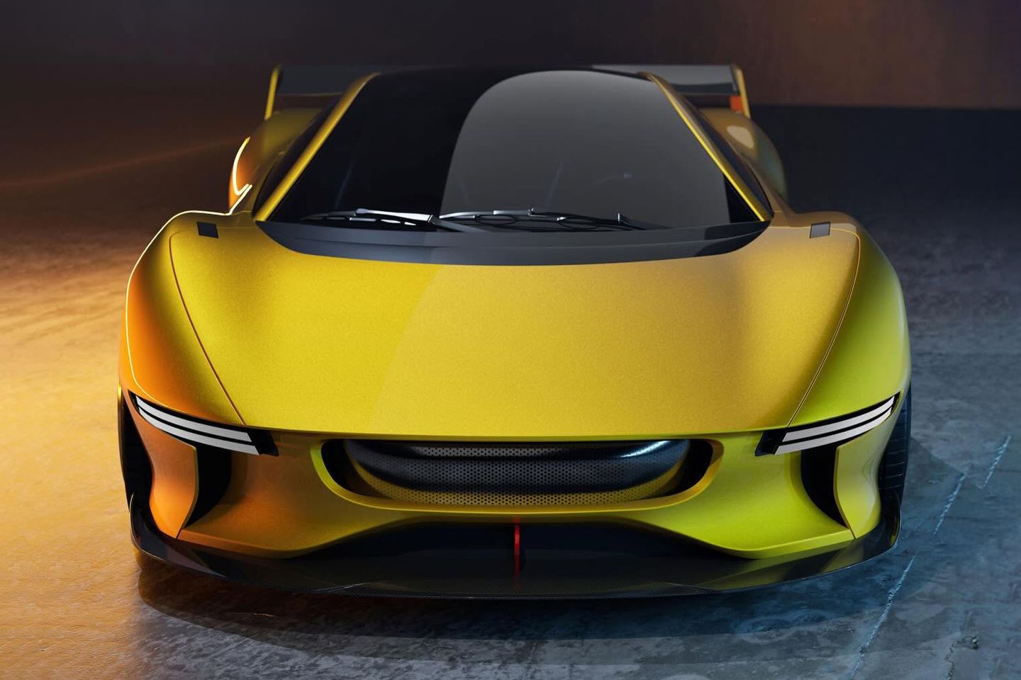
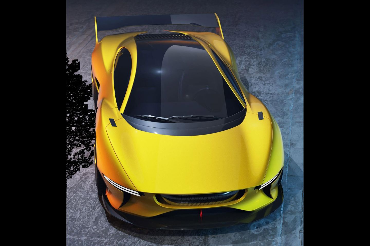
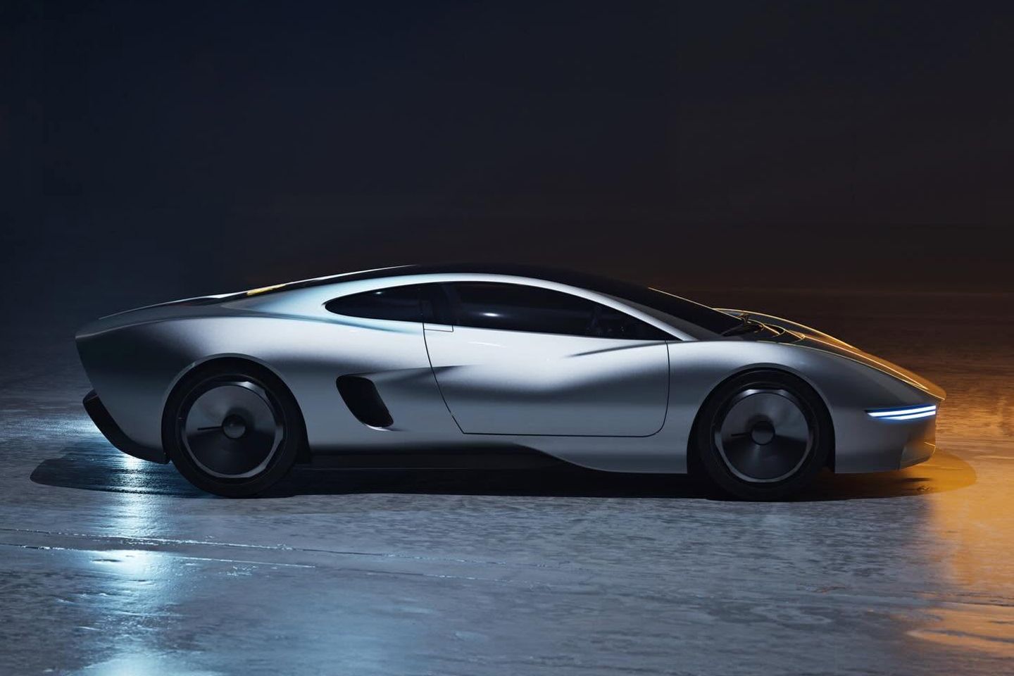
The Callum version looks too much like everything else. Sure, there are sharper, more incisive lines and inevitably compressed overhangs, but in its rush to redefine ‘every surface, detail and proportion’, the reimagining has done away with too much of the XJ220’s distinctiveness. Jaguar’s 220mph (theoretically anyway) hypercar managed to look like an elongated muscle car, even as it went through the simultaneously fraught business of tipping its hat to the past while beckoning the future underneath with the kind of Venturi effect you need to generate more than a tonne of downforce at 200mph.
Sure, there were some quirks. The rear lights were from the Rover 200; you needed a pole vault to get over the door sills (and a shrink ray to get you through the opening); the front compartment was huge - but would only accommodate two giant cooling fans - while the boot itself was hilariously tiny, remarkably so when you consider that it was two feet longer than a Ferrari F40. The pop-up radio antenna was hilarious, too, and the pop-up headlights didn’t pop up at all; they were fixed in position and revealed by retractable covers.
That these have gone in Callum’s rework rather says it all. Ditto (perhaps more reasonably) the Rover 200 lights. But what is an XJ220 without either? Or without its giant overhangs? Or Transit-style door locks? A pale imitation, we’d argue - pretty enough in isolation, and not without some inventive details, yet sterilised to the point of anodyne, even in its ‘more focused’ (yellow-coloured) GT1 interpretation. Jaguar’s effort was a sledgehammer made sleek; summoned from a drafting table and chiselled into gigantic being by hand. No clever render can hold a candle to it.


Agree with the article, the "re-imagining" has taken away everything that made the XJ220 what it was. It's just another concept car.
In fact, the whole car was ridiculously huge. Nearly 5 metres long and 2 metres wide - 35 years ago, when cars were much smaller than the hulking SUVs people are buying today. It's as big as a Lotus Eletre and only has room for two people. No wonder most orders were cancelled.
Gassing Station | General Gassing | Top of Page | What's New | My Stuff