Feedback please!
Discussion


This week I have been mostly... playing around with creative modes on my 350D. A couple I particularly like:


Others at www.binaryimage.net/albums/lacock
Any feedback welcomed!
Others at www.binaryimage.net/albums/lacock
Any feedback welcomed!

Sorry... missed this first time round.
Don't know Canon creative modes
Can't comment on the top one looks fine, possibly a focus issue - but that could easily be the resize for web.
The bottom one (I know the area btw - I bet you spend some time at Castle Combe!)... well it looks to me like the camera was focussed on the wall/window, not the sign. Apart from the obvious way of getting round this, a sneaky way to accentuate the sign is to put the camera into speed priority, and make it a very fast shutter speed. This will narrow the depth of field making the background soft... and making the sign sharp and stick out more. (That was about as techie as you get from me!)
Sorry if you knew this btw! One never knows where to pitch these 'comments' comments.
Steve
>> Edited by GetCarter on Monday 9th January 19:39
You can change the way the 350D selects the autofocus point - it's on p73 of the manual. I have mine set on a single point (the middle one), and do a half-press and move the camera to frame my pic.
GetCarter - if depth of field is critical to your composition, why not just do it with aperture priority instead of shutter priority? Do you get a different effect? (this is a genuine question not a smartarse one in case it reads that way, and it probably does, cos I'm knackered)
GetCarter - if depth of field is critical to your composition, why not just do it with aperture priority instead of shutter priority? Do you get a different effect? (this is a genuine question not a smartarse one in case it reads that way, and it probably does, cos I'm knackered)
rude girl said:
You can change the way the 350D selects the autofocus point - it's on p73 of the manual. I have mine set on a single point (the middle one), and do a half-press and move the camera to frame my pic.
GetCarter - if depth of field is critical to your composition, why not just do it with aperture priority instead of shutter priority? Do you get a different effect? (this is a genuine question not a smartarse one in case it reads that way, and it probably does, cos I'm knackered)
Hi rude girl
 You don't live up to your name
It doesn't matter which you choose to alter your exposure (shutter or apature priority) you'll end up with the same result (fast shutter=small apature...large apature=slow shutter) you just need to think about what is the most important element of the image you want to achieve and bias toward that...need to freeze action = high shutter speed...need large depth of field = small apature. Hope this makes sense...I'm sure a clever person can explain a lot better.
Martin.
Thanks Martin. That's what I've been doing. I'd have used aperture priority for these photos, I just wondered if there was another experiment I needed to add when I have my nerdy moments of taking 11 'identical' photos all with different settings!
ps I do live up to my name, but not in the 'ignorant' sense of the word
 Fortunately for everyone, my hockey-playing days are behind me now
ps I do live up to my name, but not in the 'ignorant' sense of the word
Fortunately for everyone, my hockey-playing days are behind me now
GetCarter said:I popped over
The bottom one (I know the area btw - I bet you spend some time at Castle Combe!)... well it looks to me like the camera was focussed on the wall/window, not the sign. Apart from the obvious way of getting round this, a sneaky way to accentuate the sign is to put the camera into speed priority, and make it a very fast shutter speed. This will narrow the depth of field making the background soft... and making the sign sharp and stick out more. (That was about as techie as you get from me!)
and took this one to see if it would be better like this .... 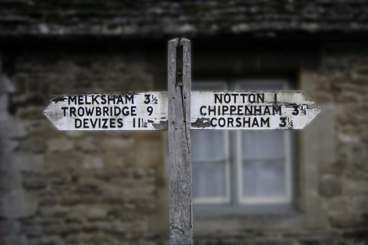
beano500 said:
I popped over
beano, being new to all this PS malarky, what is the best way to achieve the 'fake' DOF that you've done here. I assume a level of blur but when I've experimented I've failed to get something as 'true DOF' as your's looks. What %? Is it gaussian?
Thanks for your kind words! Hope the photographer will forgive me for "playing"!
I merely added gaussian blur and adjusted the levels so that any highlights would not be intrusive. I did it entirely by view of teh screen image. i don't believe there is any "right" or "wrong" amount because the size of the image (number of pixels) is really the deciding factor.
(So if your image is 3000 x 2000 it's a bit different to a 400 x 600 proposition!)
PS, I ALWAYS play with levels, or curves, or colour balance, in a seperate layer, then adjustments can be easily made by opacity. Better still you can "paint through" an adjustment layer.
Also note that I did not apply ANY sharpening. Visually, it works with this subject, but if you want part of an image to look more sharp, it's often sensible to make other parts of it less sharp, this doesn't introduce the artificial look that the various sharpening methods usually offer.
Gassing Station | Photography & Video | Top of Page | What's New | My Stuff