Website Review Please
Discussion


Have totally redesigned our site, please take a look and give opinions and any suggestions please.
Thanks.
www.bennettracing.co.uk
Thanks.
www.bennettracing.co.uk
Hi Luke !
I think it looks better and clearer designed.
In the text, I would suggest "their" instead of : "...build there own engines..."
When I click away from the "Home" page to any of the "sub-pages",
I have to click on "Home" again to return to the main menu,
there seems no "back" function.
Maybe post your current "best E.T. and Top Speed" in the black area at the top,
to impress n00bs and first-time visitors ?
Regards,
Benni
The site looks pretty good, and I'll skip the obligatory rant about the site being in flash. But...
The text on the front page is too small and hard to read. Both on the front page and elsewhere, the text overlaps other elements on the page:
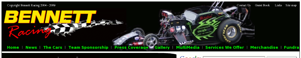
Also, the menus are cropped in places. For example, on the Sponsorship menu, the first item reads "Sponsorship inform". I assume that's meant to be "information". The rightmost top level menu is "Fundra" rather than "Fundraising".
If you're going to use green on white for headings etc., you might want to pick a slightly darker green. It's not easy to read as it stands.
There are no prices on the merch page, just the option to add stuff to your cart.
The crew photos are too dark, and could do with lightening up a bit.
The gallery and press coverage pages are very slow to load. There's no back button. If I go into the gallery, then 2006, then Summer Nats, I get a slideshow of pictures from that meeting. So far so good. But if I then want to look at other meetings from that year, the only way I can find is to go right back to the top level gallery and then drill down again. Pressing the back button would be much easier here.
There's also no ability to bookmark a page, so you can't send someone a URL of an image, for example.
After years of frankly average looking cars, you now have one that looks fanstastic. But you're hiding a tiny picture of it in the title bar. I'd be plastering it all over the place. It's a great looking car. You might as well show it off! I'd suggest something more like this:
This is with Firefox on Linux.
The text on the front page is too small and hard to read. Both on the front page and elsewhere, the text overlaps other elements on the page:
Also, the menus are cropped in places. For example, on the Sponsorship menu, the first item reads "Sponsorship inform". I assume that's meant to be "information". The rightmost top level menu is "Fundra" rather than "Fundraising".
If you're going to use green on white for headings etc., you might want to pick a slightly darker green. It's not easy to read as it stands.
There are no prices on the merch page, just the option to add stuff to your cart.
The crew photos are too dark, and could do with lightening up a bit.
The gallery and press coverage pages are very slow to load. There's no back button. If I go into the gallery, then 2006, then Summer Nats, I get a slideshow of pictures from that meeting. So far so good. But if I then want to look at other meetings from that year, the only way I can find is to go right back to the top level gallery and then drill down again. Pressing the back button would be much easier here.
There's also no ability to bookmark a page, so you can't send someone a URL of an image, for example.
After years of frankly average looking cars, you now have one that looks fanstastic. But you're hiding a tiny picture of it in the title bar. I'd be plastering it all over the place. It's a great looking car. You might as well show it off! I'd suggest something more like this:
This is with Firefox on Linux.
Kudos for having a text version of the site for those without Flash (seems to use Javascript detection hence me seeing it), this is something that is often overlooked.
In the Flash version of the site the design is nice and clean (and not just 'web 2.0', all gradients and round corners thankfully) but I would agree with comments about text size - being a Flash site you cannot easily increase the text size to read it at your own comfort level. I also agree that the contrast between the bright green and white is not high enough - knock it down a shade or two (just on the white, it is fine on the black) and it'll be easier on the eye.
I would also take a look at the menu truncation - if you need a screenshot I'll sort you one out from my PC.
Other than that it is looking very good.
BennettRacing said:
Thanks for all comments, not sure about the menu, every PC or Mac that I tried it on works fine. Not sure why its resizing like that...
This is usually because you're making assumptions about the availability of fonts. I'm guessing you're using a font that I don't have, so the flash player is substituting a font that I do have which has different metrics. If it's possible in flash, don't assume the text will be a given size, but instead make the size of each element large enough for the bounding box of the rendered text.Benni said:
Hi Luke !
I think it looks better and clearer designed.
In the text, I would suggest "their" instead of : "...build there own engines..."
When I click away from the "Home" page to any of the "sub-pages",
I have to click on "Home" again to return to the main menu,
there seems no "back" function.
Maybe post your current "best E.T. and Top Speed" in the black area at the top,
to impress n00bs and first-time visitors ?
Regards,
Benni
Changed home page. Think the 'back' option is because site is flash based. I think it looks better and clearer designed.
In the text, I would suggest "their" instead of : "...build there own engines..."
When I click away from the "Home" page to any of the "sub-pages",
I have to click on "Home" again to return to the main menu,
there seems no "back" function.
Maybe post your current "best E.T. and Top Speed" in the black area at the top,
to impress n00bs and first-time visitors ?
Regards,
Benni
Adding Et and speed is good idea.
Gassing Station | Drag Racing | Top of Page | What's New | My Stuff