
B&W conversions, lets see em!
Discussion


Evening!
There's nothing better in my opinion than a really nice B&W image. I often see what I can convert and sometimes find that a mediocre color shot can be fantastic when turned monochrome.
I'd be interested to see what people are converting and how it changes the feel of the image.
I'll start with this, only because it's very recent and I was just buggering about with it! I like the color actually but I think the B&W just pips it for me.


The color shot had some work in PS, the conversion was done in Lightroom with a slight hint of a split tone to warm it a little, some other mucking about but that's pretty much it.
Mat.
There's nothing better in my opinion than a really nice B&W image. I often see what I can convert and sometimes find that a mediocre color shot can be fantastic when turned monochrome.
I'd be interested to see what people are converting and how it changes the feel of the image.
I'll start with this, only because it's very recent and I was just buggering about with it! I like the color actually but I think the B&W just pips it for me.
The color shot had some work in PS, the conversion was done in Lightroom with a slight hint of a split tone to warm it a little, some other mucking about but that's pretty much it.
Mat.


I'm actually changing my mind now, I think I prefer the original
 (although the smudge at the top right needs work - it's more obvious in the colour one).
I can't put my hands on the original colour slide scan of my oft-trotted-out Edinburgh St. I'll see if I can find it tomorrow. Was shot on Provia (as I recall).
Funny, I was just doing some image editing, inspired by the "Joey L" thread. I was seeing how the higher level of PP look would work with one of my images.
This is a straight RAW conversion (Capture NX) + Unsharp Mask + Crop

As above, plus conversion to B&W (mainly Red channel and a bit of blue), plus H/S/B sepia conversion

This is derived from the first image, using the basic methodology linked to in the Joey L thread, that is a contrast tweak using the B&W conversion and a soft light colour layer + Shadows and highlights and a bit of subtle dodging.

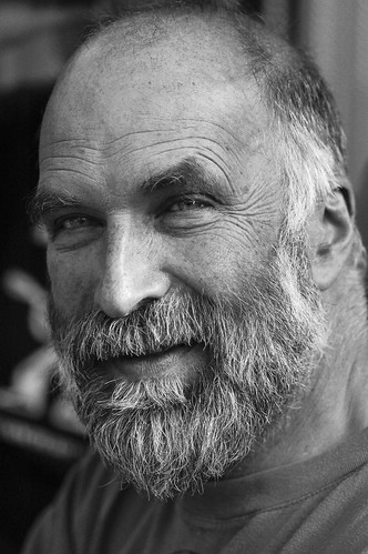
Image is of a Lani Warrior in Papua (Irian Jaya) taken last year in the Baliem Valley.
Nikon D300 and Nikon 50mm F1.8. 1/1600s @ F1.8 200ISO
Can't decide which I prefer - I think it's the B&W though I am getting a little tried of the current revival for B&W led by everyone with a B&W mode on a camera phone that uses it to make bad pictures look like slightly arty, grey photos that lack contrast!
This is a straight RAW conversion (Capture NX) + Unsharp Mask + Crop
As above, plus conversion to B&W (mainly Red channel and a bit of blue), plus H/S/B sepia conversion
This is derived from the first image, using the basic methodology linked to in the Joey L thread, that is a contrast tweak using the B&W conversion and a soft light colour layer + Shadows and highlights and a bit of subtle dodging.
Image is of a Lani Warrior in Papua (Irian Jaya) taken last year in the Baliem Valley.
Nikon D300 and Nikon 50mm F1.8. 1/1600s @ F1.8
200ISOCan't decide which I prefer - I think it's the B&W though I am getting a little tried of the current revival for B&W led by everyone with a B&W mode on a camera phone that uses it to make bad pictures look like slightly arty, grey photos that lack contrast!


Great shots Duncan!
I have to say I like the last one, which to you looks closest to what you saw? He has a great face, I think if he was standing in a doorway or something, shadow behind and his face lit up he'd look amazing. I'd love to head to Irian Jaya, it's high up on my list!
Cheers.
Mat
I have to say I like the last one, which to you looks closest to what you saw? He has a great face, I think if he was standing in a doorway or something, shadow behind and his face lit up he'd look amazing. I'd love to head to Irian Jaya, it's high up on my list!
Cheers.
Mat
Mat and others, what is it that you see in B&W shots? I'm not trying to be belligerent at all, but I really just don't see it. To me, anything in B&W, regardless of the subject matter portrayed, just becomes dark and lifeless. I could understand why people would use B&W when colour wasn't available - better to have a record than no record - but now that this is no longer the case, I am truly puzzled as to why people do it.
I've tried converting shots of my own, and invariably strong shots in colour look better in colour, and weak shots in colour just look even weaker in B&W.
What puzzles me even more is the number of times in the "criticise my shots" sections of the various photo mags - probably 50% of all the shots they get sent - that they suggest a mono conversion. Invariably I think when they do this, they kill the value of the image, so I can't decide if they're just being lazy because a mono conversion is easy to do, or if they really are seeing something which in their mind dramatically improves the shot when it's in mono. If it is the latter, then what on earth am I missing???
FG's bridge shot is a prime example of this. In the original, the natural, stark black and white tones of the bridge really make it stand out as an intruder into the natural green surroundings, and it's a superb image to my eye. Once it's converted, everything is uniformly grey and depressing.
I feel like I'm the little boy in the Emperor's new clothes every time I see a mono shot! What am I missing?
ETA - Is that a bridge, or is it a dam?
I've tried converting shots of my own, and invariably strong shots in colour look better in colour, and weak shots in colour just look even weaker in B&W.
What puzzles me even more is the number of times in the "criticise my shots" sections of the various photo mags - probably 50% of all the shots they get sent - that they suggest a mono conversion. Invariably I think when they do this, they kill the value of the image, so I can't decide if they're just being lazy because a mono conversion is easy to do, or if they really are seeing something which in their mind dramatically improves the shot when it's in mono. If it is the latter, then what on earth am I missing???
FG's bridge shot is a prime example of this. In the original, the natural, stark black and white tones of the bridge really make it stand out as an intruder into the natural green surroundings, and it's a superb image to my eye. Once it's converted, everything is uniformly grey and depressing.
I feel like I'm the little boy in the Emperor's new clothes every time I see a mono shot! What am I missing?
ETA - Is that a bridge, or is it a dam?
Edited by Kermit power on Tuesday 3rd March 07:36
Kermit power said:
Mat and others, what is it that you see in B&W shots? I'm not trying to be belligerent at all, but I really just don't see it. To me, anything in B&W, regardless of the subject matter portrayed, just becomes dark and lifeless. I could understand why people would use B&W when colour wasn't available - better to have a record than no record - but now that this is no longer the case, I am truly puzzled as to why people do it.
I've tried converting shots of my own, and invariably strong shots in colour look better in colour, and weak shots in colour just look even weaker in B&W.
What puzzles me even more is the number of times in the "criticise my shots" sections of the various photo mags - probably 50% of all the shots they get sent - that they suggest a mono conversion. Invariably I think when they do this, they kill the value of the image, so I can't decide if they're just being lazy because a mono conversion is easy to do, or if they really are seeing something which in their mind dramatically improves the shot when it's in mono. If it is the latter, then what on earth am I missing???
FG's bridge shot is a prime example of this. In the original, the natural, stark black and white tones of the bridge really make it stand out as an intruder into the natural green surroundings, and it's a superb image to my eye. Once it's converted, everything is uniformly grey and depressing.
I feel like I'm the little boy in the Emperor's new clothes every time I see a mono shot! What am I missing?
ETA - Is that a bridge, or is it a dam?
Morning Kermit!I've tried converting shots of my own, and invariably strong shots in colour look better in colour, and weak shots in colour just look even weaker in B&W.
What puzzles me even more is the number of times in the "criticise my shots" sections of the various photo mags - probably 50% of all the shots they get sent - that they suggest a mono conversion. Invariably I think when they do this, they kill the value of the image, so I can't decide if they're just being lazy because a mono conversion is easy to do, or if they really are seeing something which in their mind dramatically improves the shot when it's in mono. If it is the latter, then what on earth am I missing???
FG's bridge shot is a prime example of this. In the original, the natural, stark black and white tones of the bridge really make it stand out as an intruder into the natural green surroundings, and it's a superb image to my eye. Once it's converted, everything is uniformly grey and depressing.
I feel like I'm the little boy in the Emperor's new clothes every time I see a mono shot! What am I missing?
ETA - Is that a bridge, or is it a dam?
Edited by Kermit power on Tuesday 3rd March 07:36
All good questions you ask there, I think that it all boils down to personal preference, there is no such thing as right and wrong when an opinion is being expressed! In my experience it can be quite tricky to get a decent black and white conversion, there are a lot of very weak monochrome images in my eyes that I don't really like, they may be technically good but they just don't appeal to me, nothing wrong with that! I love high contrast black and white, I like the grainy look that you get with film and sometimes if necessary I will add grain to an image if the digital is too smooth.
There are no rules, nobody is going to get it right all the time, the best anyone can do is produce something they like and if others like it too, then that's great, if not then you have already pleased who should be your greatest critic so it doesn't really matter.
If you get a spare 2 mins, download the recent B&W files from this site,
http://www.mitchellkphotos.com/catalog.html
See if any of those do anything for you. There is a vast difference between average stuff and mind blowingly great stuff! If you still don't like it then life still goes on, if you love it then you might look for more work the same and that's all good too!
Mat.
Those do indeed look much better! They have a lightness to them which most B&W shots don't seem to have. Having said that, I'm still looking at his colour shots, then looking back at the mono shots and thinking what might have been! 
Oh well, I'm closer to getting it, but I'm still not convinced that you can improve a good colour shot by converting it.
Oh well, I'm closer to getting it, but I'm still not convinced that you can improve a good colour shot by converting it.
Antarctic Mat said:
Great shots Duncan!
I have to say I like the last one, which to you looks closest to what you saw? He has a great face, I think if he was standing in a doorway or something, shadow behind and his face lit up he'd look amazing. I'd love to head to Irian Jaya, it's high up on my list!
Cheers.
Mat
Cheers for the comments! Mat - if you get a chance go. Absolutely amasing experience. If you need any tips give us a shout!I have to say I like the last one, which to you looks closest to what you saw? He has a great face, I think if he was standing in a doorway or something, shadow behind and his face lit up he'd look amazing. I'd love to head to Irian Jaya, it's high up on my list!
Cheers.
Mat
I know what KP says about the B&W conversion - it has to be done right, on the right image for it to work. However I think when it's done right it can be so much more powerful then straight colour. I guess I just learnt using darkrooms and high contrast paper (I'm not that old though honest!) and like the simplicity. That said I do a book of each trip, usually in Black and white and whilst 90% of the shots look better in mono, there's usually a couple of images that just don't work when not in colour. Some of my images from India for example lost a lot in B&W, but that's the nature of a very colourful place!
B&W is at its best, IMO, in portraiture - especially of "interesting" faces. Stripping away the colour seems to enhance the character of the face. As I said on the portrait competition thread, my preference is for "warts and all" portraits and I think that black and white just adds impact (when done well). Just look at Karsh's portraits of Hemingway, Einstein, Churchill, etc - I think they'd have much less impact in colour. Just my opinion, of course. The world would be a boring place if we all agreed...


Kermit power said:
Mat and others, what is it that you see in B&W shots? I'm not trying to be belligerent at all, but I really just don't see it. To me, anything in B&W, regardless of the subject matter portrayed, just becomes dark and lifeless.
Well, first remember that unless you're working for money, the only person you have to please is yourself. Photography is highly personal - there's nothing wrong with disliking a photo someone else loves, it just means you have different tastes.My father was a keen amateur, particularly fond of landscapes, and did much detailed experimenting in the 1940/50s. He loved making B/W prints - which as a teenager I tried as well. But my photos never seemed to work in B/W like his did. The difference was that the starting images were different - I was seeing and composing my shots in colour, not tone. I also probably lacked an eye for composition, which IMHO is more important in B/W.
In some images colour is a vital part of the image; in others it isn't. A good colour image can be wrecked by taking the colour out; similarly, an image that looks mediocre in colour, or where the colour is simply a distraction, finds a new lease of life in B/W.
Secondly, remember that with the wonder of PhotoShop etc there are now many different ways to make a colour image into B/W. Desaturation is fairly guaranteed to give flat, disappointing results. IMO channel mixer and gradient map are where the real zing lies, and no doubt others here will have their own tricks with layer blending and so on.
Maybe B/W is something one grows into with age - like red wine?
Kermit, I think it is as the others have said there are some photographs that 'suit' B&W and some that never will but it is mainly down to you and your perception of what looks good.
I recently posted this photo in the Feb Monthly comp, it is 40 years old and I have only slightly tweaked it in PS after scanning. It would never have worked or kept it's longevity if it had been in colour, to me it is timeless. How many colour photos do you see from various decades where you can nearly pinpoint the year because of the colour profile used at that time.
I find great interest in all photos for their style, composition or interesting subject not whether it's colour or B&W.

I recently posted this photo in the Feb Monthly comp, it is 40 years old and I have only slightly tweaked it in PS after scanning. It would never have worked or kept it's longevity if it had been in colour, to me it is timeless. How many colour photos do you see from various decades where you can nearly pinpoint the year because of the colour profile used at that time.
I find great interest in all photos for their style, composition or interesting subject not whether it's colour or B&W.

It's a dam 
The trick with B&W "conversions" is to take a photo that suits mono in the first place, rather than arbitrarily converting things, imo. You almost have to see in black and white. That dam pic is borderline - as said, the colour version benefits from the sun and the lovely green of the hills, but the b&w brings out the strength of the dam.
The trick with B&W "conversions" is to take a photo that suits mono in the first place, rather than arbitrarily converting things, imo. You almost have to see in black and white. That dam pic is borderline - as said, the colour version benefits from the sun and the lovely green of the hills, but the b&w brings out the strength of the dam.
Major B, those are proper B&W portraits, fantastic! I think what appeals to me is a full tonal range, black blacks and white whites!
Yellabelly, you are right, that shot would only work in b&w, beautiful shot it is too, timeless is the word.
Dogsey, that proves the point, first shot is ok but the conversion makes it a far better shot.
There is a real art to B&W as has been said, seeing your subject in tone rather than color, I always find weather is great, heavy clouds always seem to convert well.
I have a couple from The Falkland Islands I will dig out, they are so much better in monochrome, my shots from the Antarctic though seem to suit the color versions and don't transfer well at all.
Cheers.
Mat.
Yellabelly, you are right, that shot would only work in b&w, beautiful shot it is too, timeless is the word.
Dogsey, that proves the point, first shot is ok but the conversion makes it a far better shot.
There is a real art to B&W as has been said, seeing your subject in tone rather than color, I always find weather is great, heavy clouds always seem to convert well.
I have a couple from The Falkland Islands I will dig out, they are so much better in monochrome, my shots from the Antarctic though seem to suit the color versions and don't transfer well at all.
Cheers.
Mat.


Dogsey: excellent portrait, and an example of exactly what I like - I really can't be doing with "beauty" portraits that try to hide the imperfections. Note how the B&W emphasises the texture of the hair, beard and eyebrows; the lines on the face have more impact - even the catchlights in the eyes show up better.
FG - I've loved that picture since you first posted it. One thing I do notice immediately is that the lone figure gets a bit lost in the colour version, whereas he's much more a focal point in the B&W.
FG - I've loved that picture since you first posted it. One thing I do notice immediately is that the lone figure gets a bit lost in the colour version, whereas he's much more a focal point in the B&W.
Gassing Station | Photography & Video | Top of Page | What's New | My Stuff