
Clio - Modelling shoot
Discussion


Critically speaking, you aren't using the light to full effect, i think aim for the car either hiding in the shadows, or in the light, and the background hidden, but you seem to have caught it mid way.
It might be due to the colour of the car.
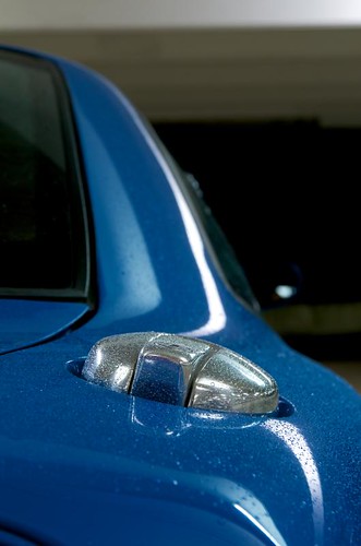
Try finding places where just a few reflections will pick out lines and themes.
Oh, an mr hoodie looks out of place, more like he's waiting for his mum to come back from shopping then dark and sinister!
It might be due to the colour of the car.
Try finding places where just a few reflections will pick out lines and themes.
Oh, an mr hoodie looks out of place, more like he's waiting for his mum to come back from shopping then dark and sinister!

If his face was in the shade too, it'd complete the urban look.

a good example of just picking out some lines, and hiding the rest, the only flaw here is slightly too much light on the front corner, the headlight stands out too much.

Slightly too bright again, but not bad, a little bit of editing to dim it down to a silhouette would be the finishing touch
TheEnd said:
Critically speaking, you aren't using the light to full effect, i think aim for the car either hiding in the shadows, or in the light, and the background hidden, but you seem to have caught it mid way.
It might be due to the colour of the car.
Try finding places where just a few reflections will pick out lines and themes.
Oh, an mr hoodie looks out of place, more like he's waiting for his mum to come back from shopping then dark and sinister!
Some shots I will agree are underexposed but others are mean to be that may. Lost to the night. It might be due to the colour of the car.
Try finding places where just a few reflections will pick out lines and themes.
Oh, an mr hoodie looks out of place, more like he's waiting for his mum to come back from shopping then dark and sinister!
Think that is down to Ross's baby face. Has that look to him.
GetCarter said:
JimNotJon said:
looks too over exposed.
I am obviously on a different planet (or need a serious monitor re-adjustment!). Many are under exposed, but I do like the compositions and ideas. Some good work chap. . I was aiming for just trying to capture very minimal bits of the car rather then getting the whole thing in.
  Inspired by me
To be honest, the location isn't good for the colour of the car. The cars sort of blends with the background. When I shot in a car park I used two flashes to bring out the car and clear out the background. As has been said, it is quite under-exposed.. They seem a little warm too.. Worst of all, some of them aren't even sharp! Sorry to be negative, but I hope you take it the right way and learn from it
This was a combination of two shots as I didn't have enough flashes, but it gives you and idea of how much better the car stands out:

ETA: yes, I know it's not quite sharp

George
Edited by GFWilliams on Monday 19th October 21:44
The three images that stood out to me have already been bagsied by TheEnd but I'll add my 2p anyhow.
If his face was in the shade too, it'd complete the urban look.
a good example of just picking out some lines, and hiding the rest, the only flaw here is slightly too much light on the front corner, the headlight stands out too much.
Slightly too bright again, but not bad, a little bit of editing to dim it down to a silhouette would be the finishing touchAgree on the first although face seems dark enough to me for that style.
Looks like you used flash to the headlight area, not sure I understand why you were trying to make that a feature- maybe for AngelEyes but... ? The other issue for me here is the competing temperatures between flash and fluoro - perhaps that's what George is meaning about the shots being too warm in places. Either blitz the shot with flash at a fast synch speed and pretty-much kill the ambient, or drop the flash. Not literally (like I did...)
On the last one, it'd work better IMO if it was either clinically straight or tilted enough to make it look 100% intentional. The style's reasonable to be fair, but to me this degree of tilt suggests it was an accimident.
FWIW, my shot below used only the location lighting - fluoro - and took just a couple of moments to compose with the light trail where I wanted it.
TheEnd said:
If his face was in the shade too, it'd complete the urban look.
a good example of just picking out some lines, and hiding the rest, the only flaw here is slightly too much light on the front corner, the headlight stands out too much.
Slightly too bright again, but not bad, a little bit of editing to dim it down to a silhouette would be the finishing touch
Looks like you used flash to the headlight area, not sure I understand why you were trying to make that a feature- maybe for AngelEyes but... ? The other issue for me here is the competing temperatures between flash and fluoro - perhaps that's what George is meaning about the shots being too warm in places. Either blitz the shot with flash at a fast synch speed and pretty-much kill the ambient, or drop the flash. Not literally (like I did...)
On the last one, it'd work better IMO if it was either clinically straight or tilted enough to make it look 100% intentional. The style's reasonable to be fair, but to me this degree of tilt suggests it was an accimident.
FWIW, my shot below used only the location lighting - fluoro - and took just a couple of moments to compose with the light trail where I wanted it.
GetCarter said:
JimNotJon said:
looks too over exposed.
I am obviously on a different planet (or need a serious monitor re-adjustment!). Many are under exposed, but I do like the compositions and ideas. Some good work chap.
Gassing Station | Photography & Video | Top of Page | What's New | My Stuff