Reading 4-wheel alignment report
Discussion


Hi,
Had my car in for a 4-wheel alignment check and am now confused by the report printout so hoping someone can tell me what the numbers actually represent.
Here's a snippet of the report for the left rear wheel:
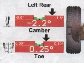
I believe the arrow is telling me I have too much negative camber but I'm not sure what the numbers are telling me. Is my current camber -2.2, or is it -2.2 from the manufacturers standard setting? And what do the two smaller numbers (-0.6 and -1.6)represent? Are these just to give some scale to the bar, so the graphic is showing a section of the camber scale between -0.6 and -1.6 with the manufacturers standard setting being in the middle of this range (i.e. -1.1)?
I know what needs to increase/decrease but I'm getting confused trying to work out how much different things need to change to buy sufficient shims (not a run of the mill car even alignment centres have shims in stock for.
Thanks for your help,
/\/\j17
Had my car in for a 4-wheel alignment check and am now confused by the report printout so hoping someone can tell me what the numbers actually represent.
Here's a snippet of the report for the left rear wheel:
I believe the arrow is telling me I have too much negative camber but I'm not sure what the numbers are telling me. Is my current camber -2.2, or is it -2.2 from the manufacturers standard setting? And what do the two smaller numbers (-0.6 and -1.6)represent? Are these just to give some scale to the bar, so the graphic is showing a section of the camber scale between -0.6 and -1.6 with the manufacturers standard setting being in the middle of this range (i.e. -1.1)?
I know what needs to increase/decrease but I'm getting confused trying to work out how much different things need to change to buy sufficient shims (not a run of the mill car even alignment centres have shims in stock for.
Thanks for your help,
/\/\j17
Ah, so the small, white numbers on the red background are actually the upper and lower limits of the green, centre section - would make sense.
I think one of the things that throws me is having an arrow between the green and the "-1.6" text and an actual of "-2.2", suggesting that "-2.2" is a setting between green and the "-1.6" outer limit of the red.
I think one of the things that throws me is having an arrow between the green and the "-1.6" text and an actual of "-2.2", suggesting that "-2.2" is a setting between green and the "-1.6" outer limit of the red.
//j17 said:
Ah, so the small, white numbers on the red background are actually the upper and lower limits of the green, centre section - would make sense.
I think one of the things that throws me is having an arrow between the green and the "-1.6" text and an actual of "-2.2", suggesting that "-2.2" is a setting between green and the "-1.6" outer limit of the red.
I think one of the things that throws me is having an arrow between the green and the "-1.6" text and an actual of "-2.2", suggesting that "-2.2" is a setting between green and the "-1.6" outer limit of the red.
 its not the clearest design of data presentation
Gassing Station | Suspension, Brakes & Tyres | Top of Page | What's New | My Stuff