**** NOVEMBER COMPETITION **** (Entries here please)
Discussion


Even I planned ahead and said If I did win this past months competition I would be hard pushed to judge it due to other commitments. Not that I would have won though...I still would have judged the competition before now.
Oh and working on a low speed line from Cairo - I appreciate those that follow the image size guidelines - those that dont are muppets..
Oh and working on a low speed line from Cairo - I appreciate those that follow the image size guidelines - those that dont are muppets..


ok
so here are the mentions, the ones that i find interesting and that speak to me:
first up, on page 2 we had some good slices in time.... a visually pleasing B&W beech scene with the bike, some great expressions of kids on a wall and a dynamic snapshot of 2 dogs. In one way or another though these images didnt quite do it.. with colour or composition letting them down.
not my sort of photography but i think its done well for what it is
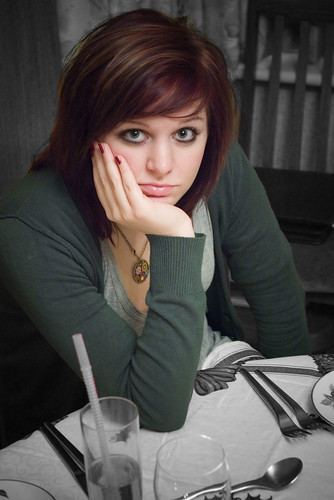
the composition immediately appeals, well focused, and the subject pops out nicely and whilst i generally dislike the whole selective colour thing, the tones used here are really pleasing especially the green which gives the picture a warmth and a soothing feel. That said, the expression and setting is not nearly interesting enough to get it close to the winner.

out of all teh baby/toddler pics this one is my preferred
teh lighting is unusual, as is the expression
i find the picture slightly unnerving and hence interesting... its almost Lynchian
i love the distorted scale you get and what a powerful stare !!
when i look into that baby's eyes I can feel all sorts of powerful stuff about that childs life, about my life and about the life that child may or may not have in the future
intense picture with good lighting and nicely cropped/framed
i also love the simplicity of it, the soft oof bg shapes and the dark space beyond
on an another day if i was in a different mood this could have taken it
this i really like.. its the sort of picture i would take so im immediately at home here
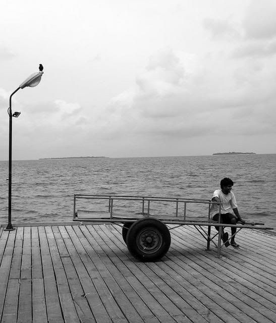
its a bit edgy and theres not enough space around the main elements and the floorboards are a bit superflous/ugly for me and i would have cropped them out a bit more but ignoring all that its a wonderful framing of 2 strong structures, one tall, one long , each with their own attached subject. The bird is pure class. Very well seen ... its a picture that is very much created by the photographer and that i like a lot. Send 20 people down to that same setting at that same time and maybe only 1 of them would have taken that shot. Again, would have been good to see it with a decent border/frame around it.
for my winner i've surprised myself and picked something quite obvious and almost a little twee.

to be fair though, the composition is totally nailed ( i also love square pics), the use of the wood is superb in framing the subject and providing interesting but not distracting texture and outline, the face of the girl is nice and bright and the hat also adds a fun element and is also beautifully incorporated into the crop. As for the subject herself, to my eyes she is is very evocative of youth and childhood, she has a wonderful innocent expression that has just a nice subtle hint of depth to it but not too chocolate box or sickly. Also, her face is slightly old fashioned looking and there is something else about her eyes that I cannot pin down but teh picture just looks old, it looks as if if this is of someone who has now grown up... i think its something to do with the long gaze as if she is focused onto the future. The picture has nostalgia and her eyes radiate the title of Youth extremely well. Well done to everyone.
so here are the mentions, the ones that i find interesting and that speak to me:
first up, on page 2 we had some good slices in time.... a visually pleasing B&W beech scene with the bike, some great expressions of kids on a wall and a dynamic snapshot of 2 dogs. In one way or another though these images didnt quite do it.. with colour or composition letting them down.
not my sort of photography but i think its done well for what it is
the composition immediately appeals, well focused, and the subject pops out nicely and whilst i generally dislike the whole selective colour thing, the tones used here are really pleasing especially the green which gives the picture a warmth and a soothing feel. That said, the expression and setting is not nearly interesting enough to get it close to the winner.
out of all teh baby/toddler pics this one is my preferred
teh lighting is unusual, as is the expression
i find the picture slightly unnerving and hence interesting... its almost Lynchian
i love the distorted scale you get and what a powerful stare !!
when i look into that baby's eyes I can feel all sorts of powerful stuff about that childs life, about my life and about the life that child may or may not have in the future
intense picture with good lighting and nicely cropped/framed
i also love the simplicity of it, the soft oof bg shapes and the dark space beyond
on an another day if i was in a different mood this could have taken it
this i really like.. its the sort of picture i would take so im immediately at home here
its a bit edgy and theres not enough space around the main elements and the floorboards are a bit superflous/ugly for me and i would have cropped them out a bit more but ignoring all that its a wonderful framing of 2 strong structures, one tall, one long , each with their own attached subject. The bird is pure class. Very well seen ... its a picture that is very much created by the photographer and that i like a lot. Send 20 people down to that same setting at that same time and maybe only 1 of them would have taken that shot. Again, would have been good to see it with a decent border/frame around it.
for my winner i've surprised myself and picked something quite obvious and almost a little twee.
to be fair though, the composition is totally nailed ( i also love square pics), the use of the wood is superb in framing the subject and providing interesting but not distracting texture and outline, the face of the girl is nice and bright and the hat also adds a fun element and is also beautifully incorporated into the crop. As for the subject herself, to my eyes she is is very evocative of youth and childhood, she has a wonderful innocent expression that has just a nice subtle hint of depth to it but not too chocolate box or sickly. Also, her face is slightly old fashioned looking and there is something else about her eyes that I cannot pin down but teh picture just looks old, it looks as if if this is of someone who has now grown up... i think its something to do with the long gaze as if she is focused onto the future. The picture has nostalgia and her eyes radiate the title of Youth extremely well. Well done to everyone.
Edited by jackal on Monday 3rd December 21:00
Edited by jackal on Monday 3rd December 21:01

Gassing Station | Photography & Video | Top of Page | What's New | My Stuff