Only the Brave - Honest Photography Feedback
Discussion


The advice I'd personally like is how to get up to the standard where I could even begin to get criticism on here. My photos please me, but are far from the standards on here - I suspect the first step would be to have the camera in my hand far longer and more often.
Still, the technical feedback on other people's photos makes for interesting reading and gives a few insights.
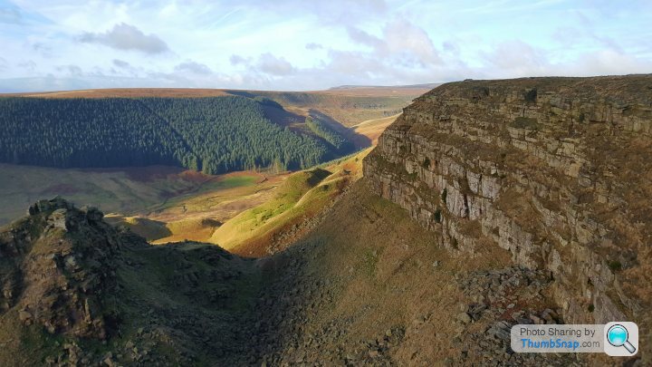
 Reflection by Lock Farm, on Flickr
Still, the technical feedback on other people's photos makes for interesting reading and gives a few insights.
Reflection by Lock Farm, on FlickrDibblyDobbler said:
Tuna said:
Perhaps it's the angle you took it from, but it's not clear what the shape of the things is.. it looks like an amorphous blob that's suddenly going to grow a mouth and start talking to you! 
I always enjoy your food photographs, so don't take that as a harsh criticism - I've got no legs to stand on - just an initial impression.
+1 The lighting is fine but the composition needs a rethink IMHOI always enjoy your food photographs, so don't take that as a harsh criticism - I've got no legs to stand on - just an initial impression.
TheRainMaker said:
Next one from me, do your worst 
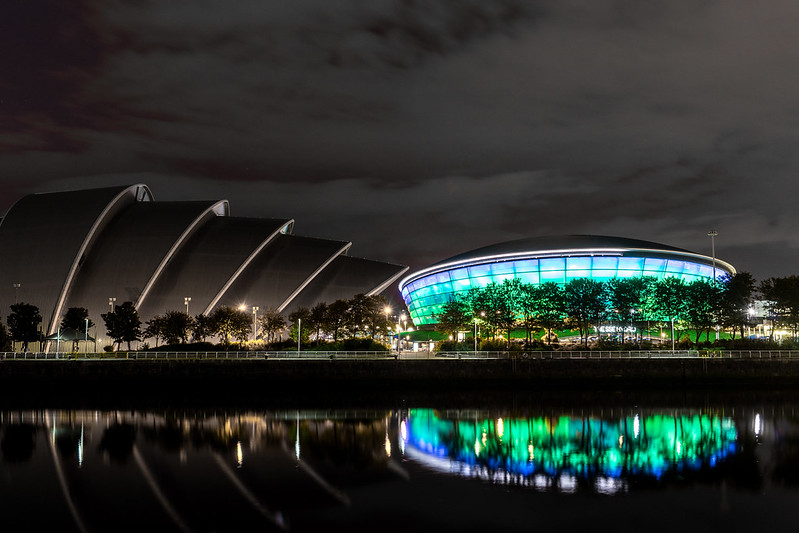 OTB 2 by The Rain Maker, on Flickr
Camera settings, f9, 34mm, 15sec, iso160, sony a7
I know where this is and know what these buildings are, but I can't quite remember how the Hydro actually sits...here it looks like it needs perspective correction but then that might be just how the building looks.OTB 2 by The Rain Maker, on FlickrCamera settings, f9, 34mm, 15sec, iso160, sony a7
I love the contrast of the colours. A shame they didn't also have the other building lit up.
I find the sky jarring... I am not sure how that would be fixed though. Part of me wants longer exposure to further smooth the water further, but shorter to stop the sky being too bright and smudgy. Maybe it would need a composite or perhaps just taking on a better night.
The alignment of the buildings doesn't work for me. It just looks a bit odd. Appreciate it's hard like because to the right you have that massive crane in the way and to the left I am not sure how well it would work with the armadillo building partly obscuring the SSE.
Just street viewing I think you'd have had some interesting angles if you were closer, like on the other side of the river. Plus the armadillo building has much more dramatic angles from over there too. Again shame it wasn't lit up.
 HK-33 by Alex Mason, on Flickr
Have at it.
Posted this because I quite like the way it turned out. Though I can't decide whether the guy intruding on the right makes it or breaks it.
Otispunkmeyer said:
HK-33 by Alex Mason, on FlickrHave at it.
Posted this because I quite like the way it turned out. Though I can't decide whether the guy intruding on the right makes it or breaks it.
singlecoil said:
Otispunkmeyer said:
HK-33 by Alex Mason, on FlickrHave at it.
Posted this because I quite like the way it turned out. Though I can't decide whether the guy intruding on the right makes it or breaks it.
If the taxi was more of a subject would that work?
Edited by Otispunkmeyer on Monday 27th November 20:31
227bhp said:
Every picture so far in this thread is as the eye sees, but yes I know where you are coming from (Long exposure pictures of motorways at night and of the stars etc) For many that is where the skill lies - recording what we see. If I'm out and I see something that is worth picturing I do it, but because I have little idea and no equipment it generally doesn't reproduce what I am seeing as well as I hoped.
I think you've got your long & short exposures the wrong way round btw, short exposure would capture moving leaf and water very realistically, it's long that blurs. Also, there are no moving parts (apart from the water) in the chaps canal scene so it could have looked more realistic and the stonework a little sharper.
It's interesting - I suspect a lot of photos come out of the camera as what the eye sees, however is that still the case after post production?I think you've got your long & short exposures the wrong way round btw, short exposure would capture moving leaf and water very realistically, it's long that blurs. Also, there are no moving parts (apart from the water) in the chaps canal scene so it could have looked more realistic and the stonework a little sharper.
Edited by 227bhp on Thursday 23 November 12:58
I certainly find it interesting to see what comes out of the camera alongside the finished product.
Otispunkmeyer said:
TheRainMaker said:
Next one from me, do your worst
OTB 2 by The Rain Maker, on Flickr
Camera settings, f9, 34mm, 15sec, iso160, sony a7
OTB 2 by The Rain Maker, on FlickrCamera settings, f9, 34mm, 15sec, iso160, sony a7

The relatively light sky was both boring and quite light, which drew the eye away from the main subject and made the image tip to the right. I retoned the sky and reduced exposure in LR to a complementary colour to the other lights. I flipped the image in PS and blurred it to extend the reflection further down, to address the tips of the roof being clipped off in the reflection. Selective burning here and there in the reflected image to maintain the illusion of a reflection. The alignment of the roof trusses and lamppost to the right in the reflection isn't quite right, this was a quick and dirty edit.
Edited by Whoozit on Tuesday 12th December 07:25
The Moose said:
It's interesting - I suspect a lot of photos come out of the camera as what the eye sees, however is that still the case after post production?
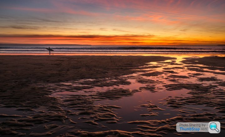
Definitely not every image you see in print or online will have been edited, aside from photojournalism (in theory). Even B&W involves a large number of choices how to process. And add on the complexity of composition, exposure, deliberate exclusion, colour theory, pixel level editing etc...arguably photos are a form of selective illusion. Some images are deliberately edited to be unrealistic. Others? I posted this image above, it's not "what the eye saw" perhaps, but it IS what *I* saw running around that beach and wanted to capture. Is it unrealistic?

Whoozit said:
The Moose said:
It's interesting - I suspect a lot of photos come out of the camera as what the eye sees, however is that still the case after post production?
Definitely not every image you see in print or online will have been edited, aside from photojournalism (in theory). Even B&W involves a large number of choices how to process. And add on the complexity of composition, exposure, deliberate exclusion, colour theory, pixel level editing etc...arguably photos are a form of selective illusion. Some images are deliberately edited to be unrealistic. Others? I posted this image above, it's not "what the eye saw" perhaps, but it IS what *I* saw running around that beach and wanted to capture. Is it unrealistic?
Given the sunsets we regularly see here, I could well believe that was what the sky looked like at the time!
The Moose said:
Is the shelf not level? My OCD coming out!
Having had another look I've had another go and tilted it a bit more, it's just a question of where to put the straighten tool, but I think I'm happier with it now and in any case the reason for this thread is not to help me decide how I feel about my pictures, it's to find out what other people thin about them, so thanks for drawing my attention to it.  Oranges and lemons 3 by Elliott and Nolan, on Flickr
singlecoil said:
Generally excellent shot - great compo, colours, lighting 
Two really minor thoughts...
- I might have cropped off the dark band at the bottom completely (ie below the wood)
- There's a leaf to the right of center which is very dark, almost black which draws my eye a bit
DibblyDobbler said:
Generally excellent shot - great compo, colours, lighting
Two really minor thoughts...
- I might have cropped off the dark band at the bottom completely (ie below the wood)
- There's a leaf to the right of center which is very dark, almost black which draws my eye a bit
Thanks for the feedback, I hadn't noticed that leaf but I can see now that it needs to be fixed before it's printed.Two really minor thoughts...
- I might have cropped off the dark band at the bottom completely (ie below the wood)
- There's a leaf to the right of center which is very dark, almost black which draws my eye a bit
I wanted the piece of wood to look like a shelf (it isn't really, it's just a length of old pine against a grey background, the grey allowed me to 'shop in the background you see using the magic overlay blend mode) so I needed the 'wall' underneath to be visible.
singlecoil said:
Thanks for the feedback, I hadn't noticed that leaf but I can see now that it needs to be fixed before it's printed.
I wanted the piece of wood to look like a shelf (it isn't really, it's just a length of old pine against a grey background, the grey allowed me to 'shop in the background you see using the magic overlay blend mode) so I needed the 'wall' underneath to be visible.
Fair enough - it was a small thing. Only other option would be maybe just to lighten the area beneath the 'shelf' a touch but in all honesty probably just leave it alone I wanted the piece of wood to look like a shelf (it isn't really, it's just a length of old pine against a grey background, the grey allowed me to 'shop in the background you see using the magic overlay blend mode) so I needed the 'wall' underneath to be visible.
singlecoil said:
DibblyDobbler said:
Generally excellent shot - great compo, colours, lighting
Two really minor thoughts...
- I might have cropped off the dark band at the bottom completely (ie below the wood)
- There's a leaf to the right of center which is very dark, almost black which draws my eye a bit
Thanks for the feedback, I hadn't noticed that leaf but I can see now that it needs to be fixed before it's printed.Two really minor thoughts...
- I might have cropped off the dark band at the bottom completely (ie below the wood)
- There's a leaf to the right of center which is very dark, almost black which draws my eye a bit
I wanted the piece of wood to look like a shelf (it isn't really, it's just a length of old pine against a grey background, the grey allowed me to 'shop in the background you see using the magic overlay blend mode) so I needed the 'wall' underneath to be visible.
On the same note of the dark leaf, now it’s been pointed out, I can’t not see it and it’s brother (back left)!!
Gassing Station | Photography & Video | Top of Page | What's New | My Stuff