Medieval Warm period due to NAO
Discussion


hairykrishna said:
Can you give real references for the data used in the sunspot cycle vs temperature graph? The graph itself comes from here a ‘skeptic', politics heavy, blog:
http://www.kowabunga.org/2007/03/global_warming_lo...
The text there says that the original figure comes from;
http://www.friendsofscience.org/
Another ‘skeptic’ blog. I can’t seem to find the figure on there though.
The basic kind of solar data (sunspot number, cycle length) is widely available. As raw data you can get it from NASA and solar observatories, historically it's all over the internet sometimes with info like here:http://www.kowabunga.org/2007/03/global_warming_lo...
The text there says that the original figure comes from;
http://www.friendsofscience.org/
Another ‘skeptic’ blog. I can’t seem to find the figure on there though.
http://spaceweather.com/glossary/sunspotnumber.htm...
Also here:
http://spaceweather.com/
And here:
http://spaceweather.com/java/archive.html
Not to mention here:
http://www.ngdc.noaa.gov/stp/SOLAR/SSN/ssn.html
Or even here:
http://web.dmi.dk/fsweb/solarterrestrial/sunclimat...
Finally here (more if you look):
http://wattsupwiththat.files.wordpress.com/2008/01...
High for looting
 data can be obtained from NOAA:
http://www.n3kl.org/sun/noaa.html
Similar data to the charts on here can be found plotted in Lassen's web version of a paper very similar to the other papers he published with and without Eigil Friis-Christensen:
http://www.tmgnow.com/repository/solar/lassen1.htm...
hairykrishna said:
Can you give real references for the data used in the sunspot cycle vs temperature graph? The graph itself comes from here a ‘skeptic', politics heavy, blog:
http://www.kowabunga.org/2007/03/global_warming_lo...
The text there says that the original figure comes from;
http://www.friendsofscience.org/
Another ‘skeptic’ blog. I can’t seem to find the figure on there though.
I recognise it - it appears to be a modified version of a (faulty) graph from a paper (Lassen & Friis-Christenson 1995) discussed here: http://www.kowabunga.org/2007/03/global_warming_lo...
The text there says that the original figure comes from;
http://www.friendsofscience.org/
Another ‘skeptic’ blog. I can’t seem to find the figure on there though.
Edited by hairykrishna on Wednesday 8th April 17:17
Edited by hairykrishna on Wednesday 8th April 17:27
http://www.realclimate.org/damon&laut_2004.pdf
See fig 1a (note the red/blue is reversed)
kerplunk said:
hairykrishna said:
Can you give real references for the data used in the sunspot cycle vs temperature graph? The graph itself comes from here a ‘skeptic', politics heavy, blog:
http://www.kowabunga.org/2007/03/global_warming_lo...
The text there says that the original figure comes from;
http://www.friendsofscience.org/
Another ‘skeptic’ blog. I can’t seem to find the figure on there though.
I recognise it - it appears to be a modified version of a (faulty) graph from a paper (Lassen & Friis-Christenson 1995) discussed here: http://www.kowabunga.org/2007/03/global_warming_lo...
The text there says that the original figure comes from;
http://www.friendsofscience.org/
Another ‘skeptic’ blog. I can’t seem to find the figure on there though.
Edited by hairykrishna on Wednesday 8th April 17:17
Edited by hairykrishna on Wednesday 8th April 17:27
http://www.realclimate.org/damon&laut_2004.pdf
See fig 1a (note the red/blue is reversed)
turbobloke said:
Similar data to the charts on here can be found plotted in Lassen's web version of a paper very similar to the other papers he published with and without Eigil Friis-Christensen:
http://www.tmgnow.com/repository/solar/lassen1.htm...
Thank you for that. I was aware of the raw data links - remember the argument we had about smoothing on a similar graph on the 'in your face' thread?http://www.tmgnow.com/repository/solar/lassen1.htm...
hairykrishna said:
turbobloke said:
Similar data to the charts on here can be found plotted in Lassen's web version of a paper very similar to the other papers he published with and without Eigil Friis-Christensen:
http://www.tmgnow.com/repository/solar/lassen1.htm...
Thank you for that. I was aware of the raw data links - remember the argument we had about smoothing on a similar graph on the 'in your face' thread?http://www.tmgnow.com/repository/solar/lassen1.htm...
turbobloke said:
Transfer functions and various digital tools allow continuous variables to be obtained from discrete variables - and there are smoothing filters commonly used in plots such as those here - means exist to allow matching of data on different timescales (the solar cycle length and the temperature anomaly) and of diffrent types, you could ask Friis-Christensen or Lassen. Plots with reciprocal cycle length (T) untouched are possible, either as 1/T or simply with the cycle length scale increasing downwards on the y-axis. The issue of how many points there are isn't one that can falsify the relationship shown.
The idea of using a log plot is curious, I can't see how it would help make things look any better, in appearance or reality. Ten seconds in Excel shows what the general type of curve that carbon dioxide exhibits over time would look as a log plot (log10 shown here). The curve mimicking the shape of the carbon dioxide trend is in blue, the corresponding log plot is in red. Whatever, it doesn't make things any better.
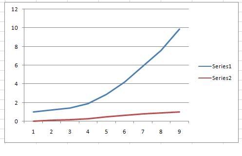
The only reason for using a log here, as far as I can see (I'm not a climate scientist), is if both variables are given in logs, to enable the comparison and analysis as rates of change.The idea of using a log plot is curious, I can't see how it would help make things look any better, in appearance or reality. Ten seconds in Excel shows what the general type of curve that carbon dioxide exhibits over time would look as a log plot (log10 shown here). The curve mimicking the shape of the carbon dioxide trend is in blue, the corresponding log plot is in red. Whatever, it doesn't make things any better.
ZondaMan said:
The only reason for using a log here, as far as I can see (I'm not a climate scientist), is if both variables are given in logs, to enable the comparison and analysis as rates of change.
OK, but neither were - so converting one seemed curiously arbitrary. Possibly just an appeal to the umpire, destined to be turned down.turbobloke said:
ZondaMan said:
The only reason for using a log here, as far as I can see (I'm not a climate scientist), is if both variables are given in logs, to enable the comparison and analysis as rates of change.
OK, but neither were - so converting one seemed curiously arbitrary. Possibly just an appeal to the umpire, destined to be turned down.Keep up the good work, TB.
Edited by ZondaMan on Wednesday 8th April 19:10
hairykrishna said:
turbobloke said:
Yes, and I also remember having to explain the physical reason for it then...no problem.
I don't seem to remember that. I do remember you refusing to say what temperature data your chart used.turbobloke said:
hairykrishna said:
turbobloke said:
Then there was hairyk's attack on my post of a plot of geomagnetic aa index against temperature anomaly, a plot which clearly showed solar eruptivity as a significant climate forcing (after it had been dismissed as such) including mock rage that some A-level website plottery didn't give anything like the chart I posted - with the same attacker being joined by at least one other True Believer in complaining about smoothed plots like that somehow being a 'fix'. If hairykrishna knew anything about solar physics and the impact of solar phenomena he would know that plasma ejected from the Sun in the solar wind typically travels at speeds between 350 and 750 km/s. This causes fast moving plasma to catch up with slower moving, this produces compression and rarefaction zones which show up as the spikes on unsmoothed plots - spieks which aren't particularly meaningful. To get a representative measure of solar wind intensity you can average by 3 point smoothing in order to compensate for the distorted view which the spikes would give.
I take it you know where the temperature data for that plot came from now then?Mine I know of, Adler and Elias (2000)as it was me who extracted it whereas the equivalent posted by a fellow True Believer was from a secondary source by Landscheidt - you could have a long wait if you go asking him, though if you have esp you might find it was the same as mine (or not)...
"I do remember you refusing to say..." is now seen to be a falsehood, no worries no apology needed for either of your two memory losses.
turbobloke said:
So, as you can see in the bold sections, the explanation was needed and given, and (now) you still claim I gave no source - not that it matters since ludo told us the argument (discussion} matters more than the source.
"I do remember you refusing to say..." is now seen to be a falsehood, no worries no apology needed for either of your two memory losses.
My mistake, sorry. I thought you hadn't provided it. I still can't find the paper but with the authors name I find a paper that reproduces the figure."I do remember you refusing to say..." is now seen to be a falsehood, no worries no apology needed for either of your two memory losses.
The source is obviously important when referring to the data. If the data or the manner in which it is presented is dubious any argument based on it is also dubious.
As for the explanation- I can't be bothered to return to the smoothing argument now, it wasn't productive then and it won't be now.
turbobloke said:
Contact Joseph D’Aleo, CCM, AMS Fellow.
Do you not have a source that doesn’t involve me tracking down and contacting the bloke directly? That figure came from somewhere.turbobloke said:
The idea of using a log plot is curious, I can't see how it would help make things look any better, in appearance or reality. Ten seconds in Excel shows what the general type of curve that carbon dioxide exhibits over time would look as a log plot (log10 shown here). The curve mimicking the shape of the carbon dioxide trend is in blue, the corresponding log plot is in red. Whatever, it doesn't make things any better.
AGW 101Climate sensitivity is the amount of global warming following a doubling of carbon dioxide concentrations. Estimates indicate that it is likely to be in the range of 2 to 4.5 °C, with a best estimate of about 3 °C. So go from about 280 ppm to 560 ppm for a warming in the range 2 to 4.5 °C. Double it again to 1120 to get the same temp. increase.
Like, er come on guys, you knew that didn't you?
nigelfr said:
following a doubling of carbon dioxide concentrations.
Given that carbon dioxide is bugger all of total greenhouse gas, it follows that doubling it is still bugger all.Given that most of it occurs naturally, mankind produces bugger all of bugger all.
Please explain how this leads to catastrophic armageddon in simple terms, for a simple lad.....
mybrainhurts said:
nigelfr said:
following a doubling of carbon dioxide concentrations.
Given that carbon dioxide is bugger all of total greenhouse gas, it follows that doubling it is still bugger all.Given that most of it occurs naturally, mankind produces bugger all of bugger all.
Please explain how this leads to catastrophic armageddon in simple terms, for a simple lad.....
nigelfr said:
Alcohol is bugger all of beer, but double the amount of alcohol in your pint and you'll see a difference.
Oh come on, you can do better than that.CO2 is measured in PPM - Parts Per Million. So 300 ppm doubled = 700 ppm or 0.0007
Booze is % - parts per hundred. So 3% doubled = 6 parts per hundred, or 0.06.
Can you see the difference there? In terms of factors?
(This is the bit where I hope I am right!)
nigelfr said:
mybrainhurts said:
nigelfr said:
following a doubling of carbon dioxide concentrations.
Given that carbon dioxide is bugger all of total greenhouse gas, it follows that doubling it is still bugger all.Given that most of it occurs naturally, mankind produces bugger all of bugger all.
Please explain how this leads to catastrophic armageddon in simple terms, for a simple lad.....
nigelfr said:
mybrainhurts said:
nigelfr said:
following a doubling of carbon dioxide concentrations.
Given that carbon dioxide is bugger all of total greenhouse gas, it follows that doubling it is still bugger all.Given that most of it occurs naturally, mankind produces bugger all of bugger all.
Please explain how this leads to catastrophic armageddon in simple terms, for a simple lad.....
Gassing Station | News, Politics & Economics | Top of Page | What's New | My Stuff