Preparing hard workers for a future of tax paying...
Discussion


NoelWatson said:
fbrs said:
cymtriks said:
...longevity, divorce, staying single, marrying later. All up....
agreedpeople per house
1991 2.51
2001 2.36
2006 2.32
2016 2.23
2026 2.16
2036 2.13
2.51 to 2.32 in real terms means you need roughly 2 million more houses just for 1991's population (57.4m)
http://www.statistics.gov.uk/census2001/profiles/c...
http://www.communities.gov.uk/documents/statistics...

Edited by fbrs on Tuesday 10th August 15:00
fbrs said:
NoelWatson said:
fbrs said:
cymtriks said:
...longevity, divorce, staying single, marrying later. All up....
agreedpeople per house
1991 2.51
2001 2.36
2006 2.32
2016 2.23
2026 2.16
2036 2.13
2.51 to 2.32 in real terms means you need roughly 2 million more houses just for 1991's population (57.4m)
http://www.statistics.gov.uk/census2001/profiles/c...
http://www.communities.gov.uk/documents/statistics...
Edited by fbrs on Tuesday 10th August 14:58
monthefish said:
Willie Dee said:
Your delusional if you think wealth comes from merit or hard work in this, or many other countries.
Willie Dee said:
I worked hard and was successful


NoelWatson said:
cymtriks said:
NoelWatson said:
....I genuinely can't see any factor that makes housing more than twice as expensive relative to earnings as 15 years ago.
Immigration, longevity, divorce, staying single, marrying later. All up.Planning restrictions, conservation, concerns over flood plains. All up.
Massive increase has certainly happened in all these areas over the last fifty years or so and the rise continues. Immigration used to be insignificant. Longevity was such that many never claimed their pension. Divorce was once for the desperate and the effect of this increase still has to work through another generation to reach its peak. Staying single is certainly on the rise as many decide that marriage or even relationships are just not for them or their social circles fill up with those already on the single path thus denying them the chance. Marrying later is also on the rise, it used to be considered normal to mary in your teens, now its considered normal to leave it until your thirties.
I really am surprised that you are questioning these factors.
NoelWatson said:
cymtriks said:
Add to this the recent history of low interest rates. Over the last ten years the base rate has averaged only 3.3 percent making this a very low rate decade. House prices have compensated for low rates by increasing. The more people get used to low rates the more likely rates are to stay low and the more likely big income multiples are to continue.
While this may seem plausible, the suggestion that low interest rates mean that house prices are more affordable over the term of the mortgage does not hold up to any scrutiny, unlessa). The link between earnings, inflation and interest rates has changed
b). It is different this time, and there will be no spikes in interest rates ever again
From where are you getting your 3.3% average? I see 4.3%
Interest rates will go up and down but the longer they are low the more people will come to see low rates as normal.
My figure of 3.3 is a quick spread sheet compiled from the BoE base rate history.
NoelWatson said:
cymtriks said:
Can you see any of the factors I've listed going into reverse in the foreseable future?
I have another factor. That 46% of people do not have any money left at the end of the month because they have overstretched themselves to buy overvalued housing. I think that will be the overriding factorNoelWatson said:
cymtriks said:
so the outlook is therefore very expensive homes
http://www.telegraph.co.uk/finance/personalfinance/7934593/Mini-property-boom-is-over-amid-concerns-about-double-dip-recession.htmlNoelWatson said:
turbobloke said:
NoelWatson said:
cymtriks said:
Immigration, longevity, divorce, staying single, marrying later. All up.
Planning restrictions, conservation, concerns over flood plains. All up.
Are you picking these at random or have you genuine evidence that suggests there has been massive increases over the past 15 years and this has had a knock on effect on prices. Furthermore, I assume you are suggesting that at least one of these factors was in reverse when house prices fell in the 90sPlanning restrictions, conservation, concerns over flood plains. All up.
http://www.google.com/publicdata?ds=wb-wdi&met...
nor life expeectancy
http://www.google.com/publicdata?ds=wb-wdi&met...
Divorce
http://www.statistics.gov.uk/images/charts/170.gif
Agreed on unemployment.
Your graphs prove me right.
cymtriks said:
NoelWatson said:
cymtriks said:
NoelWatson said:
....I genuinely can't see any factor that makes housing more than twice as expensive relative to earnings as 15 years ago.
Immigration, longevity, divorce, staying single, marrying later. All up.Planning restrictions, conservation, concerns over flood plains. All up.
Massive increase has certainly happened in all these areas over the last fifty years or so and the rise continues. Immigration used to be insignificant. Longevity was such that many never claimed their pension. Divorce was once for the desperate and the effect of this increase still has to work through another generation to reach its peak. Staying single is certainly on the rise as many decide that marriage or even relationships are just not for them or their social circles fill up with those already on the single path thus denying them the chance. Marrying later is also on the rise, it used to be considered normal to mary in your teens, now its considered normal to leave it until your thirties.
I really am surprised that you are questioning these factors.
NoelWatson said:
cymtriks said:
Add to this the recent history of low interest rates. Over the last ten years the base rate has averaged only 3.3 percent making this a very low rate decade. House prices have compensated for low rates by increasing. The more people get used to low rates the more likely rates are to stay low and the more likely big income multiples are to continue.
While this may seem plausible, the suggestion that low interest rates mean that house prices are more affordable over the term of the mortgage does not hold up to any scrutiny, unlessa). The link between earnings, inflation and interest rates has changed
b). It is different this time, and there will be no spikes in interest rates ever again
From where are you getting your 3.3% average? I see 4.3%
Interest rates will go up and down but the longer they are low the more people will come to see low rates as normal.
My figure of 3.3 is a quick spread sheet compiled from the BoE base rate history.
NoelWatson said:
cymtriks said:
Can you see any of the factors I've listed going into reverse in the foreseable future?
I have another factor. That 46% of people do not have any money left at the end of the month because they have overstretched themselves to buy overvalued housing. I think that will be the overriding factorNoelWatson said:
cymtriks said:
so the outlook is therefore very expensive homes
http://www.telegraph.co.uk/finance/personalfinance/7934593/Mini-property-boom-is-over-amid-concerns-about-double-dip-recession.htmlcymtriks said:
This is a short term crisis
Before we continue, can you run me through this pleaseNoelWatson said:
Then why did the price/earnings ration remain pretty constant (and in fact achieved a post WW2 low in 1995) before the unprecedented boom we have had?
It only remains 'pretty constant' if a person drawing a chart chooses to put a horizontal line through the data at their favourite value. Reasoning by assertion in effect.The data of that type posted on here supports a view of peaks and troughs around an upslope just as well, meaning 'not pretty constant', all depending on the preconceived notions of the chartmaker.
Also the words 'average' were omitted there in the price/earnings mention. The Office for National Statistics' Annual Survey of Hours and Earnings (ASHE) is the credible source of data for earnings in comparisons such as this. ASHE data puts average (median) gross annual earnings across all employee jobs at £20,801 which happens to be for 2008 as I have those figures to hand, but the average (mean) which could equally be taken instead of the median is £26,020 so half the working population in the sample earns less than £21k but a value of £26k is often quoted. If that sample is narrowed to full-time employees the average (mean) rises to £31,323...yet the biggest problem surely has to be the sample itself, as these ONS averages of whatever type are derived from a sample of 1% of the working population who pay tax by PAYE, so self-employed individuals are excluded. These people are acknowledged to include many wealthy people with larger incomes but no salary. If an undefined 'average' in a variable relating to a sample of 1% of the population that excludes self-employed individuals is seen as the holy grail and horizontal lines on charts can be drawn in at will this is alchemy and so suitable for drawing the type of sweeping generalisations seen on here but in effect it means little. Changing the 'average' from median to mean to full-time only generates a variation (difference) in 4x salary of £42k, how does that compare to the change in the 'average' house price during the life of these threads?
Handwaving is good, but for hailing a taxi.
Handwaving is good, but for hailing a taxi.
turbobloke said:
NoelWatson said:
Then why did the price/earnings ration remain pretty constant (and in fact achieved a post WW2 low in 1995) before the unprecedented boom we have had?
It only remains 'pretty constant' if a person drawing a chart chooses to put a horizontal line through the data at their favourite value. Reasoning by assertion in effect.The data of that type posted on here supports a view of peaks and troughs around an upslope just as well, meaning 'not pretty constant', all depending on the preconceived notions of the chartmaker.
NoelWatson said:
turbobloke said:
NoelWatson said:
Then why did the price/earnings ration remain pretty constant (and in fact achieved a post WW2 low in 1995) before the unprecedented boom we have had?
It only remains 'pretty constant' if a person drawing a chart chooses to put a horizontal line through the data at their favourite value. Reasoning by assertion in effect.The data of that type posted on here supports a view of peaks and troughs around an upslope just as well, meaning 'not pretty constant', all depending on the preconceived notions of the chartmaker.

ETA as this is the tax forever thread clone of the house price thread that last comment 'this one' shows how accurate cloning is!
Edited by turbobloke on Wednesday 11th August 09:58
turbobloke said:
NoelWatson said:
turbobloke said:
NoelWatson said:
Then why did the price/earnings ration remain pretty constant (and in fact achieved a post WW2 low in 1995) before the unprecedented boom we have had?
It only remains 'pretty constant' if a person drawing a chart chooses to put a horizontal line through the data at their favourite value. Reasoning by assertion in effect.The data of that type posted on here supports a view of peaks and troughs around an upslope just as well, meaning 'not pretty constant', all depending on the preconceived notions of the chartmaker.
NoelWatson said:
turbobloke said:
Given my good nature I just tried the PH search facility but there are poeople with greasy overalls playing about with it. Must be the House Price thread then.
That is an impossible task!NoelWatson said:
turbobloke said:
NoelWatson said:
turbobloke said:
How is 'the mean' a fixed absolute datum point? Doesn't a view on this quantity depend on the timescale used and the way data is presented?
I have fixed it for you, because I think I will have to acknowledge that it is different this time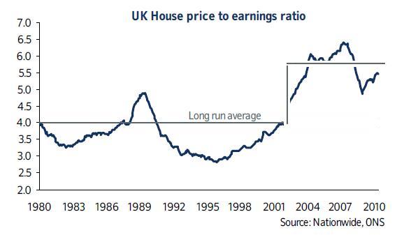
There are many assumptions being made regarding possibly arbitrary quantities having non-arbitrary meaning.
What about the equally preconceived notion that there is an average long-term % rise? See etch-a-sketch below.

These two approaches are no different in the way they make data fit assumptions. There's nothing absolute about any of it.
Not forgetting that the group contributing to average wage calculations is not the same as the subgroup who are earning enough to enter the housing market, so the original chart is flawed at that level or at least drawing too much meaning from it is flawed.
1. Why in 1995 did we have the lowest price/earnings ratio since WW2. If we agree that Brown was wrong and that we still have a boom and bust, how is it that we reached the current cycle low when we are still above the 80s high of around 5 times, and twice the 90s low, you would expect a bigger boom to lead to a bigger bust
2. Maybe I'm oversimplifying, but if we have around 20 million houses, and 70 million people, I can't see how the average person buying the average house can move around that much. Sure, the average person today may be buying a home at the lower end compared to an equivalent person a decade ago, but at some point the person that bought a decade ago need to sell. Who is going to buy it
3. Similar to 2). - people earn a certain amount in their lifetimes - I don't think tax is reducing, so how can it be that we are able to afford to pay off twice the debt that we could a decade ago. The answer is that we can't
4. Finally, what happened to the shortage of land/property in the 90s? From what I can see the population didn't suffer any dips, yet property halved (compared to earnings). Most strange!
In terms of horizontal lines and sloping lines, we may be discussing this at an angle but I didn't tilt the game for sure.
You posted that the earnings/price ratio was 'pretty constant', on this thread at 0722 today I questioned this and the sloping line is part of the basis for that.
If you're now saying that the horizontal line isn't anything to do with a 'pretty constant ratio' but reflects an arbitrary position of affordability, that's a different matter.
Clearly if the chartmaker thinks that x4 is some magic number preferable to an equally arbitrary 3.7 or 4.2, thy will draw the line in horizontally at whatever their chosen value is. This is not an analysis of the data it is just somebody's opinion.
My point was about best-fitting the data even if only by eye, nothing to do with whatever an arbitrary affordability criterion might be.
turbobloke said:
NoelWatson said:
turbobloke said:
Given my good nature I just tried the PH search facility but there are poeople with greasy overalls playing about with it. Must be the House Price thread then.
That is an impossible task!NoelWatson said:
turbobloke said:
NoelWatson said:
turbobloke said:
How is 'the mean' a fixed absolute datum point? Doesn't a view on this quantity depend on the timescale used and the way data is presented?
I have fixed it for you, because I think I will have to acknowledge that it is different this timeThere are many assumptions being made regarding possibly arbitrary quantities having non-arbitrary meaning.
What about the equally preconceived notion that there is an average long-term % rise? See etch-a-sketch below.
These two approaches are no different in the way they make data fit assumptions. There's nothing absolute about any of it.
Not forgetting that the group contributing to average wage calculations is not the same as the subgroup who are earning enough to enter the housing market, so the original chart is flawed at that level or at least drawing too much meaning from it is flawed.
1. Why in 1995 did we have the lowest price/earnings ratio since WW2. If we agree that Brown was wrong and that we still have a boom and bust, how is it that we reached the current cycle low when we are still above the 80s high of around 5 times, and twice the 90s low, you would expect a bigger boom to lead to a bigger bust
2. Maybe I'm oversimplifying, but if we have around 20 million houses, and 70 million people, I can't see how the average person buying the average house can move around that much. Sure, the average person today may be buying a home at the lower end compared to an equivalent person a decade ago, but at some point the person that bought a decade ago need to sell. Who is going to buy it
3. Similar to 2). - people earn a certain amount in their lifetimes - I don't think tax is reducing, so how can it be that we are able to afford to pay off twice the debt that we could a decade ago. The answer is that we can't
4. Finally, what happened to the shortage of land/property in the 90s? From what I can see the population didn't suffer any dips, yet property halved (compared to earnings). Most strange!
In terms of horizontal lines and sloping lines, we may be discussing this at an angle but I didn't tilt the game for sure.
You posted that the earnings/price ratio was 'pretty constant', on this thread at 0722 today I questioned this and the sloping line is part of the basis for that.
If you're now saying that the horizontal line isn't anything to do with a 'pretty constant ratio' but reflects an arbitrary position of affordability, that's a different matter.
Clearly if the chartmaker thinks that x4 is some magic number preferable to an equally arbitrary 3.7 or 4.2, thy will draw the line in horizontally at whatever their chosen value is. This is not an analysis of the data it is just somebody's opinion.
My point was about best-fitting the data even if only by eye, nothing to do with whatever an arbitrary affordability criterion might be.
Not sure what you mean by "so taking your sloping line, why is it that we haven't we dropped below it".
A best-fit line with data like that has points above and below the line. This one does, so what does your question refer to?
I'm not ascribing any mystical significance to the line drawn, which was as rough and ready as you like, but it fits the data shown in the chart better than the horizontal offering which looks to be nothing more meaningful than somebody's opinion of what affordability means - but at least that would explain why it's such an appalling fit to the data i.e. it was never meant to be. In which case any talk of 'pretty constant ratio' based on that chart is wide of the mark.
turbobloke said:
Not sure what you mean by "so taking your sloping line, why is it that we haven't we dropped below it".
A best-fit line with data like that has points above and below the line. This one does, so what does your question refer to?
I'm saying that if we are now at the bottom of the cycle, your gradient needs to be a lot steeper as we should've spent some time under the trend. I dug up some data today - will post tomorrow.A best-fit line with data like that has points above and below the line. This one does, so what does your question refer to?
NoelWatson said:
turbobloke said:
Not sure what you mean by "so taking your sloping line, why is it that we haven't we dropped below it".
A best-fit line with data like that has points above and below the line. This one does, so what does your question refer to?
I'm saying that if we are now at the bottom of the cycle, your gradient needs to be a lot steeper as we should've spent some time under the trend. I dug up some data today - will post tomorrow.A best-fit line with data like that has points above and below the line. This one does, so what does your question refer to?
Even with the rough and ready eye method, a best-fit line is drawn mindful of the data plotted, not some individual opinion/interpretation or past/future considerations.
You seem fixated with interpretation based on individual opinion (yours or similar). I explain very clearly in each post what it is I'm saying yet you manage to go beyond or around it and sometimes invent new points to argue against that I've never said.
So, to try again: I fail to see what meaning there is attached to "we should've spent some time under the trend". Who is we? The data points represent some sort of average, of house price and of earnings over time. There are several points on the curve under the line I hastily sketched and several above. Many points both ways, as it happens, which is what anybody who has drawn a few thousand best-fit lines by hand - or some automated method or other - would expect. On that basis your question has no meaning to me.
Gassing Station | News, Politics & Economics | Top of Page | What's New | My Stuff