Coronavirus - Data Analysis Thread
Discussion


It's been a while since I looked at the ONS weekly data for COVID-19 deaths by age.
1. This shows all COVID deaths since the start of the pandemic and I think really brings home how much lower they are this winter than last:

2. This version shows deaths in each age band per 100k population

The graphs are on datawrapper. If you click on the images you will see an interactive version where you can hover over to see data or highlight individual age bands.
Although they look similar at first glance, the second graph starts shows how much more likely it is for elderly people to die from this disease.
The <40's are around half of the population, but they account for just 0.8% of deaths.
There is also strong data to support vaccine efficacy here.
On the 18th Dec 2020 death rates in the 90+ group were running at 142 per 100k
On the 17th Dec 2021 this was 13 per 100k
1. This shows all COVID deaths since the start of the pandemic and I think really brings home how much lower they are this winter than last:
2. This version shows deaths in each age band per 100k population
The graphs are on datawrapper. If you click on the images you will see an interactive version where you can hover over to see data or highlight individual age bands.
Although they look similar at first glance, the second graph starts shows how much more likely it is for elderly people to die from this disease.
The <40's are around half of the population, but they account for just 0.8% of deaths.
There is also strong data to support vaccine efficacy here.
On the 18th Dec 2020 death rates in the 90+ group were running at 142 per 100k
On the 17th Dec 2021 this was 13 per 100k
Edited by Elysium on Tuesday 4th January 11:45
Sharing some stuff I posted elsewhere earlier:
This is ONS 'all cause' deaths per 100k population

On the 18th Dec 2020 all cause death rates in the 90+ group were running at 526 per 100k
On the 17th Dec 2021 this was 497 per 100k
This suggests that some of the people who are not dying of COVID now are dying of other things instead.
This is ONS 'all cause' deaths per 100k population
On the 18th Dec 2020 all cause death rates in the 90+ group were running at 526 per 100k
On the 17th Dec 2021 this was 497 per 100k
This suggests that some of the people who are not dying of COVID now are dying of other things instead.
I think this graph helps to put COVID in context:

It's interesting to me that excess deaths are higher than COVID deaths in waves 1 and 3, but much lower in wave 2:
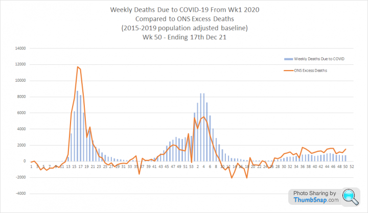
When you look at the excess that is statistically significant (i.e. beyond 2 standard deviations) you get this. It's interesting that waves 1 and 3 COVID deaths fit this curve very well, but wave 2 does not. Mainly because wave 2 excess happened when we expect to see winter excess.

Either way, I think we see three diminishing waves.
It's interesting to me that excess deaths are higher than COVID deaths in waves 1 and 3, but much lower in wave 2:
When you look at the excess that is statistically significant (i.e. beyond 2 standard deviations) you get this. It's interesting that waves 1 and 3 COVID deaths fit this curve very well, but wave 2 does not. Mainly because wave 2 excess happened when we expect to see winter excess.
Either way, I think we see three diminishing waves.
In the first months of the pandemic I produced some charts on deaths per age band based on ONS data for England and Wales. I decided it was worth updating these as we now have almost 2 years worth of data.
1. 'All cause' deaths between Wk 1 2020 and wk 51 2021 are 1,191,524. This includes 158,623 COVID deaths.
This chart shows the proportion of deaths in each age group and the proportion of the population that group comprises. 49.8% of the population are under 40, but that group accounts for only 0.8% of COVID deaths. 1,315 in total

2. This graph shows all cause and COVID deaths in context for each age group. The blue line is the COVID population fatality rate

3. This graph looks at COVID and non COVID deaths per 100k population in each age band and presents them on different y-axes so the curves can be compared. It shows that the distribution of COVID and non COVID deaths is almost identical.

1. 'All cause' deaths between Wk 1 2020 and wk 51 2021 are 1,191,524. This includes 158,623 COVID deaths.
This chart shows the proportion of deaths in each age group and the proportion of the population that group comprises. 49.8% of the population are under 40, but that group accounts for only 0.8% of COVID deaths. 1,315 in total
2. This graph shows all cause and COVID deaths in context for each age group. The blue line is the COVID population fatality rate
3. This graph looks at COVID and non COVID deaths per 100k population in each age band and presents them on different y-axes so the curves can be compared. It shows that the distribution of COVID and non COVID deaths is almost identical.
Edited by Elysium on Thursday 6th January 13:22
gareth_r said:
millen said:
Scurrilous thought, but given the 'success' of omicron in displacing everything that came before, is there merit in bio-engineering a new variant that's at least as transmissible but even less harmful? Get Wuhan working on it (if they're not already)?
Did Omicron Come From Mice? Chinese Scientists Believe SoResearchers in China have gathered evidence that the super infectious Omicron variant may have originated through a chance encounter with mice.
But was it by chance?

[/conspiracytheory]

But are you suggesting the mice planned it?
Terminator X said:
Elysium said:
In the first months of the pandemic I produced some charts on deaths per age band based on ONS data for England and Wales. I decided it was worth updating these as we now have almost 2 years worth of data.
1. 'All cause' deaths between Wk 1 2020 and wk 51 2021 are 1,191,524. This includes 158,623 COVID deaths.
This chart shows the proportion of deaths in each age group and the proportion of the population that group comprises. 49.8% of the population are under 40, but that group accounts for only 0.8% of COVID deaths. 1,315 in total
2. This graph shows all cause and COVID deaths in context for each age group. The blue line is the COVID population fatality rate
3. This graph looks at COVID and non COVID deaths per 100k population in each age band and presents them on different y-axes so the curves can be compared. It shows that the distribution of COVID and non COVID deaths is almost identical.
That 3rd graph tells a story - imagine the headline "Mad PH'er tells the world that by age group Covid kills at same rate as any other cause of death".1. 'All cause' deaths between Wk 1 2020 and wk 51 2021 are 1,191,524. This includes 158,623 COVID deaths.
This chart shows the proportion of deaths in each age group and the proportion of the population that group comprises. 49.8% of the population are under 40, but that group accounts for only 0.8% of COVID deaths. 1,315 in total
2. This graph shows all cause and COVID deaths in context for each age group. The blue line is the COVID population fatality rate
3. This graph looks at COVID and non COVID deaths per 100k population in each age band and presents them on different y-axes so the curves can be compared. It shows that the distribution of COVID and non COVID deaths is almost identical.
Edited by Elysium on Thursday 6th January 13:22
TX.
https://medium.com/wintoncentre/how-much-normal-ri...
His work is the reason why I made the third graph. This was his version:

Einion Yrth said:
Elysium said:
gareth_r said:
millen said:
Scurrilous thought, but given the 'success' of omicron in displacing everything that came before, is there merit in bio-engineering a new variant that's at least as transmissible but even less harmful? Get Wuhan working on it (if they're not already)?
Did Omicron Come From Mice? Chinese Scientists Believe SoResearchers in China have gathered evidence that the super infectious Omicron variant may have originated through a chance encounter with mice.
But was it by chance?
[/conspiracytheory]
But are you suggesting the mice planned it?

Weekly update
1. Comparison with last year
Cases per 100k tests are now quite close to last years peak. I think the downturn at the end of the line could be reporting lag, but it would be fascinating if this peaked at the same time as last year.
Admissions are increasing at a similar rate to this time last year, but still well below the levels we saw when cases were last this high.
Deaths are staying resolutely flat.

This second graph looks at the healthcare metrics. People in hospital is increasing in line with admissions, but remains at about half the level we had this time last year. Mechanical ventilator beds staying flat again, again at about half the levels we had last year

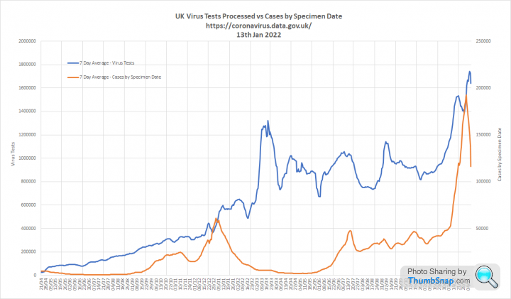
2. This shows the staggering increase in testing compared to the peak last winter. However, case growth has outstripped this indicating genuine increases in prevalence

3. Focusing on Cases per 100k Tests and Admissions. Both are increasing, but the Case Fatality Rate is falling as deaths are not changing at the same rate. The Case Hospitalisation Rate is relatively steady


4. This graph compares Cases per 100k Tests, Admissions and Deaths with a lag and deaths rebased to align the curves. We are at the point where deaths should have begun to increase, but its not yet apparent in the data. This could be significant, but we won't know for certain till next week.

This second graph shows deaths at actual levels and zooms out to a longer timescale. This makes it clear that the virus remains much less deadly than we saw last winter.

1. Comparison with last year
Cases per 100k tests are now quite close to last years peak. I think the downturn at the end of the line could be reporting lag, but it would be fascinating if this peaked at the same time as last year.
Admissions are increasing at a similar rate to this time last year, but still well below the levels we saw when cases were last this high.
Deaths are staying resolutely flat.
This second graph looks at the healthcare metrics. People in hospital is increasing in line with admissions, but remains at about half the level we had this time last year. Mechanical ventilator beds staying flat again, again at about half the levels we had last year
2. This shows the staggering increase in testing compared to the peak last winter. However, case growth has outstripped this indicating genuine increases in prevalence
3. Focusing on Cases per 100k Tests and Admissions. Both are increasing, but the Case Fatality Rate is falling as deaths are not changing at the same rate. The Case Hospitalisation Rate is relatively steady
4. This graph compares Cases per 100k Tests, Admissions and Deaths with a lag and deaths rebased to align the curves. We are at the point where deaths should have begun to increase, but its not yet apparent in the data. This could be significant, but we won't know for certain till next week.
This second graph shows deaths at actual levels and zooms out to a longer timescale. This makes it clear that the virus remains much less deadly than we saw last winter.
200bhp said:
G'Day from sunny Australia.
I'd just like to say thank you to Elysium for your fine work on this thread. I check-in on it every Friday morning and find it fascinating.
If only this data was presented to the masses in some kind of public health awareness campaign, rather than a fear campaign by mass media..... although that's a topic for the other thread!
Thanks. Good to know its helpful to people. I'd just like to say thank you to Elysium for your fine work on this thread. I check-in on it every Friday morning and find it fascinating.
If only this data was presented to the masses in some kind of public health awareness campaign, rather than a fear campaign by mass media..... although that's a topic for the other thread!


Tim Spector
98% of UK now have some level of immunity
https://twitter.com/timspector/status/147951478233...

98% of UK now have some level of immunity
https://twitter.com/timspector/status/147951478233...


NWTony said:
Elysium said:
Delta lasts about 7 days. Omicron around 5 days.
There were 800k cases in the 7 days leading up to 23rd Dec.
UKHSA have estimated that we identify around 40% of infections as cases. So this implies 2,000,000 infections.
Pretty much bang on the ONS figure
That may be a circular argument as there is every chance UKHSA is estimating identifications using the ONS prevalence data?There were 800k cases in the 7 days leading up to 23rd Dec.
UKHSA have estimated that we identify around 40% of infections as cases. So this implies 2,000,000 infections.
Pretty much bang on the ONS figure


JeffreyD said:
Elysium said:
Do we know what the "death lag" is for this variant?Are we heading for c.500 deaths a day for a couple of weeks?


I am updating my graphs every Thursday, so will look at this properly tomorrow.
In the meantime deaths lag cases by about 14 days.
We have 'complete' data for the 1st to 7th Jan, which would relate to cases on the 18th to 24th Dec
The slope of the 7 day average line looks similar for deaths and cases.
Cases increased about 1.7 times between 18th-24th Dec and the peak. That would equate to us hitting a peak of around 370 deaths per day this week, which would equate to a Case Fatality Rate (CFR) of 0.15%
Worst case, the CFR for Delta was 0.2% which would get us to a peak of 490 deaths per day.
This compares to 1,076 deaths on the 8th April 2020 and 1,359 deaths on the 19th Jan 2021.
Update as promised
1. Comparison with last year.
I must admit my mind is blown by the similarity of the peak of Cases per 100k tests with last years in terms of scale and timing. It suggests that the peak of infections we have just seen may actually have been almost the same as last years, but with case numbers dramatically amplified by mass testing.
Admissions only reached about half of last years level and deaths remain about 5 times lower.
The second graph shows hospital occupancy at around half of last years level and mechanical ventilator beds holding flat at about 1/4 of last years peak.


2. This shows raw case numbers looking very different across the two winter waves before correction for testing volumes, which have increased very significantly
3. Focusing on Cases per 100k Tests and Admissions suggests both have peaked, but with the fall in admissions less definite. The Case Hospitalisation Rate (CHR) is now running at 1.6% and the Case Fatality Rate (CFR) has reduced to 0.16%


4. This shows that Cases per 100k Tests, Admissions and Deaths continue to be very closely related. Its clear that we have some increases in deaths still to come through, but expect that they will also peak in the coming week or so.

1. Comparison with last year.
I must admit my mind is blown by the similarity of the peak of Cases per 100k tests with last years in terms of scale and timing. It suggests that the peak of infections we have just seen may actually have been almost the same as last years, but with case numbers dramatically amplified by mass testing.
Admissions only reached about half of last years level and deaths remain about 5 times lower.
The second graph shows hospital occupancy at around half of last years level and mechanical ventilator beds holding flat at about 1/4 of last years peak.
2. This shows raw case numbers looking very different across the two winter waves before correction for testing volumes, which have increased very significantly
3. Focusing on Cases per 100k Tests and Admissions suggests both have peaked, but with the fall in admissions less definite. The Case Hospitalisation Rate (CHR) is now running at 1.6% and the Case Fatality Rate (CFR) has reduced to 0.16%
4. This shows that Cases per 100k Tests, Admissions and Deaths continue to be very closely related. Its clear that we have some increases in deaths still to come through, but expect that they will also peak in the coming week or so.
Gassing Station | News, Politics & Economics | Top of Page | What's New | My Stuff