Coronavirus - Data Analysis Thread
Discussion


Update on todays numbers:
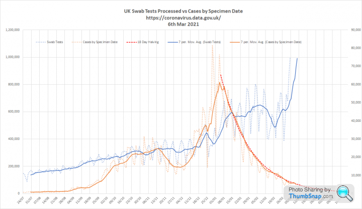
1. Tests and cases. Cases continue to fall exponentially. Halving every 18 days. We are now at mid Sept levels despite testing more than 3 times as many people each day. Which does question the need for a massive programme of asymptomatic testing of schoolchildren:

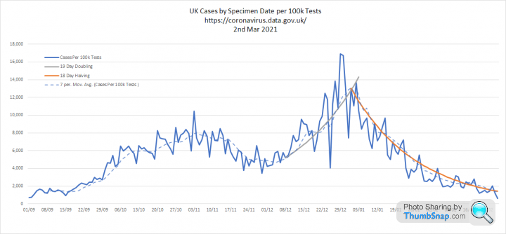
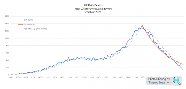
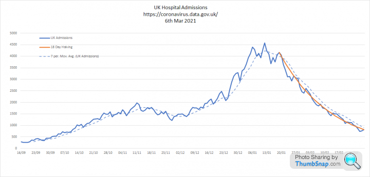
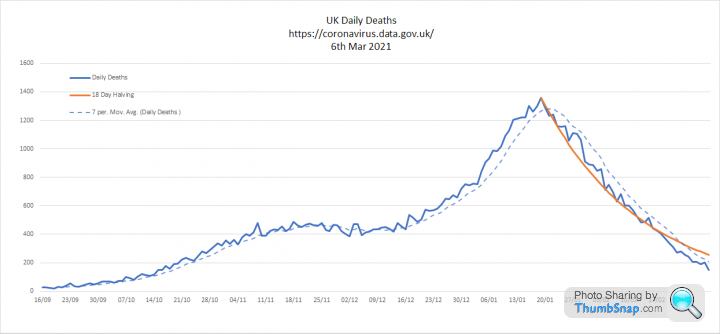
2. Key metrics. Cases per 100k tests are now back at early Sept levels. When we were coming to terms with the end of 'eat out to help out' and not even contemplating lockdown. Admissions and deaths also continuing to fall.


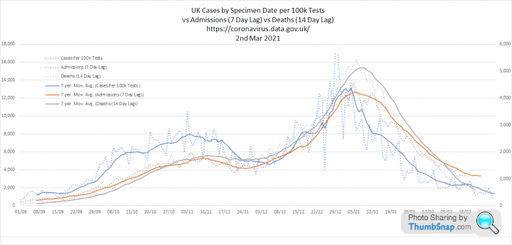
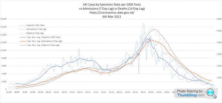
3. All three metrics seem to be converging on my lagged graph. So deaths could be below 100 per day in a couple of weeks time.


1. Tests and cases. Cases continue to fall exponentially. Halving every 18 days. We are now at mid Sept levels despite testing more than 3 times as many people each day. Which does question the need for a massive programme of asymptomatic testing of schoolchildren:
2. Key metrics. Cases per 100k tests are now back at early Sept levels. When we were coming to terms with the end of 'eat out to help out' and not even contemplating lockdown. Admissions and deaths also continuing to fall.
3. All three metrics seem to be converging on my lagged graph. So deaths could be below 100 per day in a couple of weeks time.
Big news from Karl Friston of Indie (fake) SAGE fame:
https://www.fil.ion.ucl.ac.uk/spm/covid-19/forecas...

https://www.fil.ion.ucl.ac.uk/spm/covid-19/forecas...
Karl Friston said:
A herd immunity threshold (of 68.3%) will be reached on 16th of May 2021. This threshold fluctuates depending upon transmission risk, which is predicted to fall as spring arrives.
Just in time for the pubs to open. Edited by Elysium on Friday 26th February 19:11
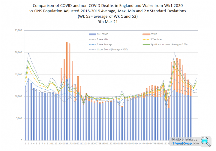
Update on excess deaths based on todays ONS report for wk 7 ending 19th Feb 21:
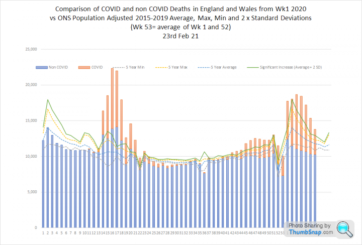
1. This shows ONS weekly deaths for England and Wales split into non-COVID (blue) and 'due to COVID (red). The dotted lines show the population adjusted 5 year average, max and min. The green line is 2 standard deviations from the average and is intended to identify statistically signifiant excess.
As has been the case through most of the 2nd wave non-COVID deaths are below the 5 year minimum. We still have statistically significant excess death, but the decline over the last few weeks does seem to be following a relatively normal winter pattern:
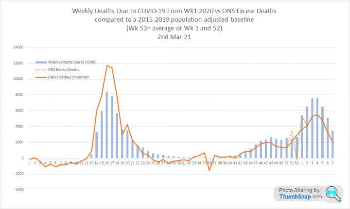
2. This graph compares deaths 'due to' COVID to excess deaths. The difference between the 1st and 2nd waves is obvious, with excess deaths much lower in the 2nd wave and consistently lower than reported COVID deaths. As per recent press articles I think this is due to our methodology, which makes it quite likely that deaths involving other conditions will be certified as 'due to' COVID
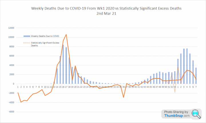
3. This graph follows the same methodology but compares the impact of COVID to statisitically significant excess deaths. In this case the difference between the first and second waves is even more stark.
1. This shows ONS weekly deaths for England and Wales split into non-COVID (blue) and 'due to COVID (red). The dotted lines show the population adjusted 5 year average, max and min. The green line is 2 standard deviations from the average and is intended to identify statistically signifiant excess.
As has been the case through most of the 2nd wave non-COVID deaths are below the 5 year minimum. We still have statistically significant excess death, but the decline over the last few weeks does seem to be following a relatively normal winter pattern:
2. This graph compares deaths 'due to' COVID to excess deaths. The difference between the 1st and 2nd waves is obvious, with excess deaths much lower in the 2nd wave and consistently lower than reported COVID deaths. As per recent press articles I think this is due to our methodology, which makes it quite likely that deaths involving other conditions will be certified as 'due to' COVID
3. This graph follows the same methodology but compares the impact of COVID to statisitically significant excess deaths. In this case the difference between the first and second waves is even more stark.
Update from todays PHE numbers:
1. Virus Tests and Cases. Lots of fluctuation on testing. I think this is due to the very significant switch to LFD and the last few days are skyrocketing, which may be due to the initial school testing. Regardless of this, cases continue to fall, broadly in line with an 18 day halving from the peak. If this continues we will be below 1,000 cases per day by the third week of April
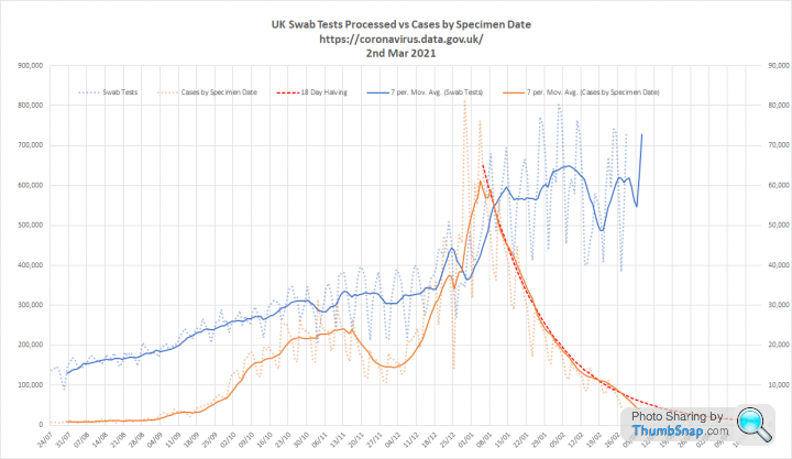
2. Key metrics. Cases per 100k tests (positivity) are also halving every 18 days. Going down about as quickly as they went up. Admissions and deaths are doing the same.

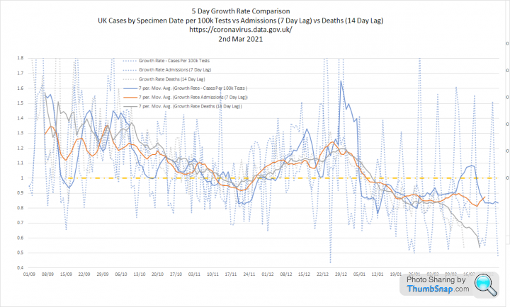
3. You can see this clearly when you overlay the 3 metrics with a lag so deaths and admissions appear alongside the cases that they relate to. Cases per 100k tests are now down to early Sept levels. But when you look at growth rates we are in a much better place. Back then the epidemic was growing with Rt around 1.4, now we have the same amount of cases per test, but with Rt below 1.
1. Virus Tests and Cases. Lots of fluctuation on testing. I think this is due to the very significant switch to LFD and the last few days are skyrocketing, which may be due to the initial school testing. Regardless of this, cases continue to fall, broadly in line with an 18 day halving from the peak. If this continues we will be below 1,000 cases per day by the third week of April
2. Key metrics. Cases per 100k tests (positivity) are also halving every 18 days. Going down about as quickly as they went up. Admissions and deaths are doing the same.
3. You can see this clearly when you overlay the 3 metrics with a lag so deaths and admissions appear alongside the cases that they relate to. Cases per 100k tests are now down to early Sept levels. But when you look at growth rates we are in a much better place. Back then the epidemic was growing with Rt around 1.4, now we have the same amount of cases per test, but with Rt below 1.
NoddyonNitrous said:
Biker 1 said:
I am in awe at Elysium's graphs & data: keep up the good work!!
I agree, the only improvement required is a workaround for the thumbsnap logo!If you click on the image it opens in thumbsnap without the logo, but at low resolution.
Click on it again and you get a high res version with no logo.

Updating my graphs today as the data was released late yesterday:
1. Cases and tests. Cases are still halving every 18 days, whilst tests are reaching for the stratosphere. It will be interesting to see how this changes next week with even more school LFD tests:
2. Key metrics. Cases per 100k tests also halving every 18 days, but I expect this to drop below the line next week with the addition of a great slug of very low positivity school tests. Admissions and deaths continue to fall. If anything the decline in deaths seems to be accelerating, but that could be reporting lag:

3. Metrics overlaid. Still following closely, but growth rates are interesting. Definitely lower than a couple of weeks ago.
1. Cases and tests. Cases are still halving every 18 days, whilst tests are reaching for the stratosphere. It will be interesting to see how this changes next week with even more school LFD tests:
2. Key metrics. Cases per 100k tests also halving every 18 days, but I expect this to drop below the line next week with the addition of a great slug of very low positivity school tests. Admissions and deaths continue to fall. If anything the decline in deaths seems to be accelerating, but that could be reporting lag:
3. Metrics overlaid. Still following closely, but growth rates are interesting. Definitely lower than a couple of weeks ago.

coanda said:
Now overlay against cold and flu virus seasonal rise and fall.
Thats effectively what this does: The first wave was very unusual. Causing high levels of COVID and non-COVID excess death.
Although the second wave has clearly also led to statistically signficant excess death it has occured when we expect to see winter excess and the distribution of deaths follows a large, but relatively predictable seasonal curve.
Todays numbers:
1. Despite huge increases in testing cases continue to fall. Still following a predictable decline and halving every 18 days:

2. The majority of tests are now consistently LFD and the number of cases seems largely irrelevant to testing volumes:

3. Key metrics are all falling. Cases per 100k tests and admissions also halving every 18 days, but the decline in deaths seems more linear:

4. Overlaying the three metrics shows that deaths are declining faster than the other measures.

I suspect that hospital admissions are now determined by general prevalence and I am cautiously hopeful that the decline in deaths is a vaccine effect.
1. Despite huge increases in testing cases continue to fall. Still following a predictable decline and halving every 18 days:
2. The majority of tests are now consistently LFD and the number of cases seems largely irrelevant to testing volumes:
3. Key metrics are all falling. Cases per 100k tests and admissions also halving every 18 days, but the decline in deaths seems more linear:
4. Overlaying the three metrics shows that deaths are declining faster than the other measures.
I suspect that hospital admissions are now determined by general prevalence and I am cautiously hopeful that the decline in deaths is a vaccine effect.
Update on Excess Deaths following todays ONS report:
1. Deaths by age band. I have shared this spreadsheet previoiusly, but now include an estimate of deaths per million population for the entire pandemic to date. A grand total of 809 people under 40 have died. 0.6% of deaths from almost 50% of the population.
27 people per million.
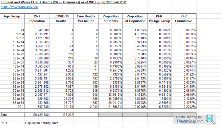
This graph attempts to show the number of people in each age group who have died with COVID (red) or survived the pandemic (blue) by age band. For most ages the deaths are barely visible. For the 90+ group, which is the most significantly impacted, deaths are still just over 5%

3. This graph looks at weekly deaths 'due to' COVID (orange) and non COVID related (blue) and compares them to the 5 year max, min and average. I have also show a green line for the point of statistically significant excess (2 standard deviations) and an 'upper bound' as used by PHE of 3 standard deviations from the mean:
It is now increasingly clear that the first wave consists of a highly unusual spike following a mild winter period. However, the second wave appears to follow a normal seasonal pattern, but at significantly elevated mortality. To be honest, I am surprised at how closely it is tracking past years
1. Deaths by age band. I have shared this spreadsheet previoiusly, but now include an estimate of deaths per million population for the entire pandemic to date. A grand total of 809 people under 40 have died. 0.6% of deaths from almost 50% of the population.
27 people per million.
This graph attempts to show the number of people in each age group who have died with COVID (red) or survived the pandemic (blue) by age band. For most ages the deaths are barely visible. For the 90+ group, which is the most significantly impacted, deaths are still just over 5%
3. This graph looks at weekly deaths 'due to' COVID (orange) and non COVID related (blue) and compares them to the 5 year max, min and average. I have also show a green line for the point of statistically significant excess (2 standard deviations) and an 'upper bound' as used by PHE of 3 standard deviations from the mean:
It is now increasingly clear that the first wave consists of a highly unusual spike following a mild winter period. However, the second wave appears to follow a normal seasonal pattern, but at significantly elevated mortality. To be honest, I am surprised at how closely it is tracking past years
Terminator X said:
So 4 out of 5 deaths are 70+ which is actually the same as they were saying when all this kicked off a year ago.
TX.
Under 40 = 49.8% of population and 0.6% of deathsTX.
40-59 = 26.1% of population and 6.1% of deaths
60-69 = 10.6% of population and 10.3% of deaths
Over 70 = 13.5% of population and 83.1% of deaths
Deaths under 60 = 197 / million or 0.0197%
havoc said:
Elysium said:
Deaths under 60 = 197 / million or 0.0197%
Some thoughts:-- That's out of 0.224% avg deaths in the population. So 1/11 of the average risk.
- Without knowing the actual # of infected, we can't come up with the important statistic, which is actual % dying out of those who've caught it. Deaths from parachute jumps per million UK people is an even lower %, but if you do deaths per active parachutist, it jumps massively.
- Are there any stats for ITU admissions?
- Or for long-covid? (I suspect not as that still seems to be considered apocryphal by some authorities)
...because you can be very-low-risk for dying from this thing but still moderate risk of ITU admission, and long-covid hasn't had the research to suggest what the risk parameters are.
This compares ONS deaths by age group to serology estimates from the UK Biobank survey. We know the serology is only telling us the minimum infected, so I have worked backwards to estimated the total infections that would be needed to result in a blended IFR of 0.6%

Total hospitalisations less 25% for hospital aquired infections suggests around 1.5% of infections could result in admission for treatment. About 10% of those requiring ICU support.
Lots of assumptions, but I think this could be 'in the ballpark'
havoc said:
anonymous said:
[redacted]
That would remove most of them.However...when common issues such as diabetes, hypertension and obesity are considered comorbidities for the purpose of Covid-19, SHOULD you be removing them?
Can you hand on heart say you don't know anyone who's got a BMI of 30+? (that's 15 stone for an average-height bloke, for example, or less than 13 stone for an average-height woman) Or close to that?
Or could someone you know be hiding high blood pressure? Or an undiscovered heart arrythmia?
What about smokers? Are they at higher risk due to reduced lung function? Is that self-inflicted too?
...and those with high lifestyle risks reducing their immune system function (e.g. poor sleep, high stress, lack of exercise...that pretty much defines every parent with small children...)
(BTW, NONE of the above put you in the at-risk category for an early vaccine)
OK, I'm labouring the point. But the comorbities here are a cop-out, quite frankly...they're near-ordinary things that are being used by some to play down the risk to Joe Public...which given the ease of contagion effectively means saying you don't care about these people's lives, you just want to carry on as normal and if these people die then tough luck.
havoc said:
Elysium said:
I think 15 million is accepted as a sensible minimum at this point
https://news.sky.com/story/covid-19-15-3-of-englan...Just saw this from a month ago...15.3% of England by mid-Jan (= c.£7m people, so closing on 10m for UK as a whole, allowing for the lower rates in the other nations). Add in 7-8 more weeks and, yeah, I can see how it could hit 15m...but that still seems a little high...based on that headline and the Feb rates I'd be more inclined towards 13m, +/- 10%. Similar ball-park though.
...and I'm still shocked at that level. Maybe I move (or more recently, don't move) in the wrong/right circles. And maybe that explains (both ways) the malaise that many seem to be feeling about the ongoing lockdowns and restrictions.
At a 1% IFR you would need 12,498,700 infections to result in the 124,987 deaths PHE have recorded within 28 days of a positive test.
At a 0.6% IFR, as per the initial estimates provided by SAGE, you would need 20,831,166 infections
This graph attempts to show the enormous scale of these hidden infections:

The ONS infection survey reported an estimate of 1,122,000 people with Coronavirus at the winter peak:
https://www.ons.gov.uk/peoplepopulationandcommunit...
havoc said:
Elysium said:
You can sense check this working backwards from deaths using an estimate of the overall IFR.
At a 1% IFR you would need 12,498,700 infections to result in the 124,987 deaths PHE have recorded within 28 days of a positive test.
At a 0.6% IFR, as per the initial estimates provided by SAGE, you would need 20,831,166 infections
Makes sense.At a 1% IFR you would need 12,498,700 infections to result in the 124,987 deaths PHE have recorded within 28 days of a positive test.
At a 0.6% IFR, as per the initial estimates provided by SAGE, you would need 20,831,166 infections
Couple of challenges (tell me to shut-up if this shouldn't be on this thread)...
- There has been some, ah, doubt over the acuracy of some deaths which have been certified as Covid. 125k could be overstating matters.
- Surely the IFR is an unknown - it's a 3-way equation - numerator (deaths, known), denominator (infections, unknown), and IFR (rate, calculated or inferred)
- Further, the IFR will vary depending upon the demographic profile of the (infected) population...a tendency towards more minorities* or older people will skew the IFR upwards.
* Who live more usually in cities...and in higher density housing...both of which increase susceptibility to infection.
However, the ONS infection survey includes a regular estimate of the proportion of the population infected with SARS-CoV-2 at a given time. This graph compares that estimate with an estimate of infections, derived from the PHE 'deaths within 28 days' and the following assumptions:
1. 21 days from infection to death
2. An overall IFR of 0.6%.
3. An average 10 day period during which a newly infected person will remain infected
I think the two curves are a decent fit, which supports my belief that the total number of people infected by this virus could easily be around 20 million.

havoc said:
Elysium said:
I think the two curves are a decent fit, which supports my belief that the total number of people infected by this virus could easily be around 20 million.
Final thought from me and I'm off to bed.You may be right, but one thing niggles here...and my concern HAS happened before with data from different sources that appear supportive...
BOTH of those curves are estimates. Is it possible that one curve is using data / estimates from the other set? Or that they're both using the same initial assumptions. (e.g. is the ONS data-set extrapolating using PHE data as part of the formula?)
https://www.ons.gov.uk/peoplepopulationandcommunit...
This is entirely unrelated to the PHE number which is based on deaths within 2 days of a PCR test.
The total of each bar is the ONS mid 2019 population projection for each age group. The red is the number dying with COVID and the yellow is the number dying of anything else.

This is how this looks like as a percentage of the population in each age range:

The unsurprising conclusion is that very few of us have died with COVID and that the people dying with COVID tend to be the same sort of people that die of other things.
Not healthy people of working age.
This is how this looks like as a percentage of the population in each age range:
The unsurprising conclusion is that very few of us have died with COVID and that the people dying with COVID tend to be the same sort of people that die of other things.
Not healthy people of working age.
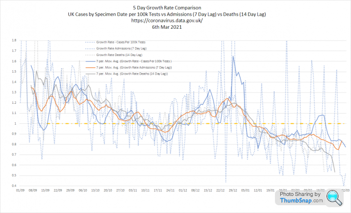
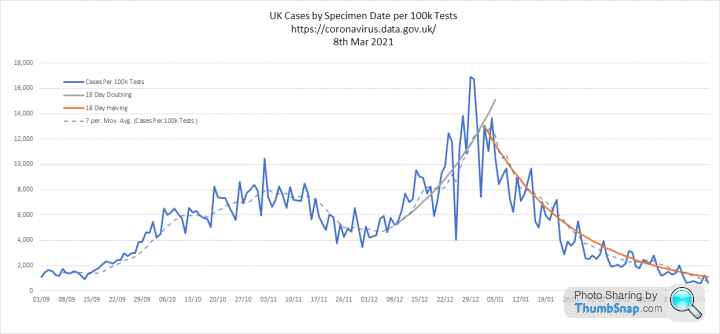
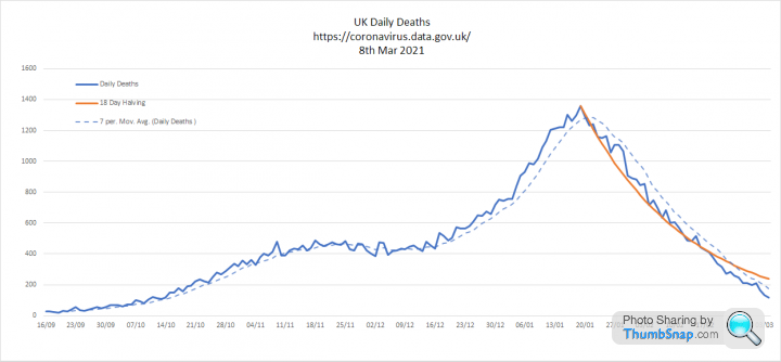
Update with todays numbers:
1. Tests and cases. The massive increase in asymptomatic LFD testing of school children has failed to produce a corresponding increase in cases, which are continuing to halve in number every 18 days:

2. Key metrics. Cases per 100k tests and admissions continue to halve every 18 days. Deaths are falling more linearly:


3. All three metrics overlaid and moving roughly together

1. Tests and cases. The massive increase in asymptomatic LFD testing of school children has failed to produce a corresponding increase in cases, which are continuing to halve in number every 18 days:
2. Key metrics. Cases per 100k tests and admissions continue to halve every 18 days. Deaths are falling more linearly:
3. All three metrics overlaid and moving roughly together
Gassing Station | News, Politics & Economics | Top of Page | What's New | My Stuff