Coronavirus - Data Analysis Thread
Discussion


The Govt website has been updated to include numbers of LFD and PCR cases for England.
This graph shows daily PCR tests in orange and LFD in blue. The red dotted line is the 7 day average of PCR cases and the barely visible yellow dotted line is the 7 day average of LFD cases.

I was quite shocked when I saw this. LFD really isn't finding cases. In fact, so far we have performed almost 27 million LFD tests, but found a grand total of just 43,106 LFD cases.
For comparison we found 66,799 PCR cases in a single day on the 4th Jan 2021
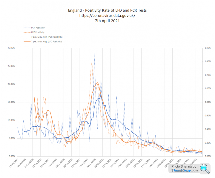
This next graph compares positivity (cases / tests) for LFD and PCR. They are shown on different y-axis to allow comparison as LFD is much lower. The interesting thing is that they align unexpectedly well:

On average PCR is finding 25 times more cases per test than LFD.
This could be about the difference between symptomatic and asymptomatic prevalence.
Or it could mean PCR is overly sensitive
Or it could mean that LFD is no sensitive enough
Or it could mean that infectious asymptomatic cases are rare.
In any event average LFD positivity for the whole of March, including the school testing is just 0.09%
9 cases per 10,000 tests.
Mind blown.
This graph shows daily PCR tests in orange and LFD in blue. The red dotted line is the 7 day average of PCR cases and the barely visible yellow dotted line is the 7 day average of LFD cases.
I was quite shocked when I saw this. LFD really isn't finding cases. In fact, so far we have performed almost 27 million LFD tests, but found a grand total of just 43,106 LFD cases.
For comparison we found 66,799 PCR cases in a single day on the 4th Jan 2021
This next graph compares positivity (cases / tests) for LFD and PCR. They are shown on different y-axis to allow comparison as LFD is much lower. The interesting thing is that they align unexpectedly well:
On average PCR is finding 25 times more cases per test than LFD.
This could be about the difference between symptomatic and asymptomatic prevalence.
Or it could mean PCR is overly sensitive
Or it could mean that LFD is no sensitive enough
Or it could mean that infectious asymptomatic cases are rare.
In any event average LFD positivity for the whole of March, including the school testing is just 0.09%
9 cases per 10,000 tests.
Mind blown.
Edited by Elysium on Monday 15th March 20:51
havoc said:
I doubt PCR is 'overly' sensitive - in a testing sense, Covid is digital - you've either got it or you haven't (like an elephant).
- Whether you've enough to then pass it on is a second question
- Whether you were tested at the right time in the development of Covid in your system is a third.
LFD lack of sensitivity...I have heard that. I have also heard (don't shoot me if this is wrong) it's possible to mis-perform the test, i.e. get a false negative...much like the old do-at-home brain-ticklers which a lot of people didn't shove far enough up their nose.
Infectious AND asymptomatic...in a primarily aerosol infection-environment (i.e. non-contact with others, given all the social-distancing measures currently in place), from what I know that would be in line with other coronaviruses* - if you're not coughing or sneezing then unless you're licking your fingers and touching everything it's difficult to see an infection vector.
Final thought - is there any difference in the 'selection methodology' - now we've a cheap and 'easily-performed' test is there a much higher proportion of random testing (asymptomatic) vs necessary testing, also is there a much higher proportion of testing outside of medical / care environments (so of people in lower-risk occupations)?
* Cold & flu, I mean.
The interesting thing is that the positivity rate of PCR and LFD tests has moved together. Which suggests that what we are seeing is not particularly due to changes in the 'blend' of asymptomatic or symptomatic people attending for testing. - Whether you've enough to then pass it on is a second question
- Whether you were tested at the right time in the development of Covid in your system is a third.
LFD lack of sensitivity...I have heard that. I have also heard (don't shoot me if this is wrong) it's possible to mis-perform the test, i.e. get a false negative...much like the old do-at-home brain-ticklers which a lot of people didn't shove far enough up their nose.
Infectious AND asymptomatic...in a primarily aerosol infection-environment (i.e. non-contact with others, given all the social-distancing measures currently in place), from what I know that would be in line with other coronaviruses* - if you're not coughing or sneezing then unless you're licking your fingers and touching everything it's difficult to see an infection vector.
Final thought - is there any difference in the 'selection methodology' - now we've a cheap and 'easily-performed' test is there a much higher proportion of random testing (asymptomatic) vs necessary testing, also is there a much higher proportion of testing outside of medical / care environments (so of people in lower-risk occupations)?
* Cold & flu, I mean.
The positivity of both tests has gradually declined since New Year with PCR overall finding 25 times more cases than LFD.
To the extent that the total LFD cases to date is only 2/3rds of what we were finding in a single day through PCR.
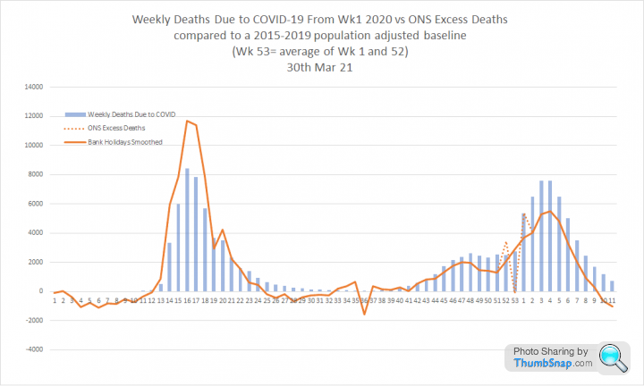
Excess deaths update with todays ONS figures for the Wk ending 5th March:
1. The big news is that we no longer have statistically significant excess death. 11,592 deaths in total for week 9 compared to a 5 year average of 11,322. Below the 2015-19 maximum of 11,780:
So the number of people dying is essentially 'normal':

2. ONS reported 1,685 deaths 'due to' COVID in wk 9. So this is only 'normal' because deaths from other causes are at an historic low. I believe this is now concusive evidence of the re-badging of deaths due to our methodology.

3. This graph shows the same comparison with 'statistically significant' excess deaths. I would argue this is the clearest way to compare the first and second waves. The scale of the second wave is now increasingly disconnected from unusual levels of death:

1. The big news is that we no longer have statistically significant excess death. 11,592 deaths in total for week 9 compared to a 5 year average of 11,322. Below the 2015-19 maximum of 11,780:
So the number of people dying is essentially 'normal':
2. ONS reported 1,685 deaths 'due to' COVID in wk 9. So this is only 'normal' because deaths from other causes are at an historic low. I believe this is now concusive evidence of the re-badging of deaths due to our methodology.
3. This graph shows the same comparison with 'statistically significant' excess deaths. I would argue this is the clearest way to compare the first and second waves. The scale of the second wave is now increasingly disconnected from unusual levels of death:
Within the next few weeks everyone over 50 and those with vulnerabilities of all ages will have been vaccinated. The latest view is that this might reduce their risk of serious illness or death by 70%+.
This graph shows ONS weekly COVID-19 deaths taken straight from their spreadsheet. The data wrapper link takes you to an interactive version, which you will also reach if you click on the link:
https://datawrapper.dwcdn.net/7N0Lb/1/

It's necessary to compress under 40's into a single age band to make it visible on this scale.
Now imagine all age bands over 50 reducing by 70%
This graph shows ONS weekly COVID-19 deaths taken straight from their spreadsheet. The data wrapper link takes you to an interactive version, which you will also reach if you click on the link:
https://datawrapper.dwcdn.net/7N0Lb/1/
It's necessary to compress under 40's into a single age band to make it visible on this scale.
Now imagine all age bands over 50 reducing by 70%
Update on todays data:
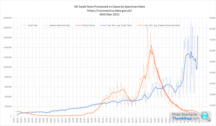
1. Tests and cases. The massive increase in testing has managed to squeeze out a few more cases dislodging us from the 18 day halving that we have followed since New Year.

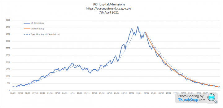
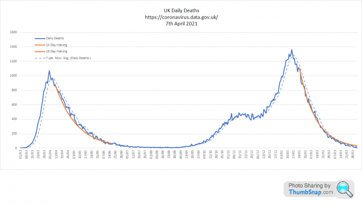
2. Key metrics. When you correct for testing volume cases per 100k tests are still following that 18 day halving. Admissions are also bang on that trendline, but deaths are still falling more quickly. Although there is reporting lag, we now have 10 days with less than 100 deaths per day:


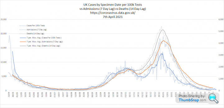
3. Three metrics overlaid. You can see how closely admissions and cases per 100k tests are tracking:

1. Tests and cases. The massive increase in testing has managed to squeeze out a few more cases dislodging us from the 18 day halving that we have followed since New Year.
2. Key metrics. When you correct for testing volume cases per 100k tests are still following that 18 day halving. Admissions are also bang on that trendline, but deaths are still falling more quickly. Although there is reporting lag, we now have 10 days with less than 100 deaths per day:
3. Three metrics overlaid. You can see how closely admissions and cases per 100k tests are tracking:
A couple of further graphs exploring LFD and PCR tests in England:
1. Yesterdays massive test number is mainly LFD and presumably driven by schools doing their first round of home tests. 1.7 million LFD in England alone on the 21st March, but positivity is just 11 per 10000
In fact we have now performed a grand total of 35 million LFD tests, which have found just under 50k cases (14 per 10,000 overall).

2. LFD and PCR positivity are continuing to track each other, just at different levels:

1. Yesterdays massive test number is mainly LFD and presumably driven by schools doing their first round of home tests. 1.7 million LFD in England alone on the 21st March, but positivity is just 11 per 10000
In fact we have now performed a grand total of 35 million LFD tests, which have found just under 50k cases (14 per 10,000 overall).
2. LFD and PCR positivity are continuing to track each other, just at different levels:
RSTurboPaul said:
Thanks as always, Elysium.
Those figures are just.... mental...
I guess that whether or not they are 'wrong' / false-positive-tastic, they are at least consistent over time and reflect general infection trends within the population?
EDIT: Forgot to say - for total clarity, could be worth labelling the Y axes?
The left hand scale is PCR positivity and the right hand scale is LFD positivityThose figures are just.... mental...
Elysium said:
2. LFD and PCR positivity are continuing to track each other, just at different levels:
I'm still not sure I understand this.I guess that whether or not they are 'wrong' / false-positive-tastic, they are at least consistent over time and reflect general infection trends within the population?
EDIT: Forgot to say - for total clarity, could be worth labelling the Y axes?
The graph shows that positivity changes for each proportionally, which suggests a link with prevalence. However PCR consistently returns a much higher %age of positive results. So when LFD briefly hit 1% PCR was above 20%
Some of this could be explained by differences in the number of people who take each test that are symptomatic. However, I think it also highlights significant differences in sensitivity between the tests.
Update on Excess Deaths following todays ONS release:
1. As of week 10, ending 12th March 2021, there are no excess deaths in England and Wales. In fact weekly deaths are only just above the 5 year minimum:

2. This graph compares the 1st and second waves of excess deaths to deaths 'due to' COVID:

Over the last 12 months (ie the entire pandemic period) there are 100k excess deaths, which represents a 19% increase in mortality.
1. As of week 10, ending 12th March 2021, there are no excess deaths in England and Wales. In fact weekly deaths are only just above the 5 year minimum:
2. This graph compares the 1st and second waves of excess deaths to deaths 'due to' COVID:
Over the last 12 months (ie the entire pandemic period) there are 100k excess deaths, which represents a 19% increase in mortality.
OK folks - quick update on todays numbers:
1. Tests and cases. Our crazy testing volumes are continuing with little sign that the kids are getting bored with it. The additional volume has arrested the fall in cases causing them to 'flatline':

2. Key metrics. Cases per 100k tests are still nicely on the 18 day halving line despite the erratic testing volumes. Admissions also seem nailed on to this trajectory. Deaths still falling faster. Although reporting lag remains an issue, we now have 2 weeks below 100 per day:


3. Metrics overlaid. All neatly following the same steady decline. And that is the one thing that worries me slightly. If this is really down to the vaccine, it seems to me that the 18 day halving should be accelerating?

1. Tests and cases. Our crazy testing volumes are continuing with little sign that the kids are getting bored with it. The additional volume has arrested the fall in cases causing them to 'flatline':
2. Key metrics. Cases per 100k tests are still nicely on the 18 day halving line despite the erratic testing volumes. Admissions also seem nailed on to this trajectory. Deaths still falling faster. Although reporting lag remains an issue, we now have 2 weeks below 100 per day:
3. Metrics overlaid. All neatly following the same steady decline. And that is the one thing that worries me slightly. If this is really down to the vaccine, it seems to me that the 18 day halving should be accelerating?
But whats going on with all the LFD tests (said no one ever)?
1. Firstly, PCR testing volumes are steady, but positivity is slowly declining. LFD volumes are now super spiky and there is a slight increase in positivity, which may or may not be meaningful:

2. This shows LFD and PCR positivity overlaid using different Y-axis so they can be compared. There is a gradual increase in LFD positivity since the school testing began. This started with a flatlining around the first week and is now turning upwards with the home tests. I have read a suggestion that this could be due to less consistent reporting for negative tests now they are being done at home.

1. Firstly, PCR testing volumes are steady, but positivity is slowly declining. LFD volumes are now super spiky and there is a slight increase in positivity, which may or may not be meaningful:
2. This shows LFD and PCR positivity overlaid using different Y-axis so they can be compared. There is a gradual increase in LFD positivity since the school testing began. This started with a flatlining around the first week and is now turning upwards with the home tests. I have read a suggestion that this could be due to less consistent reporting for negative tests now they are being done at home.
Quick update. I was going to do this yesterday, but the testing data was not published until today:
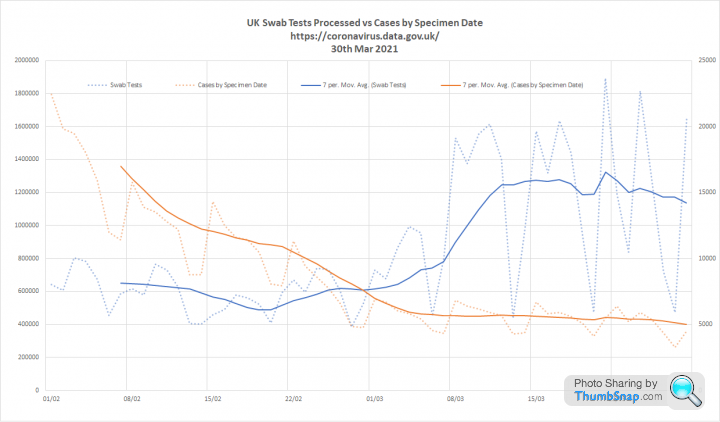
1. Tests and cases. Test volumes continue to be highly variable due to the testing of school children. However, the Sunday peak was 250k down on the previous week suggesting commitment to the scheme is waning. The mass testing has slowed the fall in cases, but not completely:
2. This zooms on the last few weeks to show the relationship between increased testing and case numbers.
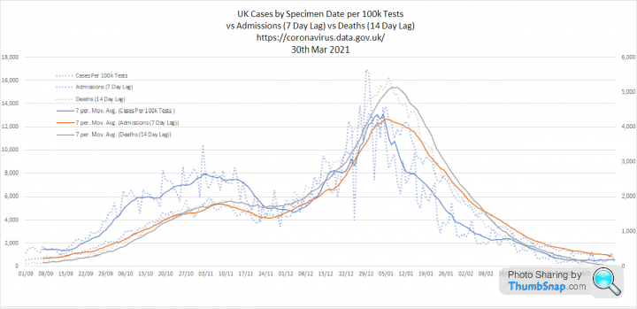
3. Key metrics. All continue to fall. Broadly halving every 18 days, but admissions is following the trend more closely:

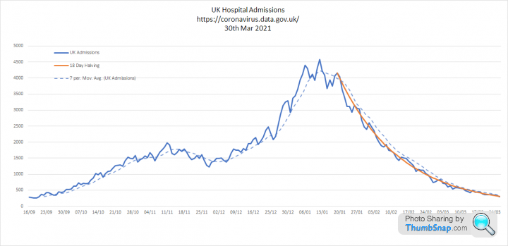

4. Metrics overlaid. The relationship between cases, admissions and deaths continues to be very clear, with all metrics converging
1. Tests and cases. Test volumes continue to be highly variable due to the testing of school children. However, the Sunday peak was 250k down on the previous week suggesting commitment to the scheme is waning. The mass testing has slowed the fall in cases, but not completely:
2. This zooms on the last few weeks to show the relationship between increased testing and case numbers.
3. Key metrics. All continue to fall. Broadly halving every 18 days, but admissions is following the trend more closely:
4. Metrics overlaid. The relationship between cases, admissions and deaths continues to be very clear, with all metrics converging

We finally got a decent update from PHE today after the Easter break:
1. Tests and cases. Testing volumes have really dropped down and cases are dropping back to the dotted red line, indicating an 18 day halving time since New Year. I am guessing that compliance with the twice weekly school testing, which was intended to continue through the holidays has fallen substantially. This is probably a good indicator of what will happen with the proposed extension of LFD to the population as a whole:

2. Key metrics. Cases per 100k tests and admissions are still following the long 18 day halving. I would have liked to see some acceleration here to signal a growing level of protection due to vaccination, but to me this seems to be 'on rails'. Deaths fell faster initially, but now also seem to be tracking the same line. We have been below 100 deaths per day since 9th March. Almost a month now:
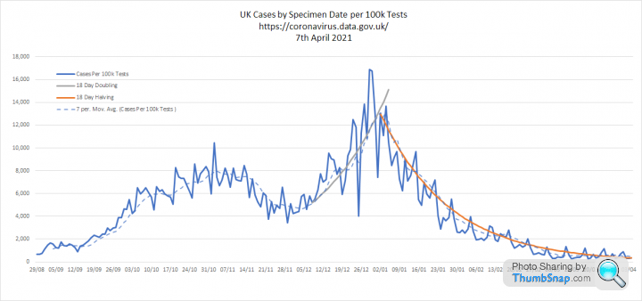

3. All three metrics overlaid. My simple assumption of a 7 day lag between cases and admissions and a 14 day lag between cases and deaths is still checking out. This also shows how admissions and deaths are moving in lockstep now. Again with that 18 day halving:
1. Tests and cases. Testing volumes have really dropped down and cases are dropping back to the dotted red line, indicating an 18 day halving time since New Year. I am guessing that compliance with the twice weekly school testing, which was intended to continue through the holidays has fallen substantially. This is probably a good indicator of what will happen with the proposed extension of LFD to the population as a whole:
2. Key metrics. Cases per 100k tests and admissions are still following the long 18 day halving. I would have liked to see some acceleration here to signal a growing level of protection due to vaccination, but to me this seems to be 'on rails'. Deaths fell faster initially, but now also seem to be tracking the same line. We have been below 100 deaths per day since 9th March. Almost a month now:
3. All three metrics overlaid. My simple assumption of a 7 day lag between cases and admissions and a 14 day lag between cases and deaths is still checking out. This also shows how admissions and deaths are moving in lockstep now. Again with that 18 day halving:
Update on the impact of LFD testing in England.
Firstly. The school testing surge seems to have collapsed with the LFD testing (shaded in blue) dropping back to early March levels. Regardless of testing, LFD cases remains very low.
We have performed almost 27 million LFD tests in the last month, but found only 17,577 cases. 7 positives for every 10,000 tests.
The expected false positive range for that volume is between 8,000 and 27,000 so its quite possible that these are almost all false positives.

Interestingly, the positivity of the LFD and PCR tests continues to be linked. Suggesting that they are both indicating changes in prevalence. PCR positivity is consistently 10-20 times higher than PCR positivity. This could be about the relative sensitivities of the tests or reflective of the difference between asymptomatic and symptomatic prevalence.
Firstly. The school testing surge seems to have collapsed with the LFD testing (shaded in blue) dropping back to early March levels. Regardless of testing, LFD cases remains very low.
We have performed almost 27 million LFD tests in the last month, but found only 17,577 cases. 7 positives for every 10,000 tests.
The expected false positive range for that volume is between 8,000 and 27,000 so its quite possible that these are almost all false positives.
Interestingly, the positivity of the LFD and PCR tests continues to be linked. Suggesting that they are both indicating changes in prevalence. PCR positivity is consistently 10-20 times higher than PCR positivity. This could be about the relative sensitivities of the tests or reflective of the difference between asymptomatic and symptomatic prevalence.
steveT350C said:
@Elysium, or anyone in fact who likes analysing data...
This website is claiming only 3,542 died of Covid-19 with no known pre-existing conditions up to 4pm 31st March 2021.
There are links to NHS data and pics of tables from said data.....
https://dailyexpose.co.uk/2021/04/05/official-nhs-...
The underlying point here is sound, but they take it too far. This website is claiming only 3,542 died of Covid-19 with no known pre-existing conditions up to 4pm 31st March 2021.
There are links to NHS data and pics of tables from said data.....
https://dailyexpose.co.uk/2021/04/05/official-nhs-...
Its very clear that the chances of dying from COVID-19 are very closely aligned with your chances of dying of anything else.
Your chance of dying increases with age, if you are affected by chronic conditions and if you are already sick due to other causes.
So if the case fatality rate for a given age group is 1%, then the sickest people in that group will have a higher chance of dying than the healthiest. Which is sort of obvious really.
What these people are really drawing attention to is the reality that people in good health rarely die due to COVID. The trouble is that when you get to 80+ the majority of people have something wrong with them.
This is a good read:
https://medium.com/wintoncentre/what-are-the-risks...
ONS deaths data is now out for week 12 ending 26th March 21. This was the third consecutive week of below average all cause deaths.
It is striking that the second wave closely follows the pattern of normal winter deaths, but at particularly high levels, sometimes more than 3 standard deviations from the 2015-2019 average.
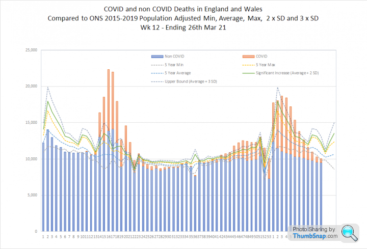

It is striking that the second wave closely follows the pattern of normal winter deaths, but at particularly high levels, sometimes more than 3 standard deviations from the 2015-2019 average.
RSTurboPaul said:
Apologies, this is a super-lazy post as I have to get to bed!
What was the 'half-life' of the 'first' wave's rate of decline?
Was it also 18 days?
I'm trying to ponder on if vaccination would make any difference to the infection rate increases/decreases but it's late and my brain is failing me.
This looks at ONS weekly deaths by age band. I looked a this a couple of weeks ago and was struck by the similarity between waves 1 and 2. What was the 'half-life' of the 'first' wave's rate of decline?
Was it also 18 days?
I'm trying to ponder on if vaccination would make any difference to the infection rate increases/decreases but it's late and my brain is failing me.

I decided that the easiest comparison would be a simple variance. Deaths in each age group in wave 2 minus the equivalent week in wave 1. Where this is flat (e.g. under 40's) the rate of decline is the same for both waves. Where this slopes downward, wave 2 is falling faster than wave 1.
Wave 2 is declining faster for older age groups. Most noticeably the over 80's but with the same trend emerging for the over 70's. This seems likely to be the impact of vaccines. The benefit is subtle at this point, because it is masked by a seasonal decline, but I think it is there:
https://datawrapper.dwcdn.net/jSwB6/3/

The PHE data is a little less easy to compare between waves. Our testing regime means that cases and admissions are not the same.
However, I think it is possible to look at deaths:
In the second wave deaths appear to be halving every 14 days. In the first wave, they halved every 18 days, which is what we currently see for admissions and cases per 100k tests.
Again, I think this could be a vaccine effect.
14 days is equivalent to a 5% fall per day
18 days is equivalent to a 4% fall per day
havoc said:

I think it's clear
- all the post-retirement age-groups show a downward trend, with the younger groups in that bracket starting their trend later, as the vaccine (with the consequent benefits) take effect later for them.
- all the pre-retirement age-groups are (statistically) flat.
Rt is below 1 for everyone, which I think is due to seasonality. However, it is lower for older age groups, which is likely to be the vaccines impact.
vaud said:
Elysium said:
Agreed. It does seem to fit.
Rt is below 1 for everyone, which I think is due to seasonality. However, it is lower for older age groups, which is likely to be the vaccines impact.
R is below 1 due to restrictions.Rt is below 1 for everyone, which I think is due to seasonality. However, it is lower for older age groups, which is likely to be the vaccines impact.
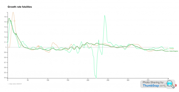
In the meantime, these graphs show fatalities per million population for UK, Portugal and Sweden and the associated growth rates, which roughly approximate Rt. There is close correlation between all three countries, despite very different restrictions being imposed at very different times. This leads me to conclude that other factors are at play. Seasonality in particular.

There is a great paper here which finds that restrictions have clear impacts, but that more severe restrictions like lockdowns do not create significant additional benefits:
https://onlinelibrary.wiley.com/doi/10.1111/eci.13...
Gassing Station | News, Politics & Economics | Top of Page | What's New | My Stuff