Coronavirus - Data Analysis Thread
Discussion


QuartzDad said:
https://twitter.com/COVID19actuary/status/13468439...
The Continuous Mortality Investigation (CMI) has published its penultimate Mortality Monitor for 2020.
Key points:
- CMI calculates 75,000 excess deaths to 25 December, of which 14,200 are in the second wave.
We've been doing this in the Cure thread. 37.5k of these excess deaths are deaths occurring in the home not from Covid.The Continuous Mortality Investigation (CMI) has published its penultimate Mortality Monitor for 2020.
Key points:
- CMI calculates 75,000 excess deaths to 25 December, of which 14,200 are in the second wave.
QuartzDad said:
https://twitter.com/COVID19actuary/status/13468439...
The Continuous Mortality Investigation (CMI) has published its penultimate Mortality Monitor for 2020.
Key points:
- CMI calculates 75,000 excess deaths to 25 December, of which 14,200 are in the second wave.
Interesting. The Continuous Mortality Investigation (CMI) has published its penultimate Mortality Monitor for 2020.
Key points:
- CMI calculates 75,000 excess deaths to 25 December, of which 14,200 are in the second wave.
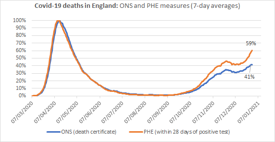
This graph overlays weekly COVID deaths as reported by PHE and ONS. The ONS numbers are 'due to COVID' and the PHE ones are deaths within 28 days of a positive test. I have also added an ONS 'excess deaths' line which is the number of additional deaths in 2020 compared to the population adjusted average for 2015-2019. All three are on the same scale.
If you click on the image it will take you to datawrapper where you can highlight each curve and pick out individual numbers:

PHE data, indicates the second wave is just over half the height of the first and much broader
ONS data increases the first wave, but reduces the second wave, so the difference is around 70/30
This differential increases to 80/20 for 'excess deaths'.
So the apparent severity of this second wave varies considerably depending on the metrics used.
The ONS 'excess death' differential closely matches the CMI one.
The weekly vaccination stats are out, they cover the week up to Sunday 3rd Jan.
England did 327,000, can't find any updates from the other nations.
EDIT: Difficult to draw comparisons between two weeks data impacted by bank holidays however
w/c 20 Dec: 44,000 per day assuming 6 days exc. 25th
w/c 27 Dec: 65,000 per day assuming 5 days exc. 28th and 1st
which is a 48% increase in capacity. A long way to go to reach 2m a week.
https://www.england.nhs.uk/statistics/statistical-...
Edited by QuartzDad on Thursday 7th January 10:32
Edited by QuartzDad on Thursday 7th January 10:45
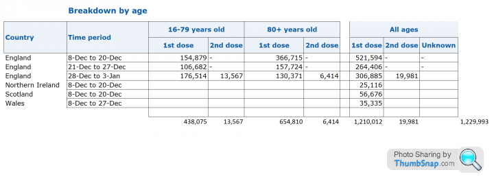
1. It looks like the data.gov.uk figures have omitted (by mistake?) the 2nd dose figures. The NHS stats site has the data so this English figure from gov.uk is missing 20k doses:
2. The Northern Ireland data now published on gov.uk has 9k fewer doses in the first two weeks than was announced by the NI NHS press release. Scotland and Wales have 143 and 208 more doses than previously published.
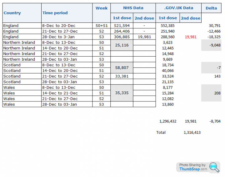
2. The Northern Ireland data now published on gov.uk has 9k fewer doses in the first two weeks than was announced by the NI NHS press release. Scotland and Wales have 143 and 208 more doses than previously published.
Interesting figures from our local hospital, we were running at around 16 patients over xmas. It then jumped by 9 in one day was steady for two days and then jumped by another 9 and levelled off again. Either the way this virus works is very strange indeed or they are importing cases from elsewhere. I wonder if these transfers are counted as new admittances even though they have come from another hospital/ area. Meh answered my own question, after running at around 3 or 4 a day the admittances jumped to 11 and 9 on those two days.
If they are counting transfers as new admittances you can add those to people who caught it in hospital and those who are admitted for another reasons but are + for covid even if they are showing no symptoms. I just do not believe any of these figures anymore they are all just utter bulls t.
t.
If they are counting transfers as new admittances you can add those to people who caught it in hospital and those who are admitted for another reasons but are + for covid even if they are showing no symptoms. I just do not believe any of these figures anymore they are all just utter bulls
t.Todays data:
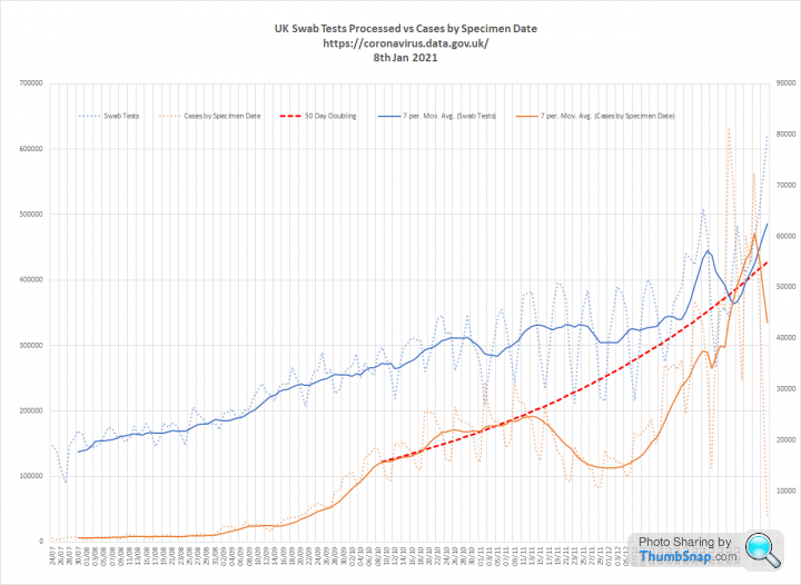
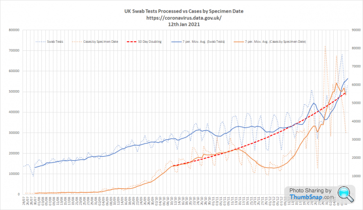
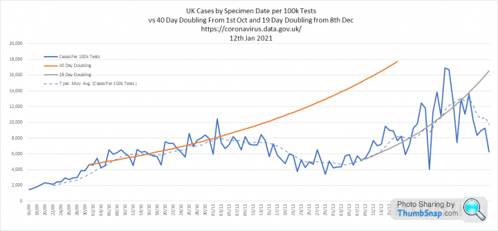
1. Tests and Cases - Big milestone today the first report of 600k plus tests processed in a single day. No disease has every been so relentless hunted. Total tests now stands at a truly incredible 56 million. Cases seem to be continuing on the trend they followed prior to the Nov 5th lockdown. Shown as a 50 day doubling since early Oct:
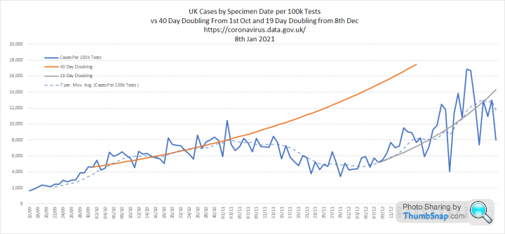
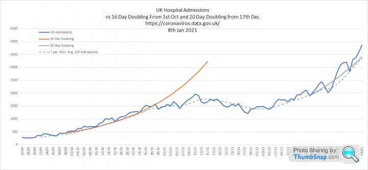
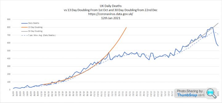
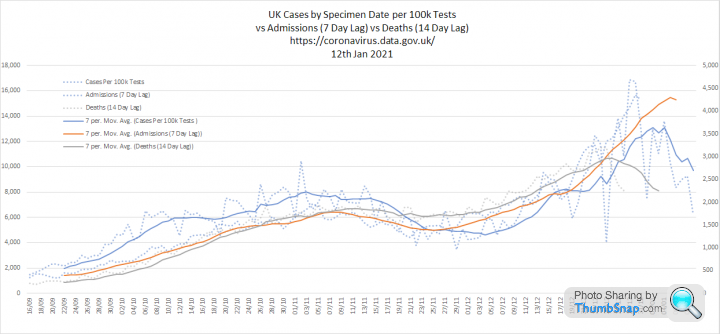
2. Cases per 100k tests, admissions and deaths. I have added trend lines to see how fast these are now growing. Cases have followed a 19 day doubling. Admissions are a bit bumpy, but seem to be on a 20 day doubling. Deaths are doubling every 30 days:
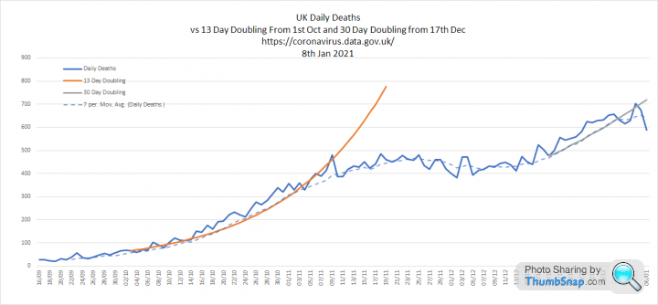
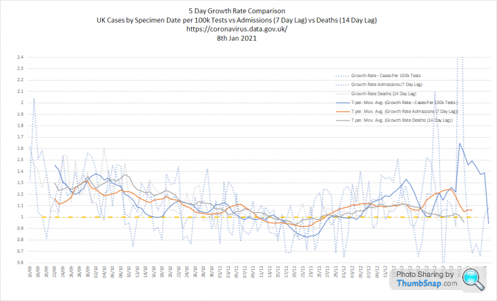
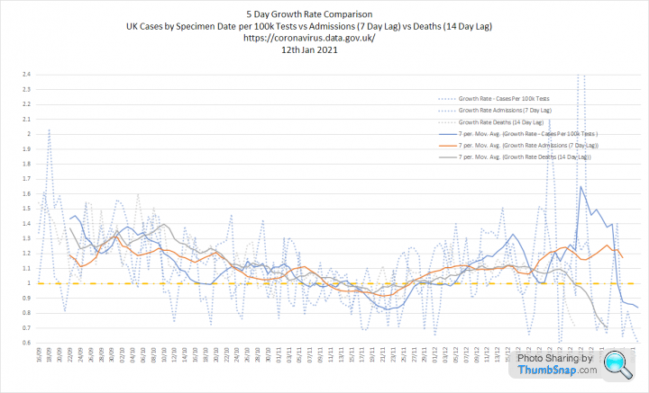
3. All three metrics overlaid with growth rates. Growth rate of cases is very volatile, but it suggests Rt of around 1.2-1.3 right in the centre of the SAGE estimate.

1. Tests and Cases - Big milestone today the first report of 600k plus tests processed in a single day. No disease has every been so relentless hunted. Total tests now stands at a truly incredible 56 million. Cases seem to be continuing on the trend they followed prior to the Nov 5th lockdown. Shown as a 50 day doubling since early Oct:
2. Cases per 100k tests, admissions and deaths. I have added trend lines to see how fast these are now growing. Cases have followed a 19 day doubling. Admissions are a bit bumpy, but seem to be on a 20 day doubling. Deaths are doubling every 30 days:
3. All three metrics overlaid with growth rates. Growth rate of cases is very volatile, but it suggests Rt of around 1.2-1.3 right in the centre of the SAGE estimate.
Interesting Twitter thread that puts paid to the "it's just flu" bks.
https://mobile.twitter.com/jburnmurdoch/status/134...
ks.https://mobile.twitter.com/jburnmurdoch/status/134...
Shame to see this thread moving down the rankings.
I have been interested to follow some posters talking about cases levelling off, particularly via the Zoe app and other data sources.
We should pick up the weekend lag slack (careful how you say that) today. Are we expecting some big headline grabbing numbers as the gaps are filled in? Will the data today help confirm a downward trend I am hoping we are now looking at.
Interested to see the PH analysis today so bumping the thread.
The ZOE data appears to show the start of a reduction in cases of around 3% per day at the moment, this would coincide with a plateuing of the daily reported infections. Fingers crossed this is the start of a downward trend in daily infections with hospitalisations and deaths to follow in short order.
The Govt website now includes positivity data for English regions (proportion of positive tests / number of people tested). This is equivalent to the cases per 100k tests figure I have graphed previously. As it cancels out increases in testing volumes changes in positivity can be a good indicator of changes in prevalence.
This graph shows positivity for each region throughout the epidemic alongside the overall positivity for 'england', which serves as an average:

This version focuses on the data since 1st Oct 2020:

If you click on the graphs they will open in Datawrapper, where you can mouseover for data or highlight particular regions.
The three regions with lowest positivity in Autumn (East of England, South East and London) are now the highest.
Similarly, the three regions with the highest positivity in Oct and Nov show relative small post lockdown surges (Yorkshire, North West and North East)
Interesting to see that London crossed the 'average' on Nov 15th. South East and East of England followed around 5th and 10th Dec respectively. So most of the growth we have seen in these regions must have started during the previous lockdown and not when they moved to the new tier system.
Most regions show positivity growth flattening off at the beginning of January. However, this data set ends 6th Jan, so some of this may be reporting lag
This graph shows positivity for each region throughout the epidemic alongside the overall positivity for 'england', which serves as an average:
This version focuses on the data since 1st Oct 2020:
If you click on the graphs they will open in Datawrapper, where you can mouseover for data or highlight particular regions.
The three regions with lowest positivity in Autumn (East of England, South East and London) are now the highest.
Similarly, the three regions with the highest positivity in Oct and Nov show relative small post lockdown surges (Yorkshire, North West and North East)
Interesting to see that London crossed the 'average' on Nov 15th. South East and East of England followed around 5th and 10th Dec respectively. So most of the growth we have seen in these regions must have started during the previous lockdown and not when they moved to the new tier system.
Most regions show positivity growth flattening off at the beginning of January. However, this data set ends 6th Jan, so some of this may be reporting lag
165,844 doses given yesterday, a weekly rate of 1.16m/week, down from 1.19m last week.
Number of doses given per 1000 people yesterday:
NI 3.98
Eng 2.46
Sco 2.32
Wal 1.66
Assuming the split of the 15m people in the top 4 priority cohorts is the same across the nations, % who have received at least one dose:
NI 19.8%
Eng 16.5%
Sco 14.4%
Wal 12.9%
Number of doses given per 1000 people yesterday:
NI 3.98
Eng 2.46
Sco 2.32
Wal 1.66
Assuming the split of the 15m people in the top 4 priority cohorts is the same across the nations, % who have received at least one dose:
NI 19.8%
Eng 16.5%
Sco 14.4%
Wal 12.9%
Edited by QuartzDad on Tuesday 12th January 17:47
Update of my graphs based on todays data.
1. Cases and tests. Still looking as if we are in line with the pre lockdown path.
2. Cases per 100k Tests, Admissions and Deaths. There are some encouraging signs that cases peaked around 2nd Jan:

3. Three metrics overlaid with growth rates. This still shows a clear relationship between cases per 100k tests and the other measures. It suggests that we may see admissions peak now, but that deaths will probably grow for another week. Unfortunately, if correct, this means that we may get close to a peak of 1000 deaths per day. We are currently at 799 on the 7th and 8th of Jan:
1. Cases and tests. Still looking as if we are in line with the pre lockdown path.
2. Cases per 100k Tests, Admissions and Deaths. There are some encouraging signs that cases peaked around 2nd Jan:
3. Three metrics overlaid with growth rates. This still shows a clear relationship between cases per 100k tests and the other measures. It suggests that we may see admissions peak now, but that deaths will probably grow for another week. Unfortunately, if correct, this means that we may get close to a peak of 1000 deaths per day. We are currently at 799 on the 7th and 8th of Jan:
Elysium said:
That data is regularly misinterpreted.
It is simply showing where people have been prior to catching COVID, not where they caught it.
Since supermarkets are one of the very few places people can go, it should be no surprise they are at the top of that chart.
It also relies on an honest response. There isn’t a section for “socialising inside when I shouldn’t have been”. It is simply showing where people have been prior to catching COVID, not where they caught it.
Since supermarkets are one of the very few places people can go, it should be no surprise they are at the top of that chart.
Sheepshanks said:
Why no daily numbers today?
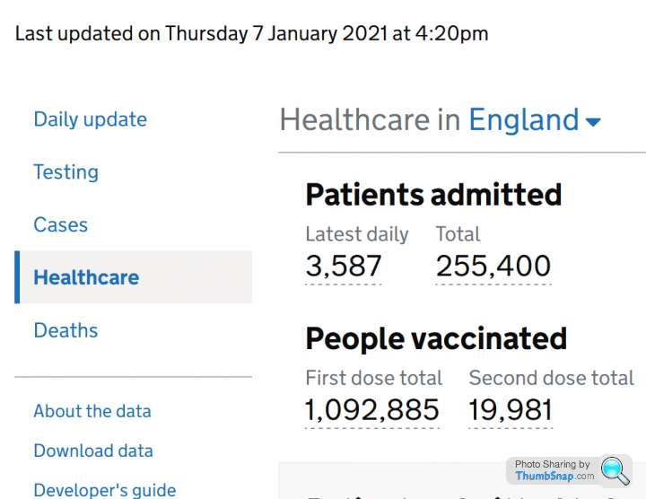
An issue with processing the death data.To show how poor the government website is, the banner is not visible on the front page, but is displayed when you click a sub category...
https://coronavirus.data.gov.uk/
Gassing Station | News, Politics & Economics | Top of Page | What's New | My Stuff