McLaren Sports Series (updated with new pics)
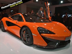
No more teasers - this is actually the 570S in all its glory!
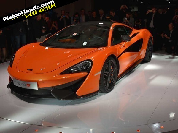
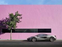
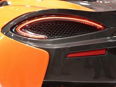
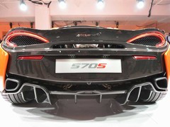
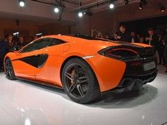
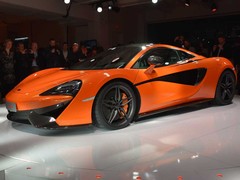
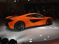
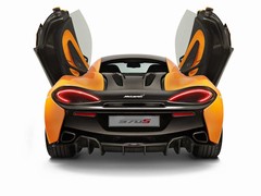
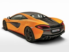
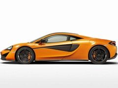
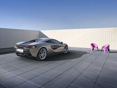
Given we've spent so long waiting to see the 570S, it's seems appropriate to begin with the styling. McLaren says it shows "evolution" of its design direction, with the front deliberately evoking the 650S and P1 but apparently "sharpened further." There's a great focus on airflow and aero, with everything from the bonnet to the flying buttresses via the intakes designed to ensure the smoothest flow of air around the car. McLaren says the appearance is "unique and striking" - it's certainly that, but it's arguably also the most challenging of the McLaren designs thus far. Still, we're not the ones spending £145,000 on a 570S...
It's powered by an evolution of the 3.8-litre twin-turbo V8 familiar to other McLarens but with 30 per cent of the components unique to this installation. The Seamless Shift Gearbox dual-clutch is the only transmission option. With 570hp at 7,400rpm and 443lb ft at 5,000-6,500rpm, McLaren says the 570S is capable of 0-62mph of 3.2 seconds, 124mph in 9.5 seconds and 204mph. Quick, then. For what it's worth, CO2 and fuel economy are officially rated at 258g/km and 25.5mpg.
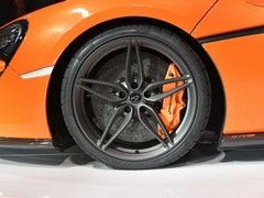
But there's another notable number associated with the 570S, and that's the weight. Alright, so 1,313kg is a dry weight with lightweight options but then a 458 Speciale has a comparable figure of 1,290kg. Carbon ceramic brakes are standard, as are Pirelli P Zero Corsa tyres. They're 225/35/R19 on the front and 285/35/R20 at the back. Interestingly the first Sports Series model doesn't use McLaren's ProActive Chassis Control. It has independent adaptive dampers but also anti-roll bars front and rear which cars with PACC do without. It retains the Normal, Sport and Track modes for both the handling and powertrain though.
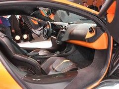
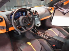
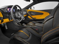
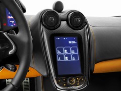
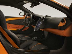
Inside there's McLaren's IRIS touchscreen infotainment system on a floating centre dash plus a few displays and details clearly inspired by the Super and Ultimate Series cars. Interior customisation is also being strongly pushed by McLaren, with Alcantara, Nappa leather and carbon fibre available for nearly here, there and everywhere. If that's too much choice, the 'By McLaren' interior specifications are there to "best showcase the stylish cabin space and coordinate with each exterior paint colour." That definitely sounds like a Ron idea...
That's it for the time being on the McLaren 570S, but it's a great deal more than we've seen previously. Expect even more when the world actually sees the smallest McLaren sometime tomorrow.
I love McLaren but I think this somehow manages to be both fussy and plain at the same time. My first thoughts were that it looked a bit like a car from the Burnout games. Not necessarily a bad thing but it doesn't look anything like a £145k+ car, I'm sure it drives like one though. Then again I was of a similar opinion about the 650s until I saw one in the flesh.
Will be very interesting to see how this drives versus it's rivals.
This is a car that I could actually own at some point in the future, once depreciation has done its work, so I'm far more excited about it than any hypercar.
I like the sparse interior too - it's a statement of intent that it's focused on the driving.
It looks quite good value for money but I guess the options will rack that up quite quickly.
It will be interesting to see what the journo's think of the "standard" suspension this has compared to the interlinked fancy suspension on the MP4 12C and 650S; they have always not fully warmed to from what I have read.
Interior looks a little cheap to me in that shot.
Exterior looks lovely in silver.
 d child of barn work and the old Korean style. Not sure why they ditched the usual interlinked suspension for a traditional one. Thought that was a signature McLaren feature...
I Agree, the interior does look a little Spartan, but im sure it will do everything and more I realistically want from a car like this. Sure it will look better in person, and without Orange. Shall we just go driving?!
well done McLaren, im bored of Negativity!
Personally I'd take the McLaren every time.
- It looks like a proper supercar (ok that may be the reason some might not choose it)
- It won't get mistaken for a lower model
- There will be less of them around
- It is less likely to get keyed by some Porsche hater
- Porsche feels like the default choice - it's good to be different
- Better residuals (if that matters?)
- when the Carrera goes Turbo, will the 911T lose it's edge?
It is a cacophony of forms going all over the place, and the Interior aghh, it looks like a Chevy Bolt collided with a Ferrari.
The quality of execution looks like it has taken a back seat as well.
Sorry not my thang.
I do like the 650 S and LT very much but at £250k - £300k they're just not worth it to me and I'd rather have a 458 Coupe or a manual 430 Coupe if I were in the market for a 2 seat mid engined coupe.

I Agree, the interior does look a little Spartan, but im sure it will do everything and more I realistically want from a car like this. Sure it will look better in person, and without Orange. Shall we just go driving?!
well done McLaren, im bored of Negativity!
Matt
Matt
There are some pictures out there of the interior of the grey car in Cream leather, looks more successful that the black and yellow interior in the article...

More high res stuff here...
http://www.netcarshow.com/mclaren/2016-570s_coupe/
ps. The strange bullet on the dash top is apparently the front center speaker of the B&W premium 12 speaker stereo
Gassing Station | General Gassing | Top of Page | What's New | My Stuff

