Hello PHers and welcome to your new look forums!
Discussion


TooMany2cvs said:
Likewise. It's similar to what we've always had, but cleaner and more modern less ancient.
Testing'd be nice, sure - there's obviously some browser-compatibility wrinkles going on, as well as a few other little bits, but on the whole, it's really not that bad. It's a step forward without being a radical change.
It's almost certainly just one step towards the end position, with a solid base skin properly extracted from the underlying functionality - so that the skin can then have options or be tailored more easily.
Indeed. Testing'd be nice, sure - there's obviously some browser-compatibility wrinkles going on, as well as a few other little bits, but on the whole, it's really not that bad. It's a step forward without being a radical change.
It's almost certainly just one step towards the end position, with a solid base skin properly extracted from the underlying functionality - so that the skin can then have options or be tailored more easily.

I really hope the devs are coding this in such a way that actual skins (in the industry-wide accepted sense of the concept rather than what we had before) are trivial to add at a later date.
In the modern age, all a skin should be is a different CSS file.
TheOversteerLever said:
Why don't you just invest in some new forum software, rather than continue to piss about with it?
That's like saying "why don't you just move house rather than fixing that leaky roof?" or "why don't you just buy a new car rather than fixing the squeaky shock absorber?"ClockworkCupcake said:
TheOversteerLever said:
Why don't you just invest in some new forum software, rather than continue to piss about with it?
That's like saying "why don't you just move house rather than fixing that leaky roof?" or "why don't you just buy a new car rather than fixing the squeaky shock absorber?"Old software can be an arse with old upotimised spaghetti code and restrictive features. New software can be very powerful, especially when adding new features, can perform better, and most importantly, be as secure as possible.
I much, much prefer this new look to the old one though.
rampageturke said:
I don't know how old this forum software actually is.
You see how at the bottom of the page it says "Copyright PistonHeads 1998-2017"? That's a fair indication. 
I joined PH in August 2001 and it had already been running for a year or so. The code has grown organically in that time - ie. probably a bit of a mess.
As we've discussed several times already on this thread, a migration to a new off-the-shelf forum platform would not be a trivial task, and would also involve big up-front investment for only a long-term gain. Fixing what you have is always quicker and cheaper in the short term (but not the long term).

rampageturke said:
ClockworkCupcake said:
TheOversteerLever said:
Why don't you just invest in some new forum software, rather than continue to piss about with it?
That's like saying "why don't you just move house rather than fixing that leaky roof?" or "why don't you just buy a new car rather than fixing the squeaky shock absorber?"Old software can be an arse with old upotimised spaghetti code and restrictive features. New software can be very powerful, especially when adding new features, can perform better, and most importantly, be as secure as possible.
I much, much prefer this new look to the old one though.
 t!
t!To those whining about the bold topics..
This is standard practice in most forum software I've ever used - it serves to highlight unread threads, and likewise if there are any new contributions to an already browsed thread.
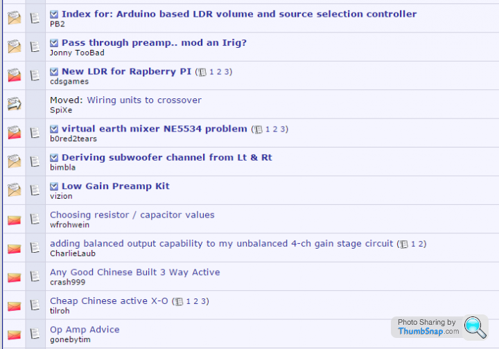
For example - this screenshot is from vBulletin - very popular board software.
Excuse me if I have missed the point.
This is standard practice in most forum software I've ever used - it serves to highlight unread threads, and likewise if there are any new contributions to an already browsed thread.
For example - this screenshot is from vBulletin - very popular board software.
Excuse me if I have missed the point.
TonyRPH said:
To those whining about the bold topics..
This is standard practice in most forum software I've ever used - it serves to highlight unread threads, and likewise if there are any new contributions to an already browsed thread.
For example - this screenshot is from vBulletin - very popular board software.
Excuse me if I have missed the point.
Maybe it is common for that type of forum but to me the text looks too stolid and too much white spaceThis is standard practice in most forum software I've ever used - it serves to highlight unread threads, and likewise if there are any new contributions to an already browsed thread.
For example - this screenshot is from vBulletin - very popular board software.
Excuse me if I have missed the point.
PH used to be better than that

however PH does seem to be working now and doesnt have the crazy screen redrawing
Browsing on mobile (Android / Opera) the visuals are ok, but the last visit fkup is REALLY ANNOYING!
I am continually scrolling up to find the last post I read - sometimes it's several pages prior to where the link takes you.
 Will the devs confirm that they even admit this is a problem?
I think one reason people get angry is the almost total lack of feedback - I'm afraid that I will keep boring people by reporting this REALLY ANNOYING bug every day or so until the code monkeys at least admit they know about it.
kup is REALLY ANNOYING!I am continually scrolling up to find the last post I read - sometimes it's several pages prior to where the link takes you.
Will the devs confirm that they even admit this is a problem?I think one reason people get angry is the almost total lack of feedback - I'm afraid that I will keep boring people by reporting this REALLY ANNOYING bug every day or so until the code monkeys at least admit they know about it.
rscott said:
It's called change - some don't seem to cope well with it....
I don`t care one way or the other if they change something. I`ll just get used to it. My issue with this font / colour scheme is it makes my eyes ache after several minutes ! Seriously, I have to close the window as I can feel my eyes starting to hurt. I`m not moaning for the sake of it, I`m moaning because I can`t read it !

yellowjack said:
thebraketester said:
xjay1337 said:
thebraketester said:
xjay1337 said:
I can live with the look but the quotes do need sorting.
They are broken currently (were not before).
The "bubble" format is hard to read.
Say what?They are broken currently (were not before).
The "bubble" format is hard to read.

Wh00sher said:
I don`t care one way or the other if they change something. I`ll just get used to it.
My issue with this font / colour scheme is it makes my eyes ache after several minutes ! Seriously, I have to close the window as I can feel my eyes starting to hurt. I`m not moaning for the sake of it, I`m moaning because I can`t read it !
I'm in 100% agreement with Wh00sher.My issue with this font / colour scheme is it makes my eyes ache after several minutes ! Seriously, I have to close the window as I can feel my eyes starting to hurt. I`m not moaning for the sake of it, I`m moaning because I can`t read it !
Edited by Adenauer on Wednesday 26th April 12:24
Doofus said:
We're up to 54 pages of mutterings now, and I ain't going to wade through all that, so can somebdoy explain the colours to me please?
You could, however, just read back a page or so though, surely?Edit: Posted this morning only a few hours ago:
miniman said:
Blue and purple are the standard colours for visited and unvisited pages. Purple indicates you've previously visited that page. Bold indicates there's a new post in that thread since your last visit. Bold purple indicates that there's a new post in a thread that you have visited.
Edited by ClockworkCupcake on Wednesday 26th April 12:23
miniman said:
Blue and purple are the standard colours for visited and unvisited pages. Purple indicates you've previously visited that page. Bold indicates there's a new post in that thread since your last visit. Bold purple indicates that there's a new post in a thread that you have visited.
So what's the significance of no purple bit is a thread on "My Stuff"?If it's in My Stuff, I've posted in the thread. So if nothing else, the page on which I posged should be purple, possibly bold purple, but not all blue, surely?

Gassing Station | Website Feedback | Top of Page | What's New | My Stuff