Hello PHers and welcome to your new look forums!
Discussion


funkyrobot said:
I'm sure we have had this.
However, anyone else noticing that if someone quotes one of your posts, it doesn't appear with a blue background? Really annoying when trying to look back over threads and see if anyone has replied to you.
Yes, same for me. Chrome on an iMac.However, anyone else noticing that if someone quotes one of your posts, it doesn't appear with a blue background? Really annoying when trying to look back over threads and see if anyone has replied to you.
funkyrobot said:
I'm sure we have had this.
However, anyone else noticing that if someone quotes one of your posts, it doesn't appear with a blue background? Really annoying when trying to look back over threads and see if anyone has replied to you.
Yes... Doesn't do it for me either. This is a useful feature from a discussion point of view However, anyone else noticing that if someone quotes one of your posts, it doesn't appear with a blue background? Really annoying when trying to look back over threads and see if anyone has replied to you.

Dr Interceptor said:
funkyrobot said:
I'm sure we have had this.
However, anyone else noticing that if someone quotes one of your posts, it doesn't appear with a blue background? Really annoying when trying to look back over threads and see if anyone has replied to you.
Yes... Doesn't do it for me either. This is a useful feature from a discussion point of view However, anyone else noticing that if someone quotes one of your posts, it doesn't appear with a blue background? Really annoying when trying to look back over threads and see if anyone has replied to you.
Click on user name then see what he's been posting in other threads
Used to be highlighted clearly in yellow background
I used your user name - this was the first post I found

Weird!!!
Speed 3 said:
tobinen said:
Anyone else experiencing text loading, then disappearing, then loading? Firefox browser FWIW.
Nope, fine on Safari / Mac. I gave up on Firefox a while back, used to be good but has lost ground significantly to Safari/Chrome.Not sure if it's been mentioned before, but going to threads even for the first time is sometimes dropping me below a last read line.
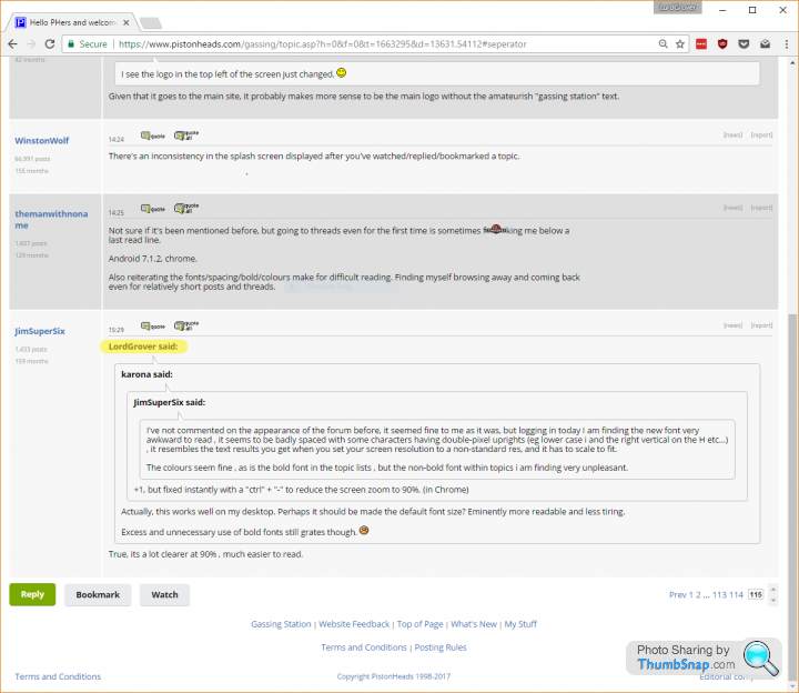
Android 7.1.2, chrome.
Also reiterating the fonts/spacing/bold/colours make for difficult reading. Finding myself browsing away and coming back even for relatively short posts and threads.
Edit for autocorrect being harsher than me.
thanks
themanwithnonam
e
Android 7.1.2, chrome.
Also reiterating the fonts/spacing/bold/colours make for difficult reading. Finding myself browsing away and coming back even for relatively short posts and threads.
Edit for autocorrect being harsher than me.
thanks
themanwithnonam
e
Edited by themanwithnoname on Thursday 27th April 18:25
LordGrover said:
karona said:
JimSuperSix said:
I've not commented on the appearance of the forum before, it seemed fine to me as it was, but logging in today I am finding the new font very awkward to read , it seems to be badly spaced with some characters having double-pixel uprights (eg lower case i and the right vertical on the H etc...) , it resembles the text results you get when you set your screen resolution to a non-standard res, and it has to scale to fit.
The colours seem fine , as is the bold font in the topic lists , but the non-bold font within topics i am finding very unpleasant.
+1, but fixed instantly with a "ctrl" + "-" to reduce the screen zoom to 90%. (in Chrome)The colours seem fine , as is the bold font in the topic lists , but the non-bold font within topics i am finding very unpleasant.
Excess and unnecessary use of bold fonts still grates though.

ClockworkCupcake said:
I joined PH in August 2001 and it had already been running for a year or so. The code has grown organically in that time - ie. probably a bit of a mess.
As we've discussed several times already on this thread, a migration to a new off-the-shelf forum platform would not be a trivial task, and would also involve big up-front investment for only a long-term gain. Fixing what you have is always quicker and cheaper in the short term (but not the long term).
Damned newbies coming on here complaining about the code As we've discussed several times already on this thread, a migration to a new off-the-shelf forum platform would not be a trivial task, and would also involve big up-front investment for only a long-term gain. Fixing what you have is always quicker and cheaper in the short term (but not the long term).

It were all fields as far as the eye could see in 2000...and all the better for it. None of this poncy pastel tones and more fonts that you can shake a stick at, and weird quote bubbles.
 HEY DEVELOPERS, if the new quote bubbles are the way to go, how come we still get the olde worlde quote style in preview when replying to a post. How's that for consistency (and evidence the old software's still there lurking about).
I've looked at the font before and after this latest change and the text is condensed by about 14%. A sentence of 108mm in length is now squashed up into 93mm. The thickness of the letters is very slightly narrower and therefore have less body to each letter. The font before this week appeared black on a white or very pale background. The condensed font appears to have less depth of blackness as the letters are slightly thinner. I've compared messages before this week and after to see what the difference is, and it's quite significant. Together with the pale background colours and the muted blue text, it will seem more difficult to read for some, me included.
The designers didn't appear to think about contrast and ease of reading. I can fully understand why there have been numerous complaints about the new appearance and eye strain. The new layout is (IMHO) awful!
The designers didn't appear to think about contrast and ease of reading. I can fully understand why there have been numerous complaints about the new appearance and eye strain. The new layout is (IMHO) awful!
SAB888 said:
I've looked at the font before and after this latest change and the text is condensed by about 14%. A sentence of 108mm in length is now squashed up into 93mm. The thickness of the letters is very slightly narrower and therefore have less body to each letter. The font before this week appeared black on a white or very pale background. The condensed font appears to have less depth of blackness as the letters are slightly thinner. I've compared messages before this week and after to see what the difference is, and it's quite significant. Together with the pale background colours and the muted blue text, it will seem more difficult to read for some, me included.
The designers didn't appear to think about contrast and ease of reading. I can fully understand why there have been numerous complaints about the new appearance and eye strain. The new layout is (IMHO) awful!
Agreed the same sThe designers didn't appear to think about contrast and ease of reading. I can fully understand why there have been numerous complaints about the new appearance and eye strain. The new layout is (IMHO) awful!
 te happens in the News but Jack and his merry band state (wrongly) "Our font weight is generic to other weights used online."
https://www.pistonheads.com/gassing/topic.asp?h=0&...
Frankly their attitude amazes me - why would any intelligent person make it harder to read ?
Come on Pistonheads.....
So I reported earlier that going to some threads would dump you under a 'last visited' line..... well now I seem to get dropped at the top of a page no matter what.
Also, some threads (this one for example) no longer has a go to last thread button....
ETA: Win10, Chrome
Also ETA: I don't understand why the purple link still.... its a thread I've obviously read, given its in my watch list but then all the other threads in that list are the same.... just seems, unneeded.
Edited by themanwithnoname on Thursday 27th April 23:04
Gassing Station | Website Feedback | Top of Page | What's New | My Stuff