Forums Look Like a School Project
Discussion


hornetrider said:
Show me What's New or My Stuff.
So no major complaints about the two pages I captured? I'm sure they're most visited pages for pretty much every user. Why not take your own screen captures and highlight what's wrong?
Only issue I can see with both is the topic title is wrapped for no apparent reason.
Edited by rscott on Thursday 9th July 15:24

rscott said:
hornetrider said:
Show me What's New or My Stuff.
So no major complaints about the two pages I captured? I'm sure they're most visited pages for pretty much every user. 
hornetrider said:
rscott said:
hornetrider said:
Show me What's New or My Stuff.
So no major complaints about the two pages I captured? I'm sure they're most visited pages for pretty much every user. Bear in mind that they need to get support for mobile working properly pretty urgently as the old mobile site is all but dead.
Has it gone live? Want a list?
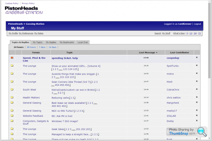
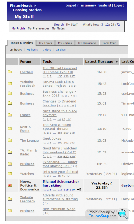
Vertical alignment on the tables is still all over the place - My Stuff is all top aligned, but What's New and the subject folders are a horrid mish-mash of up and down. e.g. Username top, everything else bottom:

The brackets and the 'dot, dot, dot' of the page links are underlined but are not links.
Fonts vary, some are Verdana by the look of it, some are not:

I assume we are sticking with the cellspacing (my pet hate) and having everything different widths?
Edited by grumbledoak on Friday 10th July 12:58
grumbledoak said:
Has it gone live? Want a list?
Vertical alignment on the tables is still all over the place - My Stuff is all top aligned, but What's New and the subject folders are a horrid mish-mash of up and down. e.g. Username top, everything else bottom:
The brackets and the 'dot, dot, dot' of the page links are underlined but are not links.
Fonts vary, some are Verdana by the look of it, some are not:
I assume we are sticking with the cellspacing (my pet hate) and having everything different widths?
Weirdly, I only see the usernames out of alignment when using IE. It's fine in Chrome & Firefox.Vertical alignment on the tables is still all over the place - My Stuff is all top aligned, but What's New and the subject folders are a horrid mish-mash of up and down. e.g. Username top, everything else bottom:
The brackets and the 'dot, dot, dot' of the page links are underlined but are not links.
Fonts vary, some are Verdana by the look of it, some are not:
I assume we are sticking with the cellspacing (my pet hate) and having everything different widths?
Edited by grumbledoak on Friday 10th July 12:58
hornetrider said:
RacingPete said:
Right, we have had internal discussions - and we are going to do the release today, but still allow you to switch for the moment.
Have a look, feedback to us, on this next iteration (by the way we are moving out of Beta and going to GTI - all those on Beta2 will automatically be moved to GTI [well we are just renaming it so it isn't exactly a migration]).
Ok thanks Pete and will do Have a look, feedback to us, on this next iteration (by the way we are moving out of Beta and going to GTI - all those on Beta2 will automatically be moved to GTI [well we are just renaming it so it isn't exactly a migration]).

What's New and My Stuff just look 'wrong'. The column widths are all over the place, which causes problems with text spacing and column graphics looking broken.
Also, columns are in a different order for the two views.
My Stuff has; Forum, Topic, Last Message, Last Contributor
What's New has; Topic, Forum, Posts, Last Message, Last Contributor
There's various formatting which is wrong, fonts are all different with seeming random use of bold... just looks like amateur night. Sorry

Incidentally I've never really noticed that My Stuff and What's New are different to each other on Big Blue as well, but you don't really pick up on it because the fonts are the same and the formatting is tidy so nothing really looks 'out of place' even though they are different.

Gassing Station | Website Feedback | Top of Page | What's New | My Stuff