Only the Brave - Honest Photography Feedback
Discussion


singlecoil said:
Better still, you choose the one you like the best and post just that one.

Forget it. Thanks for your time. I forgot to factor in that most people on PH would rather take the time to be a pedantic arse and start an argument in a deserted phone box than actually say anything worthwhile.
At the risk of sounding banal, I like them all, that's why I took them. I'd like to find ways of making them better, either in PP or in camera. This thread is for photography feedback so people can maybe learn from their betters, isn't it? I don't recall the "One Image Only" restriction in the OP. If you feel that way surely it would have been just as easy to say "The third one is the only one I care about but it needs xxxx" or whatever than just to be a dick arbitrarily? Or maybe, if you can't say anything constructive, just say nothing at all?
Dan_1981 said:
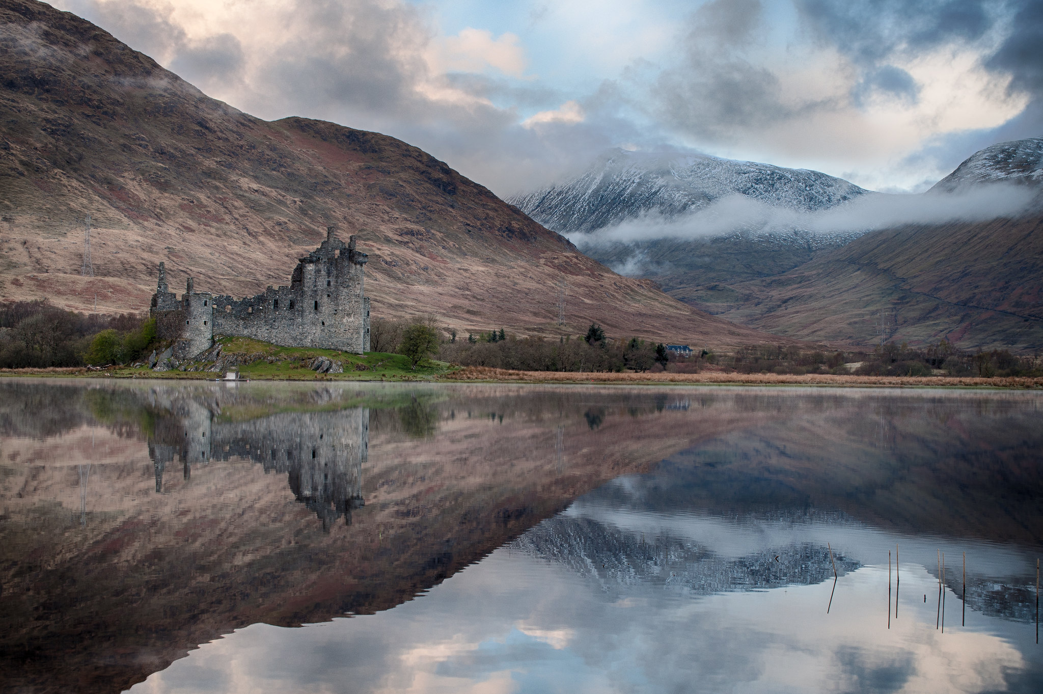
I like this but the reeds in the lake are a bit distracting IMO. I'd also remove the white object (shed?) in front of the castle.The lake looks a bit sloped to me as well.
Tycho said:
I like this but the reeds in the lake are a bit distracting IMO. I'd also remove the white object (shed?) in front of the castle.
The lake looks a bit sloped to me as well.
+1 to all of that - it might one of these you have to make squint to look straight!The lake looks a bit sloped to me as well.
Also the shadows may have been lifted a touch too far - eg the mountainsides - you could maybe add a touch of contrast back.
Generally a stunning capture by the way - I'd be delighted to have that in my Flickr stream

Nik da Greek said:
singlecoil said:
Better still, you choose the one you like the best and post just that one.
Forget it. Thanks for your time. I forgot to factor in that most people on PH would rather take the time to be a pedantic arse and start an argument in a deserted phone box than actually say anything worthwhile.
At the risk of sounding banal, I like them all, that's why I took them. I'd like to find ways of making them better, either in PP or in camera. This thread is for photography feedback so people can maybe learn from their betters, isn't it? I don't recall the "One Image Only" restriction in the OP. If you feel that way surely it would have been just as easy to say "The third one is the only one I care about but it needs xxxx" or whatever than just to be a dick arbitrarily? Or maybe, if you can't say anything constructive, just say nothing at all?

One of the problems of posting a lot of pictures at once is that usually there won't be any input from the poster on the circumstances of the picture taking, the problems you faced, what you were trying to achieve or what post processing you tried. Without that sort of info it's not really possible to give a detailed opinion on what might have worked better.
There's a local horticultural show next month and one of the competition categories is "Photo taken in the countryside". I wanted to do something recognisably local and fancied getting a sunset shot over the landmark church with the bales in the foreground. The first evening I went down there was no sunset due to clouds and the next evening (which is when I got this shot) there still wasn't much sun getting through and most of the bales had been removed.
So I did what I could, set up on a tripod and took some pictures for a Lightroom HDR. Always difficult to know how other people will see things so thought I would post it here from some reactions.
 St Mary's Church by Elliott and Nolan, on Flickr
So I did what I could, set up on a tripod and took some pictures for a Lightroom HDR. Always difficult to know how other people will see things so thought I would post it here from some reactions.
St Mary's Church by Elliott and Nolan, on FlickrDibblyDobbler said:
I would say it is 'ok' - nothing really striking there but not a bad shot. Couple of thoughts - it's maybe been shot a bit too wide as both the bales and the Church seem a bit lost in the frame, also all the interest is bang in the middle which is not necessarily ideal...
Thanks.Fortunately I've plenty of pixels left so have started experimenting with cropping the right hand side in. I knew 'striking' wasn't going to be available to me but most of the people seeing it at the show will recognise it and be able to figure out where it was taken from, so that might sway the voting in my favour (in it to win it)
`
I would say that the makings of a good photo are there, so....
I would probably try to form a foreground pattern with the rolls with the church/village in the background.
Now this is important: you need to fill the frame with interesting stuff. Sky is ok if it's lovely, and a field is ok if there's something interesting about it.
Maybe have a dog walker crossing into the frame?
Good luck!
From my first music festival, Scare Taxi at Stradisphere two weeks ago

Quite challenging really. People move in unpredictable ways. During the day the light was meh. In the evening the acts were rarely in the best lighting. I dislike flash!
Really enjoyed it though, and would love to do it again.

Quite challenging really. People move in unpredictable ways. During the day the light was meh. In the evening the acts were rarely in the best lighting. I dislike flash!
Really enjoyed it though, and would love to do it again.
singlecoil said:
Thanks.
Fortunately I've plenty of pixels left so have started experimenting with cropping the right hand side in. I knew 'striking' wasn't going to be available to me but most of the people seeing it at the show will recognise it and be able to figure out where it was taken from, so that might sway the voting in my favour (in it to win it)
`
I had a quick play in Photoshop and I do think there's a deal of untapped potential there with some cropping + adjustments. Personal preference of course Fortunately I've plenty of pixels left so have started experimenting with cropping the right hand side in. I knew 'striking' wasn't going to be available to me but most of the people seeing it at the show will recognise it and be able to figure out where it was taken from, so that might sway the voting in my favour (in it to win it)
`
DibblyDobbler said:
I would say it is 'ok' - nothing really striking there but not a bad shot. Couple of thoughts - it's maybe been shot a bit too wide as both the bales and the Church seem a bit lost in the frame, also all the interest is bang in the middle which is not necessarily ideal...
I agree, but would also add:Highlights in sky are blown and shadows in the woodland need lifting.
Also, needs a bit more punch....
Tony1963 said:
From my first music festival, Scare Taxi at Stradisphere two weeks ago
Quite challenging really. People move in unpredictable ways. During the day the light was meh. In the evening the acts were rarely in the best lighting. I dislike flash!
Really enjoyed it though, and would love to do it again.
Nice shot, works well in Mono. Crop is a tad tight for me....Quite challenging really. People move in unpredictable ways. During the day the light was meh. In the evening the acts were rarely in the best lighting. I dislike flash!
Really enjoyed it though, and would love to do it again.
DibblyDobbler said:
Turn7 said:
I agree, but would also add:
Highlights in sky are blown and shadows in the woodland need lifting.
Also, needs a bit more punch....
Agreed... I cropped, added a whack of contrast + saturation and lifted the shadows a fair chunk. Highlights in sky are blown and shadows in the woodland need lifting.
Also, needs a bit more punch....
Tony1963 said:
From my first music festival, Scare Taxi at Stradisphere two weeks ago
Quite challenging really. People move in unpredictable ways. During the day the light was meh. In the evening the acts were rarely in the best lighting. I dislike flash!
Really enjoyed it though, and would love to do it again.
Here's my thoughts- I don't care for B&W myself, but I know a lot of people do so won't comment on that. The main problem is the lamp half in and half out of chummy's hair. I don't know how many frames you shot but maybe one of the others wouldn't have that issue?Quite challenging really. People move in unpredictable ways. During the day the light was meh. In the evening the acts were rarely in the best lighting. I dislike flash!
Really enjoyed it though, and would love to do it again.
I agree about the light bulb, but there was nothing I could do about that whatsoever. Tried cloning it out, messy.
I could show a colour image, with no bulb in his hair, but then there'd be no real expression on his face, no stance.
I'd liken the experience to photographing a footy match: things are happening quickly, people are moving around, and what's in the viewfinder just behind them often isn't obvious at the time. I could've moved slightly, but then there was a marquee support!
Thankfully I'm better at fixing helicopters
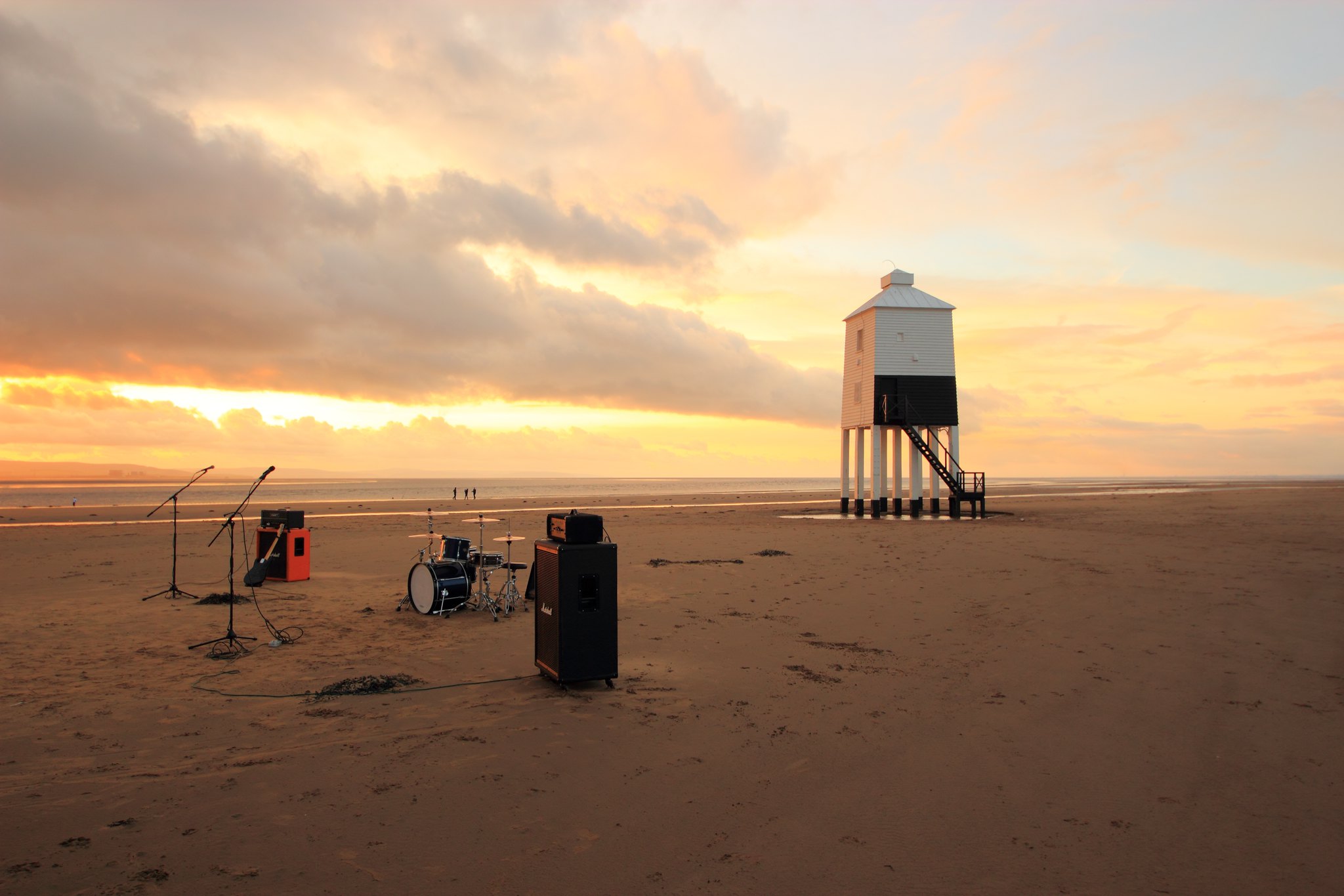
gothatway said:
OK, I'll poke my head inside the lion's den and see how much of it gets bitten off with this one ...
It's an interesting image. A bit of background info would help. Was the situation set up especially for the shot? I'm guessing yes because it doesn't look like a practical set up for a gig. I'm sure that drummer's throne is going to bury itself when he sits on it.In any case, that seaweed could have done with taking out of shot, and the horizon looks to me like it's sloping to the left a bit. It would look more balanced (to me) if it was cropped in from the right. All the above IMO.
singlecoil said:
gothatway said:
OK, I'll poke my head inside the lion's den and see how much of it gets bitten off with this one ...
It's an interesting image. A bit of background info would help. Was the situation set up especially for the shot? I'm guessing yes because it doesn't look like a practical set up for a gig. I'm sure that drummer's throne is going to bury itself when he sits on it.In any case, that seaweed could have done with taking out of shot, and the horizon looks to me like it's sloping to the left a bit. It would look more balanced (to me) if it was cropped in from the right. All the above IMO.
I agree about the seaweed, but I don't have enough post-processing experience to do that with confidence. And I see what you mean about the crop, but I wanted to keep the impression of emptiness (though there is a nuclear power station in the shot !).
Gassing Station | Photography & Video | Top of Page | What's New | My Stuff