Only the Brave - Honest Photography Feedback
Discussion


Craigwww said:
Edited by Craigwww on Tuesday 14th November 12:19
Craigwww said:
I am happy with these, I think they represent what I am trying to achieve in my photography and I would like you guys to give me your honest opinions.
I think that's all that matters really - if you're happy and can say 'Finished' then that's that. FWIW, both to me are snaps that you happened to be looking at with a camera in your hand, and neither represent anything that has 'interest' to me.
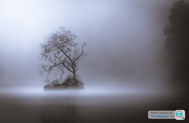
The first - the tree on it's own with the whatever-it-is to the right isnt composed to make it in any way appealing. B+W'ing it to try and add mood actually takes away from it, as it's now another random moody tree. It needed framing differently so that the tree is incidental and adds mood. Ideally you'd have that somewhere around the top left'ish of the frame slightly cropped in and not necessarily sharp, with something more interesting to the bottom right which is telling more of a story.
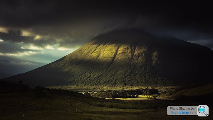
The hill with the sun on it is a nice hill with the sun on it. Not really much else to say about it tbh.
These where taken in the snow storm recently, would love to know which style people think look best and how to improve the as i can keep going back easily (although not in the snow)
I liked the way the snow whited out the back ground but it has the cost of losing sharpness on the bridge, so maybe i should try on a clean day and have the back ground clutter, or ideas? framing etc? or how to improve it in post (lightroom work only so fary, no photoshop)
 _MG_8162 by [url=https://www.flickr.com/photos/134442052@N06/][/url], on Flickr
 _MG_8147 by [url=https://www.flickr.com/photos/134442052@N06/[/url], on Flickr
 _MG_8135 by [url=https://www.flickr.com/photos/134442052@N06/][/url], on Flickr
I liked the way the snow whited out the back ground but it has the cost of losing sharpness on the bridge, so maybe i should try on a clean day and have the back ground clutter, or ideas? framing etc? or how to improve it in post (lightroom work only so fary, no photoshop)
_MG_8162 by [url=https://www.flickr.com/photos/134442052@N06/][/url], on Flickr_MG_8147 by [url=https://www.flickr.com/photos/134442052@N06/[/url], on Flickr_MG_8135 by [url=https://www.flickr.com/photos/134442052@N06/][/url], on Flickrsatans worm said:
These where taken in the snow storm recently, would love to know which style people think look best and how to improve the as i can keep going back easily (although not in the snow)
I liked the way the snow whited out the back ground but it has the cost of losing sharpness on the bridge, so maybe i should try on a clean day and have the back ground clutter, or ideas? framing etc? or how to improve it in post (lightroom work only so fary, no photoshop)
_MG_8147 by justin bowdidge, on Flickr
I prefer the middle one - I think the black and white suits the image, and the framing is better in portrait.I liked the way the snow whited out the back ground but it has the cost of losing sharpness on the bridge, so maybe i should try on a clean day and have the back ground clutter, or ideas? framing etc? or how to improve it in post (lightroom work only so fary, no photoshop)
_MG_8147 by justin bowdidge, on FlickrIt's only my personal opinion but it seems to be lacking in contrast a little, which in Photoshop I'd normally try some curve adjustments to try to create more contrast, particularly in the darker areas. Unfortunately I don't have/know Lightroom so am not sure if this is possible. Another option, which I've used a few times is to use Google's NIK collection of tools which are free to download and available as both Photoshop and Lightroom plugins, so are available to you.
I hope you don't mind, but I had a bit of a play. I tried reducing the noise slightly, then using Google NIK - Silver Effects Pro "High Structure" filter, then slightly sharpened the image.
Personally, I prefer it, but that is just my opinion, and I'm far from expert at this. I'm sure others will have their own ideas and probably do a far better job.
 bridge_update1 by conradsphotos, on Flickr
singlecoil said:
I prefer the colour image. I can't see the point of converting colour to B&W.
Fair point. I think there's cases for both, although to be fair, the colour one does show the rust on the bridge legs far more clearly, as it isn't obvious it is rust in the B&W version.In both the colour and black and white ones though, there's a lack of contrast and obvious detail.
I'd also still stick with the portrait/more vertical crop being better.
I've had a quick go at the colour one as well just to see what came out.
This time, I didn't use any pre-defined filters. Did this in PS, although it's likely similar controls are available in Lightroom.
Initially, slight noise removal.
Then boosted shadows in the shadows/highlights control.
Then use of levels to chop off the top and bottom ends of the histogram (where there was no data anyway), and slightly moved the mid-point to the right.
I then masked the water and lightened it very slightly.
Very slight increase in saturation (only +3 or +4).
Final slight sharpening with unsharp mask (80% and 0.9 pixels).
Again, everyone's opinion is equally valid, and some may or may not like it...
Original:
 _MG_8135 by The legal alien, on Flickr
Edited:
 bridge_update2 by conradsphotos, on Flickr
Edited by C&C on Saturday 10th March 19:10
Nigel_O said:
Speed addicted said:

Shot at 600mm, f6.2 (the only way I'd be shooting them!)
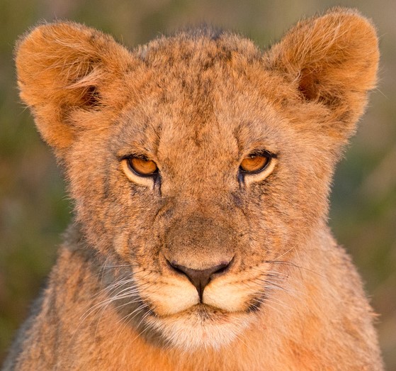
I think it makes the image feel a bit more intimate and looks as though you were closer than you really were
Go on then. From my point of view It's one of the best images I've created but there are some knowledgeable and experienced folks on here so if I can improve then I'm all ears.
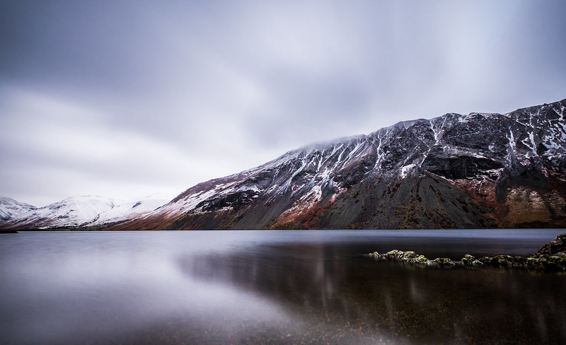 Wastwater screes by northernladgonesouth
Wastwater screes by northernladgonesouth


silobass said:
Wasn't sure if I should remove the people between the board and the jump in this. Any other c&c would be welcome too. Are the steps on the right a bit too distracting?
 Skater by Graham, on Flickr
I didn't see the people or steps until you pointed them out. But by all means take them out, if they're not part of your vision. I really like the strobe balanced with the hint of post-sunset sky in the background, really nice.Skater by Graham, on FlickrIf it were mine, I'd crop out the left side of the pic to create more dynamic tension. The curve-off of the ramp and the vertical julienne grater look really odd. Unless this is a BTS shot of "how I chopped the chronically black skater into tiny slices".
For the honesty part. I'm pretty sure that I have a massively self inflated sense of achievement with my photographs. Even though I accept that they are myopic in their focus and technically average. Sites like Flickr and 500px, both of which I contribute to, are never a good judge of quality, and family and friends are probably just as bad. I can never tell if a photo I like is good because it stands alone as an independent photograph or purely due to the memories that I have associated with that particular moment. Perhaps I'm just a validation w e and even posting in this thread is a vain attempt to seek praise.
I'm an opportunistic photographer who doesn't plan a shoot, I'm there, therefore I photograph. Subject matter is largely irrelevant as long as it has a geometric form once framed. I try to get it right first time, shoot only in JPG and almost never post-process apart from a slight alignment or cropping.
So, up for criticism and comment is my latest upload to Flickr.
Shot at the Chinese Garden of Friendship in Sydney. I love it because it reminds me of a classical oil painting. The water looks oily and dark and there's just enough of the Koi visible to be interesting.
 Oily Fish, on Flickr
e and even posting in this thread is a vain attempt to seek praise. I'm an opportunistic photographer who doesn't plan a shoot, I'm there, therefore I photograph. Subject matter is largely irrelevant as long as it has a geometric form once framed. I try to get it right first time, shoot only in JPG and almost never post-process apart from a slight alignment or cropping.
So, up for criticism and comment is my latest upload to Flickr.
Shot at the Chinese Garden of Friendship in Sydney. I love it because it reminds me of a classical oil painting. The water looks oily and dark and there's just enough of the Koi visible to be interesting.
Oily Fish, on FlickrEdited by RichTT on Sunday 8th April 11:49
RichTT said:
For the honesty part. I'm pretty sure that I have a massively self inflated sense of achievement with my photographs. Even though I accept that they are myopic in their focus and technically average. Sites like Flickr and 500px, both of which I contribute to, are never a good judge of quality, and family and friends are probably just as bad. I can never tell if a photo I like is good because it stands alone as an independent photograph or purely due to the memories that I have associated with that particular moment. Perhaps I'm just a validation we and even posting in this thread is a vain attempt to seek praise.
I'm an opportunistic photographer who doesn't plan a shoot, I'm there, therefore I photograph. Subject matter is largely irrelevant as long as it has a geometric form once framed. I try to get it right first time, shoot only in JPG and almost never post-process apart from a slight alignment or cropping.
So, up for criticism and comment is my latest upload to Flickr.
It does evoke the mood you're after. I particularly like the dissonance between the reflected leaves, and the weeds in the pond. To get it further along, if it were mine the processing would clean up the dust/bubbles, smooth the water, adjust the white balance away from green, deal with the shadow on the fish's face/water bottom left, and take out the distracting grasses to the right. e and even posting in this thread is a vain attempt to seek praise. I'm an opportunistic photographer who doesn't plan a shoot, I'm there, therefore I photograph. Subject matter is largely irrelevant as long as it has a geometric form once framed. I try to get it right first time, shoot only in JPG and almost never post-process apart from a slight alignment or cropping.
So, up for criticism and comment is my latest upload to Flickr.
Edited by RichTT on Sunday 8th April 11:49
Edited by Whoozit on Monday 9th April 21:31
Gassing Station | Photography & Video | Top of Page | What's New | My Stuff