Wrist Check - 2018
Discussion


So said:
Graemsay said:
Not mine. 
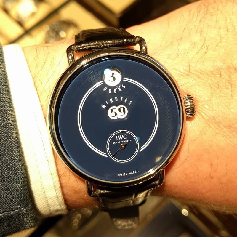
The local IWC boutique had some of the 150th Jubilee Collection on display, and I got a chance to look at the Tribute to Pallweber.
It's gorgeous, and I want one. I probably can't afford it, unfortunately.
That’s one ugly watch.The local IWC boutique had some of the 150th Jubilee Collection on display, and I got a chance to look at the Tribute to Pallweber.
It's gorgeous, and I want one. I probably can't afford it, unfortunately.

So said:
Squadrone Rosso said:
My lovely little Chronoris is getting so overdue wrist time this week 

I was about to point out that beauty is in the eye of the beholder. But you're correct, that is lovely.
Mezzanine said:
So said:
Graemsay said:
Not mine.
The local IWC boutique had some of the 150th Jubilee Collection on display, and I got a chance to look at the Tribute to Pallweber.
It's gorgeous, and I want one. I probably can't afford it, unfortunately.
That’s one ugly watch.The local IWC boutique had some of the 150th Jubilee Collection on display, and I got a chance to look at the Tribute to Pallweber.
It's gorgeous, and I want one. I probably can't afford it, unfortunately.
The lugs appear to be flimsy, bent rod presumably welded to the case.
The lug width is a bit too wide for the strap.
The onion crown is over large, which means it's pressing into the skin on the back of the wearer's hand, even though the wrist is almost straight.
It's gimmicky.
The dial is huge for the size of the display.
The resulting empty space has been filled with a coach stripe akin to one off a 1973 Ford Cortina.
The dial is navy blue. Navy blue is good, but on a watch dial it needs to be used carefully and that hasn't been.
Hours and minutes have been labelled. Why?
The profile of the case is dated.
All-in-all it looks like a novelty piece you'd see in a high street clothes shop in the accessories section.
So said:
Okay, let me be more constructive about why I think that is ugly:
The lugs appear to be flimsy, bent rod presumably welded to the case.
The lug width is a bit too wide for the strap.
The onion crown is over large, which means it's pressing into the skin on the back of the wearer's hand, even though the wrist is almost straight.
It's gimmicky.
The dial is huge for the size of the display.
The resulting empty space has been filled with a coach stripe akin to one off a 1973 Ford Cortina.
The dial is navy blue. Navy blue is good, but on a watch dial it needs to be used carefully and that hasn't been.
Hours and minutes have been labelled. Why?
The profile of the case is dated.
All-in-all it looks like a novelty piece .
I have to say, (ok, I don't have to, but I want to) I agree with all of that. The number font looks like the price signs on a market stall .The lugs appear to be flimsy, bent rod presumably welded to the case.
The lug width is a bit too wide for the strap.
The onion crown is over large, which means it's pressing into the skin on the back of the wearer's hand, even though the wrist is almost straight.
It's gimmicky.
The dial is huge for the size of the display.
The resulting empty space has been filled with a coach stripe akin to one off a 1973 Ford Cortina.
The dial is navy blue. Navy blue is good, but on a watch dial it needs to be used carefully and that hasn't been.
Hours and minutes have been labelled. Why?
The profile of the case is dated.
All-in-all it looks like a novelty piece .

So said:
Okay, let me be more constructive about why I think that is ugly:
The lugs appear to be flimsy, bent rod presumably welded to the case.
The lug width is a bit too wide for the strap.
The onion crown is over large, which means it's pressing into the skin on the back of the wearer's hand, even though the wrist is almost straight.
It's gimmicky.
The dial is huge for the size of the display.
The resulting empty space has been filled with a coach stripe akin to one off a 1973 Ford Cortina.
The dial is navy blue. Navy blue is good, but on a watch dial it needs to be used carefully and that hasn't been.
Hours and minutes have been labelled. Why?
The profile of the case is dated.
All-in-all it looks like a novelty piece you'd see in a high street clothes shop in the accessories section.
This might help you understand the Tribute to Pallweber part of the watch’s name… https://www.bloomberg.com/news/articles/2017-12-14...The lugs appear to be flimsy, bent rod presumably welded to the case.
The lug width is a bit too wide for the strap.
The onion crown is over large, which means it's pressing into the skin on the back of the wearer's hand, even though the wrist is almost straight.
It's gimmicky.
The dial is huge for the size of the display.
The resulting empty space has been filled with a coach stripe akin to one off a 1973 Ford Cortina.
The dial is navy blue. Navy blue is good, but on a watch dial it needs to be used carefully and that hasn't been.
Hours and minutes have been labelled. Why?
The profile of the case is dated.
All-in-all it looks like a novelty piece you'd see in a high street clothes shop in the accessories section.
PJ S said:
So said:
Okay, let me be more constructive about why I think that is ugly:
The lugs appear to be flimsy, bent rod presumably welded to the case.
The lug width is a bit too wide for the strap.
The onion crown is over large, which means it's pressing into the skin on the back of the wearer's hand, even though the wrist is almost straight.
It's gimmicky.
The dial is huge for the size of the display.
The resulting empty space has been filled with a coach stripe akin to one off a 1973 Ford Cortina.
The dial is navy blue. Navy blue is good, but on a watch dial it needs to be used carefully and that hasn't been.
Hours and minutes have been labelled. Why?
The profile of the case is dated.
All-in-all it looks like a novelty piece you'd see in a high street clothes shop in the accessories section.
This might help you understand the Tribute to Pallweber part of the watch’s name… https://www.bloomberg.com/news/articles/2017-12-14...The lugs appear to be flimsy, bent rod presumably welded to the case.
The lug width is a bit too wide for the strap.
The onion crown is over large, which means it's pressing into the skin on the back of the wearer's hand, even though the wrist is almost straight.
It's gimmicky.
The dial is huge for the size of the display.
The resulting empty space has been filled with a coach stripe akin to one off a 1973 Ford Cortina.
The dial is navy blue. Navy blue is good, but on a watch dial it needs to be used carefully and that hasn't been.
Hours and minutes have been labelled. Why?
The profile of the case is dated.
All-in-all it looks like a novelty piece you'd see in a high street clothes shop in the accessories section.

TiggerBits said:
This is a genuine Didun. AP make one similar I believe
If you could afford one, would you have a Didun? I ask myself. And on the photo shown, No, it looks like a cheap knockoff. Nothing wrong with cheap knockoffs, of course. Provided they don't look like a cheap knockoff.

Squadrone Rosso said:
My lovely little Chronoris is getting so overdue wrist time this week
Very nice, I really like that chronoris and considering getting one like that 2nd hand or one of the new models released last year. Went to the Oris 'pop-up' shop in London a couple of weeks back and looked at the new Williams crono one and the more simple Chronoris date, haven't decided which yet...

So said:
AmosMoses said:
Have decided that a 16600 on a nato is perfection to me. That won’t stop me buying something else soon 

Put the bracelet back on, there's a good chap.Good thing we don't all like the same thing though eh?!

LaurasOtherHalf said:
So said:
AmosMoses said:
Have decided that a 16600 on a nato is perfection to me. That won’t stop me buying something else soon
Put the bracelet back on, there's a good chap.Good thing we don't all like the same thing though eh?!
So said:
Put the bracelet back on, there's a good chap.
Too much strap going on there for me too. Isn't it a Zulu anyway, rather than a Nato?
Gassing Station | Watches | Top of Page | What's New | My Stuff