Wrist Check - 2018
Discussion


LaurasOtherHalf said:
telecat said:
Yep Most I have seen were black so I thought it stood out a little.
Well get a wrist shot up then, this is the wrist check thread! Looking forward to seeing a photo, they're nice watches TissotsMorganP104 said:
I treated myself to a late Christmas present, buying this lovely Christopher Ward C3 Malvern Chronograph MkII in the CW January sale.

Thanks to the 50% off, I got a very nice watch for not a lot of money. One very happy Morgan.
PS: Apologies for the image quality - it's just a quick mobile phone snap.
That's lovely too, especially with the old logo on the face (their new one is rubbish)-a fine looking thing.Thanks to the 50% off, I got a very nice watch for not a lot of money. One very happy Morgan.
PS: Apologies for the image quality - it's just a quick mobile phone snap.

Sticking to a traditional logo/typeface never did Rolex any harm - I can't see the fascination in constantly changing corporate logos. To me, it serves only to dilute any kind of brand awareness a business may have built up over time.
Boozy said:
unrepentant said:
don logan said:
I've been wearing my pre ceramic Sub for months, this shot highlights the bigger cases of ceramic models, not in a good way!
Edited by don logan on Sunday 7th January 17:16
tgclowes said:
don logan said:
I've been wearing my pre ceramic Sub for months, this shot highlights the bigger cases of ceramic models, not in a good way!
Edited by don logan on Sunday 7th January 17:16
Edited by don logan on Sunday 7th January 19:36
SlimRick said:
Giving my Speedmaster a rest for a while, so I'm rotating through the rest of the collection.
Today it is the turn of this - a birthday present from my wife a few years ago, made in the same month and year that I was born. It's one of my favourites.
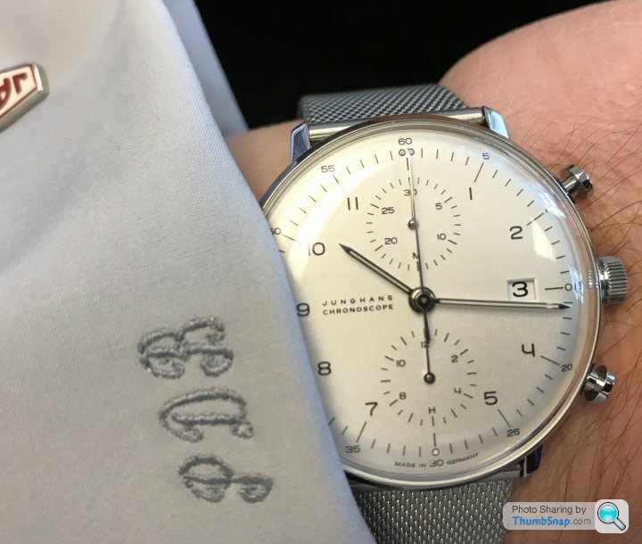
Really like that in a retro kind of way. Looking at the edges of those shirt cuffs; similar vintage to match?Today it is the turn of this - a birthday present from my wife a few years ago, made in the same month and year that I was born. It's one of my favourites.


ellroy said:

Honestly, how on earth does thumbsnap rotate everything? And can someone please explain how I stop it?
Anyway, end of the month so off with the BLNR and on with Hulk.
Here’s mine for January:
Edited by sidicks on Monday 8th January 22:28
rog007 said:
SlimRick said:
Giving my Speedmaster a rest for a while, so I'm rotating through the rest of the collection.
Today it is the turn of this - a birthday present from my wife a few years ago, made in the same month and year that I was born. It's one of my favourites.
Really like that in a retro kind of way. Looking at the edges of those shirt cuffs; similar vintage to match?Today it is the turn of this - a birthday present from my wife a few years ago, made in the same month and year that I was born. It's one of my favourites.
 :Rofl:
 Globs said:
I'm not really seeing the appeal myself though.
Got a watch in the sales for £85.50 which is the Casio Scuderia Edifice, Sadly H Samuel didn't include part of the stand or the tags so I'm trying to talk to them about that. The watch however is really crisp and it's a great 'different to the usual' look:

Looks bigger in the phone picture than in real life, the real(?) carbon fibre has good depth and always looks different depending on angles - sometimes dark, sometimes light. It's even too - the phone's offset flash just makes it appear darker on the RHS due to the angle. It's the petrolheads version of a pearl face I guess.
A real win is the big bright hands: I can always see the time easily, a #1 feature of a watch IMO. Plus the strap looks like a car tyre, so it's a win-win really.
Lume is so-so, not too bad on the hands but very faint on the pips. Accurate, wears well and the heat blued colour scheme gives it a bit of interest. The Chrono is cute but only a 10minute one so not much use at the Nurbergring unless you're going some. I'm liking this.
I like that. I have a RedBull one but I think yours looks nicer.Got a watch in the sales for £85.50 which is the Casio Scuderia Edifice, Sadly H Samuel didn't include part of the stand or the tags so I'm trying to talk to them about that. The watch however is really crisp and it's a great 'different to the usual' look:
Looks bigger in the phone picture than in real life, the real(?) carbon fibre has good depth and always looks different depending on angles - sometimes dark, sometimes light. It's even too - the phone's offset flash just makes it appear darker on the RHS due to the angle. It's the petrolheads version of a pearl face I guess.
A real win is the big bright hands: I can always see the time easily, a #1 feature of a watch IMO. Plus the strap looks like a car tyre, so it's a win-win really.
Lume is so-so, not too bad on the hands but very faint on the pips. Accurate, wears well and the heat blued colour scheme gives it a bit of interest. The Chrono is cute but only a 10minute one so not much use at the Nurbergring unless you're going some. I'm liking this.
Pupp said:

Gassing Station | Watches | Top of Page | What's New | My Stuff