CW C65 Trident Diver
Discussion


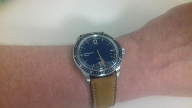
Now I'll not deny that I've been rather vocal around these parts about the way in which CW have sailed perilously close to copying the design of more iconic watches in the past. I don't know whether they've moved away from that now? But I've just seen this, which is really rather lovely (IMO):

So the question is, is this a nice take on a general homage to the 1960s, or have they ripped something else off once again?
Full details here:
https://www.christopherward.co.uk/c65-trident-vint...
So the question is, is this a nice take on a general homage to the 1960s, or have they ripped something else off once again?
Full details here:
https://www.christopherward.co.uk/c65-trident-vint...
Edited by CAPP0 on Wednesday 10th October 22:37

lostkiwi said:
It's not far off a copy of the Oris Diver 65.

Hmm, I'll leap to CW's defence (shock, horror!) and say the crown is different, the face is different and the markers around the edge of the face and the bezel are different, so, so far they're still in the clear!I think it does remind me of something but I'm not well-enough up on watch brands.
cbmotorsport said:
It has a lot of influences from various vintage brands, but isn't a direct copy of anything as far as I can see.
The logo just ruins it for me, a subtle CW below the 12 o'clock marker would have transformed it, and kept things symmetrical.
ETA: I'd take the Oris any day.
This is why I’d never own a CW watch which is a pity The logo just ruins it for me, a subtle CW below the 12 o'clock marker would have transformed it, and kept things symmetrical.
ETA: I'd take the Oris any day.
The CW looks nothing like that Oris apart from they are both blue.
I may be in the minority but I like the 9 o clock branding but I do prefere the symbol (not the name) at 12. If CW could market the watch so everyone knew what the symbol at 12 was then they would be onto a massive winner. That symbol just looks very classy.
I may be in the minority but I like the 9 o clock branding but I do prefere the symbol (not the name) at 12. If CW could market the watch so everyone knew what the symbol at 12 was then they would be onto a massive winner. That symbol just looks very classy.
Chuffedmonkey said:
The CW looks nothing like that Oris apart from they are both blue.
I may be in the minority but I like the 9 o clock branding but I do prefere the symbol (not the name) at 12. If CW could market the watch so everyone knew what the symbol at 12 was then they would be onto a massive winner. That symbol just looks very classy.
To be honest it is growing on me but I’ve never liked any of the branding of all the CW watches. On this one it looks too modern but otherwise the watch is lovely I may be in the minority but I like the 9 o clock branding but I do prefere the symbol (not the name) at 12. If CW could market the watch so everyone knew what the symbol at 12 was then they would be onto a massive winner. That symbol just looks very classy.
I've recently purchased one of the no longer available CW Rapide range - they only have the logo below 12 o'clock and i much prefer it.
https://www.christopherward.eu/c7-rapide-quartz-7
https://www.christopherward.eu/c7-rapide-quartz-7
blue_haddock said:
I've recently purchased one of the no longer available CW Rapide range - they only have the logo below 12 o'clock and i much prefer it.
https://www.christopherward.eu/c7-rapide-quartz-7
They have gone through a few logo versions and that one was not well liked by customers who have a few watches from them, hence going back to the newer design with the name at 9 o clockhttps://www.christopherward.eu/c7-rapide-quartz-7
Don’t mind the new logo and position - if nothing else I t’s a nice touch to create a bit of separation from the brands they’re often accused of ripping off. Of course I’m no expert so it wouldn’t surprise me if PH now produced a classic big brand who have a similar logo scheme.
Anyway, love the trident posted by the OP, have shortlisted it for my upcoming birthday present.
Anyway, love the trident posted by the OP, have shortlisted it for my upcoming birthday present.
blue_haddock said:
I've recently purchased one of the no longer available CW Rapide range - they only have the logo below 12 o'clock and i much prefer it.
https://www.christopherward.eu/c7-rapide-quartz-7
That’s very nice. https://www.christopherward.eu/c7-rapide-quartz-7
The more I look at that logo though - the more it just doesn’t work for me.
Maybe it’s the asymmetry as you ‘read’ it left to right? If it was rotated through 90 degrees it might look better, perhaps?
Gassing Station | Watches | Top of Page | What's New | My Stuff