APT What we nearly had!
Discussion


2xChevrons said:
Interesting stuff
Yertis said:
More interesting stuff
Thank you bothI rather liked the NSE livery, had a more 'dynamic' look to it than the solid BR blue or BR blue/grey was used to prior to the sectorisation schemes.
Not quite as good /cool (to my eyes at least) of IC Sallow livery.
Flying Phil said:
Interestingly there is a new Hornby set of APT vehicles being brought out next year. This was also featured in the current TV series.
As someone previously posted, actually out now. Think it's sold out already. I must be out of touch with model railway prices, but (to me) eye wateringly expensive, the 5 car set was something like £400, the 7 car set about £600.I understand it's new tooling to the 80s sets, and not interchangeable with them.
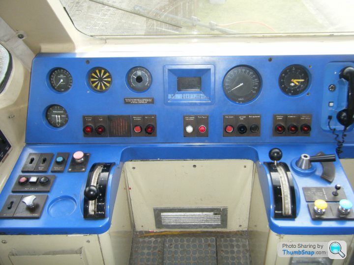
AWS (Advance Warning System) indicator.
Actuated by magnets on the track and shows what the last signal passed was - in case the driver forgets. In this case the last signal passed was a yellow. After passing a green it shows all black.
https://en.wikipedia.org/wiki/Automatic_Warning_Sy...
Actuated by magnets on the track and shows what the last signal passed was - in case the driver forgets. In this case the last signal passed was a yellow. After passing a green it shows all black.
https://en.wikipedia.org/wiki/Automatic_Warning_Sy...
Pinkie15 said:
Thank you both
I rather liked the NSE livery, had a more 'dynamic' look to it than the solid BR blue or BR blue/grey was used to prior to the sectorisation schemes.
Not quite as good /cool (to my eyes at least) of IC Sallow livery.
There's quite a nice piece here (that I've just found) about the 'Sectorisation' identity designed by an outfit called Roundel in the '80s. I once met the chap behind it and IIRC he'd been inspired/influenced by US Navy aircraft markings, I guess that's where the grey + bright colours come from (not, as it says in the article, "Mustang fighter-jets" FFS I rather liked the NSE livery, had a more 'dynamic' look to it than the solid BR blue or BR blue/grey was used to prior to the sectorisation schemes.
Not quite as good /cool (to my eyes at least) of IC Sallow livery.
 ). The engines looked great in the photos but pretty quickly the usual filth and decrepitude took over.
Personally, and despite whatever the articles says, IMO it was all just window dressing prior to the BR sell-off. That might be sour grapes – if there is one type of identity I'd like to design during the remainder of my career it would be a railway company.
Yertis said:
Pinkie15 said:
Thank you both
I rather liked the NSE livery, had a more 'dynamic' look to it than the solid BR blue or BR blue/grey was used to prior to the sectorisation schemes.
Not quite as good /cool (to my eyes at least) of IC Sallow livery.
There's quite a nice piece here (that I've just found) about the 'Sectorisation' identity designed by an outfit called Roundel in the '80s. I once met the chap behind it and IIRC he'd been inspired/influenced by US Navy aircraft markings, I guess that's where the grey + bright colours come from (not, as it says in the article, "Mustang fighter-jets" FFS I rather liked the NSE livery, had a more 'dynamic' look to it than the solid BR blue or BR blue/grey was used to prior to the sectorisation schemes.
Not quite as good /cool (to my eyes at least) of IC Sallow livery.
). The engines looked great in the photos but pretty quickly the usual filth and decrepitude took over.Personally, and despite whatever the articles says, IMO it was all just window dressing prior to the BR sell-off. That might be sour grapes – if there is one type of identity I'd like to design during the remainder of my career it would be a railway company.
I hadn't heard that Roundel were inspired by fighter aircraft. I'd always heard that the colourful geometric abstract logos were based on medieval coats of arms and jousting colours (literal liveries). But they're a brilliant example of how important and effective good branding can be for an organisation. You often see people dismissing the £x-million spent by companies on a new logo or getting in branding consultants but for Railfreight it provided a fresh, bright, confident image (in contrast to the murky Railfreight grey or the all-pervasive and cheap-looking Rail Blue) which really rewarded depots that kept their stock clean without being too labour intensive (it was, after all, based on a background of three shades of grey). The sectors each having their own identity within the over-arching scheme both emphasised the new way of business that sectorisation had brought and helped create pride and a sense of purpose and ownership. The same went for the depot plaques which were part of the rebranding, which I still think are a wonderful idea and not only excellent bits of branding but genuine works of art in their own right. Locomotives were now readily identified as part of a 'home fleet' and carried the image and reputation of their depot with them - but all these individual symbols and variants were also clearly part of a cohesive and related design scheme.
As I said, a masterclass in corporate identity.
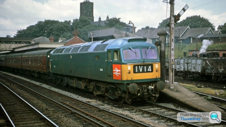
Much has already been said about the excellence of the 'BR Blue' era, Rail Alphabet and all the other elements that made up the corporate identity in the 1960s and 1970s. I always think the shade of blue was a bit too inherently 'dusty' and even when brand new it looked sort of inherently cheap and it didn't weather well. The commitment to painting literally everything Rail Blue could become a bit oppressive, especially when they painted multiple units and suburban rolling stock all-over blue. The later switch to white/blue looked a lot smarter, and the 'Large Logo' livery with the yellow ends on locos was a big improvement just because it broke up the relentless square footage of blue.
IC Swallow is a fantastic, timeless livery that I sorely miss. That 'World of Trains' magazine set not only had a full feature on the development and introduction of the Class 91s (all in Swallow livery) but a fantastic picture of a Class 37 and a rake of white-roofed Mk1 coaches on the Kyle of Lochalsh line all freshly-painted in the swallow-less InterCity MainLine livery which I think looked glorious.
I took these shots in Wembley Yard recently after bringing a train down from Crewe, to see the simple modernity of corporate blue and grey was a rather pleasant shock to the eyeballs....
Large Logo aside, I was never keen on any of the post '70s BR blue era liveries but walking past Crewe depot a couple of weeks ago the sight of a full set of Inter-City liveried charter stock was very refreshing. I'm going there early tomorrow for another job so if it's still there I'll grab some photos.
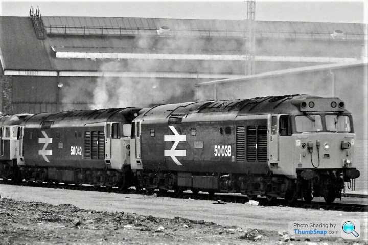
I think even in black and white the large logo scheme looked particularly striking on the '50s, before orange cantrail stripes and red bufferbeams started to appear c.1986 - I took this shot at Old Oak after prepping these two for their Padd - Oxford jobs back in 1984....
Large Logo aside, I was never keen on any of the post '70s BR blue era liveries but walking past Crewe depot a couple of weeks ago the sight of a full set of Inter-City liveried charter stock was very refreshing. I'm going there early tomorrow for another job so if it's still there I'll grab some photos.
I think even in black and white the large logo scheme looked particularly striking on the '50s, before orange cantrail stripes and red bufferbeams started to appear c.1986 - I took this shot at Old Oak after prepping these two for their Padd - Oxford jobs back in 1984....
P5BNij said:
That's exactly what the logo's designer – Gerry Barney – wanted to see:“The first time I sketched it out I covered a whole train with it, from roof to rails, so you could see it a mile away. It looked bloody great, but they wouldn’t do it. They were too apologetic about it, treating it like a badge rather than something they were proud of.”
More here...
Yertis said:
P5BNij said:
That's exactly what the logo's designer – Gerry Barney – wanted to see:“The first time I sketched it out I covered a whole train with it, from roof to rails, so you could see it a mile away. It looked bloody great, but they wouldn’t do it. They were too apologetic about it, treating it like a badge rather than something they were proud of.”
More here...

I've still got some of my '60s designed BR train crew uniform items that were issued to me in January '83, including a cotton 'Summer' jacket with the little red BR logo on the top pocket, it still fits me too, just!
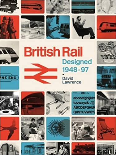
This is a really good book on the subject....
https://www.amazon.co.uk/British-Designed-1948-199...
Edited by P5BNij on Friday 12th November 12:38
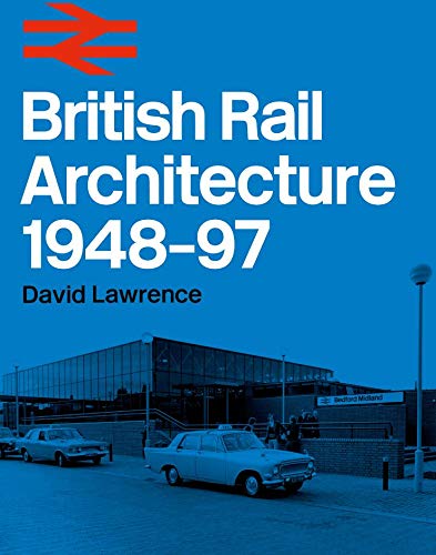
Likewise, this one on the new infrastructure....
https://www.amazon.co.uk/British-Rail-Architecture...
Edited by P5BNij on Friday 12th November 12:40
The blog The Beauty of Transport has an excellent series about the history of the railways' post-war corporate identities, from the 'cycling lion' to the latest TOC liveries.
The first recipient of the BR arrow logo was Brush Type 4 D1733 in 1964 as part of the 'XP64' experiment, the logos were applied using vinyl patches and were ripped off after about two weeks....
(In later years, during the privitisation era it was repainted back into a version of this livery).
(In later years, during the privitisation era it was repainted back into a version of this livery).
P5BNij said:
The first recipient of the BR arrow logo was Brush Type 4 D1733 in 1964 as part of the 'XP64' experiment, the logos were applied using vinyl patches and were ripped off after about two weeks....
(In later years, during the privitisation era it was repainted back into a version of this livery).
Obviously XP64 was explicitly a trial to see what worked and what didn't (and, as I understand it, was more about testing new rolling stock design features than its primary purpose being livery experiments*), but personally I'm glad for the changes they made between that and the final Rail Blue. As I said up-thread, I think Rail Blue looks unfortunately 'dusty' and worn-out even when new, and the slightly lighter shade they tried on XP64 is even worse for that. The double arrow in the red box was clearly the same as would appear on stations, hotels, signage and the Sealink fleet but just looks indecisive to me. If they couldn't bring themselves to go 'large logo' at that stage, as envisioned by Gerry Barney, the more muted and low-key appearance they ended up with at least looked tidier. (In later years, during the privitisation era it was repainted back into a version of this livery).
Interesting that XP64 had the yellow ends wrapping slightly around onto the sides, which was dropped from the original blue livery, then reappeared on the HSTs due to their nose shape and was then used to the full for the Large Logo style.
- Apparently, in a typical BR move of the era, the experiments tried out on XP64 were done after the Mk2 carriage design had been signed off, so the results had to be incorporated into the Mk2B, introduced just three years after the rollout of the Mk2....
2xChevrons said:
P5BNij said:
The first recipient of the BR arrow logo was Brush Type 4 D1733 in 1964 as part of the 'XP64' experiment, the logos were applied using vinyl patches and were ripped off after about two weeks....
(In later years, during the privitisation era it was repainted back into a version of this livery).
Obviously XP64 was explicitly a trial to see what worked and what didn't (and, as I understand it, was more about testing new rolling stock design features than its primary purpose being livery experiments*), but personally I'm glad for the changes they made between that and the final Rail Blue. As I said up-thread, I think Rail Blue looks unfortunately 'dusty' and worn-out even when new, and the slightly lighter shade they tried on XP64 is even worse for that. The double arrow in the red box was clearly the same as would appear on stations, hotels, signage and the Sealink fleet but just looks indecisive to me. If they couldn't bring themselves to go 'large logo' at that stage, as envisioned by Gerry Barney, the more muted and low-key appearance they ended up with at least looked tidier. (In later years, during the privitisation era it was repainted back into a version of this livery).
Interesting that XP64 had the yellow ends wrapping slightly around onto the sides, which was dropped from the original blue livery, then reappeared on the HSTs due to their nose shape and was then used to the full for the Large Logo style.
- Apparently, in a typical BR move of the era, the experiments tried out on XP64 were done after the Mk2 carriage design had been signed off, so the results had to be incorporated into the Mk2B, introduced just three years after the rollout of the Mk2....
Gassing Station | Boats, Planes & Trains | Top of Page | What's New | My Stuff