Climate change - the POLITICAL debate (Vol 6)
Discussion


Jinx said:
See their diagram versus the oceans one below:
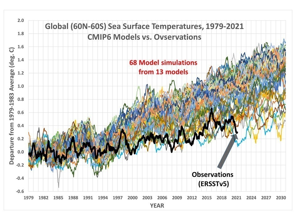

Unsurprisingly, this graph comes from the usual denier sources and is inevitably misleading. The majority of these model runs (50 of the 68 lines) are actually from one model, CanESM5, which projected much more warming than all the others.
This version shows what a difference that bias makes - the blue is the one model with 50 runs, the red are all the other models:

It's all explained here:
https://moyhu.blogspot.com/2021/04/no-global-warmi...
And this is why you don't blindly trust graphs you see on the internet. I guarantee we'll see this one in this thread repeatedly for the next 5 or 6 years by the faithful.
durbster said:
Unsurprisingly, this graph comes from the usual denier sources and is inevitably misleading.
The majority of these model runs (50 of the 68 lines) are actually from one model, CanESM5, which projected much more warming than all the others.
This version shows what a difference that bias makes - the blue is the one model with 50 runs, the red are all the other models:
It's all explained here:
https://moyhu.blogspot.com/2021/04/no-global-warmi...
And this is why you don't blindly trust graphs you see on the internet. I guarantee we'll see this one in this thread repeatedly for the next 5 or 6 years by the faithful.
Usual denier source? It is from Dr Roy Spencer PHD's site, the former NASA scientist and maintainer of the UAH ( https://www.uah.edu/essc/weather-products/global-t...) satellite temperature data set.The majority of these model runs (50 of the 68 lines) are actually from one model, CanESM5, which projected much more warming than all the others.
This version shows what a difference that bias makes - the blue is the one model with 50 runs, the red are all the other models:
It's all explained here:
https://moyhu.blogspot.com/2021/04/no-global-warmi...
And this is why you don't blindly trust graphs you see on the internet. I guarantee we'll see this one in this thread repeatedly for the next 5 or 6 years by the faithful.
Your refutation blog claims you need to use CMIP5 data and not CMIP6 data. Then does a straight subtraction of 0.022 degrees per decade on the CMIP6 data to bring it back in line with the actuals - and claims all is good?
So either it is too early to judge the CMIP6 data or the CMIP6 data is already 0.022 degrees per decade too hot??? That is the refutation of a graph that merely showed the current results of the CMIP6 ocean models and actuals?
Well, now you've just set a challenge to repeat this graph!
Summary
Person a: scientific models are over predicting temperature Vs reality...see this graph
Person b: ahhh, but that graph is skewed because one mode over predicts. See this graph instead
Person a: we, that graph still shows models over predicting temperature Vs reality.
Person b: b b but "climate denier!".
durbster said:
Unsurprisingly, this graph comes from the usual denier sources and is inevitably misleading.
The majority of these model runs (50 of the 68 lines) are actually from one model, CanESM5, which projected much more warming than all the others.
This version shows what a difference that bias makes - the blue is the one model with 50 runs, the red are all the other models:
It's all explained here:
https://moyhu.blogspot.com/2021/04/no-global-warmi...
And this is why you don't blindly trust graphs you see on the internet. I guarantee we'll see this one in this thread repeatedly for the next 5 or 6 years by the faithful.
Jinx said:
Usual denier source? It is from Dr Roy Spencer PHD's site, the former NASA scientist and maintainer of the UAH ( https://www.uah.edu/essc/weather-products/global-t...) satellite temperature data set.
I know. Jinx said:
Your refutation blog claims you need to use CMIP5 data and not CMIP6 data. Then does a straight subtraction of 0.022 degrees per decade on the CMIP6 data to bring it back in line with the actuals - and claims all is good?
So either it is too early to judge the CMIP6 data or the CMIP6 data is already 0.022 degrees per decade too hot??? That is the refutation of a graph that merely showed the current results of the CMIP6 ocean models and actuals?
You're distracting from the point. Do you accept that Spencer made the graph massively biased towards one model out of the thirteen? Do you agree that by not making that clear on the graph, it is misleading?So either it is too early to judge the CMIP6 data or the CMIP6 data is already 0.022 degrees per decade too hot??? That is the refutation of a graph that merely showed the current results of the CMIP6 ocean models and actuals?
durbster said:
Jinx said:
Usual denier source? It is from Dr Roy Spencer PHD's site, the former NASA scientist and maintainer of the UAH ( https://www.uah.edu/essc/weather-products/global-t...) satellite temperature data set.
I know. Jinx said:
Your refutation blog claims you need to use CMIP5 data and not CMIP6 data. Then does a straight subtraction of 0.022 degrees per decade on the CMIP6 data to bring it back in line with the actuals - and claims all is good?
So either it is too early to judge the CMIP6 data or the CMIP6 data is already 0.022 degrees per decade too hot??? That is the refutation of a graph that merely showed the current results of the CMIP6 ocean models and actuals?
You're distracting from the point. Do you accept that Spencer made the graph massively biased towards one model out of the thirteen? Do you agree that by not making that clear on the graph, it is misleading?So either it is too early to judge the CMIP6 data or the CMIP6 data is already 0.022 degrees per decade too hot??? That is the refutation of a graph that merely showed the current results of the CMIP6 ocean models and actuals?
Was Dr Roy Spencer PHD premature in publishing a graph of limited model runs - possibly. Is it misleading? - no - it shows what it shows. The only way it would be misleading is if after all the data is run, the early runs are shown to be outliers - but given the other model runs are still 0.022 degrees per decade too hot mayhap CMIP6 isn't looking good.
Ian Geary said:
Well, now you've just set a challenge to repeat this graph!
Summary
Person a: scientific models are over predicting temperature Vs reality...see this graph
Person b: ahhh, but that graph is skewed because one mode over predicts. See this graph instead
Try again. The graphs are equivalent. The second one is simply illustrating how much the graph is over-represented by one model.Summary
Person a: scientific models are over predicting temperature Vs reality...see this graph
Person b: ahhh, but that graph is skewed because one mode over predicts. See this graph instead
Jinx said:
As quoted from your blog source the data from the rest of the CMIP6 model runs is not available as yet. From your blog source even if you exclude the 50 runs the other 18 runs of CMIP6 models are still running too hot (by over 0.022 degree per decade as evidenced by the final graph).
Was Dr Roy Spencer PHD premature in publishing a graph of limited model runs - possibly. Is it misleading? - no - it shows what it shows. The only way it would be misleading is if after all the data is run, the early runs are shown to be outliers - but given the other model runs are still 0.022 degrees per decade too hot mayhap CMIP6 isn't looking good.
Are you seriously suggesting a layman is going to look at Spencer's graph and conclude that it shows the models are 0.022C too warm?Was Dr Roy Spencer PHD premature in publishing a graph of limited model runs - possibly. Is it misleading? - no - it shows what it shows. The only way it would be misleading is if after all the data is run, the early runs are shown to be outliers - but given the other model runs are still 0.022 degrees per decade too hot mayhap CMIP6 isn't looking good.
durbster said:
Are you seriously suggesting a layman is going to look at Spencer's graph and conclude that it shows the models are 0.022C too warm?
I was quoting from your blog source. I'm not sure many layman visit Dr Roy Spencer's website - I posted the graph to show how well the current model runs were faring - after the "nothing to see here the models are all good post" . More data is never a bad thing unless you are Dr Anthony Stephen Fauci or Dr Peter Daszak.Jinx said:
durbster said:
Are you seriously suggesting a layman is going to look at Spencer's graph and conclude that it shows the models are 0.022C too warm?
I was quoting from your blog source. I'm not sure many layman visit Dr Roy Spencer's website - I posted the graph to show So there's no doubt we'll be seeing that graph pop up on here for the next few years and it will always be posted without the context outlined above. As we can see, robinessex immediately fell for it. Others will too.
Jinx said:
how well the current model runs were faring - after the "nothing to see here the models are all good post" .
And I appreciate your attempts to spin it as a failure but the truth is, being accurate to within 0.022C is incredible for a system as complex as this. I mean, they've been significantly more accurate than Dr Roy Spencer so far...
Edited by durbster on Friday 4th June 16:56
Diderot said:
What's so significant about 1979-1983, and using it as a baseline?
Beginning of the satellite record. Spencer favours it as he plots lots of stuff vs the sat record with a 5 year running mean.
If I remember correctly it makes UAH look low vs the surface record. Lots of people tend to use a 30 year baseline with other data sets.
Jinx said:
durbster said:
Unsurprisingly, this graph comes from the usual denier sources and is inevitably misleading.
The majority of these model runs (50 of the 68 lines) are actually from one model, CanESM5, which projected much more warming than all the others.
This version shows what a difference that bias makes - the blue is the one model with 50 runs, the red are all the other models:
It's all explained here:
https://moyhu.blogspot.com/2021/04/no-global-warmi...
And this is why you don't blindly trust graphs you see on the internet. I guarantee we'll see this one in this thread repeatedly for the next 5 or 6 years by the faithful.
Usual denier source? It is from Dr Roy Spencer PHD's site, the former NASA scientist and maintainer of the UAH ( https://www.uah.edu/essc/weather-products/global-t...) satellite temperature data set.The majority of these model runs (50 of the 68 lines) are actually from one model, CanESM5, which projected much more warming than all the others.
This version shows what a difference that bias makes - the blue is the one model with 50 runs, the red are all the other models:
It's all explained here:
https://moyhu.blogspot.com/2021/04/no-global-warmi...
And this is why you don't blindly trust graphs you see on the internet. I guarantee we'll see this one in this thread repeatedly for the next 5 or 6 years by the faithful.
Your refutation blog claims you need to use CMIP5 data and not CMIP6 data. Then does a straight subtraction of 0.022 degrees per decade on the CMIP6 data to bring it back in line with the actuals - and claims all is good?
So either it is too early to judge the CMIP6 data or the CMIP6 data is already 0.022 degrees per decade too hot??? That is the refutation of a graph that merely showed the current results of the CMIP6 ocean models and actuals?
turbobloke said:
johnboy1975 said:
Diderot said:
And one second Googling reveals myriad laughable predictions of doom and apocalypse which never came to pass. And as others have pointed out, the graph you posted only serves to demonstrate the abject failure of models.
So if the models prove to be wrong, it means (the narrative will be) reducing co2 was successful. Which means pats on the back all round. SplendidWe're well past the models being wrong. Accuracy of coin flipping is celebrated as skill!

So-called 'net zero' is obviously PC BS at its finest. When enough carbon permits have changed hands for billions of pounds we will be at 'net zero', whilst actual CO2 emissions will probably remain the same or increase. Clever little earner.
deeps said:
turbobloke said:
johnboy1975 said:
Diderot said:
And one second Googling reveals myriad laughable predictions of doom and apocalypse which never came to pass. And as others have pointed out, the graph you posted only serves to demonstrate the abject failure of models.
So if the models prove to be wrong, it means (the narrative will be) reducing co2 was successful. Which means pats on the back all round. SplendidWe're well past the models being wrong. Accuracy of coin flipping is celebrated as skill!
So-called 'net zero' is obviously PC BS at its finest. When enough carbon permits have changed hands for billions of pounds we will be at 'net zero', whilst actual CO2 emissions will probably remain the same or increase. Clever little earner.
We've heard similar elsewhere, but...the answer to failing climate policy is more failing climate policy.
Repent and believe, pay more tax, and panic.
durbster said:
And I appreciate your attempts to spin it as a failure but the truth is, being accurate to within 0.022C is incredible for a system as complex as this.
I mean, they've been significantly more accurate than Dr Roy Spencer so far...
That's 10% out per decade - so no not incredible.I mean, they've been significantly more accurate than Dr Roy Spencer so far...
Edited by durbster on Friday 4th June 16:56
Jinx said:
durbster said:
And I appreciate your attempts to spin it as a failure but the truth is, being accurate to within 0.022C is incredible for a system as complex as this.
I mean, they've been significantly more accurate than Dr Roy Spencer so far...
That's 10% out per decade - so no not incredible.I mean, they've been significantly more accurate than Dr Roy Spencer so far...
Edited by durbster on Friday 4th June 16:56
Models assume that CO2 is responsible for warming, so finding some warm-warm agreement between model outputs and temperature is taken by the willing and the gullible to prove that the warming is human-caused, when it does no such thing.
Another part of model adjustments removes the possibility of natural climate change producing the same effects. In addition, agreement increases during natural El Nino warming episodes, of which there have been several major such events in the last few decades. No surprise there.
Volcanic cooling from El Chichon and Mt Pinatubo early in the satellite record depresses early temperatures (naturally) in the record and thus exaggerates the 'discovered' warming trend.
In sum, levels of agreement are exaggerated. This is only to be expected. models dictate policy and must have papal qualities for politicians to remain happy.
Edited by turbobloke on Saturday 5th June 16:32
turbobloke said:
Also what some agw supporters don't realise is that models are fed adjusted data and then adjusted after the fact for temperature, the headline variable, making temperature issues non-valid as a means of assessing accuracy. It's actually measuring the accuracy of adjustments.
Models assume that CO2 is responsible for warming, so finding some warm-warm agreement between model outputs and temperature is taken by the willing and the gullible to prove that the warming is human-caused, when it does no such thing.
Another part of model adjustments removes the possibility of natural climate change producing the same effects. In addition, agreement increases during natural El Nino warming episodes, of which there have been several major such events in the last few decades. No surprise there.
Volcanic cooling from El Chichon and Mt Pinatubo early in the satellite record depresses early temperatures (naturally) in the record and thus exaggerates the 'discovered' warming trend.
In sum, levels of agreement are exaggerated. This is only to be expected. models dictate policy and must have papal qualities for politicians to remain happy.
Classic. When they have nowhere to go they always retreat to the conspiracy theories. Models assume that CO2 is responsible for warming, so finding some warm-warm agreement between model outputs and temperature is taken by the willing and the gullible to prove that the warming is human-caused, when it does no such thing.
Another part of model adjustments removes the possibility of natural climate change producing the same effects. In addition, agreement increases during natural El Nino warming episodes, of which there have been several major such events in the last few decades. No surprise there.
Volcanic cooling from El Chichon and Mt Pinatubo early in the satellite record depresses early temperatures (naturally) in the record and thus exaggerates the 'discovered' warming trend.
In sum, levels of agreement are exaggerated. This is only to be expected. models dictate policy and must have papal qualities for politicians to remain happy.
Anyone can go and see how the old model projections fared, and the data adjustments. It's all in the public domain and been done to death here so there's no point wasting too much time on that any more.
And it's worth a reminder that no matter how hard he tries to distort things, the model projections have been significantly more accurate than turbobloke's:

turbobloke in 2008 said:
Three years or five years, I'd say both are too short a timescale as we must continually look at the data for evidence of future solar activity. Late starting solar cycles being a case in point. Archibald's original submission as featured on HM Treasury website, with cooling of 1.5 deg Celsius by 2020, has the right timescale and about the right temperature change.
Don't forget the peer-reviewed study I've posted a couple of times which found adjustments made to global surface temperatures in recent years “are totally inconsistent with published and credible" temperature data. I say don't forget, as I can't currently recall all of the authors and the PH search function isn't helping.
The above research publication tried to validate current surface temperature datasets managed by NASA, NOAA and UKMO, all of which use adjustments to raw data.
Basically, the natural cyclical pattern in earlier reported data has very nearly been ‘adjusted out' by a process in which almost surface temperature adjustments cool past temperatures and warm more current records, exaggerating warming and exaggerating tuned model agreement with adjusted data.
There's more. A climate model will use a grid of multi-kilometre cells to divide the atmosphere and oceans into manageable chunks. These are far too large but computing power and the need to generate the next IPCC report in a timescale of a few years means that too big has to be good enough. Key events such as clouds forming and thunderstorms are too small to model directly on this scale. As a result, modellers adjust or 'tune' for cloud formation and continue continue tuning until there's a match with a chosen 20th century temperature point.
This makes models subjective as much as objective and makes temperature a non-starter for assessing validity - a level of agreement is adjusted in using both data and process. It's the adjustments/tuning that are being assessed. Meanwhile political policy based on this inadequacy trundles along its harmful path, vilifying a natural trace gas operating at the base of the global food chain.
Jinx said:
durbster said:
And I appreciate your attempts to spin it as a failure but the truth is, being accurate to within 0.022C is incredible for a system as complex as this.
I mean, they've been significantly more accurate than Dr Roy Spencer so far...
That's 10% out per decade - so no not incredible.I mean, they've been significantly more accurate than Dr Roy Spencer so far...
Edited by durbster on Friday 4th June 16:56

Dr Craig Idso has a few words to say on Biden's climate muppetry. Here's a summary.
-Biden announced a policy objective to reduce emissions of 'aerial fertiliser' by 50% over the next 8.5 years, moving to 100% a decade after that
-Potus and similar believe truly that rising emissions of atmospheric carbon dioxide have placed the planet on a no-return trajectory toward climate apocalypse, but how accurate is this narrative?
-As somebody who has professionally studied the potential impacts of rising atmospheric CO2 on climate and the biosphere for over three decades now, with absolute sincerity and certainty I can answer it is woefully inaccurate.
-Rising CO2 is not presently causing, nor will humanity's emissions of this trace gas into the atmosphere ever be sufficient enough, to cause, dangerous global warming or any of the ancillary-related climate catastrophes in Potus' scaremongering
-Many peer-reviewed studies confirm there is no observational evidence that provides any compelling support for the contention that there is something unusual, unnatural, unprecedented or dangerous about Earth's current warmth
-Beyond this well-documented absence of imminent climate catastrophism, thousands of peer-reviewed scientific journal articles reveal rising atmospheric CO2 is actually a benefit to the biosphere
-Typically, a 300-ppmv increase in the air's CO2 content raises the productivity of most plants by about one-third to one-half, which stimulation is generally manifested by an increase in the number of branches and tillers, more and thicker leaves, more extensive root systems, and more flowers and fruit/grain
-In addition to inducing such amazing productivity benefits, rising atmospheric CO2 also confers upon plants other important advantages; it increases their water use efficiency, and it helps them better cope with low levels of essential resources such as light, water and nutrients
-In general, a 10% increase in atmospheric CO2 induces an approx 8% increase in global gross primary productivity (see Cheng et al., 2017)
-The implications of these benefits are enormous, yet they barely scratch the surface of the total direct and indirect benefits humanity and nature have received, and continue to receive
-When considering and accounting for such positive improvements, plus the fact that none of the apocalyptic predictions of climate catastrophe have happened / are coming true, it becomes scientifically and morally indefensible to plot a path to implement a transformative whole-government approach to change how energy is produced and consumed across all sectors of society, as Biden has committed to do
-Half the global population experiences some sort of limitation in their access to energy, energy that is needed for production of clean water, warmth, and light; one-third of those thus impacted are children and an even greater portion are in the ranks of the poor
-It's long overdue that we recognise that carbon dioxide is not a pollutant, its increasing concentration only minimally affects Earth's climate, while it offers tremendous benefits to the biosphere - as such, efforts to regulate and reduce CO2 emissions will hurt far more than they will help
-Biden's climate policy poses a real threat capable of inflicting far more havoc and damage on humanity and nature than it was ever intended to prevent.
(We can now await off-topic personal attacks on Idso.)
Gassing Station | News, Politics & Economics | Top of Page | What's New | My Stuff