Coronavirus - Data Analysis Thread
Discussion


Some updated graphs with data from https://coronavirus.data.gov.uk/
1. Tests and cases.
2. Cases per 100k tests (comparing cases on one day with tests processed 2 days later), admissions (note the full week lag in the UK data) and deaths
1. Tests and cases.
2. Cases per 100k tests (comparing cases on one day with tests processed 2 days later), admissions (note the full week lag in the UK data) and deaths
This is a great site:
https://russss.github.io/covidtracker/map.html#cha...
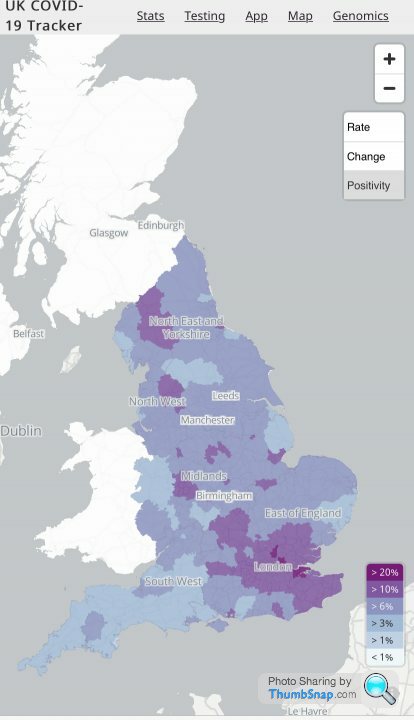
This positivity map is particularly interesting:
https://russss.github.io/covidtracker/map.html#cha...
This positivity map is particularly interesting:
Uhtred said:
Seems like the OP has given up on this thread because the current data (hospitalisations etc) does not show what they want it to...
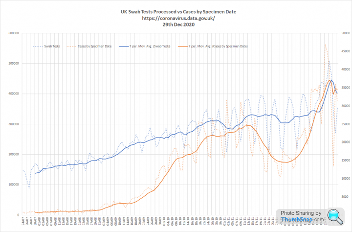
There are plenty of other threads where people can argue. This should be for sharing useful data without debate. Quite a lot of new numbers today so I have updated my graphs. The media are getting exited about 60k reported cases today, but seem to have missed the fact that we had a much more fruity 81,224 cases for specimens taken on the 29th Dec.
1. Tests and cases. I have extended a line to show what would have happened if cases had continued to grow at pre-lockdown rates (50 day doubling).
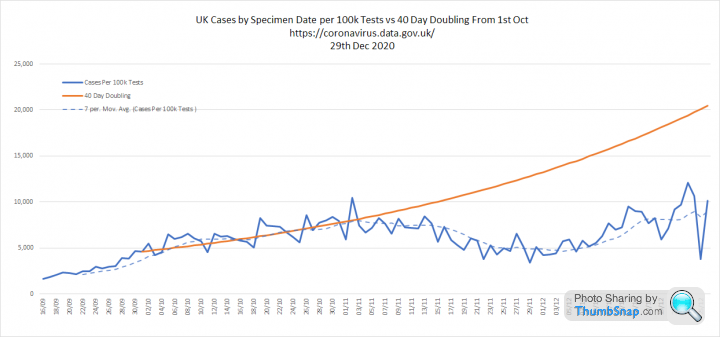
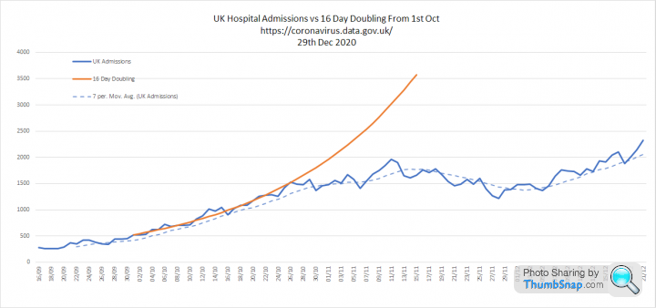
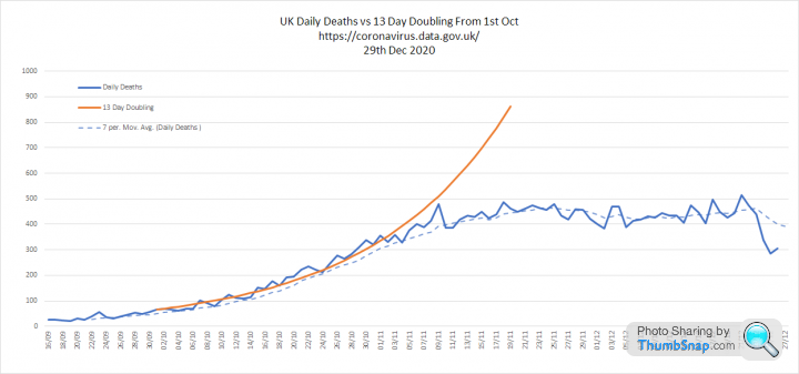
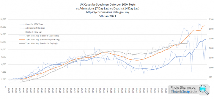
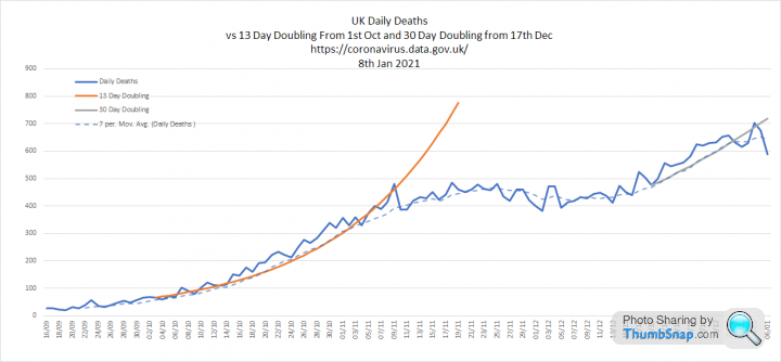
2. Cases per 100k tests, Admissions and Deaths. Cases per 100k tests are doubling every 19 days since the 8th Dec. Admissions and deaths are growing, but more slowly than pre-lockdown
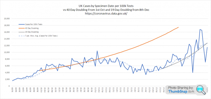
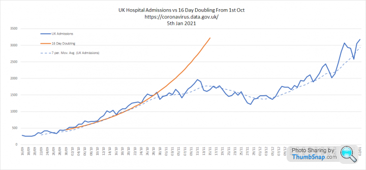
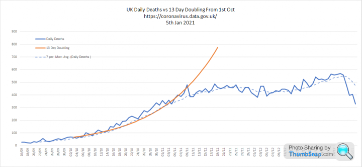
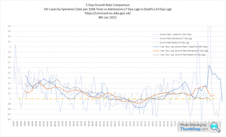
3. Three metrics overlaid and growth rates. My main observation is that these are still moving together with the lags I have assumed, deaths look slower, but I think this is reporting delay. Cases per 100k tests growth rate went a bit nuts over Christmas

Lotobear said:
I don't know if there is a link, but COVID-19 Actuaries Response Group are useful posters on twitter as well https://twitter.com/COVID19actuary
Plus this chap:
https://twitter.com/john_actuary
QuartzDad said:
https://twitter.com/COVID19actuary/status/13468439...
The Continuous Mortality Investigation (CMI) has published its penultimate Mortality Monitor for 2020.
Key points:
- CMI calculates 75,000 excess deaths to 25 December, of which 14,200 are in the second wave.
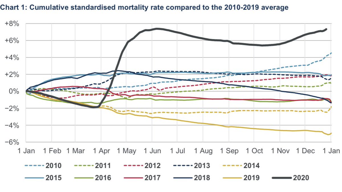
Interesting. The Continuous Mortality Investigation (CMI) has published its penultimate Mortality Monitor for 2020.
Key points:
- CMI calculates 75,000 excess deaths to 25 December, of which 14,200 are in the second wave.
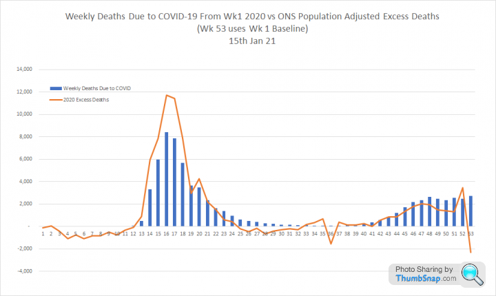
This graph overlays weekly COVID deaths as reported by PHE and ONS. The ONS numbers are 'due to COVID' and the PHE ones are deaths within 28 days of a positive test. I have also added an ONS 'excess deaths' line which is the number of additional deaths in 2020 compared to the population adjusted average for 2015-2019. All three are on the same scale.
If you click on the image it will take you to datawrapper where you can highlight each curve and pick out individual numbers:

PHE data, indicates the second wave is just over half the height of the first and much broader
ONS data increases the first wave, but reduces the second wave, so the difference is around 70/30
This differential increases to 80/20 for 'excess deaths'.
So the apparent severity of this second wave varies considerably depending on the metrics used.
The ONS 'excess death' differential closely matches the CMI one.
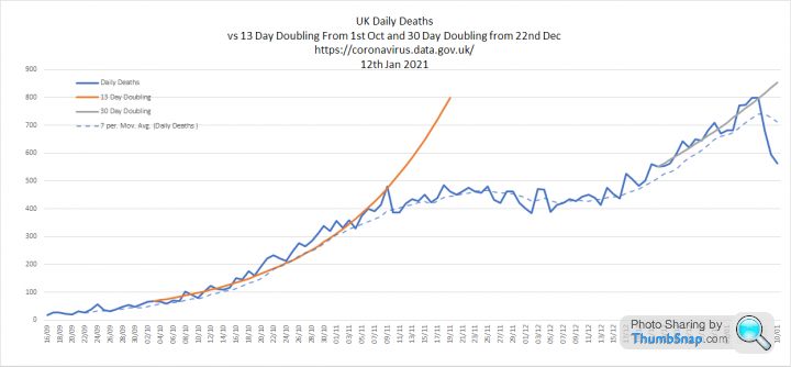
Todays data:
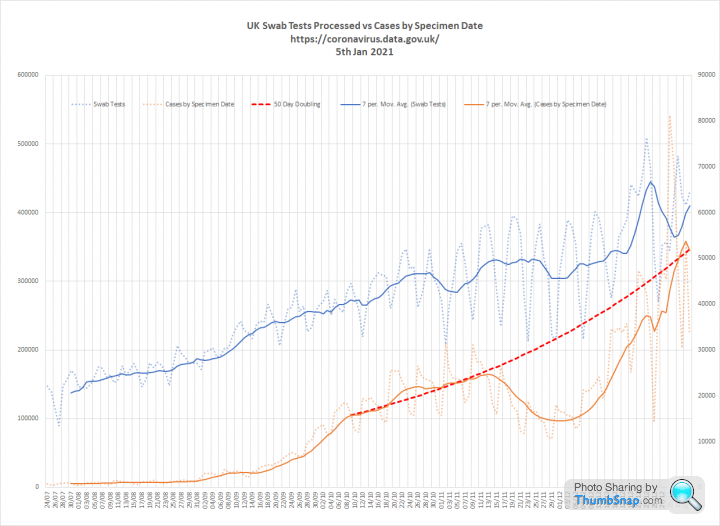
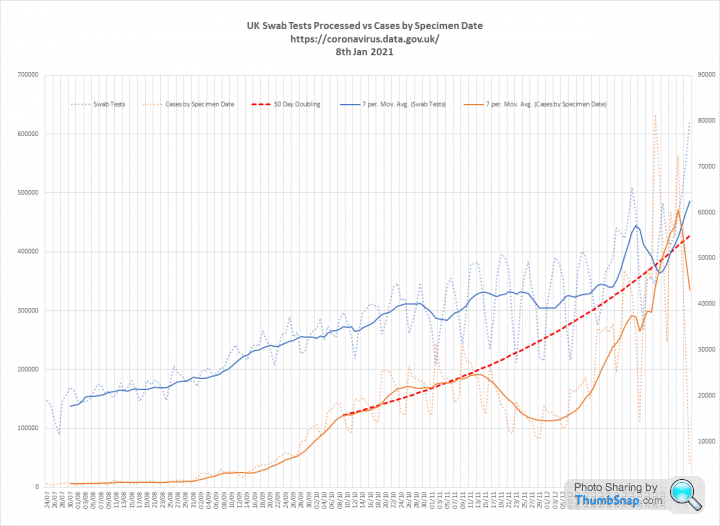
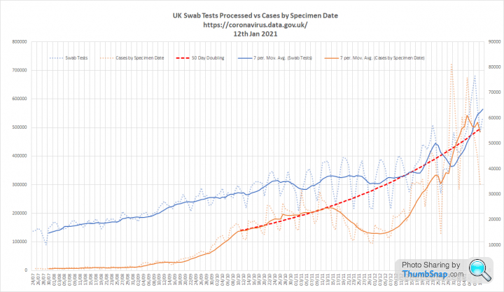
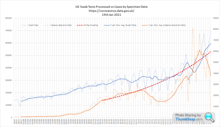
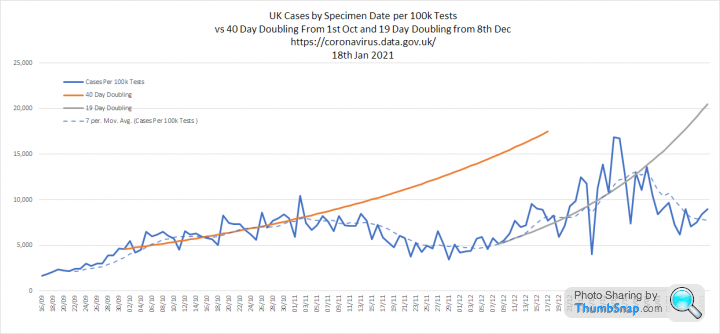
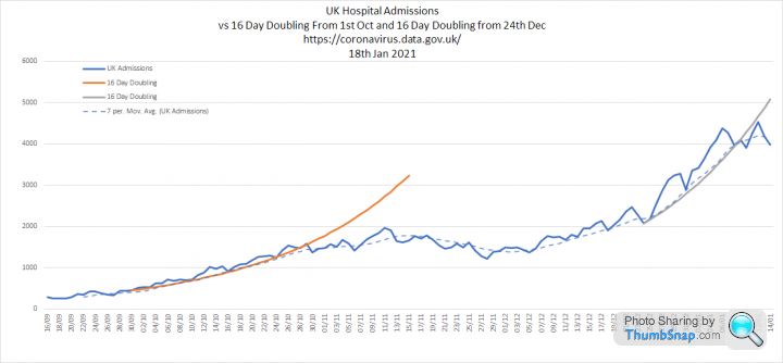
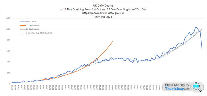
1. Tests and Cases - Big milestone today the first report of 600k plus tests processed in a single day. No disease has every been so relentless hunted. Total tests now stands at a truly incredible 56 million. Cases seem to be continuing on the trend they followed prior to the Nov 5th lockdown. Shown as a 50 day doubling since early Oct:
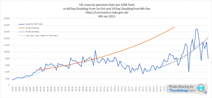
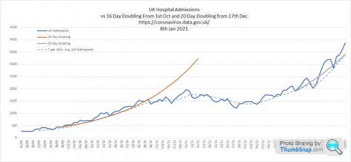
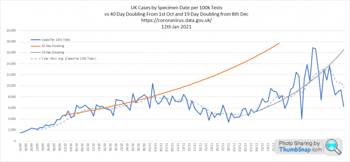
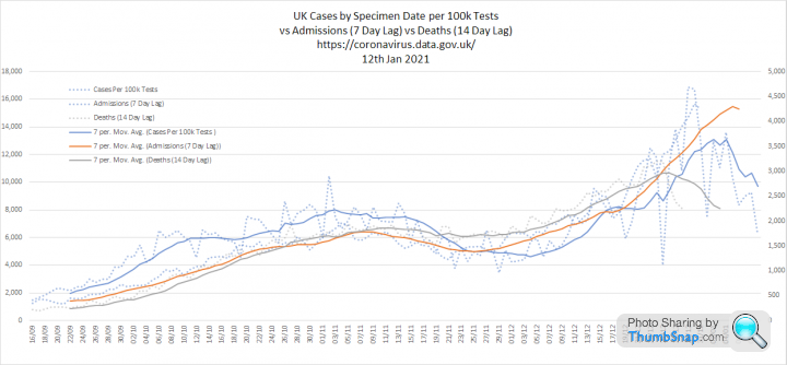
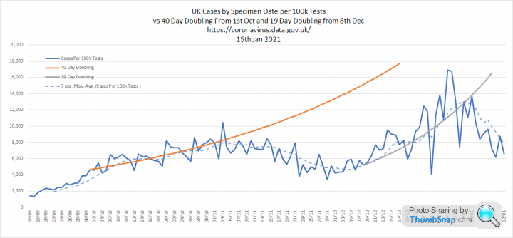
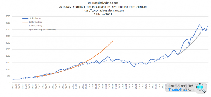
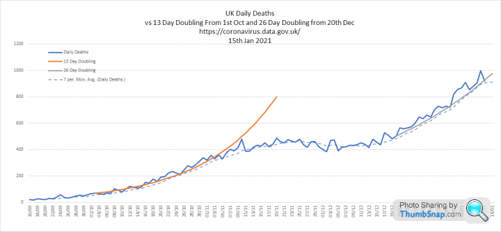
2. Cases per 100k tests, admissions and deaths. I have added trend lines to see how fast these are now growing. Cases have followed a 19 day doubling. Admissions are a bit bumpy, but seem to be on a 20 day doubling. Deaths are doubling every 30 days:
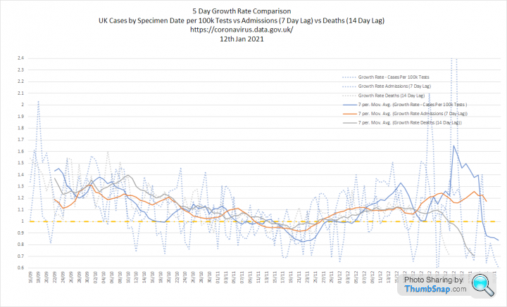
3. All three metrics overlaid with growth rates. Growth rate of cases is very volatile, but it suggests Rt of around 1.2-1.3 right in the centre of the SAGE estimate.

1. Tests and Cases - Big milestone today the first report of 600k plus tests processed in a single day. No disease has every been so relentless hunted. Total tests now stands at a truly incredible 56 million. Cases seem to be continuing on the trend they followed prior to the Nov 5th lockdown. Shown as a 50 day doubling since early Oct:
2. Cases per 100k tests, admissions and deaths. I have added trend lines to see how fast these are now growing. Cases have followed a 19 day doubling. Admissions are a bit bumpy, but seem to be on a 20 day doubling. Deaths are doubling every 30 days:
3. All three metrics overlaid with growth rates. Growth rate of cases is very volatile, but it suggests Rt of around 1.2-1.3 right in the centre of the SAGE estimate.
The Govt website now includes positivity data for English regions (proportion of positive tests / number of people tested). This is equivalent to the cases per 100k tests figure I have graphed previously. As it cancels out increases in testing volumes changes in positivity can be a good indicator of changes in prevalence.
This graph shows positivity for each region throughout the epidemic alongside the overall positivity for 'england', which serves as an average:

This version focuses on the data since 1st Oct 2020:

If you click on the graphs they will open in Datawrapper, where you can mouseover for data or highlight particular regions.
The three regions with lowest positivity in Autumn (East of England, South East and London) are now the highest.
Similarly, the three regions with the highest positivity in Oct and Nov show relative small post lockdown surges (Yorkshire, North West and North East)
Interesting to see that London crossed the 'average' on Nov 15th. South East and East of England followed around 5th and 10th Dec respectively. So most of the growth we have seen in these regions must have started during the previous lockdown and not when they moved to the new tier system.
Most regions show positivity growth flattening off at the beginning of January. However, this data set ends 6th Jan, so some of this may be reporting lag
This graph shows positivity for each region throughout the epidemic alongside the overall positivity for 'england', which serves as an average:
This version focuses on the data since 1st Oct 2020:
If you click on the graphs they will open in Datawrapper, where you can mouseover for data or highlight particular regions.
The three regions with lowest positivity in Autumn (East of England, South East and London) are now the highest.
Similarly, the three regions with the highest positivity in Oct and Nov show relative small post lockdown surges (Yorkshire, North West and North East)
Interesting to see that London crossed the 'average' on Nov 15th. South East and East of England followed around 5th and 10th Dec respectively. So most of the growth we have seen in these regions must have started during the previous lockdown and not when they moved to the new tier system.
Most regions show positivity growth flattening off at the beginning of January. However, this data set ends 6th Jan, so some of this may be reporting lag
Update of my graphs based on todays data.
1. Cases and tests. Still looking as if we are in line with the pre lockdown path.
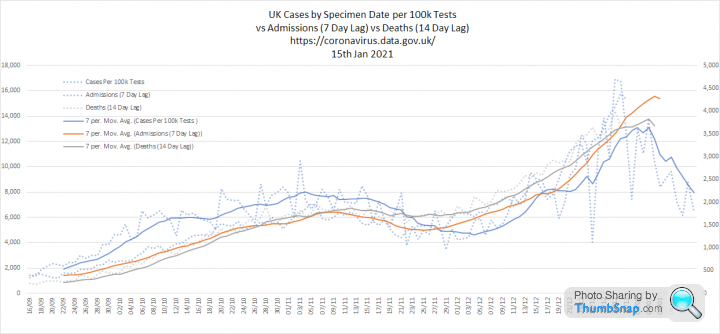
2. Cases per 100k Tests, Admissions and Deaths. There are some encouraging signs that cases peaked around 2nd Jan:

3. Three metrics overlaid with growth rates. This still shows a clear relationship between cases per 100k tests and the other measures. It suggests that we may see admissions peak now, but that deaths will probably grow for another week. Unfortunately, if correct, this means that we may get close to a peak of 1000 deaths per day. We are currently at 799 on the 7th and 8th of Jan:
1. Cases and tests. Still looking as if we are in line with the pre lockdown path.
2. Cases per 100k Tests, Admissions and Deaths. There are some encouraging signs that cases peaked around 2nd Jan:
3. Three metrics overlaid with growth rates. This still shows a clear relationship between cases per 100k tests and the other measures. It suggests that we may see admissions peak now, but that deaths will probably grow for another week. Unfortunately, if correct, this means that we may get close to a peak of 1000 deaths per day. We are currently at 799 on the 7th and 8th of Jan:
I have updated my excess deaths graphs to capture the full 2020 impact.
Confusingly, there are 53 weeks in the ONS data for 2020, which run from the 28th Dec 2019 to the 1st Jan 2021. This causes a bit of a problem as there is no corresponding wk 53 in the 5 year average. The ONS have used wk 52, which seems an odd decision as it doubles up the impact of the double bank holiday in 2020 which results in a false spike in excess deaths.
I have decided to adopt the same approach as the CMI:
1. Wk 53 uses the Wk 1 baseline
2. 2021 will use 2015 to 2019 as a baseline so the 5 year average does not include the 2020 pandemic impacts
This approach makes sense when you look at the graphs as it reverses the wk 52 false spike.
Graphs for todays data:
1. Tests and cases. Cases have been falling steadily for long enough to be confident it is not down to reporting lag. We continue to increase testing and are nudging 700k test processed per day, which is simply when you consider it was 10 times lower in the summer. The 50 day doubling that we were following in Oct aligns pretty closely with the peak:
2. Cases per 100k tests, admissions and deaths. Cases are clearly reducing and after correction for testing volume are back to early Nov levels. Admissions were doubling every 16 days, similar to Oct. Deaths are doubling every 26 days.
3. All three overlaid with growth rates. Suggests Rt for cases is now below 1
Terminator X said:
Elysium said:
I have updated my excess deaths graphs to capture the full 2020 impact.
Confusingly, there are 53 weeks in the ONS data for 2020, which run from the 28th Dec 2019 to the 1st Jan 2021. This causes a bit of a problem as there is no corresponding wk 53 in the 5 year average. The ONS have used wk 52, which seems an odd decision as it doubles up the impact of the double bank holiday in 2020 which results in a false spike in excess deaths.
I have decided to adopt the same approach as the CMI:
1. Wk 53 uses the Wk 1 baseline
2. 2021 will use 2015 to 2019 as a baseline so the 5 year average does not include the 2020 pandemic impacts
This approach makes sense when you look at the graphs as it reverses the wk 52 false spike.
Interesting to see deaths low vs 50-60k of +ive cases (not on table) especially vs March 2020. Does this suggest the new variant is "weaker" which we never hear in the News?Confusingly, there are 53 weeks in the ONS data for 2020, which run from the 28th Dec 2019 to the 1st Jan 2021. This causes a bit of a problem as there is no corresponding wk 53 in the 5 year average. The ONS have used wk 52, which seems an odd decision as it doubles up the impact of the double bank holiday in 2020 which results in a false spike in excess deaths.
I have decided to adopt the same approach as the CMI:
1. Wk 53 uses the Wk 1 baseline
2. 2021 will use 2015 to 2019 as a baseline so the 5 year average does not include the 2020 pandemic impacts
This approach makes sense when you look at the graphs as it reverses the wk 52 false spike.
TX.
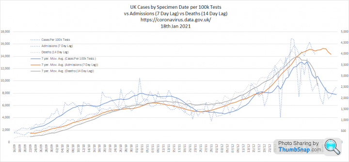
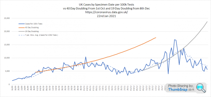
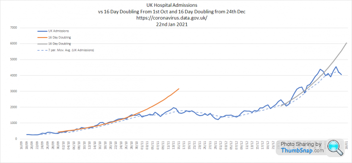
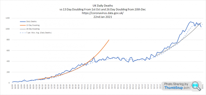
Updated data for today:
1. Cases and tests. Cases are definitely dropping, despite increasing testing. However the last few days will lag.

2. Cases per 100k tests, admissions and deaths. There is now a clear drop in test positivity around the New Year. Admissions have slowed, but its not translating into quite the same reduction. Peak daily deaths are now 1,041 on the 11th Jan. Hopefully we will not see this figure rise much further:
3. Three metrics overlaid and growth rates. The main thing to note here is that admissions are levelling off, rather than falling in line with cases.

1. Cases and tests. Cases are definitely dropping, despite increasing testing. However the last few days will lag.
2. Cases per 100k tests, admissions and deaths. There is now a clear drop in test positivity around the New Year. Admissions have slowed, but its not translating into quite the same reduction. Peak daily deaths are now 1,041 on the 11th Jan. Hopefully we will not see this figure rise much further:
3. Three metrics overlaid and growth rates. The main thing to note here is that admissions are levelling off, rather than falling in line with cases.
Edited by Elysium on Monday 18th January 20:18
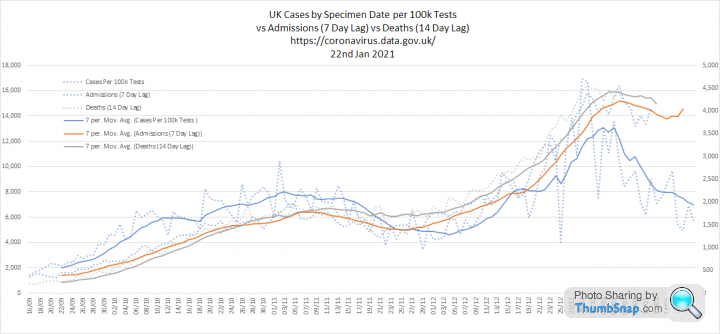
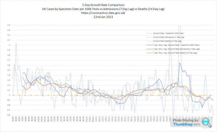
Todays numbers:
1. Tests and cases. Cases continue to fall as testing increases.

2. Cases per 100k tests, Admissions and Deaths. The reduction in cases per 100k tests is very obvious, but admissions are still staying high. There are also signs that deaths accelerated slightly around New Year.
3. All three overlaid with growth rates. Admissions and deaths are not dropping as quickly as I expected in response to the reduction in positive cases.
1. Tests and cases. Cases continue to fall as testing increases.
2. Cases per 100k tests, Admissions and Deaths. The reduction in cases per 100k tests is very obvious, but admissions are still staying high. There are also signs that deaths accelerated slightly around New Year.
3. All three overlaid with growth rates. Admissions and deaths are not dropping as quickly as I expected in response to the reduction in positive cases.
havoc said:
Elysium said:
3. All three overlaid with growth rates. Admissions and deaths are not dropping as quickly as I expected in response to the reduction in positive cases.
Odd.I would have expected there to be a 1-2 week 'lag' from the Cases curve to the Admissions curve, and the same again from Admissions to Deaths.
...but I'm not really seeing that in either case.
In the first case it possibly suggests that a lot of serious cases aren't being diagnosed until at/just before the point of admission.
In the second case it possibly suggests that hospitals HAVE reached capacity, and the in-hospital fatality rate is now increasing due to lack of suffient resources.
Other ideas?
Cases are in real time
Admissions are lagged 7 days - so numbers from 21st Jan are shown against 14th Jan
Deaths are lagged 14 days so numbers on the 21st Jan are shown against 7th Jan
The idea is that admissions and deaths appear next to the cases that caused them, so the three curves should move in relative unison.
That has been broadly the case until now. I have cast this one back a bit further to 1st August:

A reminder that this is meant to be a thread for data to be shared. There are lots of other discussion threads.
This shows ONS deaths to 8th Jan by age bands:


At this point:
60.9% of deaths have occured in the 5.1% of the population that is over 80
89.7% of deaths have occured in the 18.5% of the population that is over 65
Only 1% of deaths have occured in people under 45 (917 people)
This increases to 10.3% for people under 65 (9,321 people)
This shows ONS deaths to 8th Jan by age bands:
At this point:
60.9% of deaths have occured in the 5.1% of the population that is over 80
89.7% of deaths have occured in the 18.5% of the population that is over 65
Only 1% of deaths have occured in people under 45 (917 people)
This increases to 10.3% for people under 65 (9,321 people)
Todays numbers:
1. Tests and Cases. I have changed the 'doubling' line to 140 days from late Oct 2020:

2. Cases per 100k tests, Admissions and Deaths. Cases continue to decline, admissions are now also falling, but not as quickly. Deaths seem to have peaked, but the apparent fall is proably reporting lag:
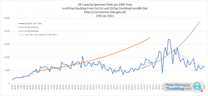


3. Three metrics overlaid and growth rates. The striking thing here is that admissions are not falling in line with cases.


1. Tests and Cases. I have changed the 'doubling' line to 140 days from late Oct 2020:
2. Cases per 100k tests, Admissions and Deaths. Cases continue to decline, admissions are now also falling, but not as quickly. Deaths seem to have peaked, but the apparent fall is proably reporting lag:
3. Three metrics overlaid and growth rates. The striking thing here is that admissions are not falling in line with cases.

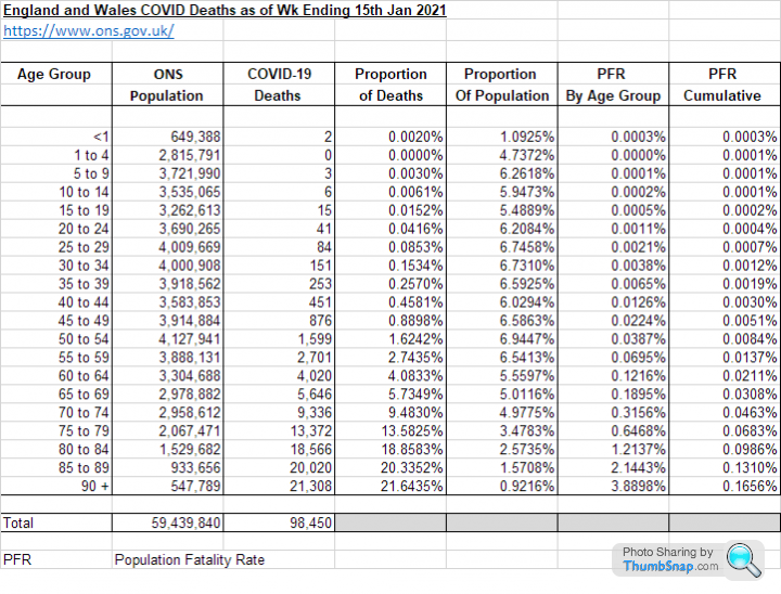
ONS data now available for wk ending 15th Jan 2021:
1. Deaths by age band:
The 55% of the population under 45 account for just 1% of deaths.
The 81% of people under 65 account for just 10% of deaths.
60% of all COVID deaths have been in the 5% of people over 80.

2. There are excess deaths in week 2 compared to a 2015-2019 population adjusted average. Overall deaths are very close to mean + 2SD (green line), which is the point of statistical significance, but I don't think 2021 deaths will fall as quickly as the green line does in future weeks:

3. This shows deaths 'due to COVID' compared to the excess deaths, based on the 2015-2019 population adjusted average. We have returned to the prior position in Wk 2 where the number of non-COVID deaths is below average. In fact the graph above shows it is at a 5 year minimum:

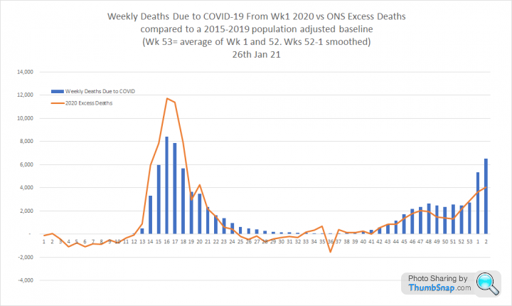
4. The reporting lags over Christmas make this graph difficult to read, so this version smooths out the excess noted between Wks 52 and 1. The area under the curve is unchanged:
1. Deaths by age band:
The 55% of the population under 45 account for just 1% of deaths.
The 81% of people under 65 account for just 10% of deaths.
60% of all COVID deaths have been in the 5% of people over 80.
2. There are excess deaths in week 2 compared to a 2015-2019 population adjusted average. Overall deaths are very close to mean + 2SD (green line), which is the point of statistical significance, but I don't think 2021 deaths will fall as quickly as the green line does in future weeks:
3. This shows deaths 'due to COVID' compared to the excess deaths, based on the 2015-2019 population adjusted average. We have returned to the prior position in Wk 2 where the number of non-COVID deaths is below average. In fact the graph above shows it is at a 5 year minimum:
4. The reporting lags over Christmas make this graph difficult to read, so this version smooths out the excess noted between Wks 52 and 1. The area under the curve is unchanged:
Gassing Station | News, Politics & Economics | Top of Page | What's New | My Stuff