Coronavirus - Data Analysis Thread
Discussion


CarlosFandango11 said:
Elysium said:
Update as promised
1. Comparison with last year.
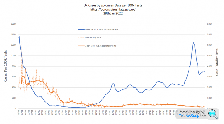
I must admit my mind is blown by the similarity of the peak of Cases per 100k tests with last years in terms of scale and timing. It suggests that the peak of infections we have just seen may actually have been almost the same as last years, but with case numbers dramatically amplified by mass testing.
Are you suggesting that cases are proportional to the number of tests? Sure, cases will increase if you test more, but the relationship isn’t proportional. And the ONS and Zoe both suggest that current infections are more than double than a year ago.1. Comparison with last year.
I must admit my mind is blown by the similarity of the peak of Cases per 100k tests with last years in terms of scale and timing. It suggests that the peak of infections we have just seen may actually have been almost the same as last years, but with case numbers dramatically amplified by mass testing.
The experts refer to this as the Case Ascertainment Rate and they talk about 'ascertainment bias', when trying to estimate the severity of a disease over time. The simple issue being that mild cases are less likely to be detected that severe ones:
https://pubmed.ncbi.nlm.nih.gov/32389846/
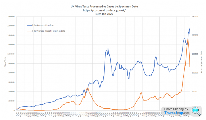
During the first March 2020 wave we only tested seriously ill people who presented to hospital with COVID symptoms. We first reported testing figures on the 22nd April 2020, when we processed 22,763 tests
Over the last seven days we have averaged 1.57m tests per day. This compares to 576k tests per day for the same period last year.
The issue becomes obvious when you compare cases in the first wave, which is practically invisible on this graph, to the second where we were testing up to 20 times more people:

Looking at the proportion of tests that are positive helps cut through this. That is why I have used Cases per 100k Tests. My observation is that this metric tracks admissions and deaths consistently as shown in the final graph of my update post. This leads me to conclude that positivity is a robust indicator of prevalence.
Our world in data also have a positivity graph, which replicates my findings:

You can see here how this positivity correlates with 'excess deaths', which indicate the first wave was more severe than the second:
Going into the omicron wave, the UKHSA estimated that we were capturing around 40% of infections as cases. My assumption was that this would increase a bit as we went into the current winter due to the sheer volume of tests being conducted.
I am genuinely surprised to see that positivity is so similar to the previous wave and my conclusion is that we are currently capturing far more mild cases than ever before.
CarlosFandango11 said:
Elysian, thanks for the detailed reply. I haven’t read it all throughly yet, but have a few thoughts.
Where you’ve suggested this year’s peak is about the same as last years, you’ve assumed that this proportion is the same or similar.
If you change the level of testing, the mix of people being tested will change. I.e. those with and without symptoms, those in hospital with suspected Covid, those who have had recent contact with someone testing positive, those testing for their workplace etc. These different groups of people will all have different probabilities of testing positive.
Testing levels create a window through which we can look at the hidden pandemic. When the window is small, we will only see a small proportion of infections. When we make the window bigger, by testing more people, that proportion will increase. Elysium said:
We can be completely certain that cases are proportional to the number of tests. However, that proportion varies over time.
Elysium said:
Going into the omicron wave, the UKHSA estimated that we were capturing around 40% of infections as cases.
Tripling the level of testing would result in more cases than infections. Hence cases are not proportional to the number of tests. That’s not to say that for some levels of testing/case/infections, there may be an approximate proportional relationship.Where you’ve suggested this year’s peak is about the same as last years, you’ve assumed that this proportion is the same or similar.
If you change the level of testing, the mix of people being tested will change. I.e. those with and without symptoms, those in hospital with suspected Covid, those who have had recent contact with someone testing positive, those testing for their workplace etc. These different groups of people will all have different probabilities of testing positive.
If you do 1m tests and positivity is 10% you will find 100k cases. If you do 10m tests and positivity is the same you will find 1m cases.
If prevalence is increasing, positivity will increase or vice versa.
You are right that, in the real world, the mix of people attending for testing is never entirely consistent. However, there has been a rock solid relationship between positivity, admissions and deaths throughout the pandemic. So positivity can tell us what is going to happen next.
I am simply observing the incredible similarity between this year and last years positivity curves, which makes me wonder if this wave is really that much bigger than the last.
I realise the ONS and Zoe surveys suggest otherwise, but its a pretty mind blowing coincidence that the scale and timing of the positivity peak is so similar.
CarlosFandango11 said:
Elysium said:
During the first March 2020 wave we only tested seriously ill people who presented to hospital with COVID symptoms. We first reported testing figures on the 22nd April 2020, when we processed 22,763 tests
Presumably the level of positive tests in March was very high. If testing had been significantly higher in March, those additional people being tested would not have been seriously ill in hospital, and I think it’s fair to say they would have a lower chance of testing positive. Hence proportionality doesn’t hold here.I made this graph last year to try to show the scale of the pandemic we could not see in March 2020. Its on datawrapper.de so if you click on it an interactive version will open that you can hover over to highlight each curve in term. Cases, Admissions and Deaths are real data from UKHSA. The blue line shows the level of infections likely to be required to lead to those outcomes. Looking back, I think the March 2020 line is understated. Looking back we can also see that a lot of infections passed by unseen last winter, which additional testing will have picked up this time around.

Edited by Elysium on Friday 14th January 17:45
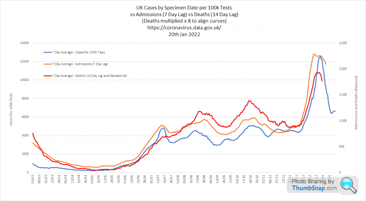
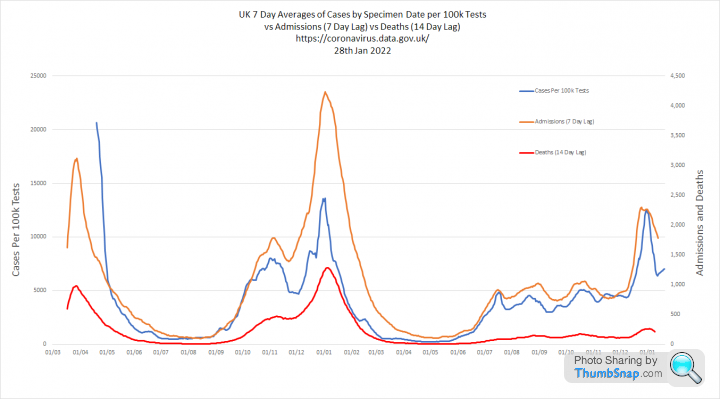
This shows Cases per 100k tests, Admissions and Deaths for the entire pandemic. Deaths are multiplied by 8 so that the 3 curves can be aligned against 2 y-axis scales
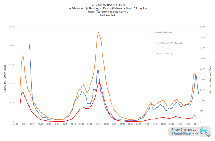
Case per 100k tests is closely aligned with admissions and deaths in the second two waves. This metric cannot be used for the first wave as we do not have testing volumes priot to mid April 2020
You can see how, following mass vaccination through the first half of 2021 the proportion admissions and deaths both fell significantly as a proportion of Cases per 100k tests. The impact on deaths being much higher than admissions.
the-photographer said:
Delta still lives

Omicron now makes up over 90% of genotyped (SGTF) cases in England on 9th January
This hasn't changed much since 25th December when the figure was 89%
This proportion is now very similar across regions
Case numbers calculated from dashboard cases and daily SGTF proportions
https://twitter.com/AlastairGrant4/status/14812009...
Only barely. That graph would work better on a linear scale Omicron now makes up over 90% of genotyped (SGTF) cases in England on 9th January
This hasn't changed much since 25th December when the figure was 89%
This proportion is now very similar across regions
Case numbers calculated from dashboard cases and daily SGTF proportions
https://twitter.com/AlastairGrant4/status/14812009...
CarlosFandango11 said:
Elysium said:
Testing levels create a window through which we can look at the hidden pandemic. When the window is small, we will only see a small proportion of infections. When we make the window bigger, by testing more people, that proportion will increase.
If you do 1m tests and positivity is 10% you will find 100k cases. If you do 10m tests and positivity is the same you will find 1m cases.
With your small window, you see some hidden/asymptomatic infections, as well as those with symptoms. Making the window larger (and without anything else changing) will result in finding more hidden/asymptomatic infections, and probably an immaterial number of symptomatic infections - I expect most of these would have been seen through the original window. The two populations (asymptomatic & symptomatic) will have different positivity rates, symptomatic being higher than asymptomatic). This will result in the enlarged window having a lower positivity rate than the original.If you do 1m tests and positivity is 10% you will find 100k cases. If you do 10m tests and positivity is the same you will find 1m cases.
Positivity rate = cases/tests. Assuming that positivity is the same is the equivalent to assuming that cases are proportional to tests, which is false - I provided some counter examples previously.
For another counter example: If positivity remains the same regardless of the number of tests, and the whole population of the UK had been tested daily over the past month, there would be approximately 2 new infections for each individual over the past month which I has clearly not been the case.

When you look at the data, you see that only a small proportion of those who have PCR tests are positive at a given time. This is because people with symptoms often have other viruses and the prevalence of those varies with time.
Positivity is not fixed. It changes with prevalence, which is why admissions and deaths follow very similar trajectories.
CarlosFandango11 said:
Elysium said:
You are right that, in the real world, the mix of people attending for testing is never entirely consistent. However, there has been a rock solid relationship between positivity, admissions and deaths throughout the pandemic. So positivity can tell us what is going to happen next.
I do see that there is a relationship, but not one that’s rock solid throughout the pandemic and I think that there are more factors that have a significant influence.The positivity peak in April 2020 is roughly double the peak in January 2021. But admissions and deaths are both greater at the peak in January 2021 than April 2020 - this is the inverse of what I would expect. Perhaps the low level of testing in April 2020 is the cause of this.
And the vaccination program has significantly altered the relationship early last year. And there seems to have been a change with deaths reducing from October/November last year, presumably due to booster jabs and also it looks like deaths are currently peaking a lot lower than might be expected, possibly due to Omicron being milder & maybe delta cases reducing.
CarlosFandango11 said:
Elysium said:
I am simply observing the incredible similarity between this year and last years positivity curves, which makes me wonder if this wave is really that much bigger than the last.
I realise the ONS and Zoe surveys suggest otherwise, but its a pretty mind blowing coincidence that the scale and timing of the positivity peak is so similar.
This and last year’s peaks are reasonably similar but I don’t think there is anything to read into this. The peaks look like 13% and 11% (cases/100k tests look to be ~8% different) which I wouldn’t describe as mind blowingly close, and the peaks occurring on a similar date seems to a coincidence driven by when Omicron was imported into the UK.I realise the ONS and Zoe surveys suggest otherwise, but its a pretty mind blowing coincidence that the scale and timing of the positivity peak is so similar.
The one big difference between the two peaks is that now we are doing about three times the number of tests that were done last year. If the current level of testing was the same as last year, would you still think that this year’s peak of infections was the same as last year’s?
For me, with reasonably similar peak positivity rates and assuming that there aren’t any other differences, testing 3 times the level compared to last year suggests that the recent peak infections were three times the level of last year. Zoe and ONS are consistent with a significant increase in infections compared to last year.
There are two interesting things for me:
1. We have opened the testing window x 3, but positivity is similar. If prevalence was much higher now, we would expect to see more difference. PCR positivity is largely determined by the number of symptomatic people who have COVID vs other illness. LFD positivity is surprisingly variable with prevalence, because only a certain number of people log negative tests.
2. The timing of the peak and fall is also very similar, despite different variants and different approaches.
Its not impossible that both of these things happened as a coincidence. However, it doesn't feel as if this is the most likely explanation. My theory is that the rise and fall is seasonal, not due to lockdown or Plan B and that the testing has amplified the scale of this latest wave. I am not arguing that it is the same, because the Zoe and ONS data contradicts that. What I am saying is that the relative difference between waves 1 and 2 was massively distorted by testing and it looks as if something similar has happened between waves 2 and 3.
CarlosFandango11 said:
Elysium, my reasoning for my past few post in this thread has been to object to two claims that I think are false (peak infections this year being the same as last and cases being proportional to tests) and to explain why I think this. I think that I’ve done this, and won’t post further about this I think it would be a detriment to an excellent thread that you started and continue to contribute to - many thanks for this.
I was in two minds about replying as I have tried to avoid too much discussion in this thread. However, this debate is exactly what I had in mind when I started it. People looking at the data and analysing its potential meaning. Regarding the two claims:
1. I am not arguing that the two peaks are the same. I am highlighting something odd in the data that I believe shows they are less different than might otherwise be supposed.
2. Cases / tests = positivity. Regardless of testing levels, positivity changes continually. The positivity curve has very effectively predicted admissions and deaths throughout the pandemic.
NoddyonNitrous said:
Elysium, can I just check my understanding of the lags that you build in for admissions & deaths? AIUI, you move the relevant curve to the left on the X-axis because admissions happen 1-week after infection and deaths two weeks after. Is that correct?
And thank you for your efforts - very interesting and informative!
This is correct. My reasoning is that the level of admissions on a given day relates to cases that occured 7 days before and that deaths relate to cases 14 days before. And thank you for your efforts - very interesting and informative!
So:
1. Cases per 100k tests are shown on by specimen date
2. Admissions are shifted back 7 days from the date they occur
3. Deaths are shifted back 14 days from the date they occur
My 7 day averages are taken as the middle of the 7 days to make the curves less laggy.
I started doing this in Sept 2020 and the curves have aligned quite consistently.
Edited by Elysium on Monday 17th January 11:04
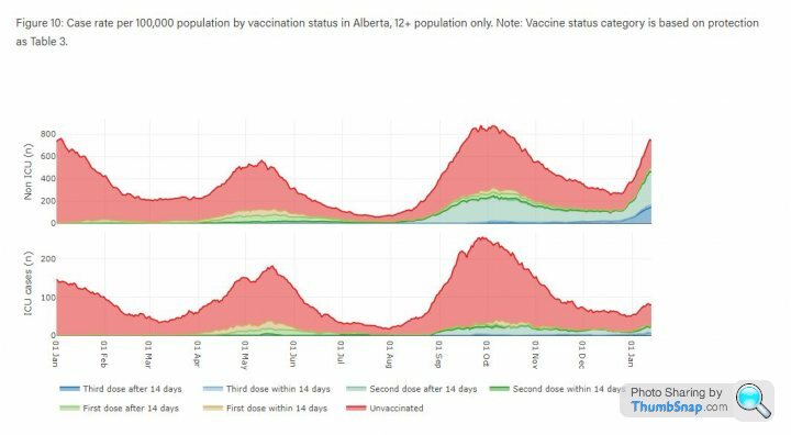
Byker28i said:
Spotted this for your analysis Elysium, detailed data on 3rd shots and vaccines from Alberta.
https://www.alberta.ca/stats/covid-19-alberta-stat...
That link is actually quite interesting: https://www.alberta.ca/stats/covid-19-alberta-stat...
These first two charts show that vaccination is improving outcomes at all ages, but that this is much more material for those aged 40+. Similar to the UK and where the nub of the question around vaccination of younger people comes in:
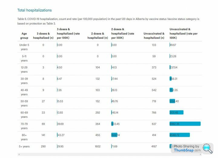

I am guessing the spike at the end of the Non-ICU graph below is omicron. What's interesting is that
1. Vaccine status seems to have less impact on general admissions than before
2. Vaccine status still has an impact on ICU admissions, with benefits for double and triple vaxxed
3. The numbers in ICU are not increasing in the same way.
Another update with todays figures:
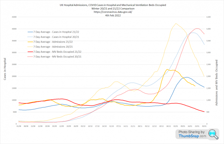
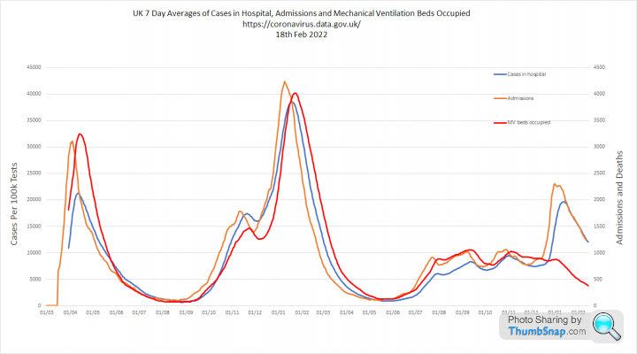
1. Comparison with last year. The decline in Cases per 100k tests has stalled in the last few days. Testing is back up to 1.5m a day. However, the good news is that Admissions and Deaths appear to have peaked. Admissions were about half the level we saw last year and deaths around 5 times lower.
Patients in hospital are also around half last years peak and mechanical ventilator beds are more than 5 times lower,


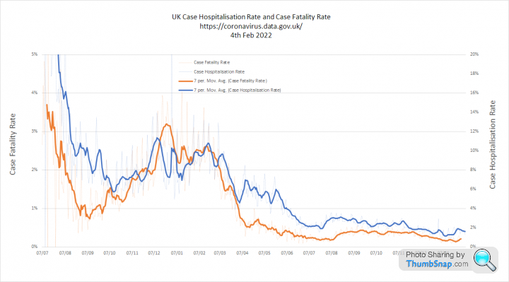
2. These graphs shows Cases per 100k Tests and Admissions in more detail. The key point being that the Case Hospitalisation Rate is now bouncing around 1.5% and the Case Fatality Rate is around 0.16%


3. These graphs show all three metrics overlaid. You can see that deaths have increased less than the other metrics, which supports the idea omicron is inherently less severe. The second graph shows deaths without rebasing which illustrates just how different this wave is to the last.

1. Comparison with last year. The decline in Cases per 100k tests has stalled in the last few days. Testing is back up to 1.5m a day. However, the good news is that Admissions and Deaths appear to have peaked. Admissions were about half the level we saw last year and deaths around 5 times lower.
Patients in hospital are also around half last years peak and mechanical ventilator beds are more than 5 times lower,
2. These graphs shows Cases per 100k Tests and Admissions in more detail. The key point being that the Case Hospitalisation Rate is now bouncing around 1.5% and the Case Fatality Rate is around 0.16%
3. These graphs show all three metrics overlaid. You can see that deaths have increased less than the other metrics, which supports the idea omicron is inherently less severe. The second graph shows deaths without rebasing which illustrates just how different this wave is to the last.
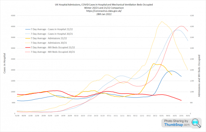
Update.
1. Comparison with last year.
The first graph shows Cases per 100k Tests, Admissions and Deaths this year as solid lines, versus the same time last year as dotted lines.
Cases per 100k tests is no longer declining and has 'stuck' at a level that is now higher than last year. The peak in admissions and deaths is now very clear being about 1/2 and 1/5th of last years totals respectively, despite far less restrictions now.
The second graph shows a similar view for Admissions, People in Hospital and People in Mechanical Ventilator Beds. The number in hospital has again peaked at about 1/2 of the level we saw last year. But the really interesting thing is the long steady fall in the number on ventilators.
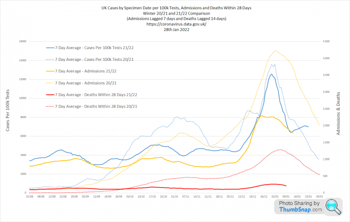
2. These graphs show the Cases per 100k Tests and Admissions curves against the Case Fatality Rate (CFR) and Case Hospitalisation Rate (CHR)
I expected that omicron would result in significant falls in the CFR, but this is currently running at a 14 day average of 0.17% compared to 0.20% last July
The CHR has similarly settled at around 2%, which again is very similar to July.
This suggests to me that the reduction in death and serious illness from COVID is determined more by vaccination than omicrons intrinsically lower severity

3. Looking at these metrics together is interesting as we see the current relationship is similar to July and that the proportion of cases leading to Deaths and Admissons was running slightly higher in the 6 months between 'freedom day' and the omicron wave.
For the first graph deaths are rebased (x8) to align the curves. The second graph zooms out for a wider view and shows deaths at actual levels. It seems to me that COVID was comprehensively 'de-fanged' by May 2021 and that this recent winter wave simply maintains that trend. Despite all the 'noise' about vaccines effectiveness against infection, the data suggests that they have been highly effective at reducing hospitalisation (by 50%) and death (by 80%).

1. Comparison with last year.
The first graph shows Cases per 100k Tests, Admissions and Deaths this year as solid lines, versus the same time last year as dotted lines.
Cases per 100k tests is no longer declining and has 'stuck' at a level that is now higher than last year. The peak in admissions and deaths is now very clear being about 1/2 and 1/5th of last years totals respectively, despite far less restrictions now.
The second graph shows a similar view for Admissions, People in Hospital and People in Mechanical Ventilator Beds. The number in hospital has again peaked at about 1/2 of the level we saw last year. But the really interesting thing is the long steady fall in the number on ventilators.
2. These graphs show the Cases per 100k Tests and Admissions curves against the Case Fatality Rate (CFR) and Case Hospitalisation Rate (CHR)
I expected that omicron would result in significant falls in the CFR, but this is currently running at a 14 day average of 0.17% compared to 0.20% last July
The CHR has similarly settled at around 2%, which again is very similar to July.
This suggests to me that the reduction in death and serious illness from COVID is determined more by vaccination than omicrons intrinsically lower severity
3. Looking at these metrics together is interesting as we see the current relationship is similar to July and that the proportion of cases leading to Deaths and Admissons was running slightly higher in the 6 months between 'freedom day' and the omicron wave.
For the first graph deaths are rebased (x8) to align the curves. The second graph zooms out for a wider view and shows deaths at actual levels. It seems to me that COVID was comprehensively 'de-fanged' by May 2021 and that this recent winter wave simply maintains that trend. Despite all the 'noise' about vaccines effectiveness against infection, the data suggests that they have been highly effective at reducing hospitalisation (by 50%) and death (by 80%).
Edited by Elysium on Friday 28th January 11:39
Vanden Saab said:
Thanks Elys.
I think you are underestimating the part previous infection has to play but until we get some info on the numbers in hospital because of a second infection we will never know. We must have been close to 60% of the population infected at least once by xmas this year compared to 20 -30% last year. Not doubting the part vaccination has played though.
My observation was really about the timing. I think you are underestimating the part previous infection has to play but until we get some info on the numbers in hospital because of a second infection we will never know. We must have been close to 60% of the population infected at least once by xmas this year compared to 20 -30% last year. Not doubting the part vaccination has played though.
The impact of the virus can be seen in the CHR and CFR, which are the proportion of cases that result in hospitalisation or death. Both of these measures steadily reduced during the first half of 2021, coinciding with our programme of mass vaccination. The really interesting thing is that they have not changed all that much since then:

That supports idea that vaccines changed those proportions. Particularly when you consider that over 70% of the cases in the entire pandemic occured after June 2021.
However, its also possible that we have simply been able to detect more mild cases, which would also drive down the CHR and CFR as our mass testing programme really 'ramped up' during the same sort of period.
I accept your point about infection derived immunity, but I think this has built up more in younger age groups who are far less likely to be ill anyway. This is the reason why I think we would be in much the same place if we had stopped the vaccine programme at the over 50's
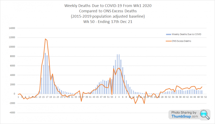
Reassuringly, the ONS data shows profound differences in the number of people dying with COVID this winter compared to last winter.

This graph shows the percentage change in deaths per 100k population for each age band between the final week of Dec 20 and the final week of Dec 21.
The death rate is lower for all age bands, but the reduction increases almost linearly with age:

I think this is likely to be directly correlated with vaccine take up in each group.
The death rate is lower for all age bands, but the reduction increases almost linearly with age:
I think this is likely to be directly correlated with vaccine take up in each group.
the-photographer said:
Elysium said:
Update.
2. These graphs show the Cases per 100k Tests and Admissions curves against the Case Fatality Rate (CFR) and Case Hospitalisation Rate (CHR)
I expected that omicron would result in significant falls in the CFR, but this is currently running at a 14 day average of 0.17% compared to 0.20% last July
The CHR has similarly settled at around 2%, which again is very similar to July.
This suggests to me that the reduction in death and serious illness from COVID is determined more by vaccination than omicrons intrinsically lower severity
Pretty close figures to Page 122. These graphs show the Cases per 100k Tests and Admissions curves against the Case Fatality Rate (CFR) and Case Hospitalisation Rate (CHR)
I expected that omicron would result in significant falls in the CFR, but this is currently running at a 14 day average of 0.17% compared to 0.20% last July
The CHR has similarly settled at around 2%, which again is very similar to July.
This suggests to me that the reduction in death and serious illness from COVID is determined more by vaccination than omicrons intrinsically lower severity
https://assets.publishing.service.gov.uk/governmen...
UKHSA said:
Vaccine effectiveness against mortality with the Omicron variant has been estimated for those aged 50 years and older by combining the risk of becoming a symptomatic case with the risk of death among symptomatic cases in vaccinated (all vaccines combined) compared to unvaccinated individuals (Table 1)
So the apparent reduction in vaccine efficacy against serious illness and death from omicron is based on an increased likelihood of infection rather than waning efficacy against severe disease. isaldiri said:
Elysium said:
Interesting comment on that page:
Did have this discussion with you on the other thread - I'm increasingly certain that PHE/UKHSA efficacy numbers for serious disease are 2nd order calculations backed out from overall numbers and thus showing some waning over time just like infection efficacy rather than comparing any potential waning over time when actually infected. UKHSA said:
Vaccine effectiveness against mortality with the Omicron variant has been estimated for those aged 50 years and older by combining the risk of becoming a symptomatic case with the risk of death among symptomatic cases in vaccinated (all vaccines combined) compared to unvaccinated individuals (Table 1)
So the apparent reduction in vaccine efficacy against serious illness and death from omicron is based on an increased likelihood of infection rather than waning efficacy against severe disease. The comment on the UKHSA report together with the data we have confirms you are absolutely correct.
I think this makes the booster argument quite circular, but we will never quite know what would have happened without them.
This is from the latest ICNARC report (page 53)
https://www.icnarc.org/DataServices/Attachments/Do...
Absolutely extraordinary.
https://www.icnarc.org/DataServices/Attachments/Do...
Absolutely extraordinary.

An update with todays data. I think this may be the last one I do as I am now daring to dream we are finally on the other side of this.
1. Comparison with Last Year
Admissions, People in Hospital, People on Mechanical Ventilators and Deaths are all much lower than last year. The 'bounce' in Cases per 100k tests does not seem to be meaningfully translating to anything else.
The metric I think matters most at this point is people on mechanical ventilators as this is less affected by incidental cases being treated for non-COVID illness. This was essential flat through late summer and autumn and has steadily declined since November.

2. Analysis of the Case Fatality Rate and Case Hospitalisation Rate shows that the severity of COVID was fundamentally recalibrated by July 2021 and has remained largely unchanged since. I believe that this shows COVID was comprehensively defanged by the original 2 dose vaccine programme.
3. Overlaying Cases per 100k Tests, Admissions and Deaths shows that the latter have some way still to fall. However, Admissions have now been in decline for 23 consecutive days and deaths for 11.

1. Comparison with Last Year
Admissions, People in Hospital, People on Mechanical Ventilators and Deaths are all much lower than last year. The 'bounce' in Cases per 100k tests does not seem to be meaningfully translating to anything else.
The metric I think matters most at this point is people on mechanical ventilators as this is less affected by incidental cases being treated for non-COVID illness. This was essential flat through late summer and autumn and has steadily declined since November.
2. Analysis of the Case Fatality Rate and Case Hospitalisation Rate shows that the severity of COVID was fundamentally recalibrated by July 2021 and has remained largely unchanged since. I believe that this shows COVID was comprehensively defanged by the original 2 dose vaccine programme.
3. Overlaying Cases per 100k Tests, Admissions and Deaths shows that the latter have some way still to fall. However, Admissions have now been in decline for 23 consecutive days and deaths for 11.
Edited by Elysium on Friday 4th February 18:44
One more update given the now very real prospect of an imminent end date for COVID testing
1. Year on year comparisons of the last two winter waves. I have simplified the first graph which now only shows cases per 100k tests and deaths within 28 days. The second graph shows the three main hospital metrics. The conclusion is now very obvious. Cases are not resulting in anywhere near the same level of severe outcomes that we saw one year ago:


2. This is why. The CHR (Case Hospitalisation Rate) and CFR (Case Fatality Rate) have consistently declined since December 2020. Back then 12% of cases resulted in hospitalisation. Now it's less than 2%. Back then 3% of cases resulted in deaths, whereas it is now less than 0.2%
These are enormous differences

3. These graphs set out the same metrics for the whole pandemic. The most striking thing is the MV bed line on the final graph. There was no winter wave of people requiring ventilators. We had 3500 beds occupied last year and its about 10 times lower now.

1. Year on year comparisons of the last two winter waves. I have simplified the first graph which now only shows cases per 100k tests and deaths within 28 days. The second graph shows the three main hospital metrics. The conclusion is now very obvious. Cases are not resulting in anywhere near the same level of severe outcomes that we saw one year ago:
2. This is why. The CHR (Case Hospitalisation Rate) and CFR (Case Fatality Rate) have consistently declined since December 2020. Back then 12% of cases resulted in hospitalisation. Now it's less than 2%. Back then 3% of cases resulted in deaths, whereas it is now less than 0.2%
These are enormous differences
3. These graphs set out the same metrics for the whole pandemic. The most striking thing is the MV bed line on the final graph. There was no winter wave of people requiring ventilators. We had 3500 beds occupied last year and its about 10 times lower now.
I think we now have evidence that 'zero COVID' or the eradication of COVID in a region through isolation and lockdown has failed.
New Zealand, which was once the poster child for this idea, has now exceeded the UK's recent peak of cases when corrected for population size. However, they may now benefit with a lower death rate due to the inherent lower severity of omicron in a heavily vaccinated population:
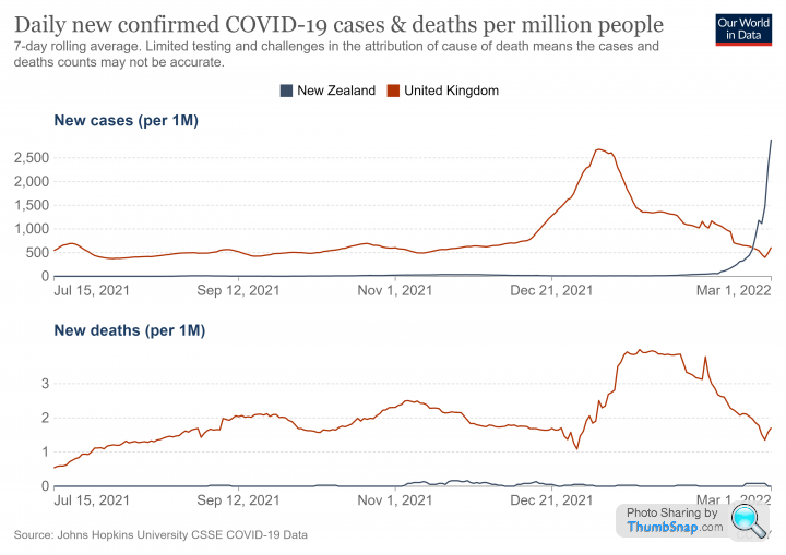
New Zealand, which was once the poster child for this idea, has now exceeded the UK's recent peak of cases when corrected for population size. However, they may now benefit with a lower death rate due to the inherent lower severity of omicron in a heavily vaccinated population:
CarlosFandango11 said:
Elysium said:
I think we now have evidence that 'zero COVID' or the eradication of COVID in a region through isolation and lockdown has failed.
New Zealand, which was once the poster child for this idea, has now exceeded the UK's recent peak of cases when corrected for population size. However, they may now benefit with a lower death rate due to the inherent lower severity of omicron in a heavily vaccinated population:
What was New Zealand’s strategy for Covid? I don’t think it was to keep at “zero COVID” forever. If it was to keep levels of COVID very low, or zero, until their population had a high level of vaccinations to minimise deaths, then it looks like they’ve been successful.New Zealand, which was once the poster child for this idea, has now exceeded the UK's recent peak of cases when corrected for population size. However, they may now benefit with a lower death rate due to the inherent lower severity of omicron in a heavily vaccinated population:
https://edition.cnn.com/2021/10/05/asia/new-zealan...
Gassing Station | News, Politics & Economics | Top of Page | What's New | My Stuff