Coronavirus - Data Analysis Thread
Discussion


NoddyonNitrous said:
Terminator X said:
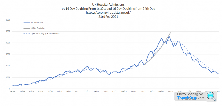
"The striking thing here is that admissions are not falling in line with cases"
What does or might that mean?
TX.
A fall in the number of cases in the community is not leading to a reduction in hospital admissions. The latter usually lag behind the former by about a week, on that graph the admissions haven't fallen 11 days after the community cases started to. E.g.:-What does or might that mean?
TX.
Scottish data: cases started falling 6th January

Hospital admissions started falling 11th January, a week later

Could be a sign of a more virulent virus with a higher admission %age.
Any other thoughts?
At the peak the total number will be limited by capacity as as only the sickest will be accepted. As the pressure eases the number admitted could remain high as the NHS uses its capacity to treat people who are less ill and may not have been admitted in earlier weeks.
Updated comparison between PHE deaths 'within 28 days', ONS deaths 'due to COVID' and ONS 'excess deaths' based on the population adjusted 2015-2019 average.

According to the PHE measure, the second wave is now bigger than the first. Thats not quite the case for ONS deaths and is definitely not the case for excess deaths.
According to the PHE measure, the second wave is now bigger than the first. Thats not quite the case for ONS deaths and is definitely not the case for excess deaths.
I did not have a chance to update my graphs at the end of the week so have done so today:
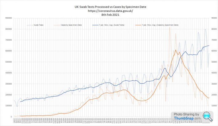
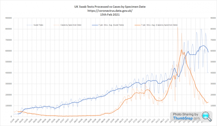
1. Tests and cases. Cases are plummeting despite continuing increases in testing a new high of 772k processed on the 27th Jan.

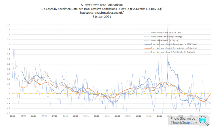
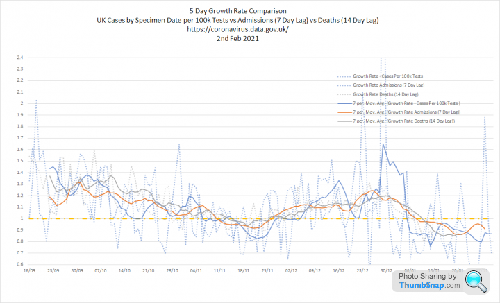
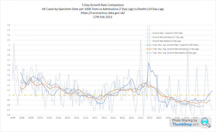
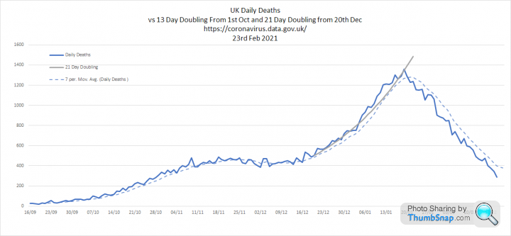
2. Cases per 100k tests, admissions and deaths. Cases per 100k tests has continued to drop, now down to late Sept levels. Admissions seem to have peaked around 11th Jan and deaths a week later on the 18th Jan. However, admissions are still not falling as quickly as cases.


3. All 3 metrics overlaid with growth rates. All growth rates below 1 for a couple of weeks. Interestingly, cases per 100k tests growth rate seems to be realigning with the others following Christmas volatility.

1. Tests and cases. Cases are plummeting despite continuing increases in testing a new high of 772k processed on the 27th Jan.
2. Cases per 100k tests, admissions and deaths. Cases per 100k tests has continued to drop, now down to late Sept levels. Admissions seem to have peaked around 11th Jan and deaths a week later on the 18th Jan. However, admissions are still not falling as quickly as cases.
3. All 3 metrics overlaid with growth rates. All growth rates below 1 for a couple of weeks. Interestingly, cases per 100k tests growth rate seems to be realigning with the others following Christmas volatility.
Update on 'excess deaths' following todays wk 3 report by the ONS.
1. We are back into statistically significant excess death for wk 3 2021, but this is starting to look like the peak and wk 4 should be a little better:

2. This graph compares deaths 'due to' COVID with excess deaths. Once again COVID is higher in Wk 3 because we are seeing a lower than normal level of non-COVID deaths:
3. This compares PHE, ONS and ONS Excess deaths for England and Wales for the entire pandemic. The second wave is now considerably bigger than the first according to PHE, about the same according to the ONS, but still smaller based on excess deaths. I remain of the view that these differences are down to methodology:

1. We are back into statistically significant excess death for wk 3 2021, but this is starting to look like the peak and wk 4 should be a little better:
2. This graph compares deaths 'due to' COVID with excess deaths. Once again COVID is higher in Wk 3 because we are seeing a lower than normal level of non-COVID deaths:
3. This compares PHE, ONS and ONS Excess deaths for England and Wales for the entire pandemic. The second wave is now considerably bigger than the first according to PHE, about the same according to the ONS, but still smaller based on excess deaths. I remain of the view that these differences are down to methodology:
Update on todays numbers and I have to say it looks pretty positive:
1. Tests and Cases. The fall we are seeing now is much more significant that in lockdown 2. Looking at this graph I can't help feeling that the second 'circuit breaker' lockdown just 'squashed the sombrero' and quickly rebounded causing the second peak.

2. Cases per 100k tests, admissions and deaths. Cases now back to Sept levels, with admissions and deaths finally slowing. Looking at these now its obvious that the growth in deaths slowed during the second lockdown, but the daily numbers never really reduced.

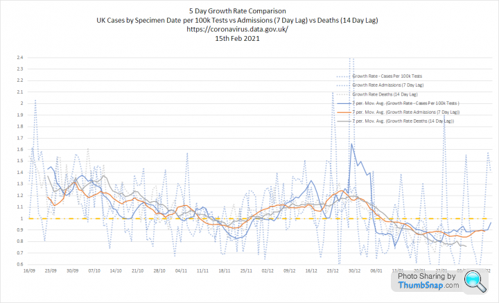
3. Three metrics overlaid with growth rates. Good news here is that growth rates are holding below 1 with admissions and deaths following the fall in cases per 100k tests. This should continue for the next couple of weeks at least:

1. Tests and Cases. The fall we are seeing now is much more significant that in lockdown 2. Looking at this graph I can't help feeling that the second 'circuit breaker' lockdown just 'squashed the sombrero' and quickly rebounded causing the second peak.
2. Cases per 100k tests, admissions and deaths. Cases now back to Sept levels, with admissions and deaths finally slowing. Looking at these now its obvious that the growth in deaths slowed during the second lockdown, but the daily numbers never really reduced.
3. Three metrics overlaid with growth rates. Good news here is that growth rates are holding below 1 with admissions and deaths following the fall in cases per 100k tests. This should continue for the next couple of weeks at least:
Update following todays data:
1. Cases continue to fall as tests edge ever higher. However there has been a massive shift to LFD tests. The second graph shows the %'age split between LFD and PCR tests over time and the fall in cases does seem to align with the switch in methodology. At this point the data is not available for the whole of the UK, so this is England only:

2. Cases per 100k tests, Admissions and Deaths. All metrics are falling, although there will be some reporting lag with deaths:


3. Three metrics overlaid with growth rates. Admissions are still not falling as quickly as cases. It may be that we are now admitting people who are less sick, ongoing hospital transmission, or the difference between LFD and PCR:


1. Cases continue to fall as tests edge ever higher. However there has been a massive shift to LFD tests. The second graph shows the %'age split between LFD and PCR tests over time and the fall in cases does seem to align with the switch in methodology. At this point the data is not available for the whole of the UK, so this is England only:
2. Cases per 100k tests, Admissions and Deaths. All metrics are falling, although there will be some reporting lag with deaths:
3. Three metrics overlaid with growth rates. Admissions are still not falling as quickly as cases. It may be that we are now admitting people who are less sick, ongoing hospital transmission, or the difference between LFD and PCR:
panholio said:
Hi Elysium.
Thanks for all the graphs. I do really look forward to them.
Just a thought, would Thursday or Friday be a better day to update? Seems to be that Monday and Tuesday are both impacted by lag one way or another.
Thanks again.
No problem. I usually do Friday as well, but don't always get a chance. Thanks for all the graphs. I do really look forward to them.
Just a thought, would Thursday or Friday be a better day to update? Seems to be that Monday and Tuesday are both impacted by lag one way or another.
Thanks again.
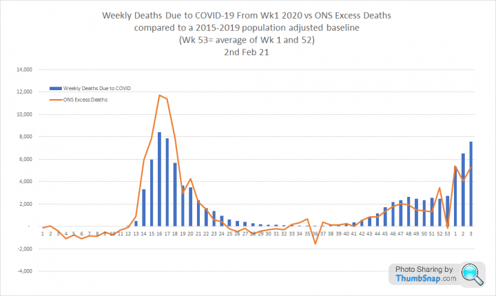
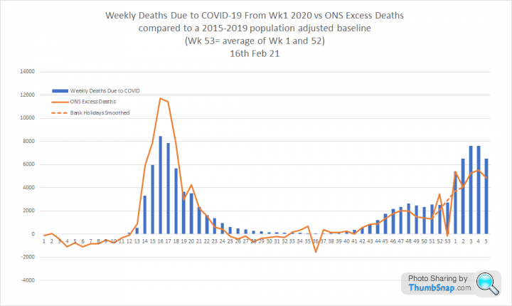
Update on excess deaths based on todays ONS data for the week ending 29th Jan 2021
1. This shows weekly deaths divided between those 'due to' COVID and other causes. The lines are the 5 year Max, Min and Average and the green line indicates statistically significant excess death. Once again non-COVID deaths are below the 5 year minimum. This is characteristic of the second wave and very different to the first. There are hopeful signs this might be the peak of 'due to' COVID deaths.

2. This compares 'due to' COVID deaths with excess deaths. Again hopeful signs that the excess is flattening off. If this is the peak of excess deaths, then it is about half the size of the March peak.

3. This compares weekly deaths for England and Wales record by PHE, ONS and ONS excess deaths. According to PHE the second wave is now significantly bigger than the first. According to the ONS it is similar. But in terms of ONS excess deaths the second wave is still quite a bit smaller. The difference is methodology and the fact that the second wave occured at a 'normal' time for an endemic seasonal virus.

1. This shows weekly deaths divided between those 'due to' COVID and other causes. The lines are the 5 year Max, Min and Average and the green line indicates statistically significant excess death. Once again non-COVID deaths are below the 5 year minimum. This is characteristic of the second wave and very different to the first. There are hopeful signs this might be the peak of 'due to' COVID deaths.
2. This compares 'due to' COVID deaths with excess deaths. Again hopeful signs that the excess is flattening off. If this is the peak of excess deaths, then it is about half the size of the March peak.
3. This compares weekly deaths for England and Wales record by PHE, ONS and ONS excess deaths. According to PHE the second wave is now significantly bigger than the first. According to the ONS it is similar. But in terms of ONS excess deaths the second wave is still quite a bit smaller. The difference is methodology and the fact that the second wave occured at a 'normal' time for an endemic seasonal virus.
Update based on todays data:
1. Cases and tests. Cases continue to fall and are now back at early Oct levels. However, this no longer tells the full story as we have dramatically shifted focus from PCR to LFD. The second graph is for England only, but it shows the 7 day average for PCR in orange and LFD in blue. I am going to try to see if I can figure out the separate positivity rates for each test:


2. Cases per 100k tests, admissions and deaths. All metrics falling


3. Three metrics overlaid and growth rates. I think the switch to lateral flow testing is the hidden reason why admissions and deaths have fallen more slowly than cases per 100k tests

1. Cases and tests. Cases continue to fall and are now back at early Oct levels. However, this no longer tells the full story as we have dramatically shifted focus from PCR to LFD. The second graph is for England only, but it shows the 7 day average for PCR in orange and LFD in blue. I am going to try to see if I can figure out the separate positivity rates for each test:
2. Cases per 100k tests, admissions and deaths. All metrics falling
3. Three metrics overlaid and growth rates. I think the switch to lateral flow testing is the hidden reason why admissions and deaths have fallen more slowly than cases per 100k tests
Quick update on excess deaths following todays ONS report for week 5:
1. This graph shows weekly deaths split into those 'due to' COVID in orange and those where COVID was not a cause of death in blue. The dotted lines are the population adjusted 5 year max, min and average. The green line is statistically significant excess death. (2 x SD). The most striking observation is still that non-COVID deaths are below the 5-year minimum in the second wave, but were in significant excess in the first:

2. This graph shows 'excess deaths' compared to the 5-year average overlaid with reported 'due to' COVID deaths. I have added a dotted line to smooth out the bank holiday reporting lags over Christmas, whilst keeping the area beneath the curve the same. The second wave is still smaller than the first in terms of excess death:
3. A similar graph, but this time the orange line shows statistically significant excess death. Anything above zero means something unusual going on. It is immediately obvious that the COVID deaths in the first wave align with that unusual increase in death, but in the second wave the majority do not:

1. This graph shows weekly deaths split into those 'due to' COVID in orange and those where COVID was not a cause of death in blue. The dotted lines are the population adjusted 5 year max, min and average. The green line is statistically significant excess death. (2 x SD). The most striking observation is still that non-COVID deaths are below the 5-year minimum in the second wave, but were in significant excess in the first:
2. This graph shows 'excess deaths' compared to the 5-year average overlaid with reported 'due to' COVID deaths. I have added a dotted line to smooth out the bank holiday reporting lags over Christmas, whilst keeping the area beneath the curve the same. The second wave is still smaller than the first in terms of excess death:
3. A similar graph, but this time the orange line shows statistically significant excess death. Anything above zero means something unusual going on. It is immediately obvious that the COVID deaths in the first wave align with that unusual increase in death, but in the second wave the majority do not:
bongtom said:
Armchair Expert said:
Curiosity question.
We all know that the East Asian countries have got off lightly from Covid 19 whether by luck, management or other reasons, kind of wondering what are the stats for East Asian People in North America or Europe?
Anyone know?
Well China had pretty draconian measures (that the western media decried and went off about human rights etc), Taiwan has an excellent medical system and obedient citizens, S Korea - no idea. We all know that the East Asian countries have got off lightly from Covid 19 whether by luck, management or other reasons, kind of wondering what are the stats for East Asian People in North America or Europe?
Anyone know?
SE Asia had it quite bad, apart from Cambodia but they’ve got a very young population (thanks to the Khmer Rouge) and no public transport to speak of plus the majority of the population live in the open air on stilted houses.
I think there’s no correlation between cases in those countries and their residents in the west.
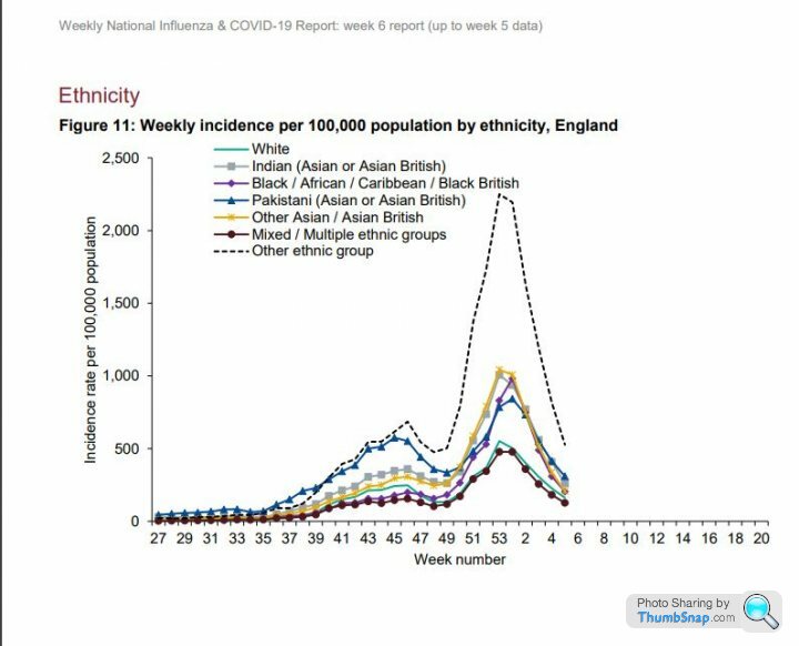
https://assets.publishing.service.gov.uk/governmen...
East Asian people in the UK will be in the group shown by the Yellow line in this graph, which seems to follow the general trend:
Pete102 said:
Can you surmise the main point here? Do you think that the switch to LFT is resulting in missed positives, leading to more admissions (although still down overall?).
3. Three metrics overlaid and growth rates. I think the switch to lateral flow testing is the hidden reason why admissions and deaths have fallen more slowly than cases per 100k tests
Firstly, testing capacity has steadily increased since April, so using raw case numbers could potentially give you a distorted view of what is happening: 3. Three metrics overlaid and growth rates. I think the switch to lateral flow testing is the hidden reason why admissions and deaths have fallen more slowly than cases per 100k tests
I have been using 'cases per 100k tests' as a metric, because it corrects for changes in testing volumes, in terms of short term cycles and that long term increase. I have found that admissions and deaths track this metric quite closely with a 7 and 14 day lag:
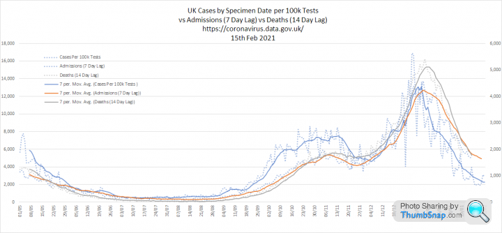
However, admissions and deaths were slow to fall after the peak in cases per 100k tests around New Year. I now believe this is because that coincides with a systemic switch from PCR to LFD tests. The question is if the LFD tests are actually telling us anything useful about prevalence:
I noticed some interesting data on this in the latest PHE surveillance report I linked to earlier:

This shows very low positivity from LFD tests. So as we switch to LFD cases per 100k tests will also fall. I think admissions and deaths will track PCR positivity more closely than overall positivity.
Murph7355 said:
Elysium said:
....The most striking observation is still that non-COVID deaths are below the 5-year minimum in the second wave, but were in significant excess in the first...
People can only die once?The excess deaths graphs I have posted show ONS deaths ‘due to’ COVID. Which are where COVID appears on the death certificate as an underlying cause of death. It does not mean there are not other causes, but the mention of COVID anywhere in the ‘chain of events’ leading to a death trumps any other condition.
Graveworm said:
Elysium said:
The excess deaths graphs I have posted show ONS deaths ‘due to’ COVID. Which are where COVID appears on the death certificate as an underlying cause of death. It does not mean there are not other causes, but the mention of COVID anywhere in the ‘chain of events’ leading to a death trumps any other condition.
There can only be 1 underlying cause of death on a certificate, so "The underlying cause" not "An underlying cause" in ONS terms. There can be other conditions that lead to the underlying cause that are listed separately. Then there are other significant causes. If Covid appears in either of those it is "Mentioned" in ONS parlance. My understanding is that ONS ‘Due to’ COVID deaths are where COVID is stated in part 1. .
Update with todays numbers:
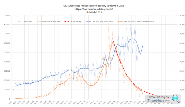
1. Cases are continuing to decline, but testing growth has also slowed. I have added a dotted line showing 18 day halving, which suggests that if the trend continues it will be late April before we reach less than 1,000 cases per day:
2. This graph shows cases for England overlaid against tests split into PCR and LFD. You can see that LFD tests, which return relatively a low %age of positive result are falling fastest:

3. Key metrics. The fall in Cases per 100k tests is flattening off, but the dotted line suggests that this metric is also halving every 18 days. Admissions and deaths continue to fall:


4. Metrics overlaid with growth rates.

1. Cases are continuing to decline, but testing growth has also slowed. I have added a dotted line showing 18 day halving, which suggests that if the trend continues it will be late April before we reach less than 1,000 cases per day:
2. This graph shows cases for England overlaid against tests split into PCR and LFD. You can see that LFD tests, which return relatively a low %age of positive result are falling fastest:
3. Key metrics. The fall in Cases per 100k tests is flattening off, but the dotted line suggests that this metric is also halving every 18 days. Admissions and deaths continue to fall:
4. Metrics overlaid with growth rates.
NoddyonNitrous said:
So the apparent rise in cases/100k tests is caused by the big reduction in less productive LF tests.
Scotlands cases and admissions and deaths continue to fall, but the ITU admissions is trending upwards. Worrying that an increasing percentage of hospital admissions are requiring Intensive care. ITU admission criteria haven't changed. Is this pattern being seen in rUK too?
Public Health Scotland data of ITU admissions to 19/2/21:-

It’s perhaps a bit early to say cases per 100k tests is rising, but LFD volumes will distort the numbers.Scotlands cases and admissions and deaths continue to fall, but the ITU admissions is trending upwards. Worrying that an increasing percentage of hospital admissions are requiring Intensive care. ITU admission criteria haven't changed. Is this pattern being seen in rUK too?
Public Health Scotland data of ITU admissions to 19/2/21:-
An increase in %age ICU admissions could reflect the fact that people who are being admitted are younger. This could be a positive vaccine effect as the elderly are more protected.
The elderly admissions do not tend to get to ICU
Tuesday again, which means an update from the ONS on 'excess deaths'
1. This graph shows all deaths divided into non COVID in blue and 'due to' COVID in orange. Non COVID deaths continue to be below the 5 year minimum and, although overall deaths remain at a statistically significant 'excess', it is tracking a normal 'curve' for winter.
I think this supports the argument that he first wave was an entirely unexpected event, whereas the second wave is more consistent with a seasonal endemic virus, albeit one that it acting at an unusually high severity because it is still new to the population:

2. These two graphs show 'due to' COVID deaths compared to the ONS excess and statistically significant excess deaths. The key point here is that the first wave COVID deaths align closely with the statistically significant excess, whereas the second wave does not. I think this shows the difference between the two waves and it reinforces the view outlined above that the second wave is a seasonal resurgence:


1. This graph shows all deaths divided into non COVID in blue and 'due to' COVID in orange. Non COVID deaths continue to be below the 5 year minimum and, although overall deaths remain at a statistically significant 'excess', it is tracking a normal 'curve' for winter.
I think this supports the argument that he first wave was an entirely unexpected event, whereas the second wave is more consistent with a seasonal endemic virus, albeit one that it acting at an unusually high severity because it is still new to the population:
2. These two graphs show 'due to' COVID deaths compared to the ONS excess and statistically significant excess deaths. The key point here is that the first wave COVID deaths align closely with the statistically significant excess, whereas the second wave does not. I think this shows the difference between the two waves and it reinforces the view outlined above that the second wave is a seasonal resurgence:
Update with todays data:
1. Testing is on the rise again and is heading for a new peak. Meanwhile cases continue to fall and are now at Sept 2020 levels. There were some suggestions last week that the rate of decline might be slowing. However, I think this is simply exponential decay, with the dotted redline illustrating Halving every 18 days. If this rate continues we will drop below 1,000 cases per day during the second half of April:

2. Key metrics. Cases per 100k tests (positivity) is also halving every 18 days. I was concerned that the switch to LFD from PCR might make this a less useful measure, but it seems the positivity of the LFD tests is so low that the volumes become almost irrelevant. Admissions and deaths are also falling consistently:

3. Metrics overlaid with growth rates. After an initial lag hospital admissions are now falling in line with cases per 100k tests. Deaths seem to be falling faster, but are prone to reporting delays. You would expect the vaccines to reduce admissions faster than cases as people suffer much milder illness, but that is not happening yet.


1. Testing is on the rise again and is heading for a new peak. Meanwhile cases continue to fall and are now at Sept 2020 levels. There were some suggestions last week that the rate of decline might be slowing. However, I think this is simply exponential decay, with the dotted redline illustrating Halving every 18 days. If this rate continues we will drop below 1,000 cases per day during the second half of April:
2. Key metrics. Cases per 100k tests (positivity) is also halving every 18 days. I was concerned that the switch to LFD from PCR might make this a less useful measure, but it seems the positivity of the LFD tests is so low that the volumes become almost irrelevant. Admissions and deaths are also falling consistently:
3. Metrics overlaid with growth rates. After an initial lag hospital admissions are now falling in line with cases per 100k tests. Deaths seem to be falling faster, but are prone to reporting delays. You would expect the vaccines to reduce admissions faster than cases as people suffer much milder illness, but that is not happening yet.
Gassing Station | News, Politics & Economics | Top of Page | What's New | My Stuff