Coronavirus - Data Analysis Thread
Discussion


I'm sure you guys are aware of this fantastic Twitter account that takes the Government data and presents it in various formats way better than the Government site does.
https://twitter.com/RP131
As various charts have been in place for months you can easily make comparisons of historical data
https://twitter.com/RP131
As various charts have been in place for months you can easily make comparisons of historical data
Here's one concerning the efficiency of a Corona app (DE):
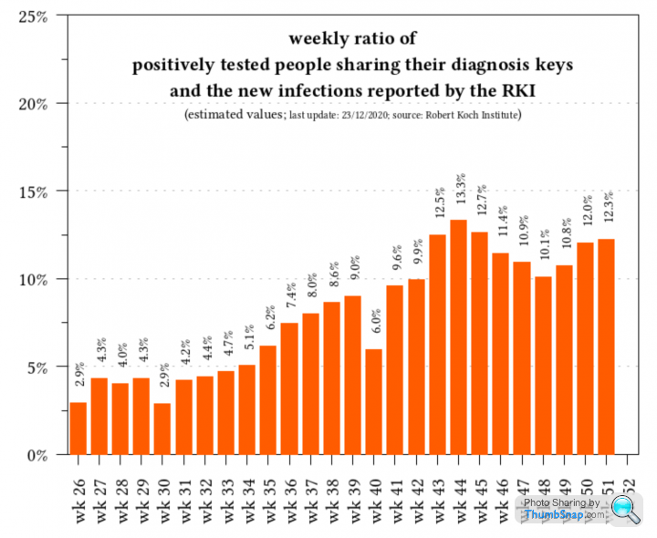
Given that the number of downloads compared to the total population (24.2m/83m) doesn't say much; the share of actually reported positive results "diagnosis key" gives a better insight on effective use of the app.
Some more wrangled data on the Corona app here:
https://micb25.github.io/dka/index_en.html
The app will give its user a risk category when they met someone who reported a positive diagnosis, the reporting success will be at ~10%; but acting accordingly by the user will be less.
The chain to success is pretty long:
having a device to run the app
downloading the app
running the app & bluetooth on
carrying the device permanently when meeting others
(actually reporting a positive result to the benefit of the app)
receiving a risk warning
acting accordingly (self-isolation, ...)
LimJim said:
anonymous said:
[redacted]
Interesting never seen this one beforeMore seriously, it seems to show that you can stymie the virus with non-pharmaceutical measures, but its simply a game of chicken and unfortunately, the virus is not ever going to blink first. It will be there waiting when you've ran out of air and are coming to the surface to breathe.
It as I have been beginning to think - we can't get rid of it by hiding, the area under the curve isn't going to change. The only question is: Do you want one big curve? or lots of little ones? the integration is the same.
Tough decision to make I guess because whilst the final answers might not be too disimilar, the former choice will almost certainly look horrific to all and sundry. But the latter is effectively a death by a thousand cuts.
Graveworm said:
Are those per-day values on the Y-axis? it doesn't seem to say. I assume they are.Preprint, not yet reviewed.
Conclusion: - Specifically, people with blood group A have a higher risk whereas people with blood group O have a lower risk for SARS-Cov-2 infection and COVID-19 severity.
“Relationship between the ABO Blood Group and the COVID-19 Susceptibility”
https://www.medrxiv.org/content/10.1101/2020.03.11...

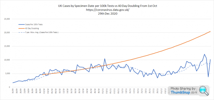
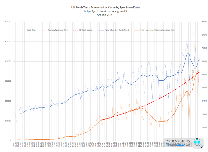
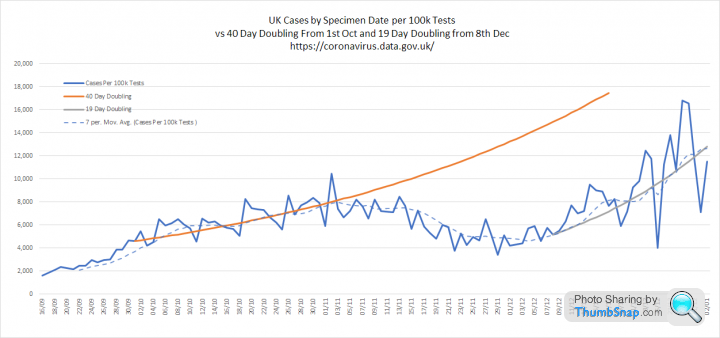
Some updated graphs with data from https://coronavirus.data.gov.uk/
1. Tests and cases.
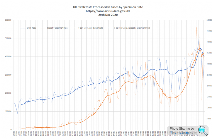
2. Cases per 100k tests (comparing cases on one day with tests processed 2 days later), admissions (note the full week lag in the UK data) and deaths
1. Tests and cases.
2. Cases per 100k tests (comparing cases on one day with tests processed 2 days later), admissions (note the full week lag in the UK data) and deaths
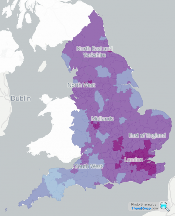
This is a great site:
https://russss.github.io/covidtracker/map.html#cha...
This positivity map is particularly interesting:
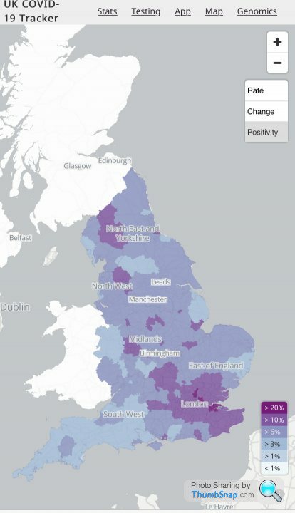
https://russss.github.io/covidtracker/map.html#cha...
This positivity map is particularly interesting:
Elysium said:
This is a great site:
https://russss.github.io/covidtracker/map.html#cha...
This positivity map is particularly interesting:
5 days later:https://russss.github.io/covidtracker/map.html#cha...
This positivity map is particularly interesting:
Ashfordian said:
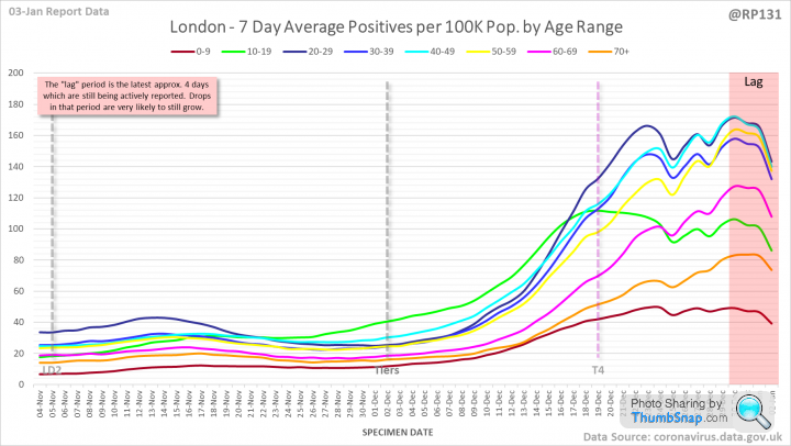
I'm sure you guys are aware of this fantastic Twitter account that takes the Government data and presents it in various formats way better than the Government site does.
https://twitter.com/RP131
As various charts have been in place for months you can easily make comparisons of historical data
Wasn't aware. Now following - thankshttps://twitter.com/RP131
As various charts have been in place for months you can easily make comparisons of historical data
Has London peaked? (Sorry think I've misread - there's more to be added in the 'lag' section isn't there
 )
)https://twitter.com/RP131/status/13457663075774054...
Latest vaccination stats from https://www.england.nhs.uk/statistics/statistical-...
It only includes total to date so I'll try to keep track of the per week figures as well.
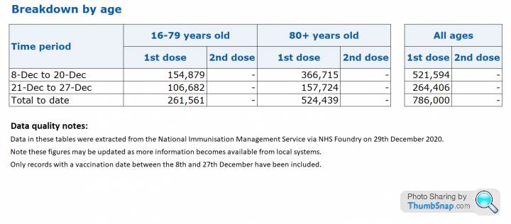
It only includes total to date so I'll try to keep track of the per week figures as well.
I've posted this before in other threads, but I'll throw this one out again:
https://aatishb.com/covidtrends/?data=deaths&l...
The chart plots reported covid-19 deaths in last week against the total deaths from Covid-19. The chart is animated so you can watch what the data does over time, and scroll back and forth.
This one is in logarthimic scale, but there is linear scale too.
You can add additional countries to the chart, see confirmed cases.
The data comes from John Hopkins University.
Uhtred said:
Seems like the OP has given up on this thread because the current data (hospitalisations etc) does not show what they want it to...
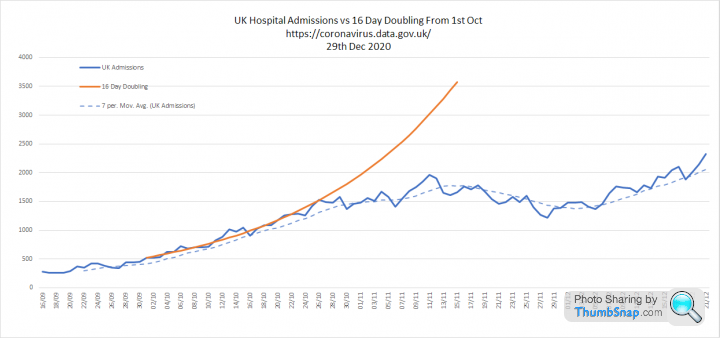
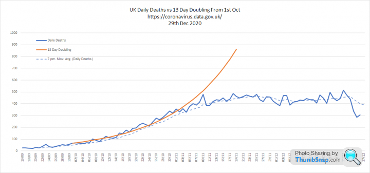
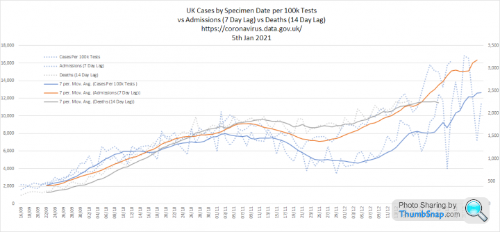
There are plenty of other threads where people can argue. This should be for sharing useful data without debate. Quite a lot of new numbers today so I have updated my graphs. The media are getting exited about 60k reported cases today, but seem to have missed the fact that we had a much more fruity 81,224 cases for specimens taken on the 29th Dec.
1. Tests and cases. I have extended a line to show what would have happened if cases had continued to grow at pre-lockdown rates (50 day doubling).
2. Cases per 100k tests, Admissions and Deaths. Cases per 100k tests are doubling every 19 days since the 8th Dec. Admissions and deaths are growing, but more slowly than pre-lockdown
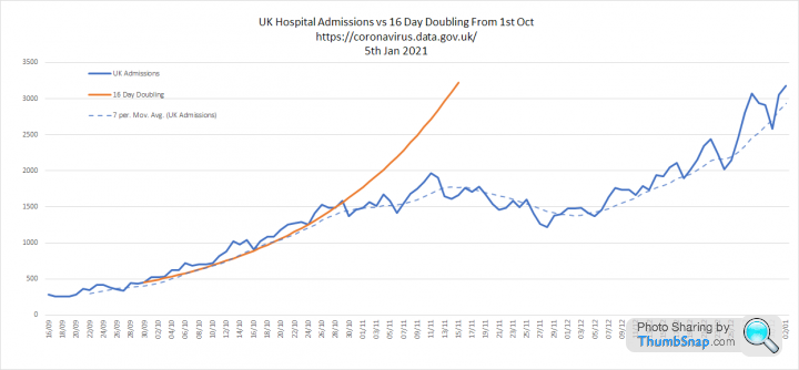
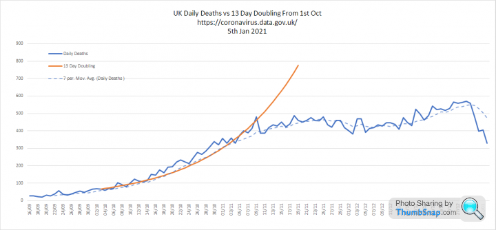
3. Three metrics overlaid and growth rates. My main observation is that these are still moving together with the lags I have assumed, deaths look slower, but I think this is reporting delay. Cases per 100k tests growth rate went a bit nuts over Christmas

Lotobear said:
I don't know if there is a link, but COVID-19 Actuaries Response Group are useful posters on twitter as well https://twitter.com/COVID19actuary
Plus this chap:
https://twitter.com/john_actuary
https://twitter.com/COVID19actuary/status/13468439...
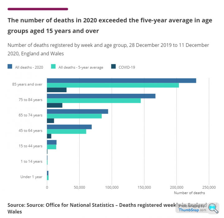
The Continuous Mortality Investigation (CMI) has published its penultimate Mortality Monitor for 2020.
Key points:
- CMI calculates 75,000 excess deaths to 25 December, of which 14,200 are in the second wave.
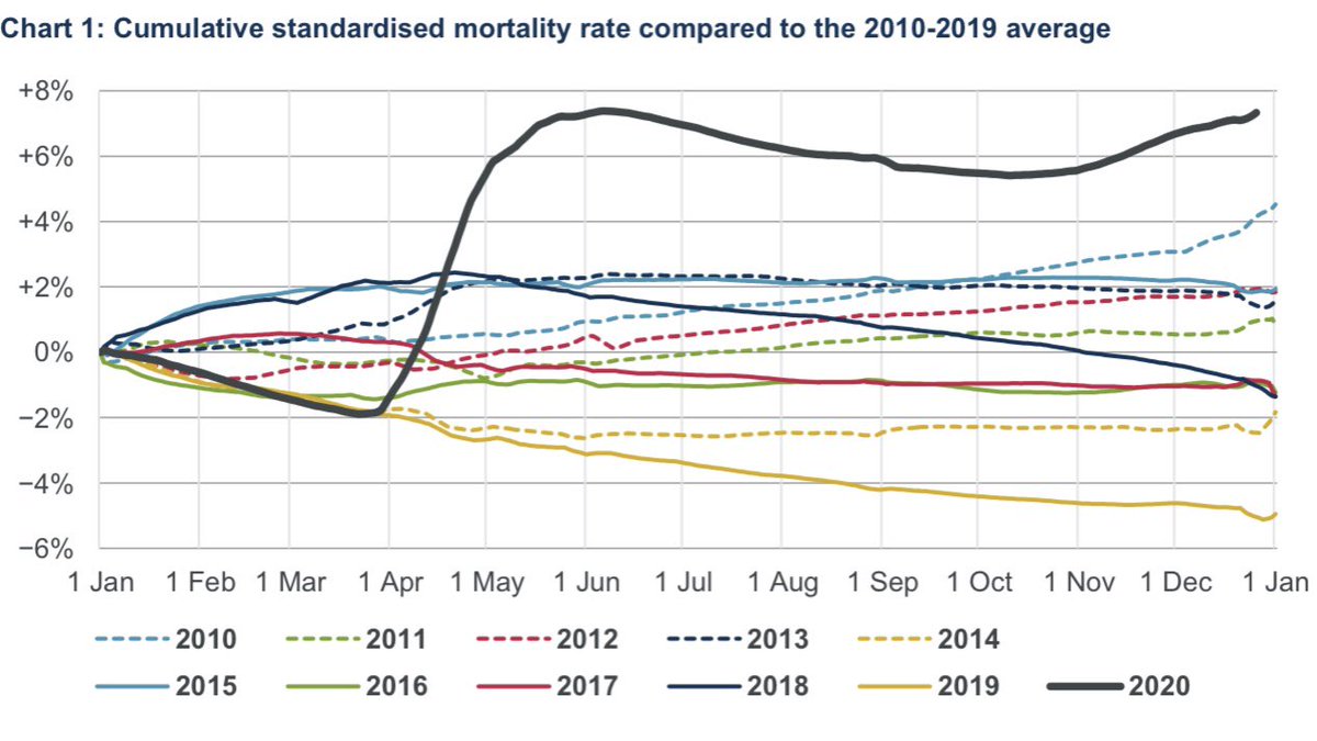
The Continuous Mortality Investigation (CMI) has published its penultimate Mortality Monitor for 2020.
Key points:
- CMI calculates 75,000 excess deaths to 25 December, of which 14,200 are in the second wave.
Gassing Station | News, Politics & Economics | Top of Page | What's New | My Stuff