Climate Change - The Scientific Debate (Vol. II)
Discussion


jshell said:
Gadgetmac said:
Who said it was the highest UK ever recorded? London was the place specified. It's there in black and white, right above your post 
Windy.com uses models...brilliant...so that's not just one model got it right then? In fact they use the ECMWF model just like the Beeb as one of the models to future cast.
In fact if windy.com did it a day earlier that's an even more impressive use of a model.
One in the eye for those who don't like models then.
As ever, what IS your point? Do you ever actually HAVE a point? It appears to be endless ramblings of a confused mind. I'm off back to ignoring you. Have fun!Windy.com uses models...brilliant...so that's not just one model got it right then? In fact they use the ECMWF model just like the Beeb as one of the models to future cast.
In fact if windy.com did it a day earlier that's an even more impressive use of a model.
One in the eye for those who don't like models then.
Edited by Gadgetmac on Wednesday 22 January 17:06
Please, do fecking stop responding, you only make yourself look stupid.
Considering this
https://www.bbc.co.uk/news/science-environment-480...
I'm guessing this
https://www.bbc.co.uk/news/world-51420681
Is not going to help matters.
It will be interesting to see how these birds cope in 2020 onwards as warming touches the outliers of their continent.
https://www.bbc.co.uk/news/science-environment-480...
I'm guessing this
https://www.bbc.co.uk/news/world-51420681
Is not going to help matters.
It will be interesting to see how these birds cope in 2020 onwards as warming touches the outliers of their continent.
Edited by Gandahar on Friday 7th February 23:19
Gandahar said:
Considering this
https://www.bbc.co.uk/news/science-environment-480...
I'm guessing this
https://www.bbc.co.uk/news/world-51420681
Is not going to help matters.
It will be interesting to see how these birds cope in 2020 onwards as warming touches the outliers of their continent.
When I looked up both the Vostok and Law Dome ice core records I saw that periods of rapid temperature change are not in any way unusual in that region.https://www.bbc.co.uk/news/science-environment-480...
I'm guessing this
https://www.bbc.co.uk/news/world-51420681
Is not going to help matters.
It will be interesting to see how these birds cope in 2020 onwards as warming touches the outliers of their continent.
Edited by Gandahar on Friday 7th February 23:19
Kawasicki said:
Gandahar said:
Considering this
https://www.bbc.co.uk/news/science-environment-480...
I'm guessing this
https://www.bbc.co.uk/news/world-51420681
Is not going to help matters.
It will be interesting to see how these birds cope in 2020 onwards as warming touches the outliers of their continent.
When I looked up both the Vostok and Law Dome ice core records I saw that periods of rapid temperature change are not in any way unusual in that region.https://www.bbc.co.uk/news/science-environment-480...
I'm guessing this
https://www.bbc.co.uk/news/world-51420681
Is not going to help matters.
It will be interesting to see how these birds cope in 2020 onwards as warming touches the outliers of their continent.
Edited by Gandahar on Friday 7th February 23:19

Then, since 1960, the CO2 rises drastically and we can expect and see the temperature rising too...
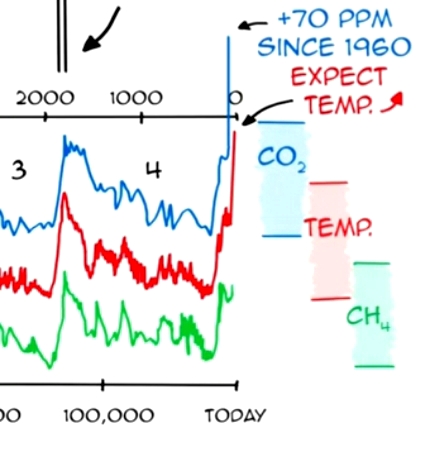
The graph I posted clearly shows the word "Expect Temp" short for Expected Temp and the temp has begun to rise. Do you dispute the correlation?
Your graph shows the usual decline after the peak has failed to happen this time...the first time for how long in the shown x axis...why is that?
Here's another graph from the Vostok ice core showing how the co2 and temp are performing the same dance.

Do you seriously think the dance won't continue?
Your graph shows the usual decline after the peak has failed to happen this time...the first time for how long in the shown x axis...why is that?
Here's another graph from the Vostok ice core showing how the co2 and temp are performing the same dance.
Do you seriously think the dance won't continue?
Gadgetmac said:
The graph I posted clearly shows the word "Expect Temp" short for Expected Temp and the temp has begun to rise. Do you dispute the correlation?
Your graph shows the usual decline after the peak has failed to happen this time...the first time for how long in the shown x axis...why is that?
Here's another graph from the Vostok ice core showing how the co2 and temp are performing the same dance.
Do you seriously think the dance won't continue?
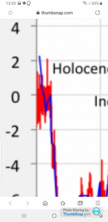
If you zoom in on the last section of that graph, CO2 is going up, the temperature is going down. Oops !!Your graph shows the usual decline after the peak has failed to happen this time...the first time for how long in the shown x axis...why is that?
Here's another graph from the Vostok ice core showing how the co2 and temp are performing the same dance.
Do you seriously think the dance won't continue?
robinessex said:
Gadgetmac said:
The graph I posted clearly shows the word "Expect Temp" short for Expected Temp and the temp has begun to rise. Do you dispute the correlation?
Your graph shows the usual decline after the peak has failed to happen this time...the first time for how long in the shown x axis...why is that?
Here's another graph from the Vostok ice core showing how the co2 and temp are performing the same dance.
Do you seriously think the dance won't continue?
If you zoom in on the last section of that graph, CO2 is going up, the temperature is going down. Oops !!Your graph shows the usual decline after the peak has failed to happen this time...the first time for how long in the shown x axis...why is that?
Here's another graph from the Vostok ice core showing how the co2 and temp are performing the same dance.
Do you seriously think the dance won't continue?

Gadgetmac said:
robinessex said:
Gadgetmac said:
The graph I posted clearly shows the word "Expect Temp" short for Expected Temp and the temp has begun to rise. Do you dispute the correlation?
Your graph shows the usual decline after the peak has failed to happen this time...the first time for how long in the shown x axis...why is that?
Here's another graph from the Vostok ice core showing how the co2 and temp are performing the same dance.
Do you seriously think the dance won't continue?
If you zoom in on the last section of that graph, CO2 is going up, the temperature is going down. Oops !!Your graph shows the usual decline after the peak has failed to happen this time...the first time for how long in the shown x axis...why is that?
Here's another graph from the Vostok ice core showing how the co2 and temp are performing the same dance.
Do you seriously think the dance won't continue?
Wrong Graph. The one YOU posted last

Edited by robinessex on Saturday 8th February 13:58
Edited by robinessex on Saturday 8th February 13:59
Gadgetmac said:
Kawasicki said:
Gandahar said:
Considering this
https://www.bbc.co.uk/news/science-environment-480...
I'm guessing this
https://www.bbc.co.uk/news/world-51420681
Is not going to help matters.
It will be interesting to see how these birds cope in 2020 onwards as warming touches the outliers of their continent.
When I looked up both the Vostok and Law Dome ice core records I saw that periods of rapid temperature change are not in any way unusual in that region.https://www.bbc.co.uk/news/science-environment-480...
I'm guessing this
https://www.bbc.co.uk/news/world-51420681
Is not going to help matters.
It will be interesting to see how these birds cope in 2020 onwards as warming touches the outliers of their continent.
Edited by Gandahar on Friday 7th February 23:19
Then, since 1960, the CO2 rises drastically and we can expect and see the temperature rising too...
Robinessex: I don’t know where you got that from but it doesn’t look like the graph I posted.
However, even if your graph is true its still a downward blip in what is an upward trend not a downward blip in a downward trend.
Looking at that data from the Vostok ice core do you still think the correlation between co2 and temperature won’t continue?
However, even if your graph is true its still a downward blip in what is an upward trend not a downward blip in a downward trend.
Looking at that data from the Vostok ice core do you still think the correlation between co2 and temperature won’t continue?
Gadgetmac said:
Robinessex: I don’t know where you got that from but it doesn’t look like the graph I posted.
However, even if your graph is true its still a downward blip in what is an upward trend not a downward blip in a downward trend.
Looking at that data from the Vostok ice core do you still think the correlation between co2 and temperature won’t continue?
Look at the end of the graph you posted at 13:32. Is there a Specsavers near you by any chance ?However, even if your graph is true its still a downward blip in what is an upward trend not a downward blip in a downward trend.
Looking at that data from the Vostok ice core do you still think the correlation between co2 and temperature won’t continue?
robinessex said:
Gadgetmac said:
Robinessex: I don’t know where you got that from but it doesn’t look like the graph I posted.
However, even if your graph is true its still a downward blip in what is an upward trend not a downward blip in a downward trend.
Looking at that data from the Vostok ice core do you still think the correlation between co2 and temperature won’t continue?
Look at the end of the graph you posted at 13:32. Is there a Specsavers near you by any chance ?However, even if your graph is true its still a downward blip in what is an upward trend not a downward blip in a downward trend.
Looking at that data from the Vostok ice core do you still think the correlation between co2 and temperature won’t continue?

As durbster said on the other thread...you don’t help yourself do you.
Gadgetmac said:
robinessex said:
Gadgetmac said:
Robinessex: I don’t know where you got that from but it doesn’t look like the graph I posted.
However, even if your graph is true its still a downward blip in what is an upward trend not a downward blip in a downward trend.
Looking at that data from the Vostok ice core do you still think the correlation between co2 and temperature won’t continue?
Look at the end of the graph you posted at 13:32. Is there a Specsavers near you by any chance ?However, even if your graph is true its still a downward blip in what is an upward trend not a downward blip in a downward trend.
Looking at that data from the Vostok ice core do you still think the correlation between co2 and temperature won’t continue?
As durbster said on the other thread...you don’t help yourself do you.

Edited by robinessex on Saturday 8th February 14:47
robinessex said:
Well, I suppose plotting a graph backward had to occur sooner than later in my 50 years of looking at them. But as the graphs since this one don't show anything of any interest, back to it. The temperature seems to have stuck
This is your whole problem Rob, you shoot from the hip, you don’t draw your gun and aim. You were in such a rush to post that you looked at the pretty coloured lines and didn’t bother to read the data points laid out clearly in front of you. Off you went regardless of the evidence.As for “nothing of any interest” please explain the temperature getting “stuck” (it’s actually rising even in the graphic you’ve posted) for the first time in half a million years whilst coincidently for the first time in half a million years co2 rises. Why is it not dipping again in-line with all of the previous cycles?
Again you are just not interested in seeing what is on display but would rather follow the pre-programming you have inflicted upon yourself.
I don’t know about “specsavers” but perhaps you might be forced to understand the graphics more if they were in braille format.
Gadgetmac said:
robinessex said:
Well, I suppose plotting a graph backward had to occur sooner than later in my 50 years of looking at them. But as the graphs since this one don't show anything of any interest, back to it. The temperature seems to have stuck
This is your whole problem Rob, you shoot from the hip, you don’t draw your gun and aim. You were in such a rush to post that you looked at the pretty coloured lines and didn’t bother to read the data points laid out clearly in front of you. Off you went regardless of the evidence.As for “nothing of any interest” please explain the temperature getting “stuck” (it’s actually rising even in the graphic you’ve posted) for the first time in half a million years whilst coincidently for the first time in half a million years co2 rises. Why is it not dipping again in-line with all of the previous cycles?
Again you are just not interested in seeing what is on display but would rather follow the pre-programming you have inflicted upon yourself.
I don’t know about “specsavers” but perhaps you might be forced to understand the graphics more if they were in braille format.
Edited by robinessex on Saturday 8th February 16:39
robinessex said:
Gadgetmac said:
robinessex said:
Well, I suppose plotting a graph backward had to occur sooner than later in my 50 years of looking at them. But as the graphs since this one don't show anything of any interest, back to it. The temperature seems to have stuck
This is your whole problem Rob, you shoot from the hip, you don’t draw your gun and aim. You were in such a rush to post that you looked at the pretty coloured lines and didn’t bother to read the data points laid out clearly in front of you. Off you went regardless of the evidence.As for “nothing of any interest” please explain the temperature getting “stuck” (it’s actually rising even in the graphic you’ve posted) for the first time in half a million years whilst coincidently for the first time in half a million years co2 rises. Why is it not dipping again in-line with all of the previous cycles?
Again you are just not interested in seeing what is on display but would rather follow the pre-programming you have inflicted upon yourself.
I don’t know about “specsavers” but perhaps you might be forced to understand the graphics more if they were in braille format.
Gassing Station | Science! | Top of Page | What's New | My Stuff