Flemke - Is this your McLaren? (Vol 5)
Discussion


Senna official video thingy: https://www.youtube.com/watch?v=yvljnF_cU84&fe...
flemke said:
Yes.
Since my last contact with them, by a great stroke of luck McLaren have located in inventory some little parts that they did not know they had, which will make the job a lot easier. I am waiting for them to make their next trip to their warehouse (100 miles away from Woking) to retrieve the parts, then I shall take the parts to the place that has been dragging its feet and say, "Here you go - are you going to do this or not?"
That's more than fair enough; good luck with it. Since my last contact with them, by a great stroke of luck McLaren have located in inventory some little parts that they did not know they had, which will make the job a lot easier. I am waiting for them to make their next trip to their warehouse (100 miles away from Woking) to retrieve the parts, then I shall take the parts to the place that has been dragging its feet and say, "Here you go - are you going to do this or not?"
Admittedly, with recent testing and now Melbourne coming up, I can understand them being rather swamped at the moment, but that's no excuse for not managing your expectations with a brief call/email.
That's often the way with specialists and non-business folk: they can be great at what they do but poor at the running their overall service/communication/admin/etc. From a bunch of highly recommended local gardeners it took us over a year to find one who could (A) get back to us, and (B) commit to a day to cut a hedge. Now that we've got one, we keep him in manicles in our cellar, so he never gets back to anyone else.
Jacobyte said:
Admittedly, with recent testing and now Melbourne coming up, I can understand them being rather swamped at the moment, but that's no excuse for not managing your expectations with a brief call/email.
I don't think the roadcar department has anything to do with the Formula 1 department, so how the upcoming race in Melbourne has an influence on matters is a mystery to me.vincegail said:
Jacobyte said:
Admittedly, with recent testing and now Melbourne coming up, I can understand them being rather swamped at the moment, but that's no excuse for not managing your expectations with a brief call/email.
I don't think the roadcar department has anything to do with the Formula 1 department, so how the upcoming race in Melbourne has an influence on matters is a mystery to me.

bobo79 said:
flemke said:
also spent probably 10-12 hours redoing the "artwork" (logo) myself to correct the graphic errors in the original
This is probably covered elsewhere in one the 5 threads, but what are the graphic errors you're referring to?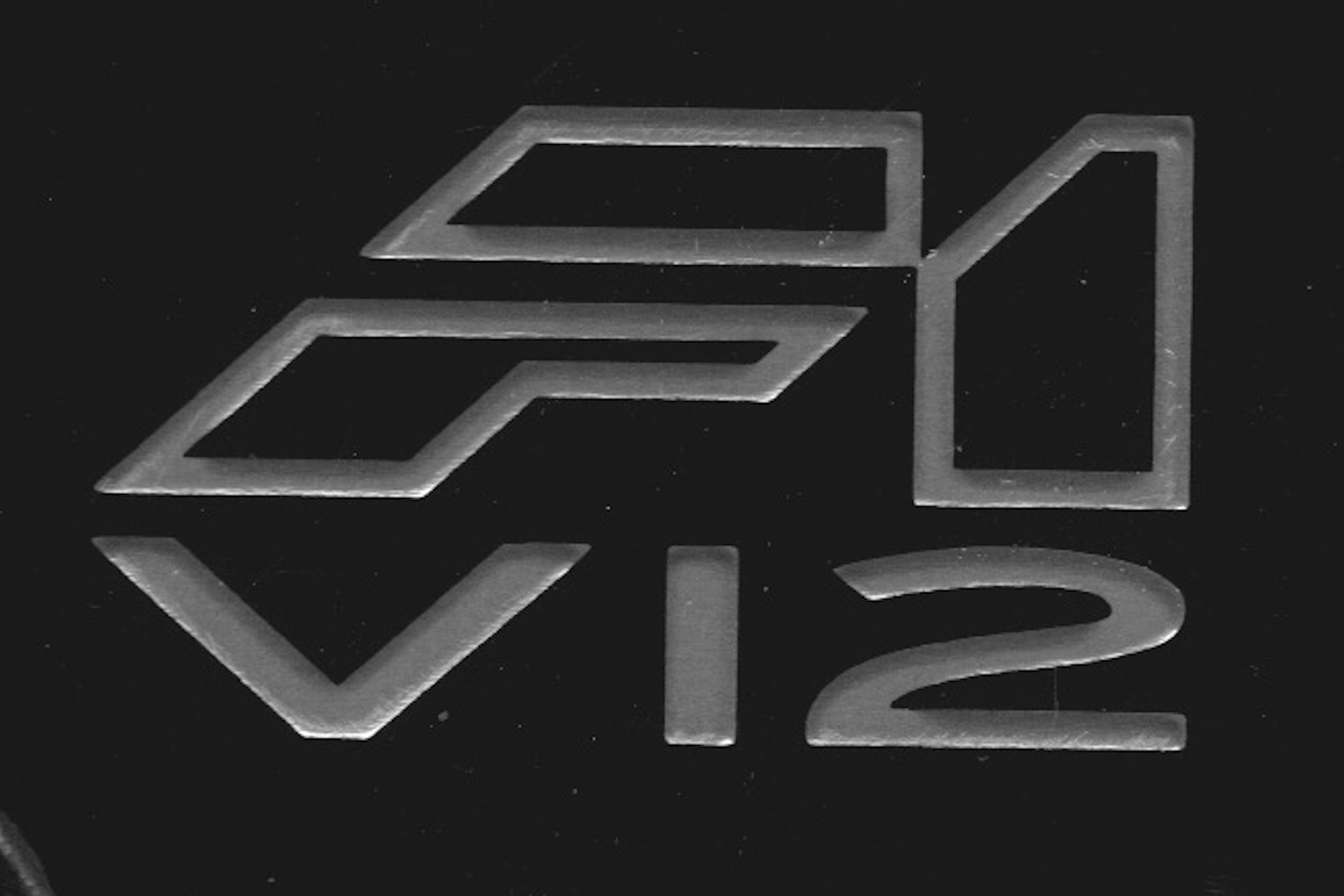
After:
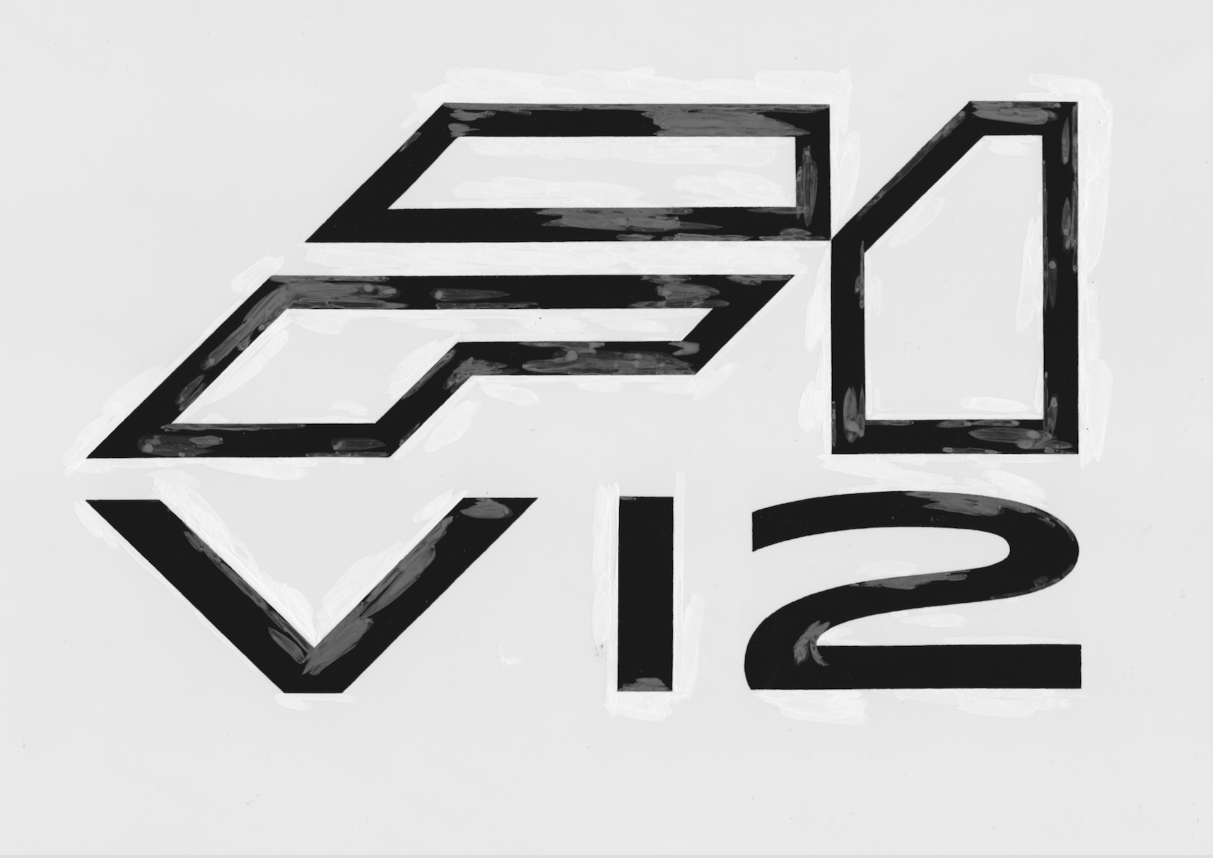
It might be me but on the original logo the diagonal line from the ‘’1’ through the ‘F’ and finally the ‘V’ that runs sort of top right to bottom left aligns in a single straight line. On the second logo, although the lines and angles themselves are much sharper, it does not. This would bother me.
Antony Moxey said:
It might be me but on the original logo the diagonal line from the ‘’1’ through the ‘F’ and finally the ‘V’ that runs sort of top right to bottom left aligns in a single straight line. On the second logo, although the lines and angles themselves are much sharper, it does not. This would bother me.
Yes, but in the original that is a mistake.To get the alignment of which you speak, you need either:
- to make the "V12" taller, which would make it too heavy in relation to the "F1", or
- to flatten all the angles by a couple of degrees.
The original, basic "F1" logo on its own had 45º angles. That logo was continued throughout production.
Originally the design on the steering wheel boss looked slightly different from the finished version. At some point, someone must have been told to reconcile the logo on the boss with the basic logos elsewhere.
I cannot see the sense of changing the fundamental "F1" logo merely to get it to align with the "V" of "V12".
In lettering, the most important quality is flow, followed by rhythm, followed by balance. All are related to weightings.
When there is more than a single horizontal line of lettering, we want to read and judge each line on its own first. Only after that do we reconcile alignments such as the one of which you speak.
If the design were a single, unified abstract form, such as this:
then obviously you'd want the diagonals to align.
When however the design is two different lines comprising two different (albeit related) messages in two different fonts of two different heights, any wish to align is a lesser priority than other factors.
If you want an insight into how well the designer of the production version of the boss (mis-)understood lettering, all you need to do is to look at the "2".

Nice thoughtful reply. I’ve looked at the two again bearing in mind what you’ve said and still am uncomfortable with the misalignment. I can see why you say it was originally a mistake, but to me it looks as though originally it was intentional so somehow should be accommodated.
Not entirely sure how though. Simply moving the V12 characters inwards would do it but would then misalign the outside edges of the ‘V’ and ‘2’ with the ‘F1’ above. I think I may be inclined to flatten the angle, redraw the line from the bottom of the ‘V’ to the top of the ‘1’ then parallel it across to the top left of the ‘F’ and see how that looked.
For me it’s a case of what’s been seen can’t be unseen and now I’ve noticed that diagonal I can’t now unsee it. Interesting (for me). Dilemma on how to solve it though.
Antony Moxey said:
Nice thoughtful reply. I’ve looked at the two again bearing in mind what you’ve said and still am uncomfortable with the misalignment. I can see why you say it was originally a mistake, but to me it looks as though originally it was intentional so somehow should be accommodated.
Not entirely sure how though. Simply moving the V12 characters inwards would do it but would then misalign the outside edges of the ‘V’ and ‘2’ with the ‘F1’ above. I think I may be inclined to flatten the angle, redraw the line from the bottom of the ‘V’ to the top of the ‘1’ then parallel it across to the top left of the ‘F’ and see how that looked.
For me it’s a case of what’s been seen can’t be unseen and now I’ve noticed that diagonal I can’t now unsee it. Interesting (for me). Dilemma on how to solve it though.
I think I was unclear when I said that the alignment was a mistake. I did not mean to imply that the alignment was unintentional. I am sure you are right that it was intentional. I meant that it was a conceptual mistake: the designer put the concept of alignment ahead of other considerations that should have had higher priority.Not entirely sure how though. Simply moving the V12 characters inwards would do it but would then misalign the outside edges of the ‘V’ and ‘2’ with the ‘F1’ above. I think I may be inclined to flatten the angle, redraw the line from the bottom of the ‘V’ to the top of the ‘1’ then parallel it across to the top left of the ‘F’ and see how that looked.
For me it’s a case of what’s been seen can’t be unseen and now I’ve noticed that diagonal I can’t now unsee it. Interesting (for me). Dilemma on how to solve it though.
As I wrote above, in doing something like this, I think you have got to default to the integrity of the original design template. The "F1" logo used throughout the car, in the "Driver's Manual", everywhere, had 45º angles.
There is nothing sacred about 45º. It is simple conceptually and the easiest to draw, but it might have been 40, 43, 49, whatever.
Once that choice had been made to go with 45, however, they really needed to stick with it.
If I had been doing the boss design at the time, I might have tried to make a slightly bigger gap between the "F1" and the "V12". That would have helped with the alignment. Having got closer to alignment by doing that, it might then have been possible to make the "V12" characters slightly taller and achieved alignment in that way. As I wrote above, I don't think you can get all the alignment by only making the "V12" taller, as the design works in part by having enough of a difference in height between the upper and lower lines.
In drawing my version of the logo, I wanted to keep it as close to the original as possible. I wanted just to clean it up, not to create something different. The biggest failing in the original was the "2", but a few other things also needed to be sorted out.
Yes I guess you could drop the V12 lower to maintain the 45 degrees, however it looks as though the gap between the F1 and V12 is intentional as it appears to be the same as the thickness of the letter V. A nice little ‘problem’ to play with though, but like you say you have to be careful with what you do if your intention is a mere tidy up rather than whole new design. Good job they didn’t decide (and not just WRT the logo) to go with a V8, but if they had it would have meant we didn’t get that awful 2!
As a small aside, is it me or does the V and 2 appear to be thicker than the 1?
As a small aside, is it me or does the V and 2 appear to be thicker than the 1?
Antony Moxey said:
Yes I guess you could drop the V12 lower to maintain the 45 degrees, however it looks as though the gap between the F1 and V12 is intentional as it appears to be the same as the thickness of the letter V. A nice little ‘problem’ to play with though, but like you say you have to be careful with what you do if your intention is a mere tidy up rather than whole new design. Good job they didn’t decide (and not just WRT the logo) to go with a V8, but if they had it would have meant we didn’t get that awful 2!
In the original, I would say that the gap between the "F1" and the "V12" was meant to be the same width as the gap between the upper and lower horizontals of the "F".This is the problem when you have people who, if I may say so, have experience in one area of design but don't really know what they're doing in another area nonetheless go outside their area of expertise - something like if you had Adrian Newey design a crankshaft. Yes, he would be less ignorant about it than most of us would be, but that wouldn't mean that he knew enough to do it right.
The easiest thing, especially with a largely "geometric" font, is to try to make everything line up and be the same size according to the ruler. The ruler and the eye are not the same thing, as illustrated by:
Antony Moxey said:
As a small aside, is it me or does the V and 2 appear to be thicker than the 1?
I presume that you are referring to my version.Actually, by ruler measurement the "1" is "thicker" than either, but it depends on how the measurement is taken.
For the "V", if you take the width of a branch as measured perpendicular to the length of its side, that distance is less than the width of the "1". If you measure the width of the branch as horizontal, however, the width is greater. The former is closer to being "correct", but the eye reads the width as somewhere between the two.
For the "2", almost the whole thing (again, as measured perpendicular to the primary axis or tangent at that point) is narrower than the "1". On the far right, where there is the 180º bend in the curve, and at the lower left, where the curve intersects the lower horizontal, however, the width is greater than that of the "1".
All these differences were created to make the characters appear balanced and consistent with each other. If the lines were exactly the same width, the characters would not be visually compatible or balanced.
Flemke,
Was it intentional that the V12 characters don't align on a baseline? Or is this just an aberrational scan? also, there appears to be a slight (very tiny) curve at the base ((bottom left corner) of the '2', is that an optical illusion or a deliberate affect to perhaps create some kind of tension in the curve of the '2'?
Was it intentional that the V12 characters don't align on a baseline? Or is this just an aberrational scan? also, there appears to be a slight (very tiny) curve at the base ((bottom left corner) of the '2', is that an optical illusion or a deliberate affect to perhaps create some kind of tension in the curve of the '2'?
Police State said:
Flemke,
Was it intentional that the V12 characters don't align on a baseline? Or is this just an aberrational scan? also, there appears to be a slight (very tiny) curve at the base ((bottom left corner) of the '2', is that an optical illusion or a deliberate affect to perhaps create some kind of tension in the curve of the '2'?
Good eye!Was it intentional that the V12 characters don't align on a baseline? Or is this just an aberrational scan? also, there appears to be a slight (very tiny) curve at the base ((bottom left corner) of the '2', is that an optical illusion or a deliberate affect to perhaps create some kind of tension in the curve of the '2'?
The first is an optical illusion. I wouldn't say that the characters align on the atomic level, but I think they are pretty good to within say 0.1mm, that sort of thing. The whole thing will be shrunk down to a width of maybe 25mm (I forget the exact amount), so it should be fine.
The second is intentional, in the sense that I tend to make corners like that. This was done with a brush and water paint. A corner like that is partly a matter of how you hold the brush and make a point with it, and partly a matter of creating a shape/detail that will do its job, which in this case is to make a blunt but distinct intersection of a curve and a "straight". I also like to have a bit of fun.
All quiet on the Flemke front...
Did you have a nice easter? Take any trips out in any of your cars (other than the A2!)
I did notice when searching for this thread that you had completed 1000+ laps of the Nordschleife and that was back in 2006, I wondered what your tally was up to now and if you still have the same desire to get out to Germany.
Swampy1982 said:
All quiet on the Flemke front...
Did you have a nice easter? Take any trips out in any of your cars (other than the A2!)
I did notice when searching for this thread that you had completed 1000+ laps of the Nordschleife and that was back in 2006, I wondered what your tally was up to now and if you still have the same desire to get out to Germany.
A normal Easter, thanks. No, I did not get to do any fun driving, unfortunately.Did you have a nice easter? Take any trips out in any of your cars (other than the A2!)
I did notice when searching for this thread that you had completed 1000+ laps of the Nordschleife and that was back in 2006, I wondered what your tally was up to now and if you still have the same desire to get out to Germany.
The last time that I drove around the 'Ring was several years ago when I stopped racing there. I don't think i have been around since. Not sure of total laps, I think in the 1,800-2,000 range.
I would like to go back, yes, but my understanding is that the tourist driving scene out there is even worse than it used to be, which would make it unsafe, frustrating, and I don't like the position of being responsible for other drivers (especially bikers) who don't know the circuit and keep putting themselves in harm's way. Excluding tourist driving, that would leave me with just the option of returning to racing, which I have often considered, but I just don't have the time to do it.
Gassing Station | General Gassing | Top of Page | What's New | My Stuff