PH Footnote: Loco for the logo
As the furore around F1's new font continues, we take a look back at some of the best (and worst) automotive rebrands
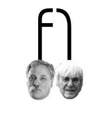
The old one wasn't exactly a marvel of graphic design - though the bold 'F' on the left and its speed strakes on the right, creating the '1' in the negative space in between, had become familiar to spectators around the world. Familiarity is no reason not to improve something, of course, but fans and drivers alike have been left unimpressed with the replacement, comprised solely of two curved lines and a vertical one which, according to Formula One's Head of Marketing, is meant to represent a pair of F1 cars racing wheel-to-wheel towards the finish line. Well, if you say so.
Lewis Hamilton branded the old design "iconic" and having appeared on the podium for the last 23 years behind jubilant drivers from Michael Schumacher to the current world champion himself, it's hard to argue with that assessment. F1 is far from the first brand to reinvent itself though, and from London 2012 to the BBC Three, organisations across the board have managed to court controversy with a clumsy stroke of the designer's pen. Here we recount the best (and the worst) of the automotive sector's rebrands.
We'll start with the obvious one. It was but a few years ago that the world's oldest and most famous race rebranded, replacing a much loved (but admittedly rather dated) logo with a fresh new look. Taking a similar negative space based approach as F1's outgoing design, Le Mans' current look is certainly a success.
Jaguar is another automotive institution to have recently rebranded. In a bid to shed the stuffy, middle management image it gained during the Ford years in favour of its rebellious new "good to be bad" ethos, the British marque retired the "leaper" hood ornament from the front of its cars. It was replaced with a redesigned version of the "growler" - a term we're guessing they skipped the focus tests on...
Less likely to have affected readers on this side of the pond was Chrysler's turn of the decade refresh. Having barely scraped through the recession - thanks to a helping hand from Uncle Sam - and needing to double its sales to survive further, its takeover by Fiat was the perfect opportunity to switch from the awful 'pentastar' to a sleeker, modern take on its classic winged badge.
Mazda has a long and interesting history as an automotive manufacturer, one which is reflected in the various badges its products have sported through the years. The most recent change came at the end of the 90s, when the previous rounded diamond - so shaped to avoid confusion with Renault - was replaced with the current "dynamic wing" logo. Symbolising Mazda's desire for 'growth' and 'improvement' it's a simple but remarkably modern design, given its age. We can't imagine anything else adorning the nose of the Furai.

We finish with something slightly different: a logo in desperate need of a redesign. For a racing series somewhat lacking in genuine excitement, image takes on another level of significance - hence last season's futuristic redesign for the cars themselves. Which is why it's such a surprise that Formula E's dire logo has persisted. Looking more like the desktop icon for a piece of accounting software than the emblem of the racing series of tomorrow, it could surely be easily improved upon. Then again, as an indicator of what to expect from the product it represents, perhaps it's not so bad after all...


 t, so don't really care there. Apparently they've decided to go 90s with the new one - if that's what people want then fair enough. The Le Mans redesign is awful though - it's gone from a classic to utter pish.
 I don't understand how people think logos date anyway - get a good one and stick with it. Morons are going to complain anyway.
t, so don't really care there. Apparently they've decided to go 90s with the new one - if that's what people want then fair enough. The Le Mans redesign is awful though - it's gone from a classic to utter pish. I don't understand how people think logos date anyway - get a good one and stick with it. Morons are going to complain anyway.
We used to have design agencies with talented artists working in them, think back to all those glorious posters we used to see. Well, when every kid at uni can use adobe illustrator its no wonder that large firms have no-one to turn to for important designs professionally, nowadays all you have is freelancers with far less weight and support behind them.
There are challenges both with designer and client.
The Old F1 logo in my opinion was a clear and clever idea.
Very much like the FedEx logo. "if you look at the white space between the "E" and "x" you can see a right-facing arrow.
This "hidden" arrow was intended to be a subliminal symbol for speed and precision"
This is very similar to the F1 Logo using the number "1"
A long time ago Shell spent millions of pounds trying to update their symbolic 'Shel' logo.
In the end they kept the current logo.
Hence term ''if it ain't broke don't fix it'


Jaguar is another automotive institution to have recently rebranded. In a bid to shed the stuffy, middle management image it gained during the Ford years in favour of its rebellious new "good to be bad" ethos, the British marque retired the "leaper" hood ornament from the front of its cars. It was replaced with a redesigned version of the "growler" - a term we're guessing they skipped the focus tests on...
A physical leaper hasn’t been used on any jag for over a decade due to pedestrian safety regulations. Bizarrely the US still got it in the early 2000’s as it was still ‘ok’ under federal law.
The rebranding was largely a switch to a 3D colour profiled leaper (from the outline below) and a change in font for the ‘Jaguar’ text to a more modern typeface.


 t
t


What's going on with those "a"s? and the strange kerning where the C in Circuit runs into the U making it top-heavy. It all feels a bit Eurostyle. There is no way it can be used as a body font.
The others are interesting
F1 Turbo

F1 Torque

The only one I like, as a headline typeface is Torque, and even that looks as though it's being read by the bingo caller who did the announcements at the US GP.
Simon
pic removed
What's going on with those "a"s? and the strange kerning where the C in Circuit runs into the U making it top-heavy. It all feels a bit Eurostyle. There is no way it can be used as a body font.
The others are interesting
F1 Turbo
pic removed
F1 Torque
pic removed
The only one I like, as a headline typeface is Torque, and even that looks as though it's being read by the bingo caller who did the announcements at the US GP.
Simon
The designer is obviously a Sci-Fi / Star Wars fan.
Gassing Station | General Gassing | Top of Page | What's New | My Stuff