RE: Lotus unveils new 'simplified' roundel
Discussion


LordGrover said:
Ta.
Hmmm. Gone too far - looks dull, uninspired and just a bit plain.
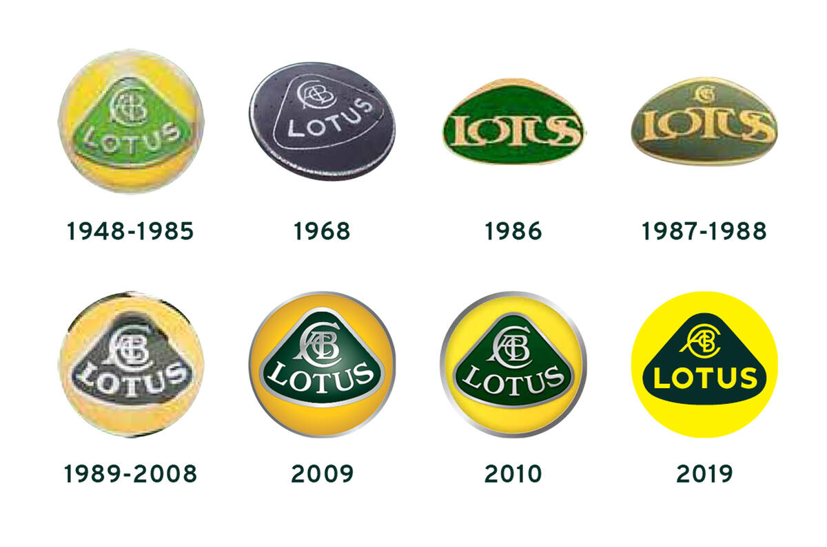
2009 above appeals to me most.
2010 for me, with 2009 close second. New one looks like a 12-year-old has created it in PowerPoint for a school art project.Hmmm. Gone too far - looks dull, uninspired and just a bit plain.
2009 above appeals to me most.
Off-topic, but Delia Smith is a near-neighbour of my in-laws.
 k singed that off!??
Europa1 said:
Lotus has been the shirt sponsor for Norwich City before (complete with branded sports seats in the dugouts), and the logo didn't seem problematic then.
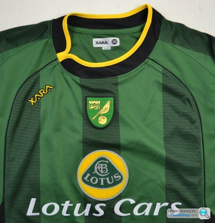
If the logo wasn't problematic, why did they need to write "Lotus Cars" underneath in big letters (and using an unrelated typeface!)The particular shade of yellow looks a bit stark, but that may just be down to how it looks on my monitor, Otherwise it works for me. A lot fresher, but still instantly recognisable.
Europa1 said:
BigChiefmuffinAgain said:
Glad to see Lotus have their priorities sorted....
How do you mean?Lotus have a lot to do to pull themselves round into a company with a future. Their range is ancient. Geely will provide funds, I assume, but their pockets are not limitless. The auto industry is going thru a lean time and facing massive structural change.
You just wonder if this was the most important thing to start with? And yes, I know they will say it sends a message etc...
BigChiefmuffinAgain said:
I've been involved with rebranding exercises. They actually take up a lot more time and resource than you think.
Lotus have a lot to do to pull themselves round into a company with a future. Their range is ancient. Geely will provide funds, I assume, but their pockets are not limitless. The auto industry is going thru a lean time and facing massive structural change.
You just wonder if this was the most important thing to start with? And yes, I know they will say it sends a message etc...
It's none of the car design team it makes no difference and freshens the brand.Lotus have a lot to do to pull themselves round into a company with a future. Their range is ancient. Geely will provide funds, I assume, but their pockets are not limitless. The auto industry is going thru a lean time and facing massive structural change.
You just wonder if this was the most important thing to start with? And yes, I know they will say it sends a message etc...
Jon_S_Rally said:
Totally see why they've done this. We are going through a period of simple, fuss-free designs. Multiple colours and gradient colours are out, so I'm not surprised that this is what they've gone for.
Absolutely. You need a logo that looks as good on the car, as it does on a large dealer sign, or an Instagram avi or website favicon. Clean, geometric designs with limited and easily-defined colours are simpler to describe procedurally for correct replication in marketing and promotion items without resorting to unwieldy raster graphics.They've done a good job I reckon, this will look 'normal' in no time and looking back in a few years the just-replaced design will look fussy and out of date.
moffspeed said:
I quite like it - they can then do a black badge version when Norwich end up in the Championship next year...
PS it was the great Jim Clark not 'Clarke".
[footnote]Edited by moffspeed on Thursday
8th August 14:25[/footnote]
Ha hope my dad doesn't read this or I'll be out of the will!PS it was the great Jim Clark not 'Clarke".
Edited by moffspeed on Thursday 8th August 14:24
[footnote]Edited by moffspeed on Thursday
8th August 14:25[/footnote]

Gassing Station | General Gassing | Top of Page | What's New | My Stuff