RE: Lotus unveils new 'simplified' roundel
Discussion


silentbrown said:
If the logo wasn't problematic, why did they need to write "Lotus Cars" underneath in big letters (and using an unrelated typeface!)
The new logo doesn't address that either.I'd assumed on the old kit it was because Lotus is far less of a household name than many Premier League shirt sponsors, and awareness of what Lotus does may be less than universal among the Premier League's TV audience.
These things go in fashions.
BT went from this

To this

To this recently launched one:
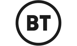
You can see that the thinking behind the new Lotus logo is a lot like that behind the new BT logo.
Give it time and they will both have bevelled edges and drop shadows when the 3D look comes back into fashion.
BT went from this
To this
To this recently launched one:
You can see that the thinking behind the new Lotus logo is a lot like that behind the new BT logo.
Give it time and they will both have bevelled edges and drop shadows when the 3D look comes back into fashion.
simonrockman said:
These things go in fashions.
BT went from this
To this
To this recently launched one:
You can see that the thinking behind the new Lotus logo is a lot like that behind the new BT logo.
Give it time and they will both have bevelled edges and drop shadows when the 3D look comes back into fashion.
They probably went for a an all black logo to save on colour toner ink on staff printed docs. Seen that logo change reason 1st hand to save the been counters chrimbo bonus. BT went from this
To this
To this recently launched one:
You can see that the thinking behind the new Lotus logo is a lot like that behind the new BT logo.
Give it time and they will both have bevelled edges and drop shadows when the 3D look comes back into fashion.

unsprung said:
Evilex said:
Is it lighter than the old one?


Yeah, but not as light(weight) as this (and design has stayed virtually same since 1958)

The old advice is still the best...
If it ain't broke, don't mend it.
Simplicate, don't complicate!
Edited by dandarez on Thursday 8th August 17:03
The CABC letters device has the potential to be highly discriminating versus competitive brands (or versus any brand, for that matter). Additionally, the circle, all encompassing as it is, denies space to the device and to the brand name.
I can't of course place myself in the shoes of Lotus management and their design partners. There are, nevertheless, a number of reasonable questions that an outsider could ask.
I don't dislike what Lotus have finally agreed. That's why I've posted about "questions" and about "speculative" designs.
Ferrari are doing the same thing and simplifying their logo for a younger audience. Behold the new my little pony inspired logo.

Who comes up with this nonsense. Your logo represents your brand. If you change it then you risk devaluation of the brand heritage. What’s next? A two pointed star from Mercedes as it’s lighter than the traditional 3 pointed version?
Who comes up with this nonsense. Your logo represents your brand. If you change it then you risk devaluation of the brand heritage. What’s next? A two pointed star from Mercedes as it’s lighter than the traditional 3 pointed version?
Edited by ducnick on Thursday 8th August 20:00
Gassing Station | General Gassing | Top of Page | What's New | My Stuff