RE: Lotus unveils new 'simplified' roundel
Discussion


ducnick said:
Ferrari are doing the same thing and simplifying their logo for a younger audience. Behold the new my little pony inspired logo.

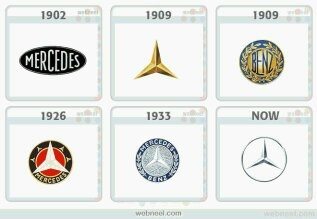
Who comes up with this nonsense. Your logo represents your brand. If you change it then you risk devaluation of the brand heritage. What’s next? A two pointed star from Mercedes as it’s lighter than the traditional 3 pointed version?
Who comes up with this nonsense. Your logo represents your brand. If you change it then you risk devaluation of the brand heritage. What’s next? A two pointed star from Mercedes as it’s lighter than the traditional 3 pointed version?
Edited by ducnick on Thursday 8th August 20:00
JxJ Jr. said:
Those saying it looks like it was done by someone on work experience are correct. The straight line of the word Lotus combined with the two curves below make the word appear bowed upwards or the whole badge appear vertically elongated. Pretty poor.
I agree that it would be improved by flattening the bottom of the triangle. JxJ Jr. said:
Those saying it looks like it was done by someone on work experience are correct. The straight line of the word Lotus combined with the two curves below make the word appear bowed upwards or the whole badge appear vertically elongated. Pretty poor.
Bit harsh IMO, I'm not into this art form enough to convincingly claim this adds some tension to the affair  , but I like it, especially the font they used. The whole thing has an "Hergé" vibe for me (for lack of better description) which is good.
 Ranking my top 3 would be 68 > 19 > 89. Could have been much, much worse -- but let's hope they stick with it for a couple of decades at least. This is important stuff not to messed with to accommodate fashion.
LordGrover said:
Ta.
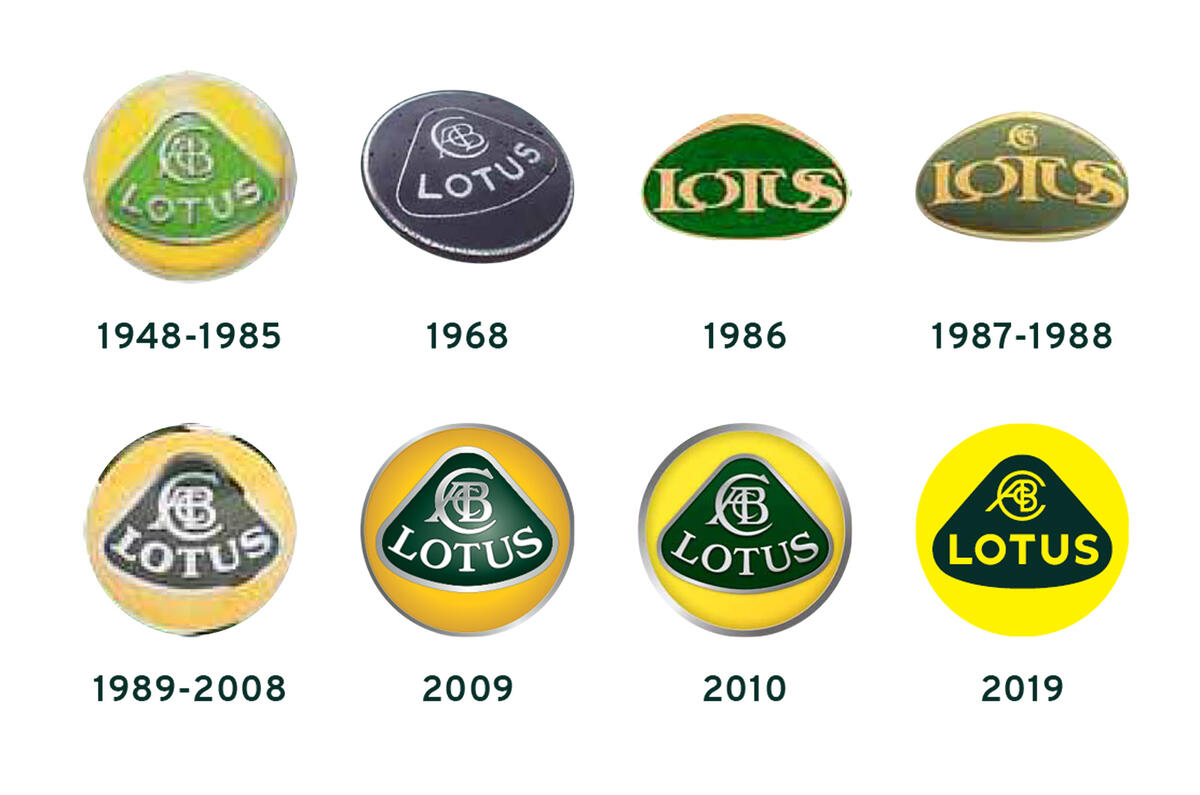
Hmmm. Gone too far - looks dull, uninspired and just a bit plain.
2009 above appeals to me most.
This IMO.Hmmm. Gone too far - looks dull, uninspired and just a bit plain.
2009 above appeals to me most.
Messing about for no good reason.
As for reverence to the original...not looking at the emblem over history.
Let's hope poor old Lotus' model line up gets something less superficial done to it.

I mentioned my disappointment with the bonnet badge here... when I watched the Evija launch....
https://www.youtube.com/watch?v=_VlJUHn8CWM&t=...
(Beautiful. Thank you Henry and Lotus of course. One thing that I find jarring is the badge. The bonnet and wing directional lines don't seem to be suited to a round badge. There are two conflicting shapes happening here, the rounded triangular bell shape of the Lotus logo badge doesn't sit nicely in a circle. It never will. I wonder if the design team ever considered taking the triangular shape and sitting it without the circle? Either way... stunning.)
...And yet, the jarring shape within a shape revised branding still doesn't sit right with me. As a designer I guess it's the aesthetic sensibilities that drive my response. Ah well, perhaps the brand guidelines include an option not to use the bounding circle in some applications.

Dreadful move, only conveys “cheapness” not “simplified”. Seems borderline reckless to have rolled this out with so little thought. Where the 2009 conveys a sense of quality, the 2010 looks only computer generated, clean but cold. Let’s hope there’s an option for new buyers to put an alternative, retro badge style on their cars, albeit a 2k option no doubt.
LotusOmega375D said:
Yes, lovely of Mercedes-Benz to remember their heritage. 1933 marked the start of a particularly memorable period for Germany...
It's the year they developed the the first Silver Arrow.https://www.mercedesamgf1.com/en/mercedes-amg-f1/a...
Edited by Gulf7 on Friday 9th August 16:41
ducnick said:
Ferrari are doing the same thing and simplifying their logo for a younger audience. Behold the new my little pony inspired logo.
Who comes up with this nonsense. Your logo represents your brand. If you change it then you risk devaluation of the brand heritage. What’s next? A two pointed star from Mercedes as it’s lighter than the traditional 3 pointed version?
You do realise that many companies update their branding quite regularly, don't you? Who comes up with this nonsense. Your logo represents your brand. If you change it then you risk devaluation of the brand heritage. What’s next? A two pointed star from Mercedes as it’s lighter than the traditional 3 pointed version?
Edited by ducnick on Thursday 8th August 20:00
My apologies if somebody has already mentioned this, but I missed it whilst reading through if they have...
I’m sure I read somewhere that the original Lotus badge was green and yellow in recognition of the colours of Norwich City. If this is the case and the new logo has replaced green with black (unless my eyes are playing tricks), is it not a bit ironic that this has been done with a view to making the logo stand out more on a Norwich football shirt?
I’m sure I read somewhere that the original Lotus badge was green and yellow in recognition of the colours of Norwich City. If this is the case and the new logo has replaced green with black (unless my eyes are playing tricks), is it not a bit ironic that this has been done with a view to making the logo stand out more on a Norwich football shirt?

Gassing Station | General Gassing | Top of Page | What's New | My Stuff