RE: Lotus unveils new 'simplified' roundel
Discussion
Drooles said:
My apologies if somebody has already mentioned this, but I missed it whilst reading through if they have...
I’m sure I read somewhere that the original Lotus badge was green and yellow in recognition of the colours of Norwich City. If this is the case and the new logo has replaced green with black (unless my eyes are playing tricks), is it not a bit ironic that this has been done with a view to making the logo stand out more on a Norwich football shirt?
Lotus didn’t move to Norfolk until about 20 years after they were founded, so that can’t be right.I’m sure I read somewhere that the original Lotus badge was green and yellow in recognition of the colours of Norwich City. If this is the case and the new logo has replaced green with black (unless my eyes are playing tricks), is it not a bit ironic that this has been done with a view to making the logo stand out more on a Norwich football shirt?
Gulf7 said:
Apart from 1986-1988, this new one is the least like the original. Seems with the announcement of the Evija and now this, Lotus is purposefully trying to move away from its heritage. Sad times.
Seems with the announcement of the Evija and now this, Lotus is purposefully trying to...become a globally recognised and relevant brand that makes money and is self-sustaining and does not focus solely on UK "enthusiasts" who care about its heritage but don't want to buy its the cars it makes.Edited by Gulf7 on Friday 9th August 07:23
Drooles said:
My apologies if somebody has already mentioned this, but I missed it whilst reading through if they have...
I’m sure I read somewhere that the original Lotus badge was green and yellow in recognition of the colours of Norwich City. If this is the case and the new logo has replaced green with black (unless my eyes are playing tricks), is it not a bit ironic that this has been done with a view to making the logo stand out more on a Norwich football shirt?
A few people have mentioned it being black, it certainly isn't.I’m sure I read somewhere that the original Lotus badge was green and yellow in recognition of the colours of Norwich City. If this is the case and the new logo has replaced green with black (unless my eyes are playing tricks), is it not a bit ironic that this has been done with a view to making the logo stand out more on a Norwich football shirt?
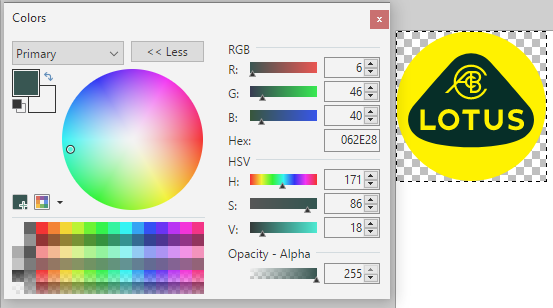
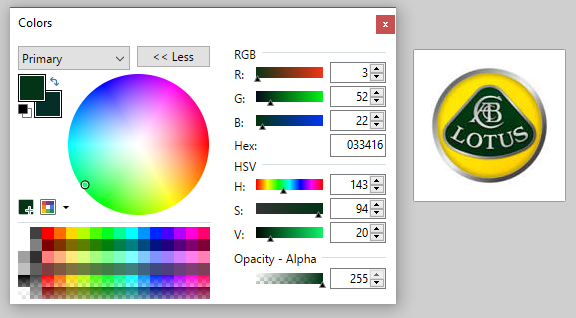
It is a slightly different shade of dark green, but nowhere near black.
Macboy said:
Seems with the announcement of the Evija and now this, Lotus is purposefully trying to...become a globally recognised and relevant brand that makes money and is self-sustaining and does not focus solely on UK "enthusiasts" who care about its heritage but don't want to buy its the cars it makes.
This makes sense.For what it’s worth, I like it and think it will do the job well.
A late to the party comment - original is still the best
The new one is Crap - regardless of all the marketing B S
Geely cannot replicate Lotus early heritage / nor can it be taken away, thankfully.
The original badge was co created by Hazel and Colin Chapman, the black badge in 1968 was a memorial to Jim Clark as has been previously said. These were fitted to the Lotus road cars in 1968 after his death - some owners also ordered them for their earlier and later cars, in homage to him.
There have been other minor colour changes as has been shown/ the Camel Yellow for instance to match the race car sponsorship.
The iconic Mk 1 Lotus Cirtina stripe matches the (Olive) green on the original Lotus badge. Lotus Yellow was an original colour that matched the shade of yellow on the original badge.
The curve of the lettering follows the radius of the original softened triangle shape in the badge, which is to be found in the holes in the Elan / Europa steel wheels of the 1960’s & ‘early 70’s range of cars.
They’re messing with the final connection to the original owner and designer - very foolish, in my opinion.
Jon_S_Rally said:
Totally see why they've done this. We are going through a period of simple, fuss-free designs. Multiple colours and gradient colours are out, so I'm not surprised that this is what they've gone for.
Somebody needs to tell ebay, google etc !The cynic in me says they have removed the chrome/silver which reduces costs on car badges
Edited by oilit on Friday 9th August 12:07
loudlashadjuster said:
A few people have mentioned it being black, it certainly isn't.


It is a slightly different shade of dark green, but nowhere near black.
It must be my eyes or my screen. I’m glad it’s green - that seems much more appropriate. I still prefer the original but I’m still living in the twentieth century!

It is a slightly different shade of dark green, but nowhere near black.
boyse7en said:
loudlashadjuster said:
Glad you did that, saved me the bother. Shows how much people really care about changes to "iconic" logoscarinaman said:
I wouldn't compare the brands of online companies with that of an established car company. They're not comparable products and they're of different ages. Do people really have an emotional investment in eBay and Google? They're just software and interfaces to products and services. You don't spend £100,000 on them and drive them around, wearing them like clothes.
indeed, completly different market spacesif anything they should have gone back to the original design
it just looks a cheap penny pinching exercise
Dave Hedgehog said:
carinaman said:
I wouldn't compare the brands of online companies with that of an established car company. They're not comparable products and they're of different ages. Do people really have an emotional investment in eBay and Google? They're just software and interfaces to products and services. You don't spend £100,000 on them and drive them around, wearing them like clothes.
indeed, completly different market spacesif anything they should have gone back to the original design
it just looks a cheap penny pinching exercise
If it was farmed out to a bunch of bearded millennials with yo-yo desks and fitness corners then it wouldn't be cheap.
Oakman said:
A late to the party comment - original is still the best
The new one is Crap - regardless of all the marketing B S
Geely cannot replicate Lotus early heritage / nor can it be taken away, thankfully.
The original badge was co created by Hazel and Colin Chapman, the black badge in 1968 was a memorial to Jim Clark as has been previously said. These were fitted to the Lotus road cars in 1968 after his death - some owners also ordered them for their earlier and later cars, in homage to him.
There have been other minor colour changes as has been shown/ the Camel Yellow for instance to match the race car sponsorship.
The iconic Mk 1 Lotus Cirtina stripe matches the (Olive) green on the original Lotus badge. Lotus Yellow was an original colour that matched the shade of yellow on the original badge.
The curve of the lettering follows the radius of the original softened triangle shape in the badge, which is to be found in the holes in the Elan / Europa steel wheels of the 1960’s & ‘early 70’s range of cars.
They’re messing with the final connection to the original owner and designer - very foolish, in my opinion.
Was relying on all that heritage and the same old thing working for Lotus? Or have they been bumbling along for the last however many years on the brink of collapse? If Lotus is to survive, it needs to make some pretty big changes. A slight tweak of the branding to go with such a change is fairly common practice.The new one is Crap - regardless of all the marketing B S
Geely cannot replicate Lotus early heritage / nor can it be taken away, thankfully.
The original badge was co created by Hazel and Colin Chapman, the black badge in 1968 was a memorial to Jim Clark as has been previously said. These were fitted to the Lotus road cars in 1968 after his death - some owners also ordered them for their earlier and later cars, in homage to him.
There have been other minor colour changes as has been shown/ the Camel Yellow for instance to match the race car sponsorship.
The iconic Mk 1 Lotus Cirtina stripe matches the (Olive) green on the original Lotus badge. Lotus Yellow was an original colour that matched the shade of yellow on the original badge.
The curve of the lettering follows the radius of the original softened triangle shape in the badge, which is to be found in the holes in the Elan / Europa steel wheels of the 1960’s & ‘early 70’s range of cars.
They’re messing with the final connection to the original owner and designer - very foolish, in my opinion.
loudlashadjuster said:
Glad someone else posted this, saved me doing it.Dave Hedgehog said:
indeed, completly different market spaces
if anything they should have gone back to the original design
it just looks a cheap penny pinching exercise
But you see rebranding exercises and minor logo changes across all industries. Ford, for example, have subtly changed their oval loads of times. This is nothing new at all.if anything they should have gone back to the original design
it just looks a cheap penny pinching exercise
I suspect it wasn't a cheap exercise in the slightest.
Macboy said:
Seems with the announcement of the Evija and now this, Lotus is purposefully trying to...become a globally recognised and relevant brand that makes money and is self-sustaining and does not focus solely on UK "enthusiasts" who care about its heritage but don't want to buy its the cars it makes.
Personally I'd like to see Lotus capitalise on what it's famous for, but hey, what do I know, maybe the market for 1.7 tonne £2M electric hypercars and football sponsorship is where the real money is? I guess as a Lotus owner who's moving to Caterham after 14 years I'm just one of those UK "enthusiasts" who care about its heritage but don't want to buy its the cars it makes. To me Lotus is more than a badge - it's about Colin Chapman's design ethos.Edited by Gulf7 on Friday 9th August 16:46
Gassing Station | General Gassing | Top of Page | What's New | My Stuff


