B a d g e S p a c i n g
Discussion


ajprice said:
Riley Blue said:
Matt Cup said:
ajprice said:
I think it's because the I isn't a full width letter, but the spacing/kerning on M A R T I N looks off.
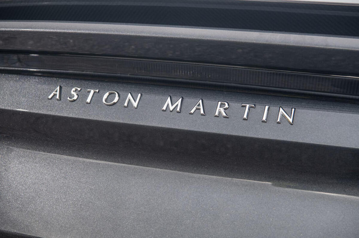
Looks fine to me. Kerning 101, adjusting the space between letters depending on the shape of the letters. With equal spacing, W A looks more spaced out than E R .


crofty1984 said:
ajprice said:
Riley Blue said:
Matt Cup said:
ajprice said:
I think it's because the I isn't a full width letter, but the spacing/kerning on M A R T I N looks off.
Looks fine to me. Kerning 101, adjusting the space between letters depending on the shape of the letters. With equal spacing, W A looks more spaced out than E R .
Alan535 said:
crofty1984 said:
ajprice said:
Riley Blue said:
Matt Cup said:
ajprice said:
I think it's because the I isn't a full width letter, but the spacing/kerning on M A R T I N looks off.
Looks fine to me. Kerning 101, adjusting the space between letters depending on the shape of the letters. With equal spacing, W A looks more spaced out than E R .
Biggest issue for me with Aston Martin is the inconsistency. The wordmark is tracked out on some cars, but not others. Got to be one or the other.
ReaperCushions said:
Do certain dealers still stick their brand on the back of cars these days (On the actual bodywork, not the back window).
I seem to remember Mangoletsi was a particular culprit.
I think there used to be a bit of cool about having a Mangoletsi sticker on your Alfa. Like having an old school BMW with a Sytner sticker.I seem to remember Mangoletsi was a particular culprit.
Matt Cup said:
It’s just not necessary though is it? The badge above it gives the game away when it comes to distinguishing what it is.
But as the other poster says about the Chinese market it kinda makes sense why manufacturers are going this way.
I thought that. Should say “continental” if anything.But as the other poster says about the Chinese market it kinda makes sense why manufacturers are going this way.
ReaperCushions said:
Do certain dealers still stick their brand on the back of cars these days (On the actual bodywork, not the back window).
I seem to remember Mangoletsi was a particular culprit.
I remember Taggarts doing this some years ago. Much to the annoyance of some customers who'd forked out for a Jaguar XJ6 and found a cheap silvered plastic advertisement stuck on the boot lid. The practice was soon discontinued.I seem to remember Mangoletsi was a particular culprit.
ReaperCushions said:
Do certain dealers still stick their brand on the back of cars these days (On the actual bodywork, not the back window).
I seem to remember Mangoletsi was a particular culprit.
Sort of related, do Fords of Winsford still put the frosted/engraved looking logo in the back window of their cars? Apparently they were a git to remove, especially as they were over the top of the window heater elements.I seem to remember Mangoletsi was a particular culprit.

Hackney said:
Bought my Golf from Vindis in Bedford one of my questions was, “does it have the Vindis sticker on the back”. With some relief the answer was, “no, only in used cars”
I got my used GTI from Vindis, and told them I'll only pick it up if they take the stickers off. Guess what? They said "not a problem", and sure enough, all stickers were gone when I collected. Hardly a huge problem.SmoothCriminal said:
Seat vw and skoda have all got that crappy lettering for the models now well the new ones have, first thing to do is debadge.
On the clubman name what else could mini do for the lettering the word hasn't got equal number of letters so one side is always going to be odd
Erm, how about not write it like a tOn the clubman name what else could mini do for the lettering the word hasn't got equal number of letters so one side is always going to be odd
 t and just put it to the side?
ajprice said:
Yes, the A spacing doesn't look right either. On MARTIN, the M A R looks more spaced out than the T I N .
Kerning 101, adjusting the space between letters depending on the shape of the letters. With equal spacing, W A looks more spaced out than E R .
Love a good bit of keming, me!Kerning 101, adjusting the space between letters depending on the shape of the letters. With equal spacing, W A looks more spaced out than E R .
sxmwht said:
SmoothCriminal said:
Seat vw and skoda have all got that crappy lettering for the models now well the new ones have, first thing to do is debadge.
On the clubman name what else could mini do for the lettering the word hasn't got equal number of letters so one side is always going to be odd
Erm, how about not write it like a tOn the clubman name what else could mini do for the lettering the word hasn't got equal number of letters so one side is always going to be odd
t and just put it to the side?

Gassing Station | General Gassing | Top of Page | What's New | My Stuff