Discussion


It does look beautiful in that colour but I still think it would be even better without the accents.
The wheels look great too; I wonder whether your new GTR-style rims will look as good.
The interior colour scheme works well with the rest of the car IMO - no need to change it!
Thanks for posting the photos.
The wheels look great too; I wonder whether your new GTR-style rims will look as good.
The interior colour scheme works well with the rest of the car IMO - no need to change it!
Thanks for posting the photos.
Joe911 said:


The car is looking good - the side strake is finished off well with the blue 'boundary' and it's refreshing to see it 'cut' at the end rather than tapered like other F1's.
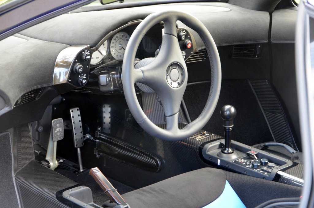
I like the interior however the steering wheel, for me, looks out of place [perhaps it's the colour?] but it's feel and diameter are what counts.
Is it the colouring of the interior that is your issue, or the fabric?
Edited by hurstg01 on Thursday 15th September 09:19

Flemke,
Love the colours, much darker than expected in the real world. Also the tattoo looks very subtle and shows a some nice individuality on the car, without being garish as many thought likely.
It's great to see so many details in so many photos, but the setting for the photos is not great IMHO, I'm not a photographer, but it's far to busy in the backgrounds and shooting against so much green just isn't great for showing the colours.
I hoping that George (GFWilliams) didn't shoot these as these look nothing like the epic photos that he has done of Andys F1.
kind regards
Guy (We spoke through our Ruf connection some years ago in case you forgot)
deviant said:
flemke said:

You like modifying cars.
You have gone for pinstriping on the F1.
I believe you may have posted a number of pictures of early oval and dirt track cars.
Are you a closet rodder Flemke?
Guyr said:
Flemke,
Love the colours, much darker than expected in the real world. Also the tattoo looks very subtle and shows a some nice individuality on the car, without being garish as many thought likely.
It's great to see so many details in so many photos, but the setting for the photos is not great IMHO, I'm not a photographer, but it's far to busy in the backgrounds and shooting against so much green just isn't great for showing the colours.
I hoping that George (GFWilliams) didn't shoot these as these look nothing like the epic photos that he has done of Andys F1.
kind regards
Guy (We spoke through our Ruf connection some years ago in case you forgot)
Photos not taken by me, although I have got another shoot of a F1 road car coming up soon I hope.... Unfortunately I can't say anything further right now.Love the colours, much darker than expected in the real world. Also the tattoo looks very subtle and shows a some nice individuality on the car, without being garish as many thought likely.
It's great to see so many details in so many photos, but the setting for the photos is not great IMHO, I'm not a photographer, but it's far to busy in the backgrounds and shooting against so much green just isn't great for showing the colours.
I hoping that George (GFWilliams) didn't shoot these as these look nothing like the epic photos that he has done of Andys F1.
kind regards
Guy (We spoke through our Ruf connection some years ago in case you forgot)
identti said:
That is perfect. No other word for it.
I've never lusted over a car more!
I work at McLaren - did MOE in Woking Business park do the work on this car?
Not sure what you mean, both by "MOE" (or "ME") and "work". I think that Woking BP is name of the industrial estate where the racing team used to be located and, no, the car has never been on that property.I've never lusted over a car more!
I work at McLaren - did MOE in Woking Business park do the work on this car?
So the wheel nuts are coloured because they're handed or something? Or did you just run out of blue/red ones? Not sure I like that!
Car looks fantastic though, really glad to see it back on the road.
How long has it been away for? (yes I'm sure I could skirt back a few pages and work it out) My own car has been away for over 10 weeks now and it feels like it's been gone a year
Car looks fantastic though, really glad to see it back on the road.
How long has it been away for? (yes I'm sure I could skirt back a few pages and work it out) My own car has been away for over 10 weeks now and it feels like it's been gone a year


flemke said:
Not sure what you mean, both by "MOE" (or "ME") and "work".
MOE = McLaren Owner('s) ExclusiveI was told they dropped the 'O' in Monterey, deciding to just call it 'McLaren Exclusive' now.
George - great news on your little side note. I do hope that works out and am intrigued as to which car it might be.

>8^)
ER
Joe911 said:
waremark said:
No pics of the seats in this session?
The car looks fabulous - squiggle, white lines, interior etc all work well, well done Flemke.
bThe car looks fabulous - squiggle, white lines, interior etc all work well, well done Flemke.
 ks, no, sorry. My plan was to photograph everything - all those tiny details that make the car so unique, etc. - in the end we just ran out of time.
While Flemke isn't so sure - I didn't see what the problem was with the interior scheme.
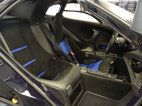
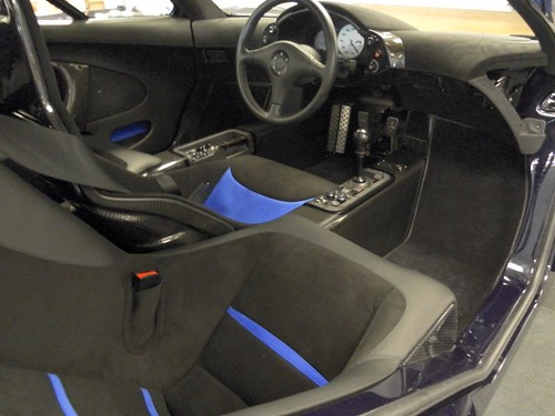
First, the blue material is more intense than I expected. The glass is not that transparent from the outside; even a v bright colour trimming is subdued when seen through the glass. Also, the driver's seat is a distance away from the door opening. I expected these two factors to tend to minimise how much the blue would stand out, requiring me to make it brighter than otherwise. That did not turn out to be the case.
The hue of the blue fabric is okay (its pure colour relationship with the exterior paint), but that particular colour needs to be toned down by darkening it or diluting it.
Next, although the fabric itself is of higher quality than Alcantara (same manufacturer for both), it looks cheap (as in crude, ostentatious, simplistic). It's too stark.
The layout of the panels is not right, either. Because of the brightness of the fabric, I used minimal narrow bands on the passenger seats. That succeeded in avoiding too much bright blue, but the width of the bands is slightly too narrow, and there should be more of them (but there can't be, because of the brightness of the blue). A subtler blue (or other colour), which would enable more of it to be used, would work better.
The driver's seat has too close a balance between the amount of blue and the amount of black. The eye doesn't want a "checkerboard" of equality; one colour or material should predominate, with the other supporting or complementing.
Also, the fabric does not appeal in large flat panels.
The original idea was to use a utilitarian fabric which connoted motoring or racing. This fabric Ferrari used for years in its racing cars:


Then we have this sort of thing:


I don't mean that any of the above specific materials would have been right, as they obviously would not have been. Rather, I'm trying to example ways in which textile can succeed in an interior, have something of its own design integrity whilst existing solely to support the rest.
I looked at tons of textiles. The problem was that, as they were all intended for commercial/industrial use (airport seating, coaches, office furniture), they all to varying degrees had a slightly bristly quality against the skin - something that one would not notice in public seating which has been used thousands of times prior to oneself, but which would be annoying in a private car.
The textile I used has a very nice hand (feel against the skin), whilst being extremely durable. The only problem is that it doesn't look good in the way that I used it.
Back to the drawing board, or, in this case, the sample book.
Gassing Station | General Gassing | Top of Page | What's New | My Stuff