Does literally NOTHING get tested around here for THE LOVE OF GOD
Be fair, they've tested this look on the mobile version where it has been universally hated. And rejoice for it is now consistent across all platforms.
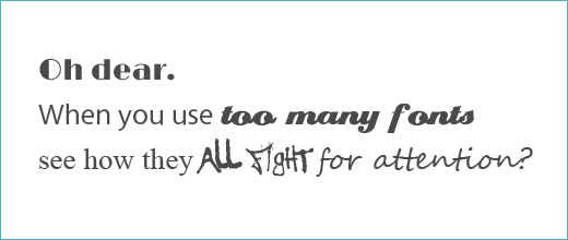
I could get used to it. It's not THAT bad but the line spacing is far too close together and makes the text look bunched up. Posted deliberately like this to illustrate the point.