Hello PHers and welcome to your new look forums!
Discussion


LordGrover said:
Font has improved this morning. Positive.
Unnecessary 1990s-style hyperlink colouring and font weight still an issue for me.
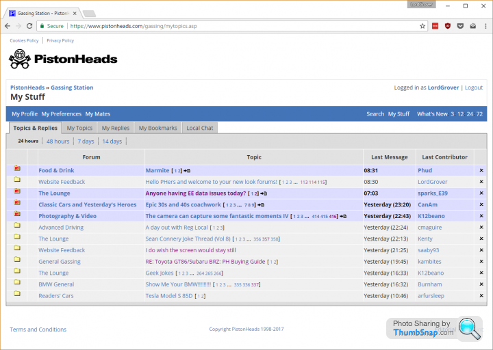
...and what's going on with the dark colons here?

I've tried the site just now on Firefox , Opera and Chrome , and I'm still seeing the glitchy irregular font mentioned before , same as yesterday , which is unpleasant to try and read. I wish I was seeing the font as per your screenshot , which looks really nice.Unnecessary 1990s-style hyperlink colouring and font weight still an issue for me.
...and what's going on with the dark colons here?
Vaud said:
NoIP said:
What is the purple font meant to signify? It doesn't seem to have any consistency. I'm also getting some of the page numbers appearing in purple too - pages of posts that I've already read. 
I think its a poor reflection and a somewhat dated "best practice" for read links.Vaud said:
And if it's not obvious then it has failed as a UX.
I asked about this the other day and got a curt reply (without an answer) from one of the older members.I agree; with something as simple as browsing you shouldn't have people asking what it means.
It looks terrible and I find the fonts, layout and colours unpleasant but persevere and will stick around for now.
Edited by Funk on Saturday 29th April 23:59
bmw535i said:
This may have already been asked, but can we have a like and dislike button at the bottom of every post like they do in the comments sections at the bottom of news articles online?
It may reduce the necessity to moderate quite so much
No. The site you are looking for is called Facebook. This is PistonHeads.It may reduce the necessity to moderate quite so much

NoIP said:
bmw535i said:
This may have already been asked, but can we have a like and dislike button at the bottom of every post like they do in the comments sections at the bottom of news articles online?
It may reduce the necessity to moderate quite so much
No. The site you are looking for is called Facebook. This is PistonHeads.It may reduce the necessity to moderate quite so much
It's a simple feature which can go a long way. I too think PH should adopt it, like everywhere else has. Well, after they fix half the stuff in this thread.
768 said:
Or Reddit. Or HackerNews. Or Disqus, spot.im, XDA, etc, etc.
It's a simple feature which can go a long way. I too think PH should adopt it, like everywhere else has. Well, after they fix half the stuff in this thread.
No they really should not. All 'like' buttons serve to do is give people an inflated sense of self-importance and they cause more trouble than they're worth. What ends up happening is post 'likes' are made based on whether you're in a certain clique, not on the merit of your post, which squarely leads back to my first point.It's a simple feature which can go a long way. I too think PH should adopt it, like everywhere else has. Well, after they fix half the stuff in this thread.
NoIP said:
No they really should not. All 'like' buttons serve to do is give people an inflated sense of self-importance and they cause more trouble than they're worth. What ends up happening is post 'likes' are made based on whether you're in a certain clique, not on the merit of your post, which squarely leads back to my first point.
A bit like when people have been a member for a few days and come in gobbing off 
NoIP said:
768 said:
Or Reddit. Or HackerNews. Or Disqus, spot.im, XDA, etc, etc.
It's a simple feature which can go a long way. I too think PH should adopt it, like everywhere else has. Well, after they fix half the stuff in this thread.
No they really should not. All 'like' buttons serve to do is give people an inflated sense of self-importance and they cause more trouble than they're worth. What ends up happening is post 'likes' are made based on whether you're in a certain clique, not on the merit of your post, which squarely leads back to my first point.It's a simple feature which can go a long way. I too think PH should adopt it, like everywhere else has. Well, after they fix half the stuff in this thread.
Gassing Station | Website Feedback | Top of Page | What's New | My Stuff