Forum Changes from "All Skin" user perspective
Poll: Forum Changes from "All Skin" user perspective
Total Members Polled: 110
Discussion


Following on from Here
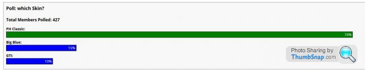
The previous poll was responded to by 427 members and was about which skin you preferred
PH has been making some changes to the new "single skin" GTI
From the perspective of your user "previously preferred skin" what's the feedback - "better" - "no change" - "worse"
Was the noise all "classic" users upset with GTI being forced upon them and now it's all GTI" users upset at the changes towards a more classic layout being forced on them?
Please note all "feedback" regarding the issues should be in this thread
saaby93 said:
Just get on with it
with this one theyve got the ads working properly and theyve got https
All it needs is some adjustment to the colours so they dont grate as much, and reduce the white space and font sizes a bit un bolding where possible
Other wise much better effort than last time
Agreed, especially with the part in bold.with this one theyve got the ads working properly and theyve got https
All it needs is some adjustment to the colours so they dont grate as much, and reduce the white space and font sizes a bit un bolding where possible
Other wise much better effort than last time
Edited by DocJock on Thursday 27th April 10:46
pits said:
I'd say the current one is the worst of the four skins we've had so far...
Honestly I prefer it to GTI, it seems like a improved interation of it. However both skins pale in comparison to Big Blue & Classic in my opinion, I used Big Blue previously.My biggest points of contention with GTI and the new skins are:
-The way quotes are handled, even when they are working I much prefered the way BB/Classic boxed up the quote, the new skin is absolutely s
 t in this regard,especially considering it doesnt seem to want to colour your own quotes correctly.
 -Font scaling, the font used doesn't seem to scale as well was it did on previous skins
-Reply button placement, I prefered BB/Classic but to be honest this is probably because I am more used it than anything else
-Ad placement, it was tolerable in BB, now there are too many and in bad places. I now use Adblock on PH.
I commend the developers for granting us SSL (which doesn't seem to be working correctly for me at this exact moment
 ) as it is a long overdue improvement, but the visual appearance of the site REALLY needs work now if you wish to retain users. Personally I am in the "why fix what wasn't broken" camp in this regard, I would like to return to BB and carry that on as the sole skin but based on polls in here I would say you should start working on Classic again.
 Many users won't even know what a skin is, which one they are using, or the difference between them. All I know is that up until about a week to 10 days ago, the layout was infinitely better than it it is now. It's difficult to read now because of the condensed font and contrast between text and backgrounds is awful.
If the original poll, and now this latest poll both show a majority who used and still prefer the original "classic" then why, if you need to create a skin at all, can't you make one which emulates "classic"? I have to say I've been using PH for years and had never used anything other than "classic". I only used PH on desktops/laptops with the occasional ipad use while away from home. Never had a problem or wished it looked different.
Gassing Station | Website Feedback | Top of Page | What's New | My Stuff