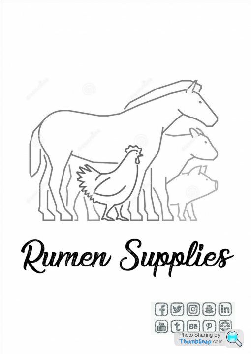
My company logo...
Discussion


Have you got permission to use the graphic from the artist?
https://lucdof1.deviantart.com/art/Sheep-and-cow-3...
https://lucdof1.deviantart.com/art/Sheep-and-cow-3...
I think your concerns are valid. I have used this website to generate logos for various spin off concepts for my work. Cheap, quick, and you can get some good responses: https://www.fiverr.com/categories/graphics-design/...

Frimley111R said:
Keep it simple (see Google's logo/Apple/MS etc). Thing I always say to people is: consider what it will look like on a small screen. The more detailed it is the more blurred and illegible it will become on a smartphone.
Definitely this.Keep to simple lines and clean, clear fonts. Text shadows and images will look awful when resized small and you may not have access to a high quality version for large prints either.
Something like this incorporated into a logo would be better:
If you're looking to do something with your website then I'd advise getting a designer to do both, so the brand image can be carried through and be consistent. Feel free to PM me if this is something you're interested in.
Edited by jammy-git on Saturday 16th September 11:14

 te.
te.Just to reinforce your thoughts, I don't think the logo looks very professional. The image for me looks like it belongs on the front cover of a children's book about animals and I think the shadowed font just doesn't sit right. Maybe if you lost the shadow and made the outline of the text black it might look better?
AC123 - I'm no expert, but your image is a bit 90's free clipart... and as you have mentioned it is borderline amateurish for a company logo.
Mr. Git is right, simple and clear font, the shadowing detracts from the overall impact.
As I can't sleep, I had a quick play with google images and a free font site - just for a laugh...
NOTE: This is PistonHeads - so I have included some big cocks!

Mr. Git is right, simple and clear font, the shadowing detracts from the overall impact.
As I can't sleep, I had a quick play with google images and a free font site - just for a laugh...
NOTE: This is PistonHeads - so I have included some big cocks!
Just to strengthen what you already think really.. I'm a product/graphic design teacher and I wouldn't be pushing my students to design something similar.
I think the main issue with the shadow is that it just doesn't look 'right' because the shadow on the animals is like the light comes from top left but the text looks like the light comes from the top right therefore they contradict each other. I was finding it hard to concentrate on anything else!
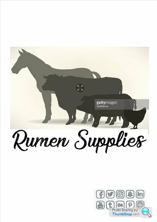
As the others have said. Keep it simple, memorable and try and use no more than two colours ideally. (shades of the same colour are fine, shades of grey and add some shades of blue for example.) very similar to the poster above. I love the logo with the animals ontop of each other!
Dion.
I think the main issue with the shadow is that it just doesn't look 'right' because the shadow on the animals is like the light comes from top left but the text looks like the light comes from the top right therefore they contradict each other. I was finding it hard to concentrate on anything else!
As the others have said. Keep it simple, memorable and try and use no more than two colours ideally. (shades of the same colour are fine, shades of grey and add some shades of blue for example.) very similar to the poster above. I love the logo with the animals ontop of each other!
Dion.
anonymous said:
[redacted]
Get a proper Designer to do one for you, an agency may charge too much but there’s plenty of young freelancers out there that do good work for reasonable fees.Don’t use images from royalty free websites as a logo (shutterstock, istock etc) it’s actually against the license unless you specifically pay for an exclusive license.
Honestly I wouldn’t use any kind of animal illustration as part of a logo.
Logo design is worth paying someone at least a small amount for. A lot more goes into decent logos than you can imagine, the most critical one being something called ‘The Golden Ratio’.
Look it up, and you’ll see a massive amount of the best logos, (simple but instantly recognisable) are designed using it.

I designed mine using that and I’m quite pleased with it.
Logo design is worth paying someone at least a small amount for. A lot more goes into decent logos than you can imagine, the most critical one being something called ‘The Golden Ratio’.
Look it up, and you’ll see a massive amount of the best logos, (simple but instantly recognisable) are designed using it.
I designed mine using that and I’m quite pleased with it.
Gassing Station | Business | Top of Page | What's New | My Stuff