What are the best/worst car badges/emblems?
Discussion


I was reminded of this the other day when I saw a Chevrolet as I can’t stand the Chevrolet “bowtie” logo/emblem, especially in gold! I had a Spark/Aveo as a courtesy/hire car whilst my car was being repaired a couple of years ago for a couple of weeks and it was actually fairly decent but looking at that gold “bowtie” on the steering wheel just made my teeth itch!

I’ve never owned one or spent a significant amount of time in one and some of their cars are quite good-looking and better value than their corporate peers (VW/Audi) but I also dislike the SEAT logo/emblem and maybe subconsciously it has prevented me from ever buying one.

Also for a cool “supercar” brand, I think the McLaren logo is pretty poor.

It’s not that having a simple logo/emblem is a problem. BMW/Audi/Mercedes-Benz/VW/Porsche/Ford all have fairly simple logos but they’re all instantly recognisable and you don’t really need the name of the brand written on the car to know what it is (although for the first 5-6 years of my life, I thought it was a Jord, not a Ford, as the F was so stylized)! So the German manufacturers seem to be pretty good at this, as do the French, the Peugeot lion, Renault diamond and Citroen chevrons are all pretty strong logos but they have been restyled over the years and I’m not always sure if the “new” design is an improvement.
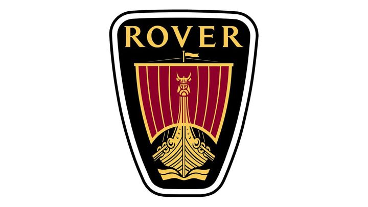
Unfortunately, the British and Japanese manufacturers seem to be consistently the worst. I guess the Japanese ones aren’t bad but Subaru aside pretty boring and I’m trying to teach my kids about cars but they consistently mistake a Hyundai for a Honda. Britain has some of the best/strongest car brand names in the business: Jaguar, Land Rover, Aston Martin, Bentley, Rolls Royce, MINI, Morgan, Lotus but none of the badges are really up to much and it seems that they have all started having to write the names on the back of the cars so that people can tell what they actually are. I always thought that the Jaguar “leaper” didn’t really work as it wasn’t symmetrical and was leaping backward into the past rather than into the future and the “growler” didn’t really look serious. Ironically, the best badge design on a British car is now defunct.
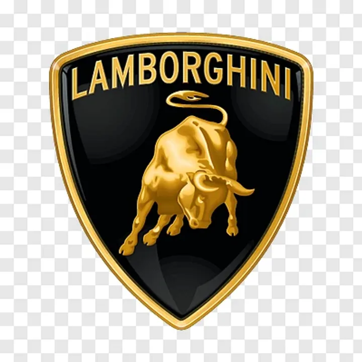
The best car badges/emblems have to come from the Italians though surely? The Ferrari prancing horse, Maserati trident, Abarth scorpion and Alfa Romeo serpent eating a man are all brilliant but I think I’ll go with the Lamborghini raging bull as my favourite, even though a Lamborghini isn’t the car that I would necessarily buy.
So what in your opinion are the best and worst car badges/emblems?
I’ve never owned one or spent a significant amount of time in one and some of their cars are quite good-looking and better value than their corporate peers (VW/Audi) but I also dislike the SEAT logo/emblem and maybe subconsciously it has prevented me from ever buying one.
Also for a cool “supercar” brand, I think the McLaren logo is pretty poor.
It’s not that having a simple logo/emblem is a problem. BMW/Audi/Mercedes-Benz/VW/Porsche/Ford all have fairly simple logos but they’re all instantly recognisable and you don’t really need the name of the brand written on the car to know what it is (although for the first 5-6 years of my life, I thought it was a Jord, not a Ford, as the F was so stylized)! So the German manufacturers seem to be pretty good at this, as do the French, the Peugeot lion, Renault diamond and Citroen chevrons are all pretty strong logos but they have been restyled over the years and I’m not always sure if the “new” design is an improvement.
Unfortunately, the British and Japanese manufacturers seem to be consistently the worst. I guess the Japanese ones aren’t bad but Subaru aside pretty boring and I’m trying to teach my kids about cars but they consistently mistake a Hyundai for a Honda. Britain has some of the best/strongest car brand names in the business: Jaguar, Land Rover, Aston Martin, Bentley, Rolls Royce, MINI, Morgan, Lotus but none of the badges are really up to much and it seems that they have all started having to write the names on the back of the cars so that people can tell what they actually are. I always thought that the Jaguar “leaper” didn’t really work as it wasn’t symmetrical and was leaping backward into the past rather than into the future and the “growler” didn’t really look serious. Ironically, the best badge design on a British car is now defunct.
The best car badges/emblems have to come from the Italians though surely? The Ferrari prancing horse, Maserati trident, Abarth scorpion and Alfa Romeo serpent eating a man are all brilliant but I think I’ll go with the Lamborghini raging bull as my favourite, even though a Lamborghini isn’t the car that I would necessarily buy.
So what in your opinion are the best and worst car badges/emblems?
Edited by white_goodman on Friday 16th May 18:59
Worst? The Krit car company from Detroit, Michigan, USA.
https://en.wikipedia.org/wiki/K-R-I-T_Motor_Car_Co...
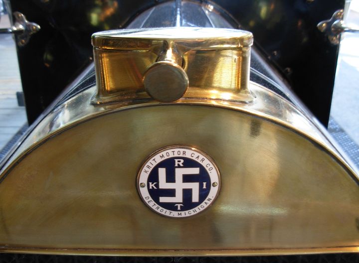
https://en.wikipedia.org/wiki/K-R-I-T_Motor_Car_Co...
FourWheelDrift said:
Worst? The Krit car company from Detroit, Michigan, USA.
https://en.wikipedia.org/wiki/K-R-I-T_Motor_Car_Co...
Oh dear! Might be a good time for a comeback though?https://en.wikipedia.org/wiki/K-R-I-T_Motor_Car_Co...
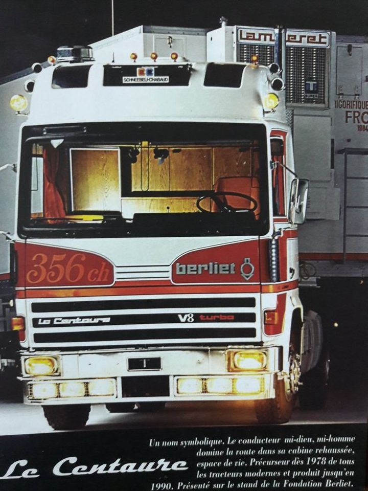
Commercial vehicles not cars but I always though the Berliet logo was very smart.
The transformation from a locomotive to something so stylised that it became a abstract shape which looked like the icon for a motor on a technical drawing is ace.
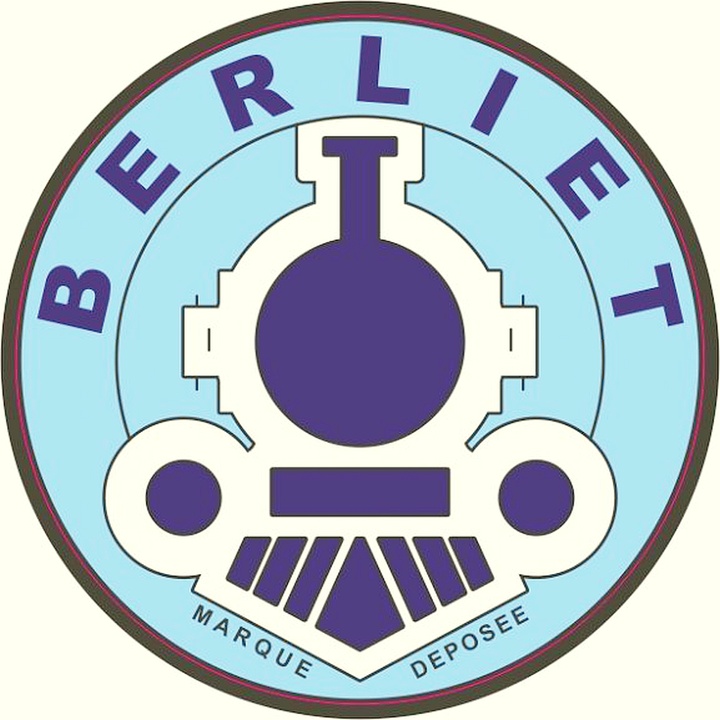

Also while we are doing Francophile stuff, Citroën’s deux chevrons represents the double helical gears perfected by their eponymous founder.
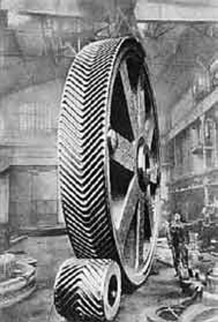

The transformation from a locomotive to something so stylised that it became a abstract shape which looked like the icon for a motor on a technical drawing is ace.
Also while we are doing Francophile stuff, Citroën’s deux chevrons represents the double helical gears perfected by their eponymous founder.
Edited by Stick Legs on Friday 16th May 21:06


Gassing Station | General Gassing | Top of Page | What's New | My Stuff