Only the Brave - Honest Photography Feedback
Discussion


This thread has one purpose and one purpose only. It's for photographers of all levels to present to the group any of their own images that they consider to be 100% complete, are happy with and who want honest, non biased, considered feedback on.
This thread is not for those who cannot take criticism, or for those who wish to share blurry, underexposed iphone snaps of their dog.
I do not believe there is a thread on here that has this specific intent, however, as this is as a photography forum, I believe it should. It's the best way for us all to learn.
If you take an active interest in photography, no matter what level you consider yourself to be, I encourage you to please take a few minutes to pick an image and have your say. Be honest, there is no point in beating about the bush or being afraid to offend someone. Likewise it's an opportunity to praise those images that you really appreciate. If the image is on this thread the OP wants you to be 100% honest whether positive or negative.
I'm half expecting this thread to die a fast death, please prove me wrong. I believe there is a wealth of talent and knowledge on here that could benefit everyone. And by providing a small forum to critique openly, will be invaluable to any brave poster!
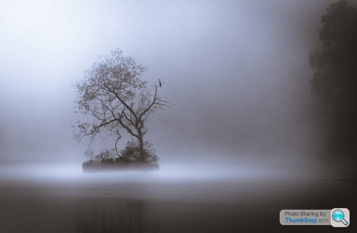
As this thread is my idea, I will be brave and volunteer two images to get things started.
I am happy with these, I think they represent what I am trying to achieve in my photography and I would like you guys to give me your honest opinions.
Here goes... don't be gentle, be honest.
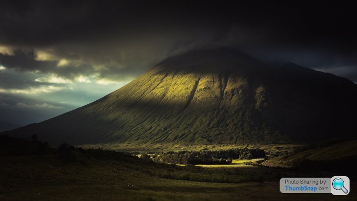
I am happy with these, I think they represent what I am trying to achieve in my photography and I would like you guys to give me your honest opinions.
Here goes... don't be gentle, be honest.
Edited by Craigwww on Tuesday 14th November 12:19
Nigel_O said:
First suggestion - get a FlickR account and stop using thumbsnap - it always helps to see the Exif data
And a question - have you done much with post-processing for either of the images?
Image 1 - I rather like this - was it a long-ish exposure? I ask as the left-hand branches on the tree are a bit blurred. The top-left corner is a bit "blown-out".
Image 2 - either the sky / clouds were actually very dark, or it has been darkened a bit too far in PP - I love the splash of light on the mountainside, but I'm left wondering where it came from - maybe a wider shot with more of the light source (presumably a break in the cloud) to the left and the mountain to the right
Great idea for a thread though - there are some actual Pro 'togs on here and a lot of exceptional amateurs who would be great to learn from - I certainly don't class myself in either of those categories, so I'll be watching with interest - might even get brave enough to post a few of my own once I've seen how gentle the feedback is.....
Thanks for the feedback! :-)And a question - have you done much with post-processing for either of the images?
Image 1 - I rather like this - was it a long-ish exposure? I ask as the left-hand branches on the tree are a bit blurred. The top-left corner is a bit "blown-out".
Image 2 - either the sky / clouds were actually very dark, or it has been darkened a bit too far in PP - I love the splash of light on the mountainside, but I'm left wondering where it came from - maybe a wider shot with more of the light source (presumably a break in the cloud) to the left and the mountain to the right
Great idea for a thread though - there are some actual Pro 'togs on here and a lot of exceptional amateurs who would be great to learn from - I certainly don't class myself in either of those categories, so I'll be watching with interest - might even get brave enough to post a few of my own once I've seen how gentle the feedback is.....
Edited by Nigel_O on Tuesday 14th November 13:38
Image 1 - Yes was low light at the time of shooting and if I recall (I will check later) the exposure was a few seconds. It was a foggy day. In post I noticed the movement blur on the branches but didn't think it detracted from the image. The bright patch in the corner I added actually, visually I liked some contrast and felt it give it an ethereal feel and somewhere for the bird to be looking towards.
Image 2 - I darkened this quite a bit actually, to make the most of the contrast between the splash of light coming from a cloud break and the heavy cloud over the mountain. It was shot handheld and 'off the cuff' as I was driving past. It looks a fair bit darker when viewed on this forum than on my Macbook though. I was influenced by a photo by Damien Shields that was a bit similar.
Nigel_O said:
Just proves that we all see things in different ways - I think it would benefit from being lighter, you like it darker - who is to say which one of us is wrong
For comparison, here's a similar photo from my FlickR album - I wanted to get more in to the left, but it would have let the A5 creep into the shot, which I didn't want
 Ogwen Valley 2 by Nigel Ogram, on Flickr
This was also an opportune shot - spotted it while driving along the A5 and quickly parked up and rattled a few shots off. I didn't want to lose the definition in the sun rays and the clouds, so I exposed for the lighter areas which left the foreground a bit under-exposed - had to bring it back a little in PP - I still kept it dark enough to show it was in the shade, but light enough to see the detail
On comparing your shot and mine, I would agree, mine would benefit from being lighter. I didn't mind losing the foreground detail as there really wasn't anything there but maybe it would provide more of a balance if the foreground was more exposed. For comparison, here's a similar photo from my FlickR album - I wanted to get more in to the left, but it would have let the A5 creep into the shot, which I didn't want
Ogwen Valley 2 by Nigel Ogram, on FlickrThis was also an opportune shot - spotted it while driving along the A5 and quickly parked up and rattled a few shots off. I didn't want to lose the definition in the sun rays and the clouds, so I exposed for the lighter areas which left the foreground a bit under-exposed - had to bring it back a little in PP - I still kept it dark enough to show it was in the shade, but light enough to see the detail
I like the fact you haven't overdone the image by adding more sun rays, I see alot of manufactured images these days with fake sun rays (I even tried it myself) and although they can add drama to the shot, I don't think they are very convincing.
I think you're right, if you were able to frame the shot more to the left, it would have been a better composition and there would be less 'dead space' to the right but it's saved by the row of trees that lead you 'up the valley' and into the image.
Edited by Craigwww on Tuesday 14th November 14:31
RobDickinson said:
Thats a stunning image but I think could be improved.
The main problem with it is the top left corner is too bright, it either draws the eye or overpowers the central image. you could crop closer or tone this down. It might not be much of a problem on an actual print
you could also crop some of the bottom off as it doesnt add much but I dont think that would change a lot.
Hi Rob, appreciate your thoughts and I genuinely hadn't thought the bright patch was that obvious. Given that it has been mentioned twice now, I am going to re-process the image 'sans bright spot'. The main problem with it is the top left corner is too bright, it either draws the eye or overpowers the central image. you could crop closer or tone this down. It might not be much of a problem on an actual print
you could also crop some of the bottom off as it doesnt add much but I dont think that would change a lot.
The image is already cropped a fair bit and I would be hesitant cropping it further for fear of losing some quality but I think it's worth trying it. I will post the new edit tonight if I get a chance.
Speed addicted said:

I took this when the sun poked through the clouds just long enough to light up the mountains, 30 seconds later it was back to solid grey.
Do your worst!
First of all, nice shot. I genuinely enjoy looking at it and you were fortunate to get such great light to illuminate the mountains in the background. It's hard for me to find something I don't like about the image. I like the fact my eye is drawn from the far right of the image all the way through to the left by following the rail cars. I also like the slightly muted colour and tone. If I was to find something to criticize, I would say that it has a bit of a commercial feel to it. Perhaps something I would see as a billboard background or advert. I couldn't see it as a framed print on someone's wall, it doesn't have a great deal of story or personality to it. If there happened to be a few rail workers or workmen somewhere in the image, it would feel more personal to me.
If I was to be picky, I would have removed the small tree that sits to the left of the image on where the railway cutting meets the bank, I find it a bit distracting and interrupts the flow slightly from right to left but that is being pedantic.
However, I do like it.
Edited by Craigwww on Wednesday 15th November 03:28
spence1886 said:
I would echo these comments (and am also a definite amateur) so treat comments as suggestions, not criticism.
I like both photos a lot, but there is scope for playing with them in the hope of improvements to make them truly excellent:
Photo 1 - Try a different crop - probably not square, but 6x5 ration maybe - which will cut out the tree on the right. (this is a Thomas Heaton tip and is something I now always consider with my photos).
Photo 2 - does seem way too dark. Boosting the exposure but limiting its effect on the already illuminated area might work...
Having been a long time PH lurker... this thread finally got me to sign up... after I take a brave pill or two, I may put up one or two of my own pics...
Yea I think a 6x5 might be better.. another Thomas Heaton fan here and I did see recently he likes this size. I will try tonight. I like both photos a lot, but there is scope for playing with them in the hope of improvements to make them truly excellent:
Photo 1 - Try a different crop - probably not square, but 6x5 ration maybe - which will cut out the tree on the right. (this is a Thomas Heaton tip and is something I now always consider with my photos).
Photo 2 - does seem way too dark. Boosting the exposure but limiting its effect on the already illuminated area might work...
Having been a long time PH lurker... this thread finally got me to sign up... after I take a brave pill or two, I may put up one or two of my own pics...
Already tweeked the levels last night in Photo 2 and although I haven't got it just the way I want, lighter in some areas definitely makes the photo better and more dynamic.
Please post up and thanks for the feedback.
TheRainMaker said:
OK, I'll jump in.
After last months competition and the feedback being it could possibly do with some more PP, what would you change, how could it be improved?
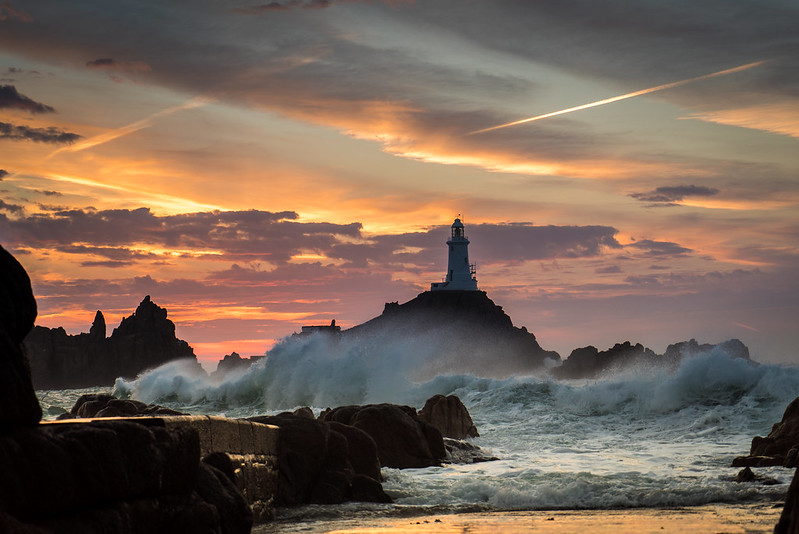 Jersey Sunset by The Rain Maker, on Flickr
Camera settings
F4, 70mm, ISO 100, 1/60, Handheld, Sony A7s
All feedback appreciated.
Thanks for posting.After last months competition and the feedback being it could possibly do with some more PP, what would you change, how could it be improved?
Jersey Sunset by The Rain Maker, on Flickr Camera settings
F4, 70mm, ISO 100, 1/60, Handheld, Sony A7s
All feedback appreciated.
I like this image also and would echo some of the comments already made.
I would crop out the bottom of the image and lose the bright area of reflections on the wet sand. I would also try and recover some details from the shadow areas, bring out a little definition on the lighthouse and rocks. I would so this with the good old fashioned dodge and burn brushes in LR or PS. Just be careful not to overdo it and make the image unrealistic. Also I would experiment with split toning, this is a personal thing though but can really create 'mood'.. not that the image is lacking in mood though.
Personally if I was taking that image, if possible I would have clambered up onto that wall on the left to take the shot and really capture just the sky, lighthouse and turbulent sea and use the wall as a lead in line. That might be easier to say than do of course and not alot you can do about that now.
singlecoil said:
I was sufficiently happy with this one to post it in the Random Photos thread but it's always interesting to hear how others see one's stuff
 Mince pies and port Christmas themed by Elliott and Nolan, on Flickr
Hi and thanks for posting. Mince pies and port Christmas themed by Elliott and Nolan, on FlickrThis isn't the kind of photography I'm into, doesn't create any emotion in me but at the same time, I can appreciate it being technicaly correct and aesthetically pleasing.
The only thing that jumps out of me is there seems to be alot of detail lost in the shadows. I would personally aim to process this kind of image and make sure the whole scene is exposed fully. I want to feel the texture in the mince pies and see the pattern in the wood on the table for example. I also would have adjusted the white balance a little and made the image a tad warmer, it should feel cosy and warm but I don't get that feeling to the extent I could do. I would also have thrown in the hint of a Christmas cracker... just to really bring out some Christmas spirit lol.
I like the composition and the use of depth of field too, makes me feel like I'm sitting at the table drooling over the pies and wine.
TheRainMaker said:
Personally I prefer this composition, works much better in my humble eyes. 
The only thing I would say is there is a bit of halo around the lighthouse and land on the horizon that needs cleaned up.
Edited by Craigwww on Thursday 16th November 11:02
corozin said:
I have no idea why this thread exists. If you want constructive critique, post your stuff for review on photo.net.
I have no idea why this comment exists. If you want to be constructive, pick an image and leave a critique. Otherwise you might feel more at home on mums.net.Edited by Craigwww on Monday 20th November 05:25
singlecoil said:
I must admit that I also am not keen on long exposure shots of moving water, and I'm not hugely keen on B&W images either. But leaving that aside for my taste that picture is a bit too contrasty. Apart from that I think it's an excellent photo, with plenty of impact.
I would tend to agree on the above. However I do enjoy the odd 'moving water' shot when done correctly.Personally for me, although it's not a 'bad' image at all, I'm struggling to find the point of it. In this image the water seems to be the subject of the photo. I find that moving water shots work only when they are part of an image but not the main focus, e.g foreground of a landscape shot, where the landscape is more the subject. The reason I say this, is that I too had a series of shots I took of moving water at sunset and after spending hours processing them... I sat back and thought..that's boring..so I converted it to B&W to see if it would make more of an impact.. before realising I was trying to polish a turd and just abandoned it. BTW I am not saying your image is a turd!!
What was the reason this was processed in B&W, was that the intention when you took the shot or like me, you felt the image lacked something so a monochrome conversion was employed to bring some mood?
Edited by Craigwww on Monday 20th November 12:11
DavidY said:
Interesting feedback
I did a small project on Industrial Decline local to me, and all the images (whether rightly or wrongly) were processed in a B&W 'Northern Gritty' style, hence the boosted contrast, and high structure (clarity).
On this particular picture the water (and the force of the water) was the subject. Surprisingly the exposure is only 1/4 second, so it just shows the speed the water was travelling at.
Provided with some context, I can see how this image would work as a series on industrial decline.I did a small project on Industrial Decline local to me, and all the images (whether rightly or wrongly) were processed in a B&W 'Northern Gritty' style, hence the boosted contrast, and high structure (clarity).
On this particular picture the water (and the force of the water) was the subject. Surprisingly the exposure is only 1/4 second, so it just shows the speed the water was travelling at.
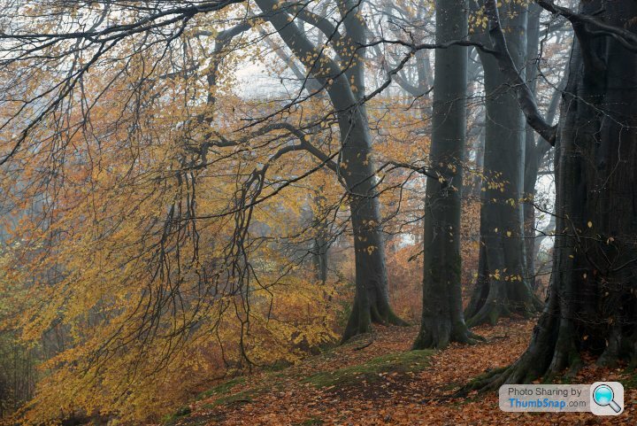
I'm keen to try some woodland photography myself.. not so easy when you live and work in Saudi though.
I love the composition, colour and the tone of the image. Makes me long to be back in Scotland actually.
If that was my image, I would be tempted to add some highlights to some of the red leaves, really bring out the contrast and suggest a bit of sunlight back lighting them. It may be deemed 'cheating' though and it doesn't appear there was much direct sunlight in the shot.
chrismarr said:
A wee bit, this is unedited just resized.
Just a tip and not an issue in your finished image.
RichTT said:
For the honesty part. I'm pretty sure that I have a massively self inflated sense of achievement with my photographs. Even though I accept that they are myopic in their focus and technically average. Sites like Flickr and 500px, both of which I contribute to, are never a good judge of quality, and family and friends are probably just as bad. I can never tell if a photo I like is good because it stands alone as an independent photograph or purely due to the memories that I have associated with that particular moment. Perhaps I'm just a validation w e and even posting in this thread is a vain attempt to seek praise.
I'm an opportunistic photographer who doesn't plan a shoot, I'm there, therefore I photograph. Subject matter is largely irrelevant as long as it has a geometric form once framed. I try to get it right first time, shoot only in JPG and almost never post-process apart from a slight alignment or cropping.
So, up for criticism and comment is my latest upload to Flickr.
Shot at the Chinese Garden of Friendship in Sydney. I love it because it reminds me of a classical oil painting. The water looks oily and dark and there's just enough of the Koi visible to be interesting.
 Oily Fish, on Flickr
With the intention of this thread in mind, to me this is just a pretty poor snap of a fish and I fail to see any photographic merit in it. e and even posting in this thread is a vain attempt to seek praise. I'm an opportunistic photographer who doesn't plan a shoot, I'm there, therefore I photograph. Subject matter is largely irrelevant as long as it has a geometric form once framed. I try to get it right first time, shoot only in JPG and almost never post-process apart from a slight alignment or cropping.
So, up for criticism and comment is my latest upload to Flickr.
Shot at the Chinese Garden of Friendship in Sydney. I love it because it reminds me of a classical oil painting. The water looks oily and dark and there's just enough of the Koi visible to be interesting.
Oily Fish, on FlickrEdited by RichTT on Sunday 8th April 11:49
Gassing Station | Photography & Video | Top of Page | What's New | My Stuff