F1Visualized and other stats charts
Discussion


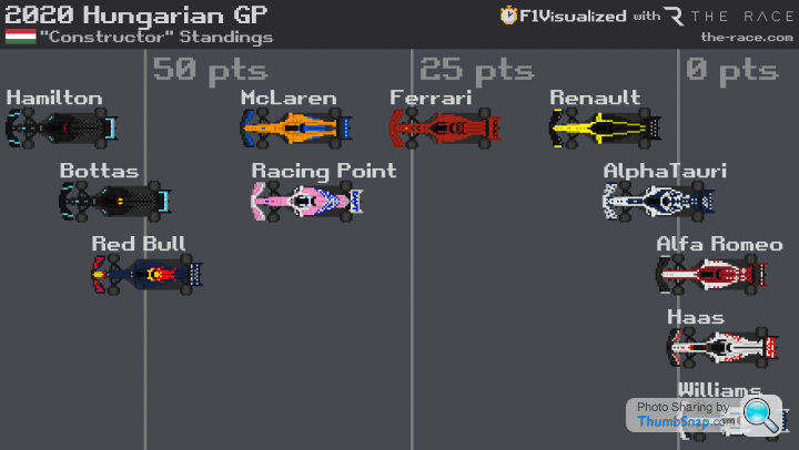
F1Visualized is a Twitter account making charts and animations per race this year, some of the charts really show how great or not a race was, and they have charts of the constructors and driver titles etc.
https://twitter.com/f1visualized
Another video I've just found shows the top 15 drivers career points since 1950 using the 2019 points system.
https://youtu.be/ywbxGfE4mRg
https://twitter.com/f1visualized
Another video I've just found shows the top 15 drivers career points since 1950 using the 2019 points system.
https://youtu.be/ywbxGfE4mRg
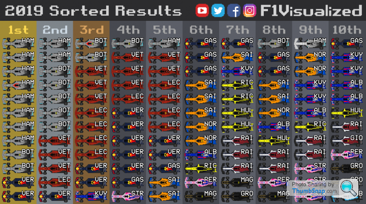
2019 season as a race https://twitter.com/f1visualized/status/1213867250...
Top 10 2019 v 2020. The top 5 is a top 3 now, the rest are closer to each other and scoring more points. https://twitter.com/f1visualized/status/1310929575...
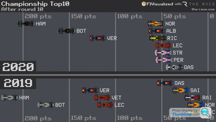
To be fair though, you don't need a chart to know it's a top 3 and close fight for the rest of them this year .
.
To be fair though, you don't need a chart to know it's a top 3 and close fight for the rest of them this year
.The new cars for 2021, first up with the Aston Martin 
https://twitter.com/f1visualized/status/1495452099...

https://twitter.com/f1visualized/status/1495452099...
Gassing Station | Formula 1 | Top of Page | What's New | My Stuff