Climate change - the POLITICAL debate. Vol 4
Discussion


Omigawd it's worse than previously thought! Even Capt Mainwaring should panic.
Each and every previous timed-out armageddonist hype-fest hasn't taught alarmists anything.
http://nymag.com/daily/intelligencer/2017/07/clima...
"If your anxiety about global warming is dominated by fears of sea-level rise..."
Why? Sea level has been flat with rises added by the hand of man.
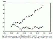
This graphic from a published paper "shows that sea level, as measured by satellites - the lower line - has been flat. How they generate the graph they need, the upper line, is by adding an isostatic adjustment, which is a number plucked from thin air."
<waits for believer on today's shift to say no-way followed by nothing new or worth reading>
Each and every previous timed-out armageddonist hype-fest hasn't taught alarmists anything.
http://nymag.com/daily/intelligencer/2017/07/clima...
"If your anxiety about global warming is dominated by fears of sea-level rise..."
Why? Sea level has been flat with rises added by the hand of man.
This graphic from a published paper "shows that sea level, as measured by satellites - the lower line - has been flat. How they generate the graph they need, the upper line, is by adding an isostatic adjustment, which is a number plucked from thin air."
<waits for believer on today's shift to say no-way followed by nothing new or worth reading>
Gandahar said:
Well done on the violin photo. ho ho ho.
Meanwhile, back to the topic rather than an infinite amount of monkeys providing nothing of interest
https://www.reuters.com/article/us-usa-epa-pruitt-...
That could be good fun if they did it, but sounds like hot air
And the first question should be:-Meanwhile, back to the topic rather than an infinite amount of monkeys providing nothing of interest
https://www.reuters.com/article/us-usa-epa-pruitt-...
That could be good fun if they did it, but sounds like hot air
Does a minute temperature rise of the planet (whatever that actually is) matter?
Todays CC or AGE puff piece by Roger Hairbrain:-
'Make new rules' to save the oceans
http://www.bbc.co.uk/news/science-environment-4057...
New rules are urgently needed to protect the open seas, scientists have warned.
A report to a UN ocean conference in New York points out that more than 60% of the ocean has no rules because it’s outside national jurisdiction.
It says the open ocean is at risk from climate change, over-fishing, deep sea mining, farm pollution and plastics.
The authors say one area – the Bay of Bengal - is at a tipping point which could impact on global fish stocks.............................continues
I'm sure all the worlds nations will sit down and all be jolly good friends, and get it sorted in no time. Er, except China, who are busy occupying islands that aren’t theirs, with military personal, in the South China Sea, and threatening all the smaller countries who object. Nothing to do with Oil and Gas fields of course!
I say I say I say...Wayne Rooney's hair is falling out again, what could he use to keep it in? A plastic bag.
Saving the oceans - where would we put them? Not in a giant plastic bag for sure. The ecoactivists would be very annoyed, they don't like plastic bags.
Bet hardly any of this (below) is on the BBC's website, politicians don't discuss it routinely either.
The oceans have had billions of years to absorb carbon dioxide including eras with up to 18 times as much carbon dioxide in the atmosphere as today, yet the oceans are not acidic at pH=8.1 and will not become so due to the actions of an extremely large capacity carbonate-hydrogencarbonate buffer solution known as the oceans themselves.
Carbonate structures are produced within organisms where pH is controlled by cell biochemistry, the availability of raw materials is an issue but there are organelles that can move ions along channels against concentration gradients where diffusion is opposed.
Cell biochemistry includes buffering effects (as does our blood and our cells) and operates independently of external conditions but see above in terms of availability of raw materials; opportunities to overcome this are not available at any realistically small external pH changes.
Carbon dioxide is not simply 'an acid' in spite of or because of that fact we see experiments claimed to be carried out in relation to this phenomenon that substitute hydrochloric acid for carbon dioxide dissolution - hydrochloric acid lacks any ability to operate as dissolved carbon dioxide does through the common ion effect and the buffer solution (carbonate/hydrogencarbonate) described above.
Ocean chemistry buffers against pH changes - while the dissolving of carbon dioxide raises carbonate levels, carbonate is what organisms need to produce calcium carbonate.
So far this is biology and equilibrium chemistry, there's more bad news for alarmists available in terms of the kinetics of dissolution where high-order dependence on under-saturation and very large dissolution rate constants implied by some earlier laboratory studies fail to simulate data from the oceans, recent work confirms a more linear rate picture.
We now know that healthy, growing corals 'acidify' the oceans around them, another causallty problem for the faith side. Andreas Andersson of the Scripps Institution of Oceanography in San Diego, California, and his colleagues carefully monitored a coral reef in Bermuda for five years, and found that spikes in acidity were linked to increased reef growth. Healthy corals were responsible for an effect supposedly due to man.
A final word from Dr J Floor Anthoni who has described a revealing study examining the plankton record in a deep sea core of the North Atlantic together with experiments with living cultures of one of the most common small phytoplankton organisms, the coccolith Emiliania Huxleyi. This coccolith is a major contributor to calcium deposits in the oceans to ~50%. Contrary to other studies that found a decrease in calcification, this study found an increase in calcification, accompanied by larger individuals, although at somewhat slower growth rates. The difference in experimental setup may have been decisive since whereas other studies changed the pH by adding external acids or bases such as HCl, this team mimicked the real world more accurately by bubbling air with known concentrations of CO2 (280-750ppm, pH=8.1-7.7) through their cultures. This alone gives the study increased validity and scientific credibility. The study showed that, paradoxically for scaremongers, even though calcite dissolves more rapidly at higher carbon dioxide concentrations (though at a linear rate compared to the previously used but erroneous power law) it is also more easily made, resulting in heavier shells, which approximately doubled in size. A lower pH also encouraged productivity, which provided the energy to grow bigger and to make larger shells.
turbobloke said:
This graphic from a published paper "shows that sea level, as measured by satellites - the lower line - has been flat. How they generate the graph they need, the upper line, is by adding an isostatic adjustment, which is a number plucked from thin air."
<waits for believer on today's shift to say no-way followed by nothing new or worth reading>
Would you care to provide a link? I'm afraid your unreadable gif and vague quote from an unspecified source are not very compelling to those of us who don't just believe things we read on the internet without seeing some evidence first.

Even Ars Technica gives in their sub-heading for the iceberg article that it likely has little to do with climate change.
Normally, for them, absolutely anything different is caused by the devils gas; CO2.
Not even any worry over sea levels...citing the ice was already floating on the sea so when it melts it won't make much difference.
Normally, for them, absolutely anything different is caused by the devils gas; CO2.
Not even any worry over sea levels...citing the ice was already floating on the sea so when it melts it won't make much difference.
Otispunkmeyer said:
Even Ars Technica gives in their sub-heading for the iceberg article that it likely has little to do with climate change.
Normally, for them, absolutely anything different is caused by the devils gas; CO2.
Not even any worry over sea levels...citing the ice was already floating on the sea so when it melts it won't make much difference.
Yes that would be unusual for Ars Technica. Normally, for them, absolutely anything different is caused by the devils gas; CO2.
Not even any worry over sea levels...citing the ice was already floating on the sea so when it melts it won't make much difference.
More generally, alarmists find any glimmer of a scare to hype, and they get one in melting icebergs though as you rightly point out it won't make much difference in reality. As reality is the last place any believer will go, they're making hay.
As petrolheads know, fresh water from icebergs is less dense than salty sea water. This means that the melted fresh water will take up a slightly larger volume than the displaced salt water which results in a small increase in the water level i.e. a very, very small rise in sea level.
However this is a "rise in sea level" and it leads to baseless scaremongering when following the alarmists' Schneider Bible where they "offer up some scary scenarios" with "little mention of any doubts one might have" in order to "decide what the right balance is between being effective and being honest".
among the various additional factors affecting sea level (glacial isostasy, shelf margin movement, change in seafloor spreading rate, sediment transfer, 'juvenile' water e.g. volcanism, subduction, and thermosteric effects) there's clearly enough sea level drop to cancel out any minuscule rise overall - leading to the flatline sea level from satellite data, with the claimed sea level rise added by the hand of man later on in the form of adjustments.
durbster said:
turbobloke said:
This graphic from a published paper "shows that sea level, as measured by satellites - the lower line - has been flat. How they generate the graph they need, the upper line, is by adding an isostatic adjustment, which is a number plucked from thin air."
<waits for believer on today's shift to say no-way followed by nothing new or worth reading>
Would you care to provide a link? I'm afraid your unreadable gif and vague quote from an unspecified source are not very compelling to those of us who don't just believe things we read on the internet without seeing some evidence first.
PS. Does a minute planet temperature rise matter?
turbobloke said:
This graphic from a published paper "shows that sea level, as measured by satellites - the lower line - has been flat. How they generate the graph they need, the upper line, is by adding an isostatic adjustment, which is a number plucked from thin air."
It's not 'plucked out of the air'. Look it up.Otispunkmeyer said:
Even Ars Technica gives in their sub-heading for the iceberg article that it likely has little to do with climate change.
Normally, for them, absolutely anything different is caused by the devils gas; CO2.
Not even any worry over sea levels...citing the ice was already floating on the sea so when it melts it won't make much difference.
The buoyancy is the likely mechanism for the break up anyway. Increased ice thickness below the surface creating increased uplifting force on the margins of land ice, resulting in a shearing of the ice at the highest stress point (probably).Normally, for them, absolutely anything different is caused by the devils gas; CO2.
Not even any worry over sea levels...citing the ice was already floating on the sea so when it melts it won't make much difference.
budgie smuggler said:
turbobloke said:
This graphic from a published paper "shows that sea level, as measured by satellites - the lower line - has been flat. How they generate the graph they need, the upper line, is by adding an isostatic adjustment, which is a number plucked from thin air."
It's not 'plucked out of the air'. Look it up.That said when there are several adjustment values (and presumably some of the individual adjustments might be dependent upon or otherwise influence one or more of the other values) is there a formal standard for presenting the range of possible results in a graphic? Especially a monochrome graphic for printing?
This is a serious question btw.
If using a graph such as this for illustration as part of a presentation by some means to a politician - especially a busy politician in a position of authority - the image presented needs to be readily understood. More likely the message to be pushed is clearly presented and the variability dismissed as "too complicated" .
budgie smuggler said:
turbobloke said:
This graphic from a published paper "shows that sea level, as measured by satellites - the lower line - has been flat. How they generate the graph they need, the upper line, is by adding an isostatic adjustment, which is a number plucked from thin air."
It's not 'plucked out of the air'. Look it up. it's the way you tell 'em.
The Colorado team once had this image depicting satellite data error on their website at the URL below. Not now.
http://sealevel.colorado.edu/files/current/sl_err_...

Note the magnitude of the errors with respect to the claimed annual sea level rise. The latest incarnation of the error chart shows larger errors. After processing, the mean level trend claims an error one order of magnitude smaller.
The sea level rise adjustment process can be seen over a timescale of only three years. As the 2006 result of Jevreveja et al showed 90s sea level rise rates to be the same as 40s rates, skewering agw, adjustments were needed quickly and these were provided by Vehmeer and Rahmstorf 2009. During the intervening three years, historical raw data didn't change (!).

Around the globe, sea levels in realty are rising, falling and some show stasis. Taking those showing a rise is informative. The San Francisco tidal gauge has been up and running since 1854, and over the last century it showed an increase of 2mm per year. Interestingly, since the start of records in 1854 the annual rate of sea level rise has been 2mm per year. Given that this period covers industrialisation and the advent of so-called manmade global warming, the fact that the trend is uniform (as elsewhere) adds another nail to the agw coffin.
The paper abstract below considers the error question and the "we are not doomed after all" points together. Note the reduction in the rate of claimed sea level rise since 2005. What happened to the much-vaunted acceleration in sea level rise ? Another oops for agw and sea level scaremongering,
A new assessment of the error budget of global mean sea level rate estimated by satellite altimetry over 1993–2008
M. Ablain1, A. Cazenave2, G. Valladeau1, and S. Guinehut1
1CLS, Ramonville Saint-Agne, France
2LEGOS, OMP, Toulouse, France
Abstract.
A new error budget assessment of the global Mean Sea Level (MSL) determined by TOPEX/Poseidon and Jason-1 altimeter satellites between January 1993 and June 2008 is presented using last altimeter standards. We discuss all potential errors affecting the calculation of the global MSL rate. We also compare altimetry-based sea level with tide gauge measurements over the altimetric period. Applying a statistical approach, this allows us to provide a realistic error budget of the MSL rise measured by satellite altimetry. These new calculations highlight a reduction in the rate of sea level rise since 2005, by ~2 mm/yr. ... Since November 2005, MSL is accurately measured by a single satellite, Jason-1. However the error analysis performed here indicates that the recent reduction in MSL rate is real.
Envisat data needs adjusting too (of course) but take a peek at the numbers. Squint a bit at the unadjusted and adjusted trends - top right corner - maybe using a magnifying glass


turbobloke said:
As petrolheads know, fresh water from icebergs is less dense than salty sea water. This means that the melted fresh water will take up a slightly larger volume than the displaced salt water which results in a small increase in the water level i.e. a very, very small rise in sea level.
Yes, together with a commensurate decrease in ocean salinity, IOW the square root of f k-all
k-allLongQ said:
It would be nice to see the adjusted numbers presented with error bars.
That said when there are several adjustment values (and presumably some of the individual adjustments might be dependent upon or otherwise influence one or more of the other values) is there a formal standard for presenting the range of possible results in a graphic? Especially a monochrome graphic for printing?
This is a serious question btw.
If using a graph such as this for illustration as part of a presentation by some means to a politician - especially a busy politician in a position of authority - the image presented needs to be readily understood. More likely the message to be pushed is clearly presented and the variability dismissed as "too complicated" .
Are you talking about 'measurement of uncertainty' as used in calibration? as in combining errors in each stage of a measurement?That said when there are several adjustment values (and presumably some of the individual adjustments might be dependent upon or otherwise influence one or more of the other values) is there a formal standard for presenting the range of possible results in a graphic? Especially a monochrome graphic for printing?
This is a serious question btw.
If using a graph such as this for illustration as part of a presentation by some means to a politician - especially a busy politician in a position of authority - the image presented needs to be readily understood. More likely the message to be pushed is clearly presented and the variability dismissed as "too complicated" .
for example if you use a voltmeter and a signal generator (standards) to calibrate an oscilloscope measurement then you have to combine the measurement of uncertainty of both standards to ascertain the total uncertainty.
This may help (page 4).............
http://nfogm.no/wp-content/uploads/2016/03/Calibra...
I may be teaching you egg sucking and/or way off track

dickymint said:
LongQ said:
It would be nice to see the adjusted numbers presented with error bars.
That said when there are several adjustment values (and presumably some of the individual adjustments might be dependent upon or otherwise influence one or more of the other values) is there a formal standard for presenting the range of possible results in a graphic? Especially a monochrome graphic for printing?
This is a serious question btw.
If using a graph such as this for illustration as part of a presentation by some means to a politician - especially a busy politician in a position of authority - the image presented needs to be readily understood. More likely the message to be pushed is clearly presented and the variability dismissed as "too complicated" .
Are you talking about 'measurement of uncertainty' as used in calibration? as in combining errors in each stage of a measurement?That said when there are several adjustment values (and presumably some of the individual adjustments might be dependent upon or otherwise influence one or more of the other values) is there a formal standard for presenting the range of possible results in a graphic? Especially a monochrome graphic for printing?
This is a serious question btw.
If using a graph such as this for illustration as part of a presentation by some means to a politician - especially a busy politician in a position of authority - the image presented needs to be readily understood. More likely the message to be pushed is clearly presented and the variability dismissed as "too complicated" .
for example if you use a voltmeter and a signal generator (standards) to calibrate an oscilloscope measurement then you have to combine the measurement of uncertainty of both standards to ascertain the total uncertainty.
This may help (page 4).............
http://nfogm.no/wp-content/uploads/2016/03/Calibra...
I may be teaching you egg sucking and/or way off track
I'll dig up the link once again and find the table used. Seemed to have lost it when the browser froze a while back.
robinessex said:
That's all you do Durbster. Belief.
Yes, if you ignore the enormous amount of evidence I have continuously provided to explain why I think what I think. 
Tell me, what evidence have you provided to explain why you think what you think?
I think the world's climate scientists are the people with the best understanding of the climate.
On what grounds do you doubt them?
Where do you get your information from that's better than theirs?
How can you claim your position not based on belief?
Because to me it just looks like you've seen turbobloke use the term "believers" for some unknown reason, and now you're just repeating it like a parrot because you don't know how to think independently. At least, that's what the evidence suggests.
LongQ said:
It would be nice to see the adjusted numbers presented with error bars.
That said when there are several adjustment values (and presumably some of the individual adjustments might be dependent upon or otherwise influence one or more of the other values) is there a formal standard for presenting the range of possible results in a graphic? Especially a monochrome graphic for printing?
This is a serious question btw.
If using a graph such as this for illustration as part of a presentation by some means to a politician - especially a busy politician in a position of authority - the image presented needs to be readily understood. More likely the message to be pushed is clearly presented and the variability dismissed as "too complicated" .
Data is rarely used in isolation and further to dickymint's reply, there's info on errors and how they combine at the following links, each presentation has a slightly different flavour. These links go to pdf files.That said when there are several adjustment values (and presumably some of the individual adjustments might be dependent upon or otherwise influence one or more of the other values) is there a formal standard for presenting the range of possible results in a graphic? Especially a monochrome graphic for printing?
This is a serious question btw.
If using a graph such as this for illustration as part of a presentation by some means to a politician - especially a busy politician in a position of authority - the image presented needs to be readily understood. More likely the message to be pushed is clearly presented and the variability dismissed as "too complicated" .
www.met.rdg.ac.uk/~swrhgnrj/combining_errors.pdf
www.webpages.uidaho.edu/for274new/Handouts/Combini...
www.phys.columbia.edu/~w3081/exp_files/ESDandCombi...
Gassing Station | News, Politics & Economics | Top of Page | What's New | My Stuff